
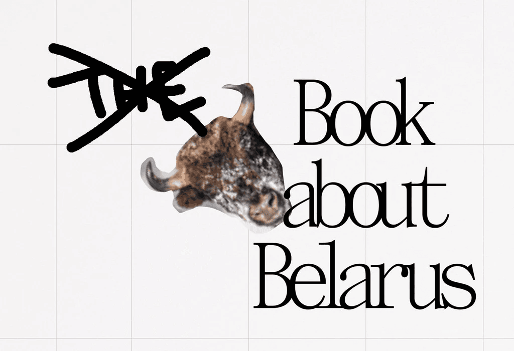
How KUT was made
Today, everything is very fast with AI, and this long read is very different — it is very long and very hardcore. It reflects years of scrupulous work without AI, with a great deal of manual graphic design, ideation driven by the human brain rather than ChatGPT, and the writing of real words by real humans. It carries 1000% craft. I hope this kind of work never dies, and I hope we as designers keep making things like we did here.
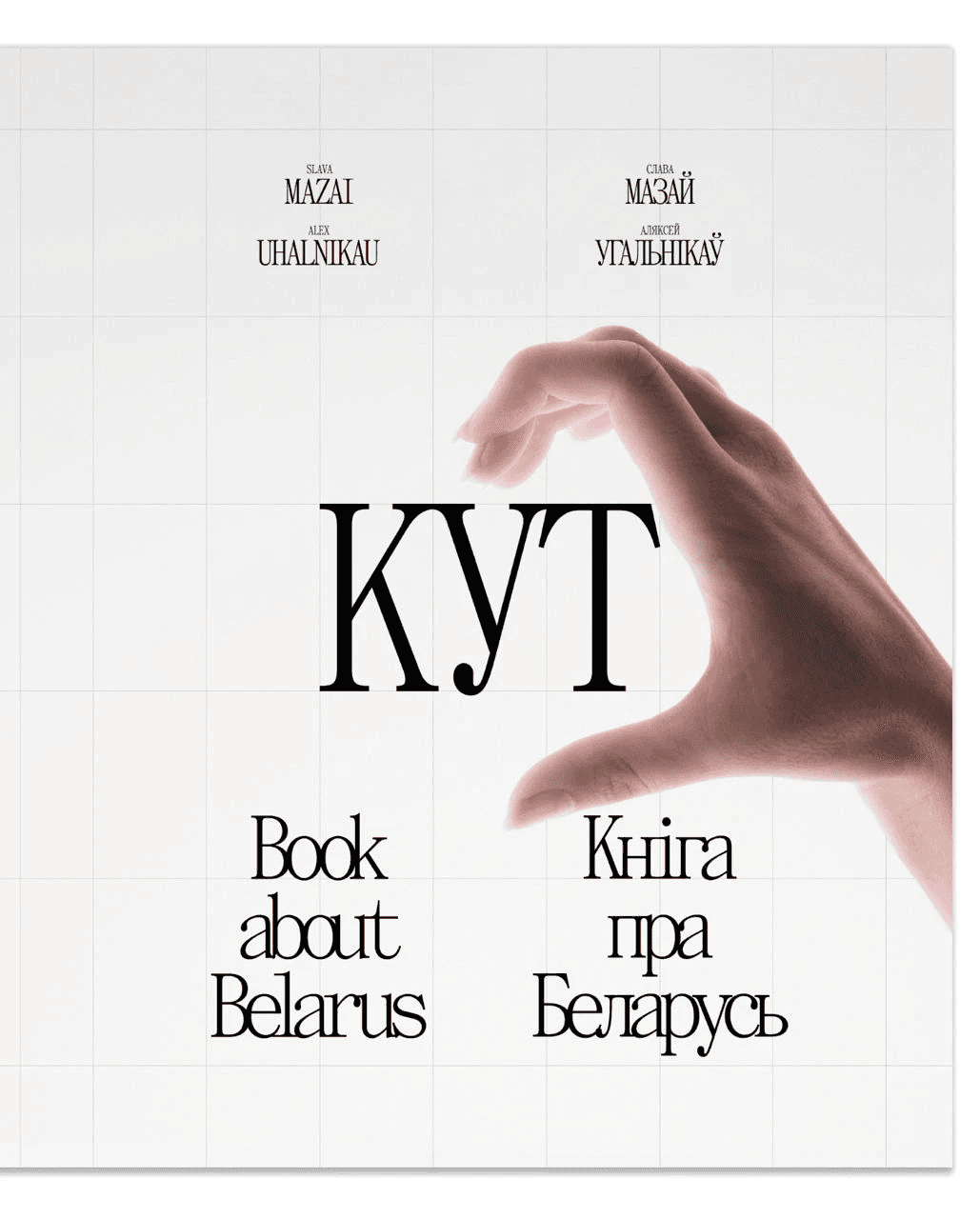
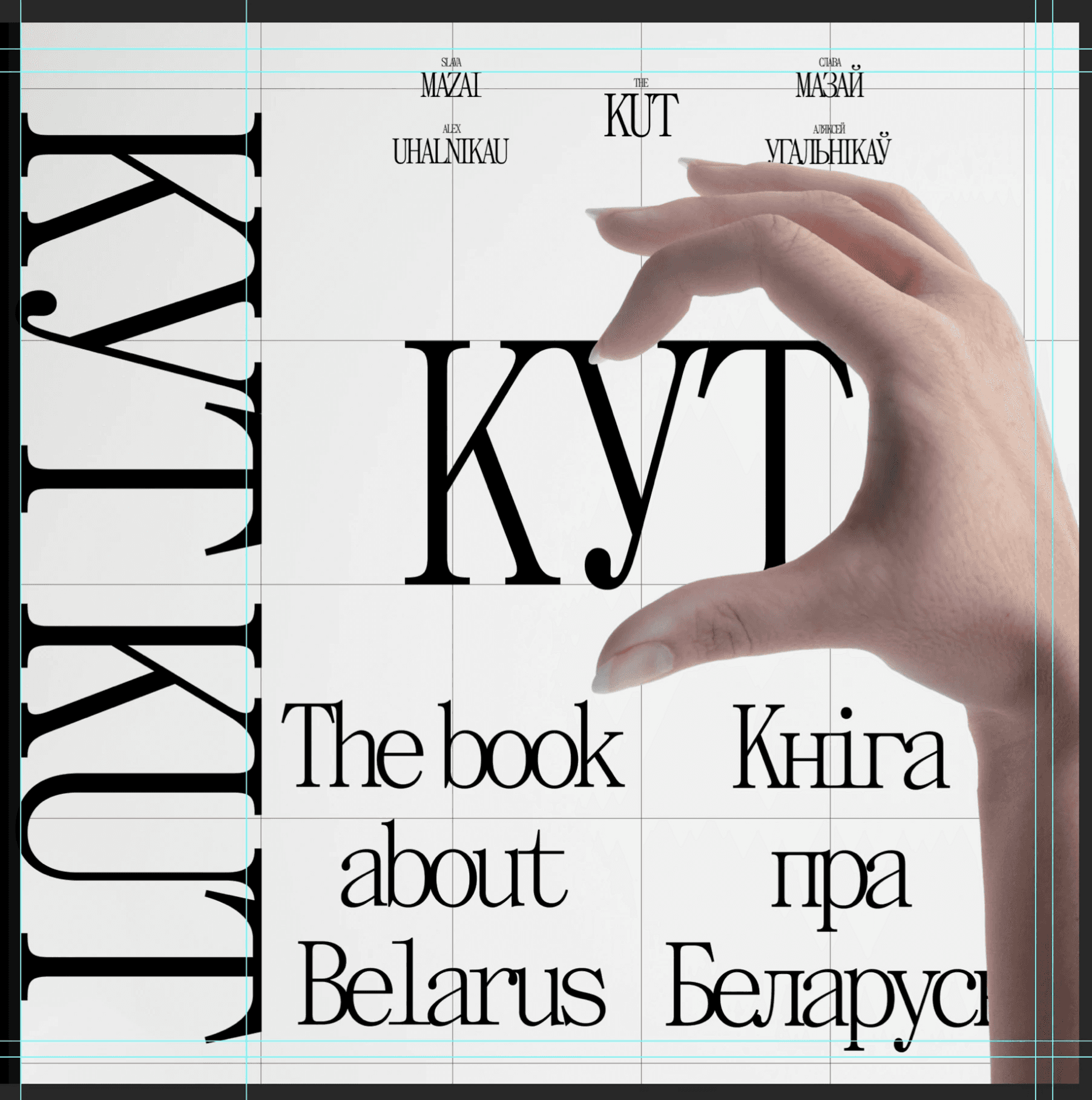
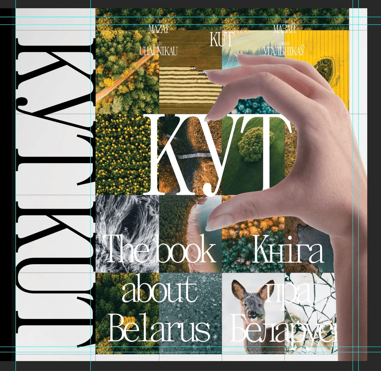
ABOUT KUT
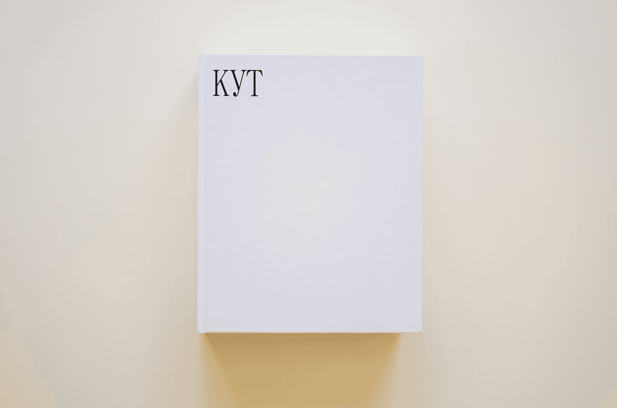
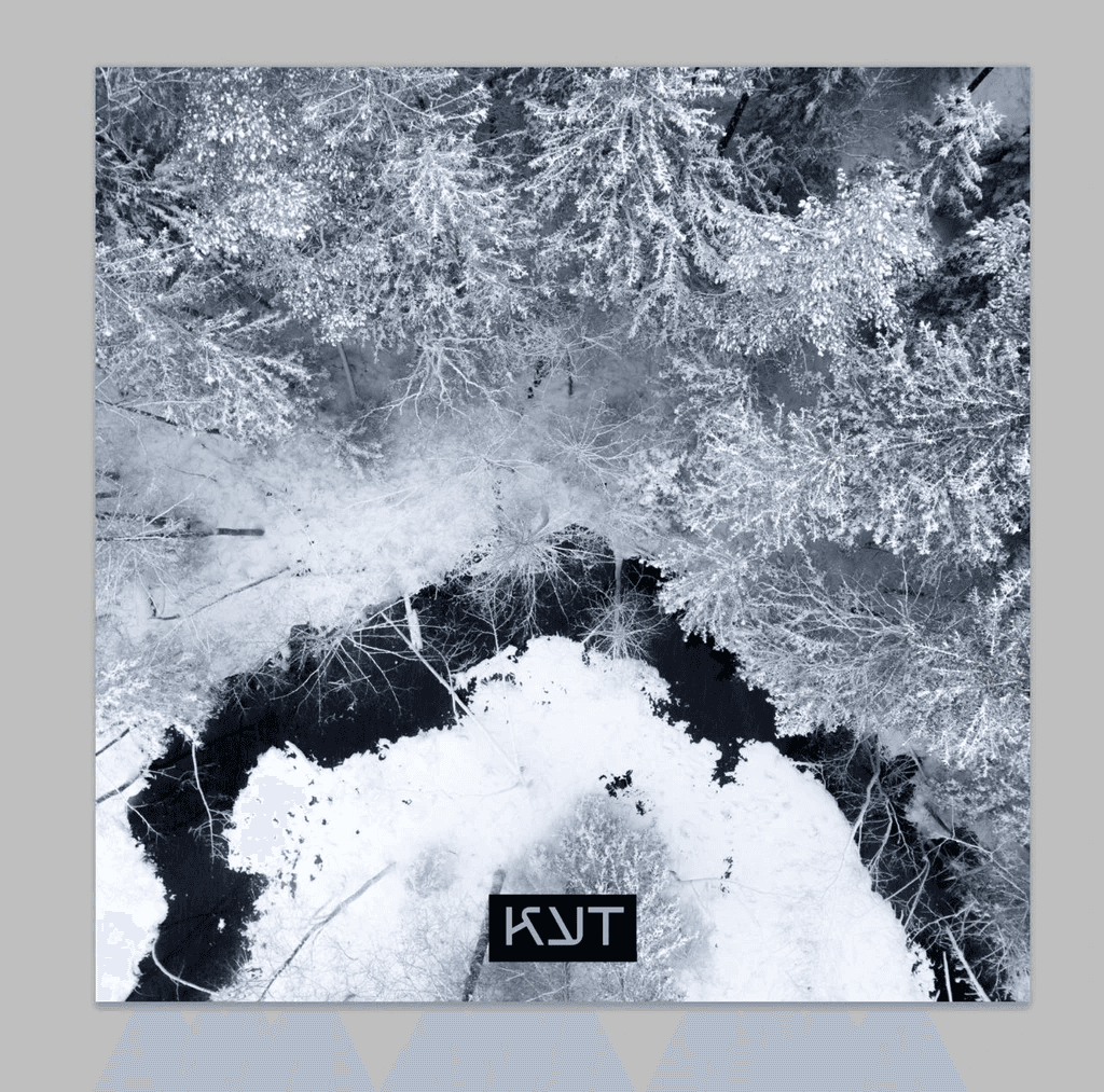
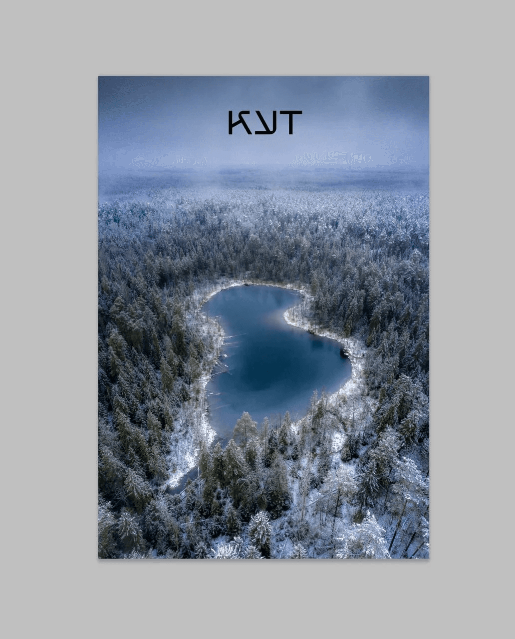
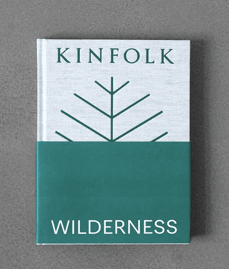
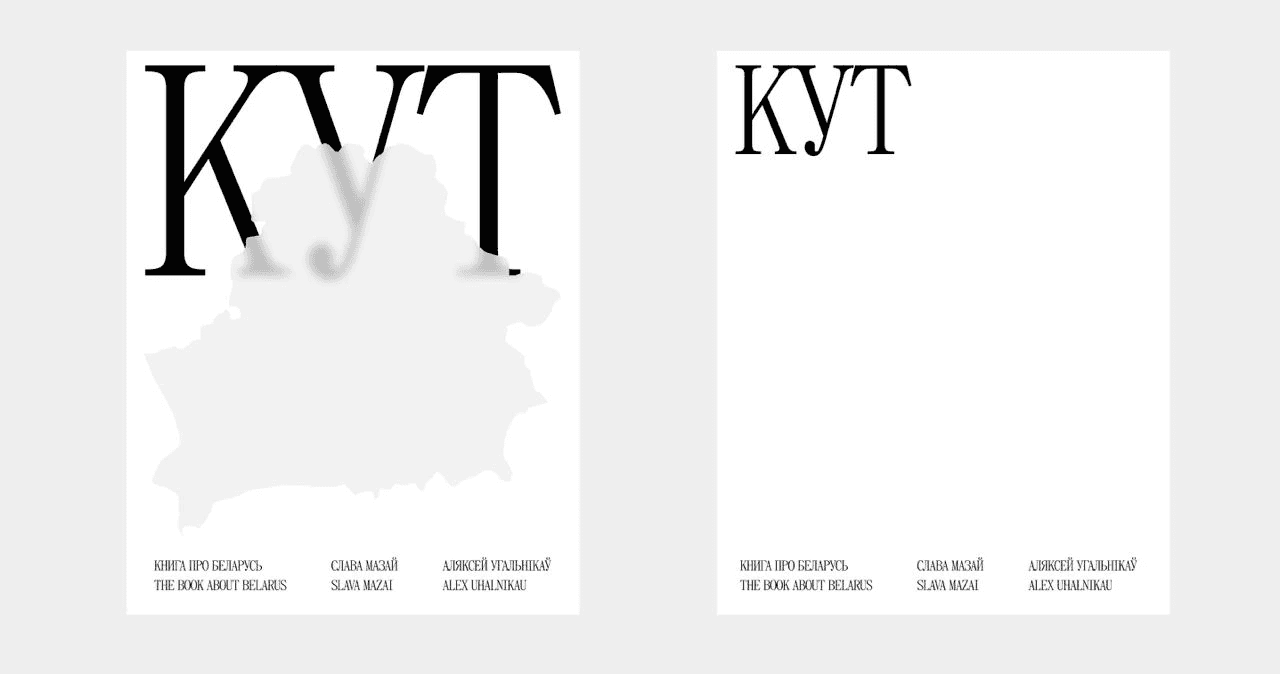
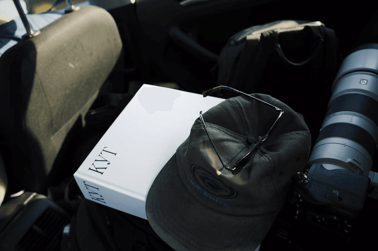
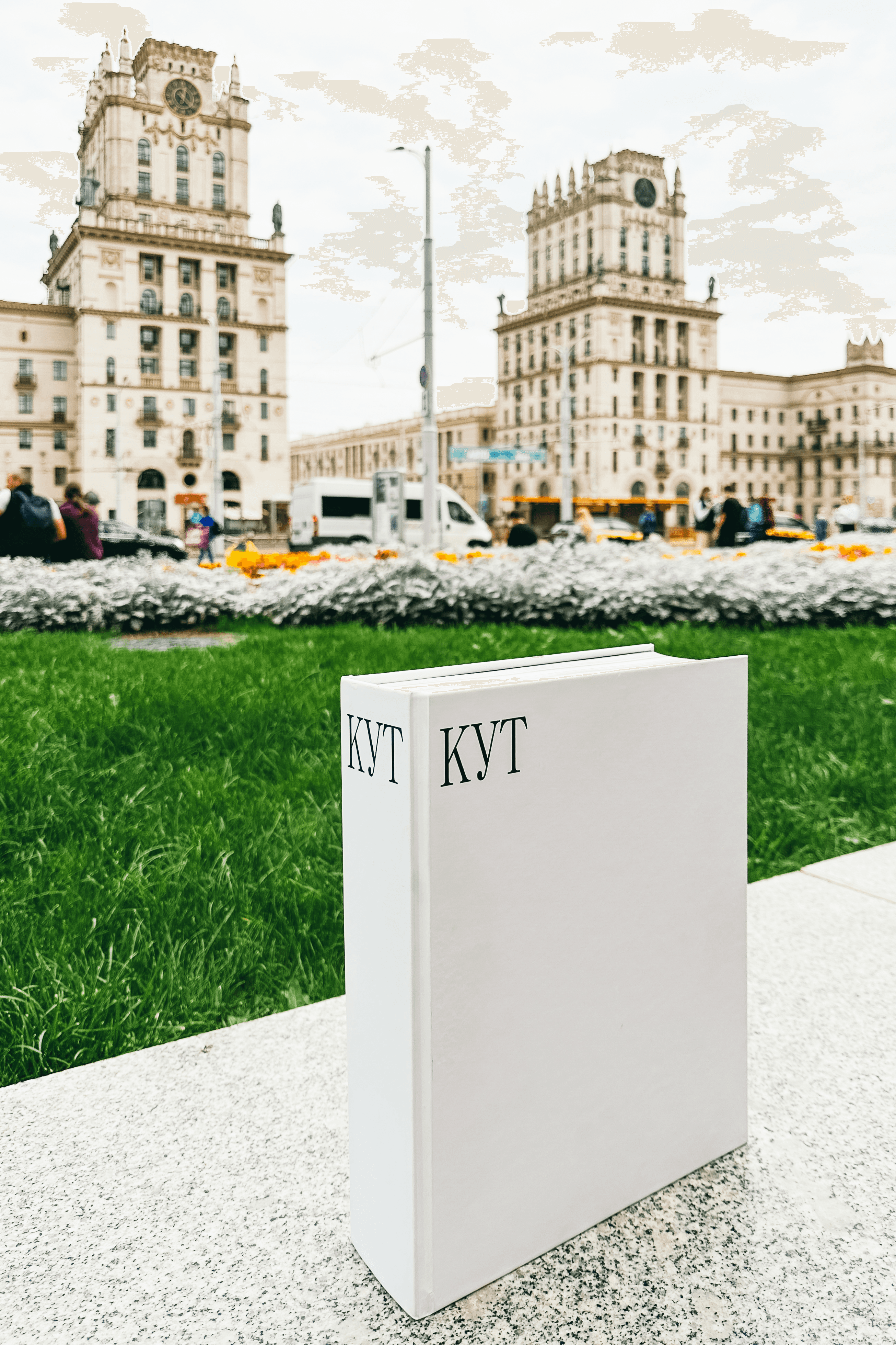
Cover
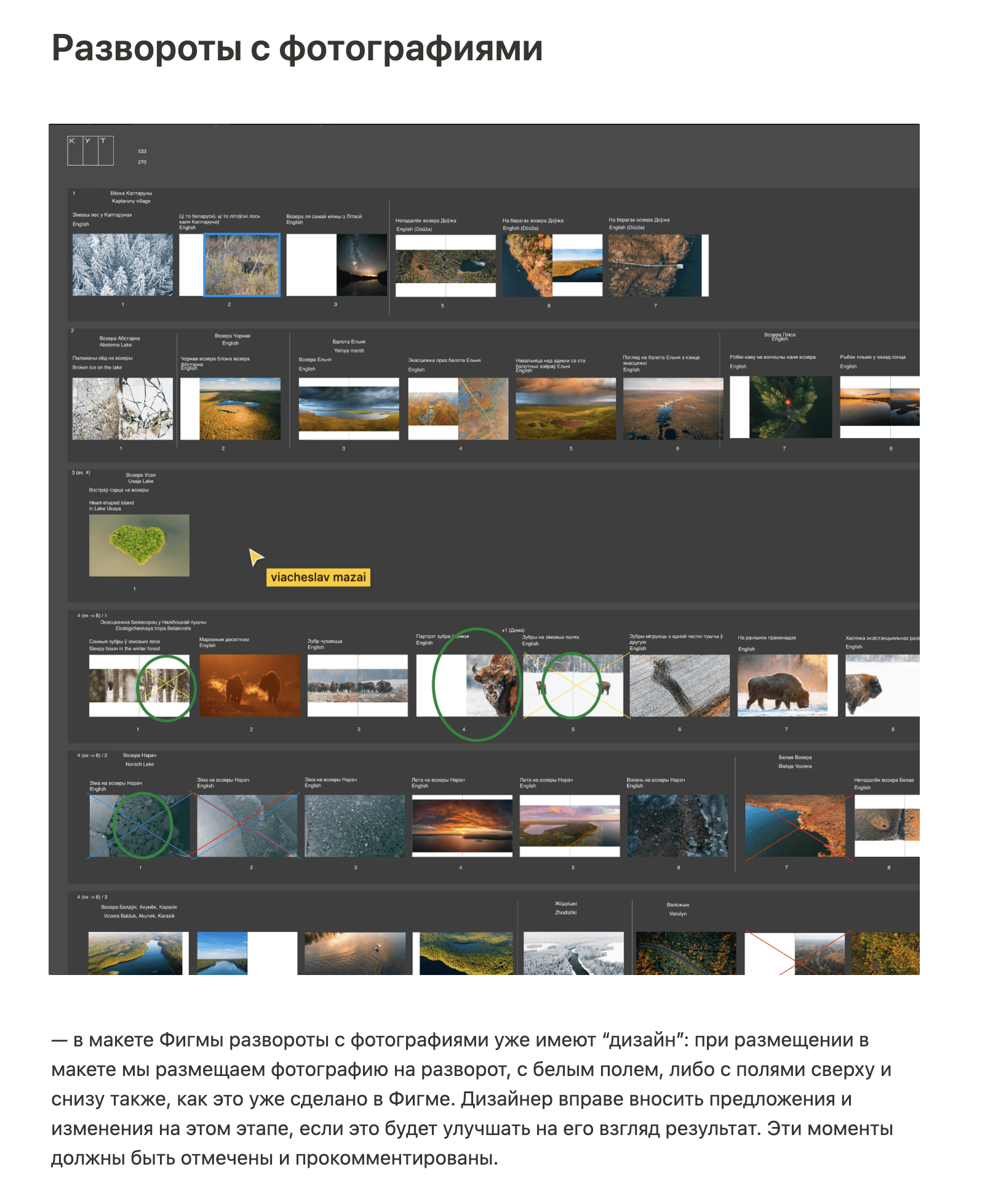
Spreadsheet (1)
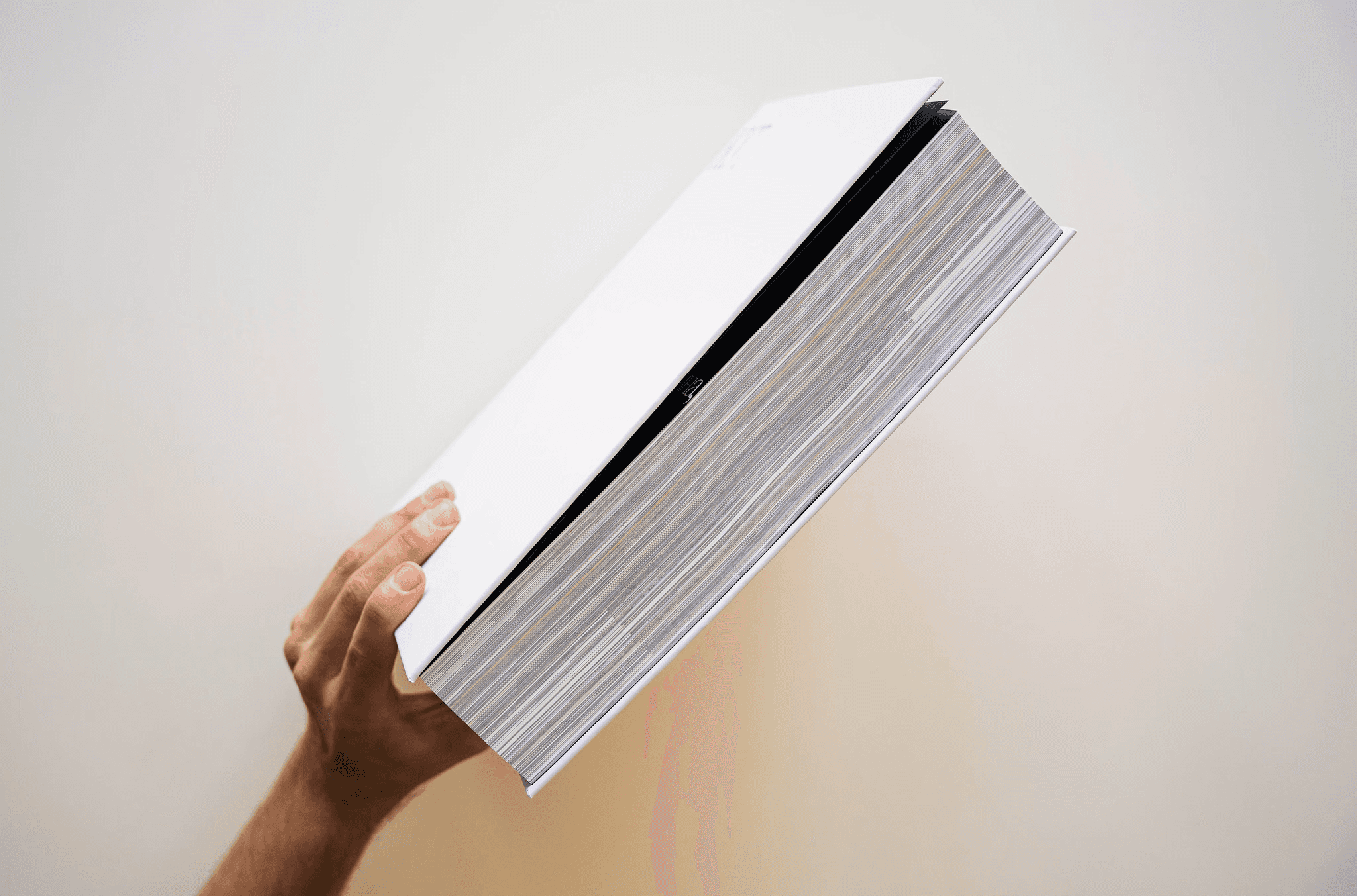
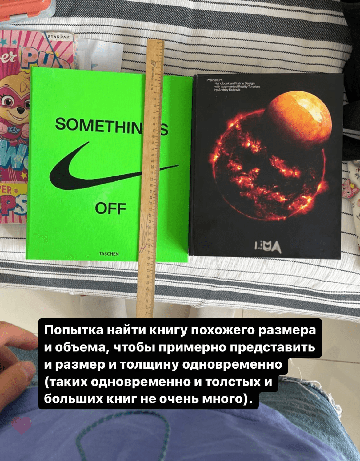
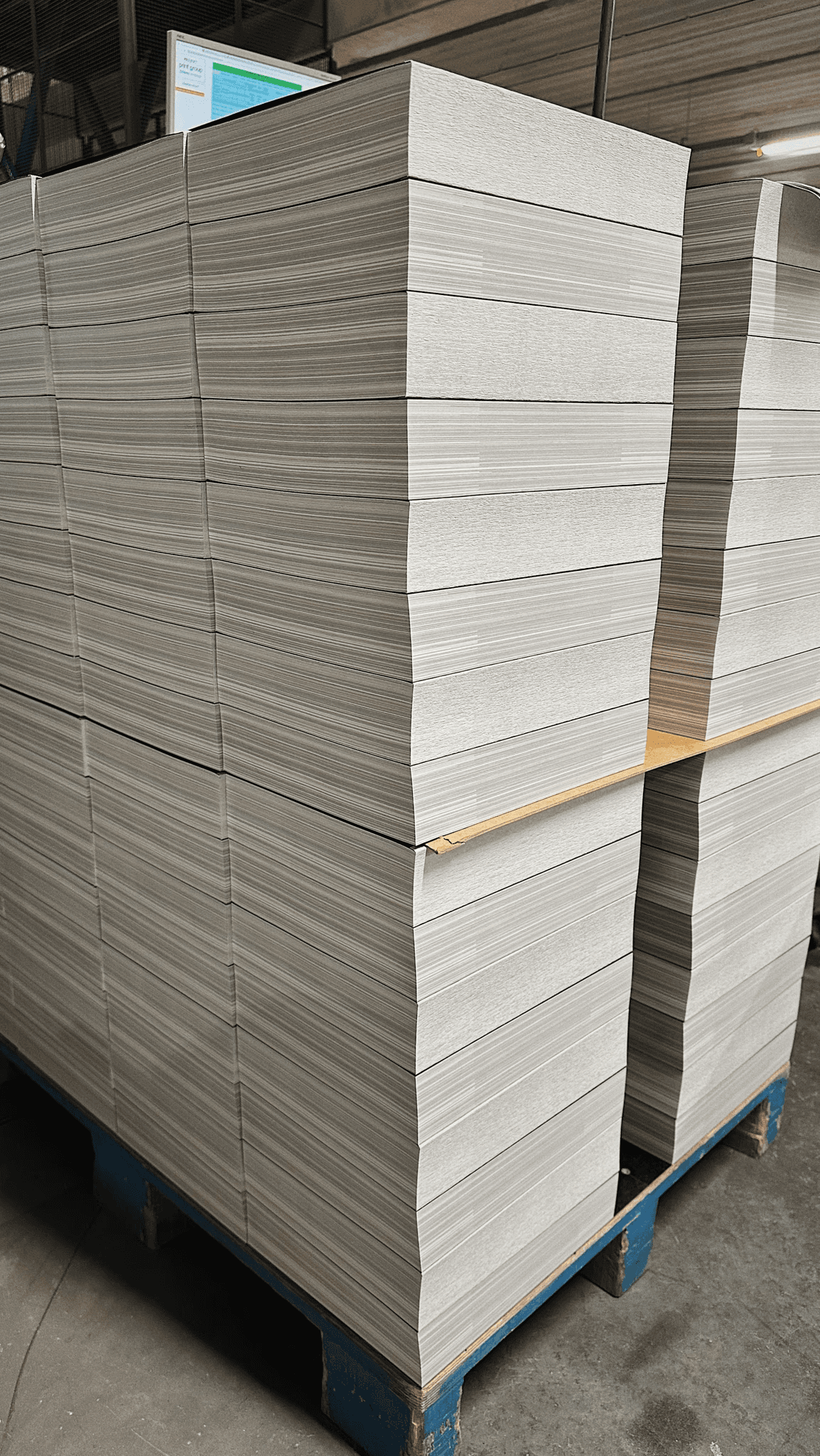
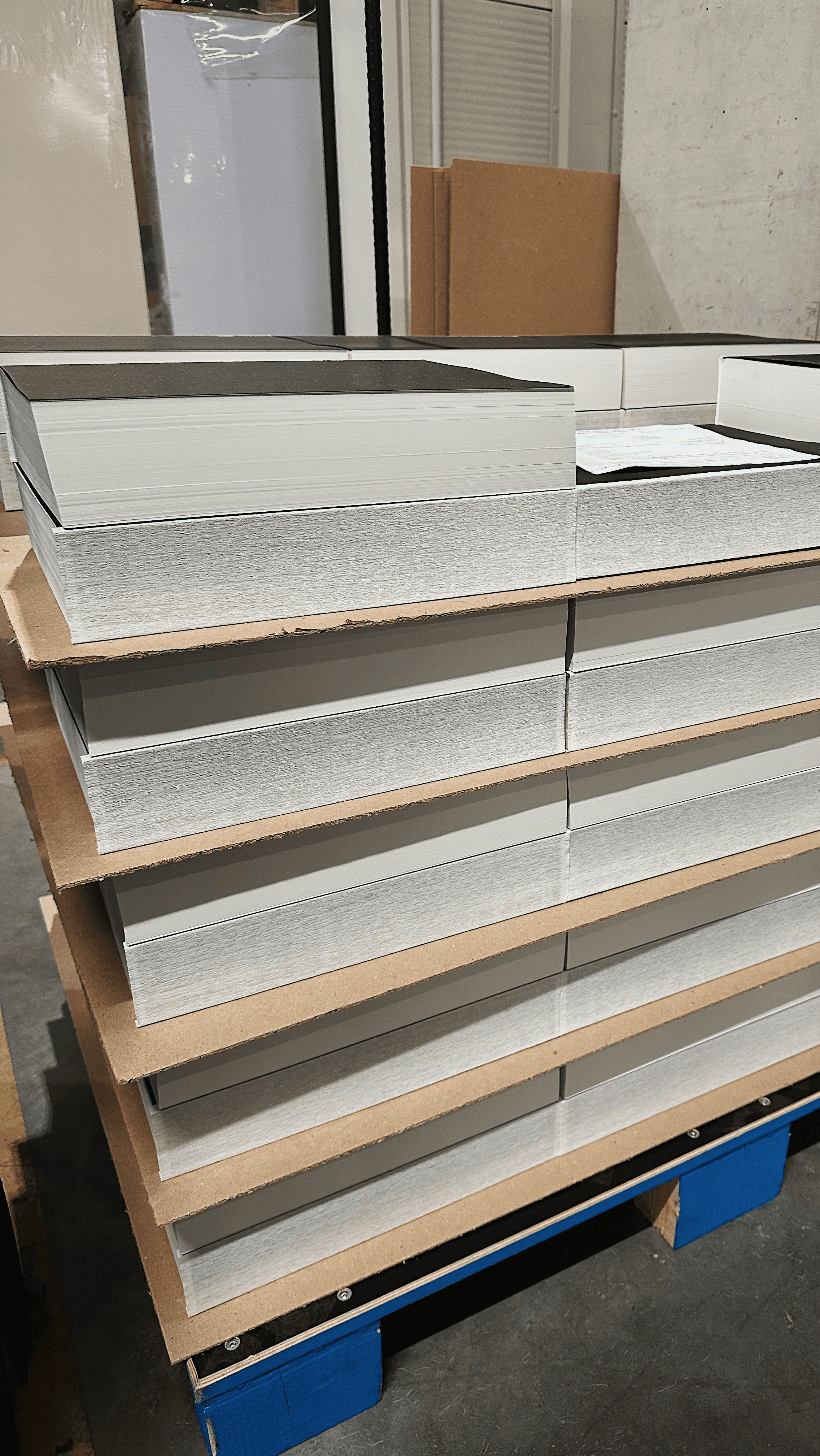
The thickness of the book block is 67.88 mm.
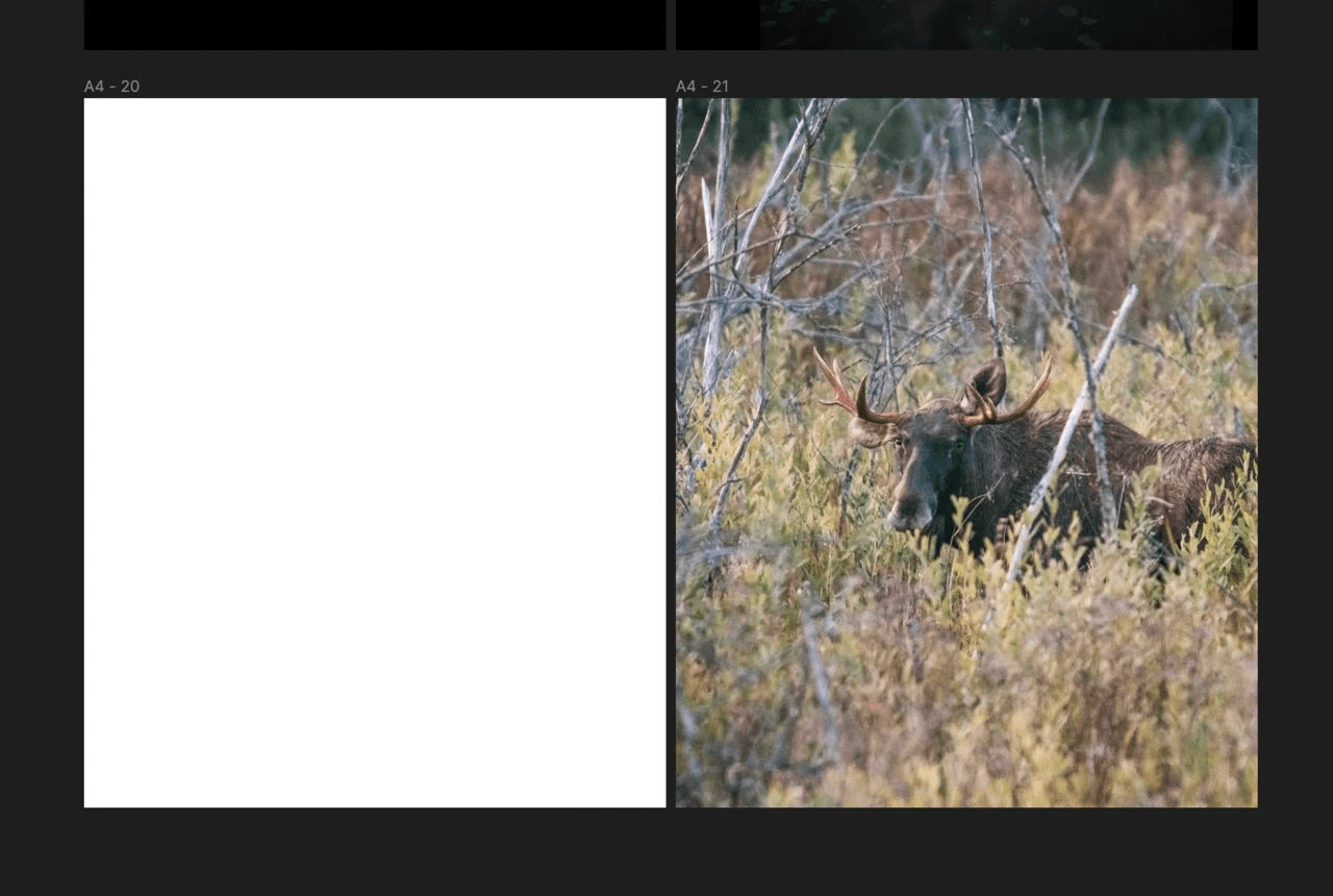
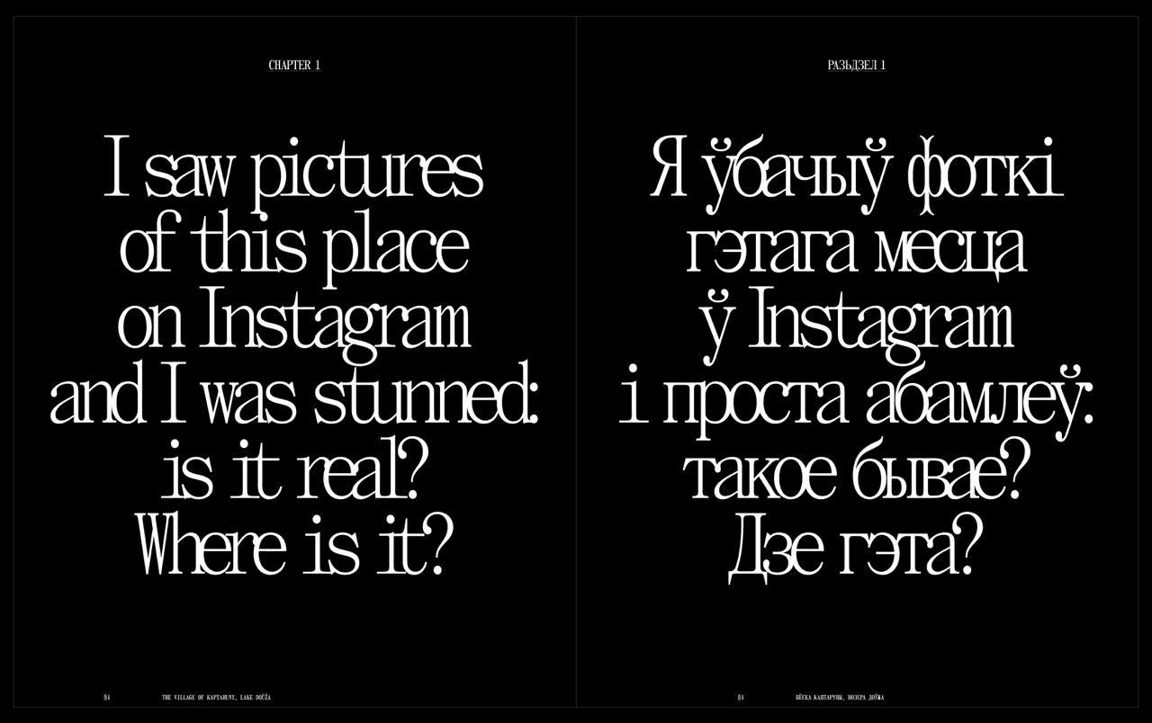
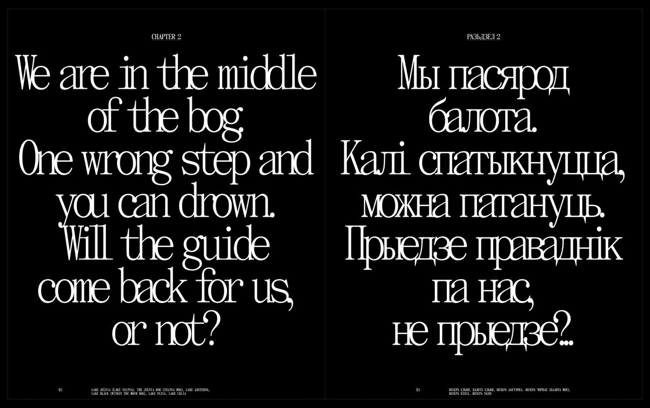
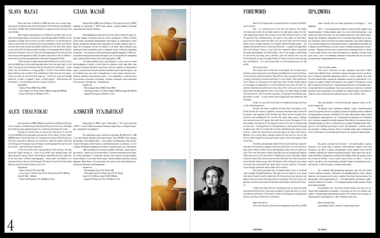
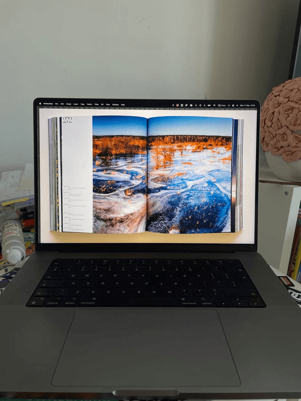
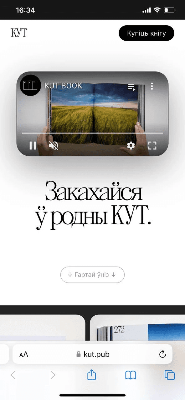
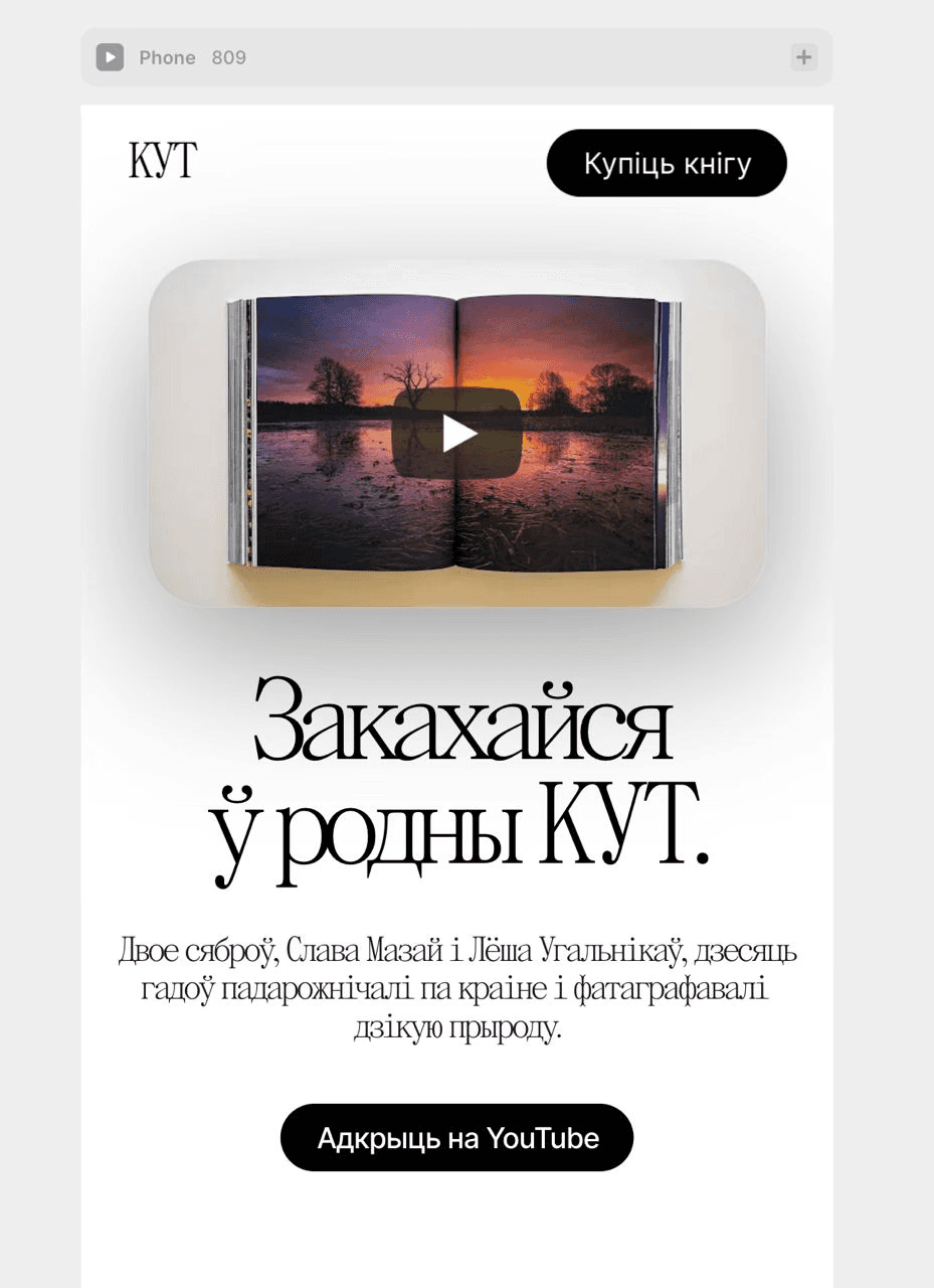
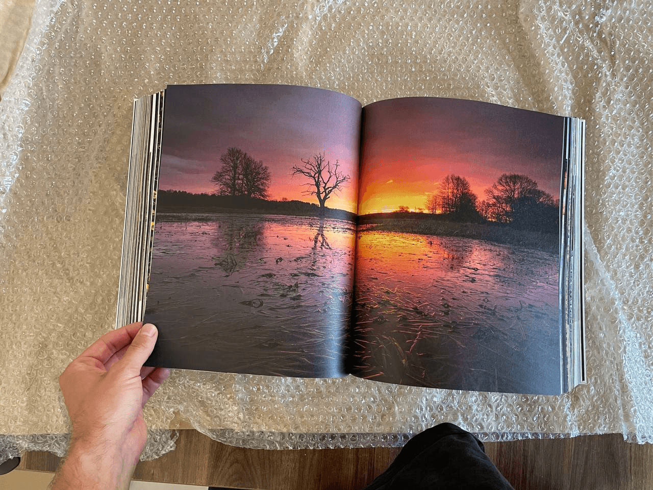
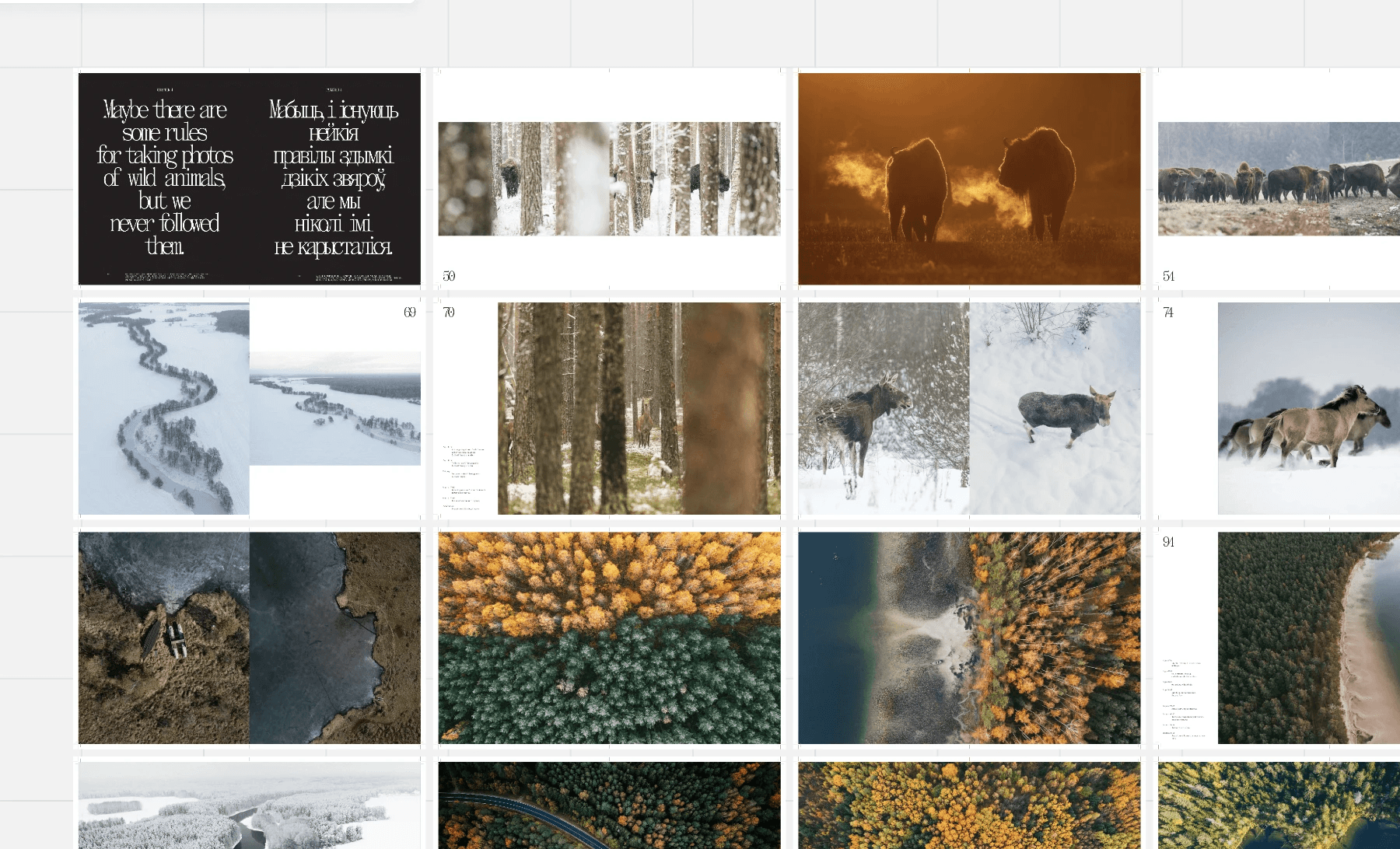
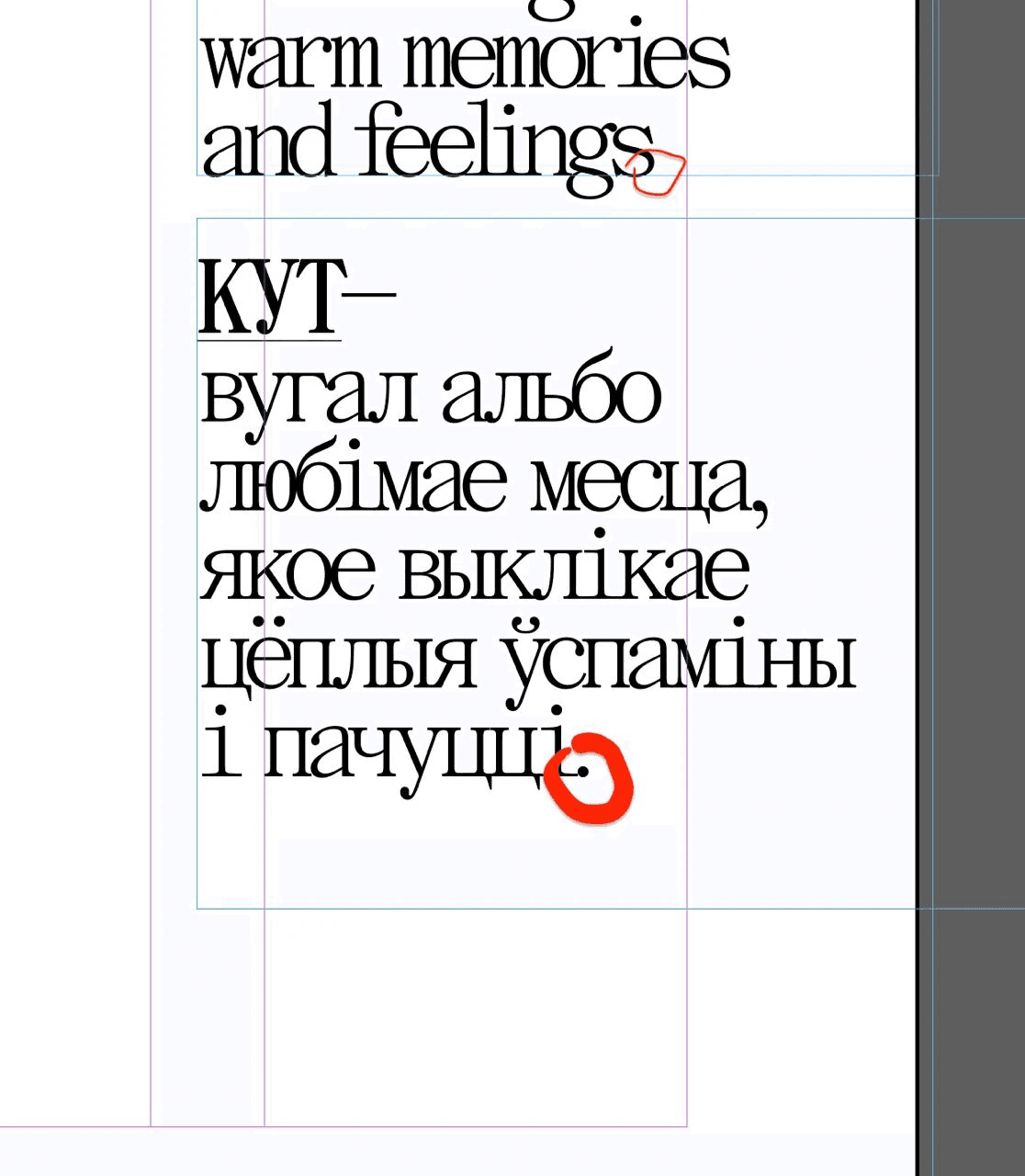
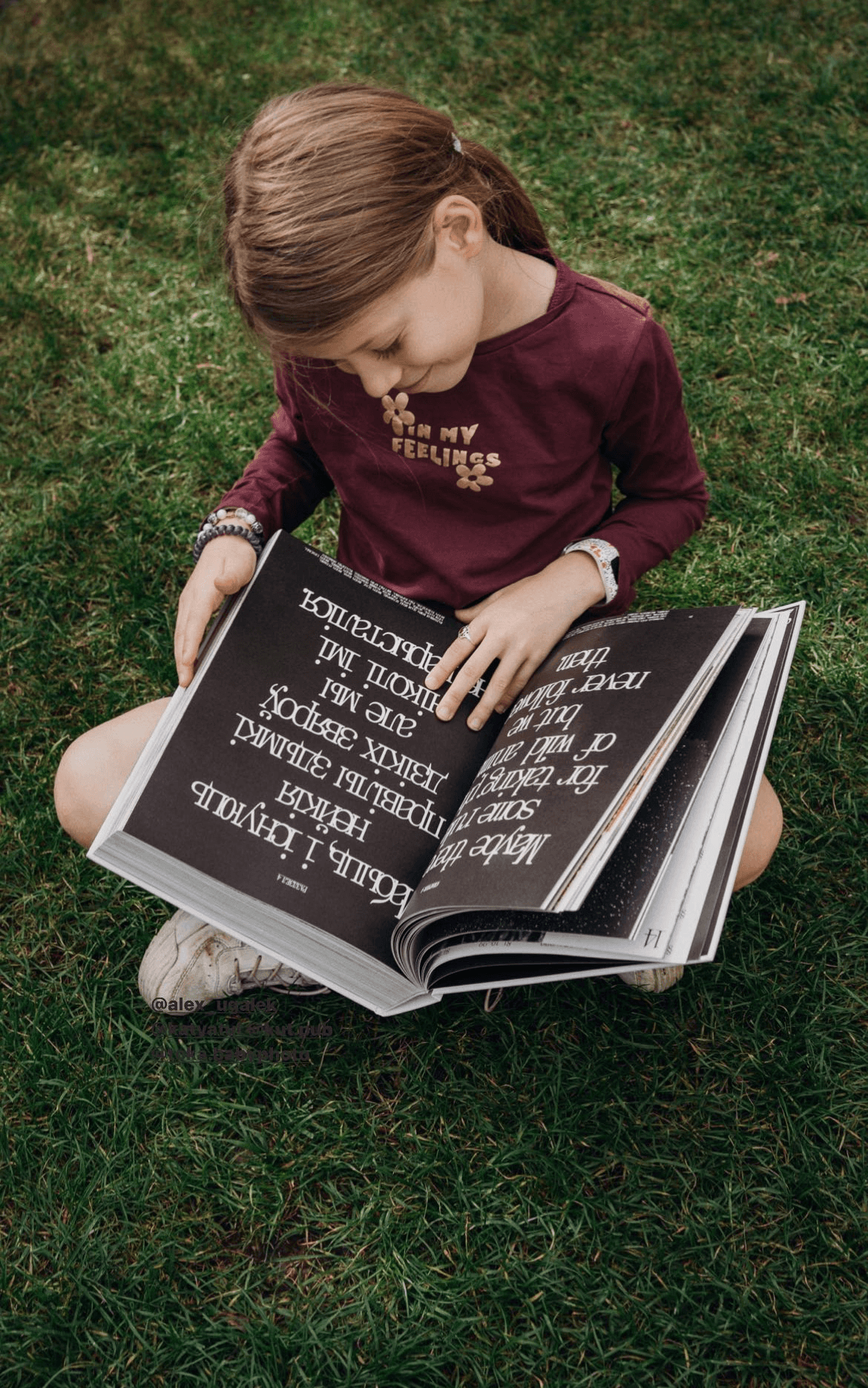
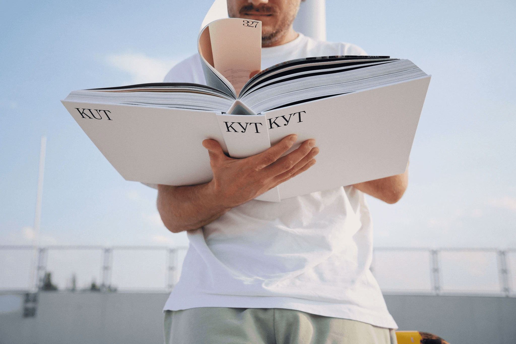
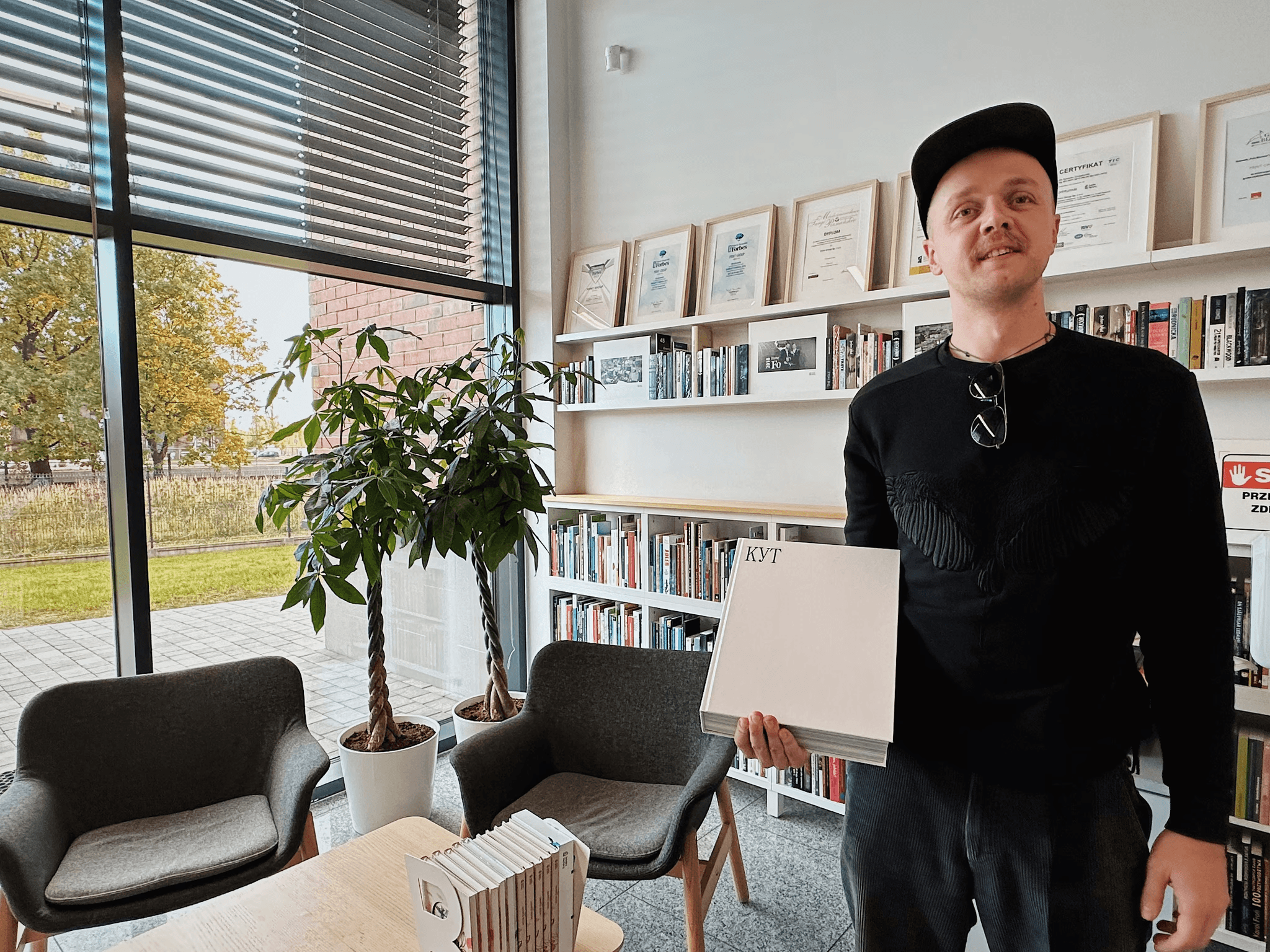
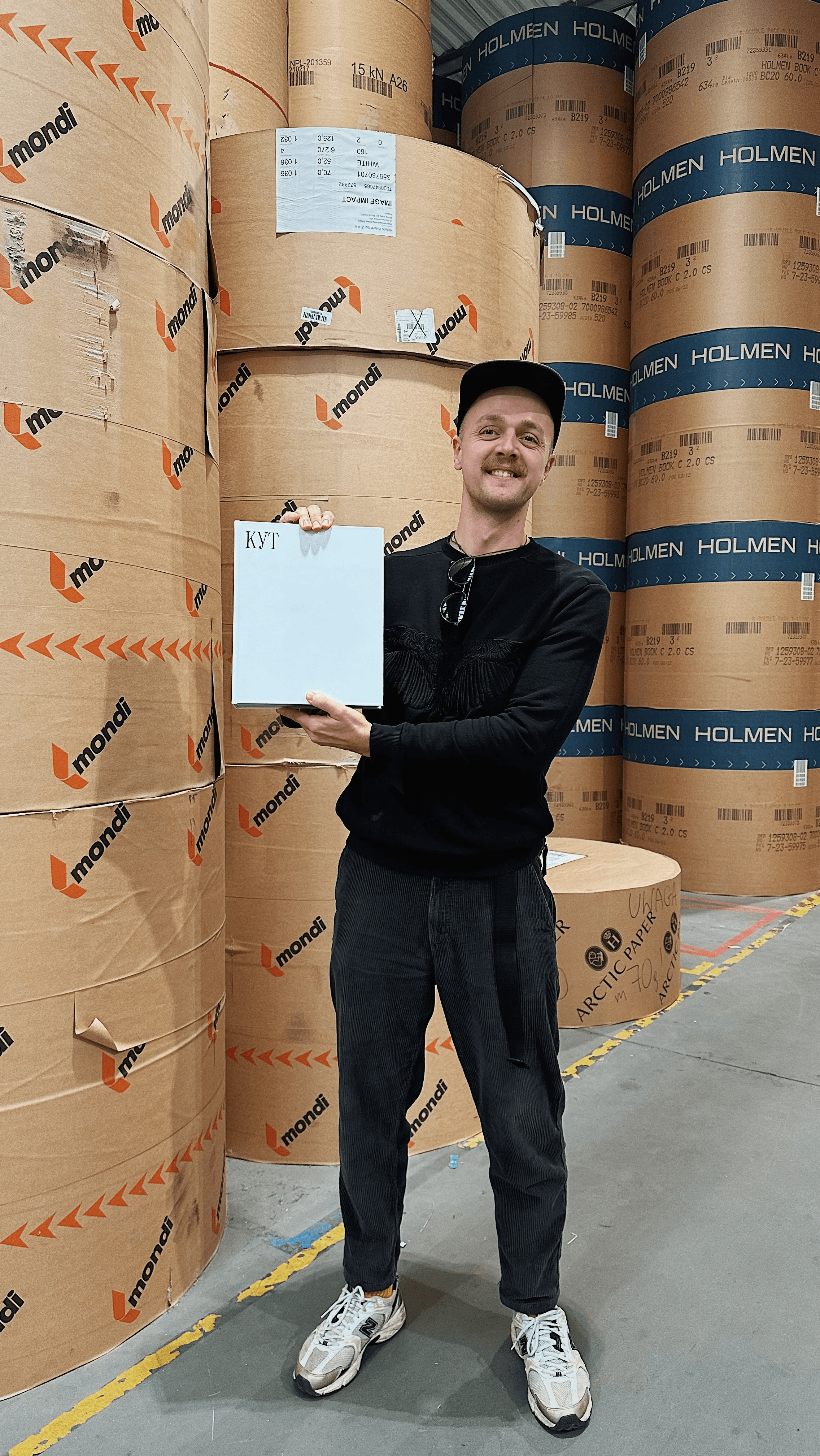
КUT — is a book with photographs of the wildlife in Belarus, in Belarusian and English.
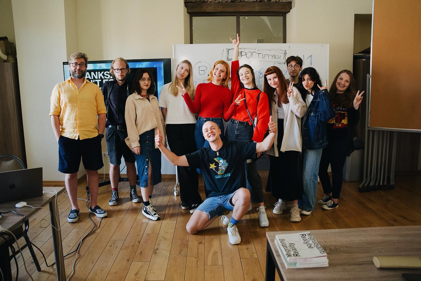
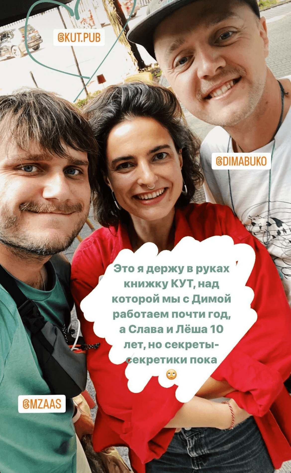
We worked on this book for one year. We – includes myself, Di Buko (the designer), Slava Mazai and Alex Ugalnikov (the photographers) and Olya Polevikova (the editor).
Here I will talk about what we did and how we did it. It was really quite interesting: behind the simplicity of the white cover lie hundreds, somewhere even thousands, of discarded ideas and design solutions.
Flick through the book
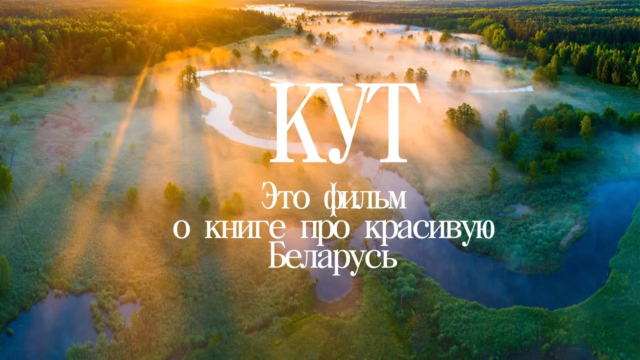
What a film about the book
HOW TO BECOME A PUBLISHER
I’ll start from the end.
For some reason, I have often been asked how to get that code that you find on books at the bookshop. This code is called an ISBN code.
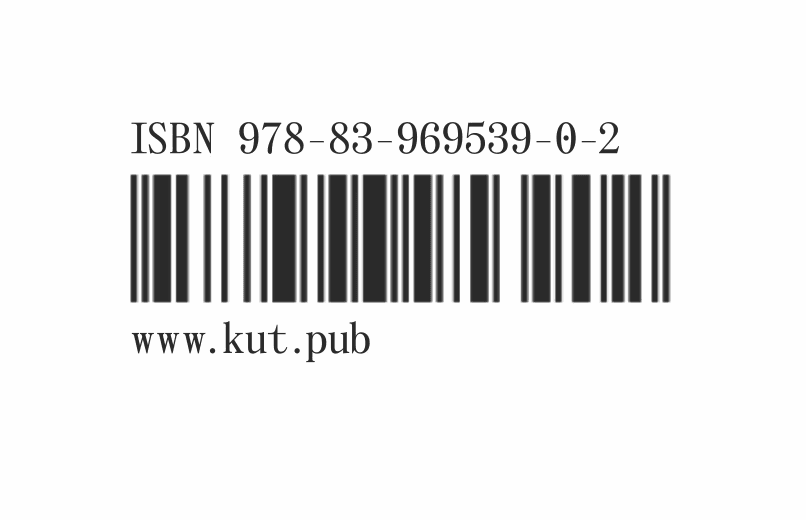
The ISBN code of our book
All the books in the world* have an ISBN code - an International Standard Book Number. The rules to obtain a number vary from country to country.
We self-published our book and obtained this number ourselves. That’s right, we are really published it ourselves, 100% self-published.
We publish the book in Poland. It isn’t too difficult to get a code here, anyone can do it via this website e-isbn.pl.
* Technically, this is not entirely true, as you can make a book without an ISBN code. A book with photos of your cat, for example, and publish it at your local printing shop. It won’t be any less of a book. ISBN codes often affect how your book is taxed in a particular country. For example, in Poland, the VAT for books with an ISBN code is 5 percent, but 23 percent for books without a code.
I have also heard that in some countries, getting an ISBN number opens up opportunities for additional funding for publishing. But I’m not sure.
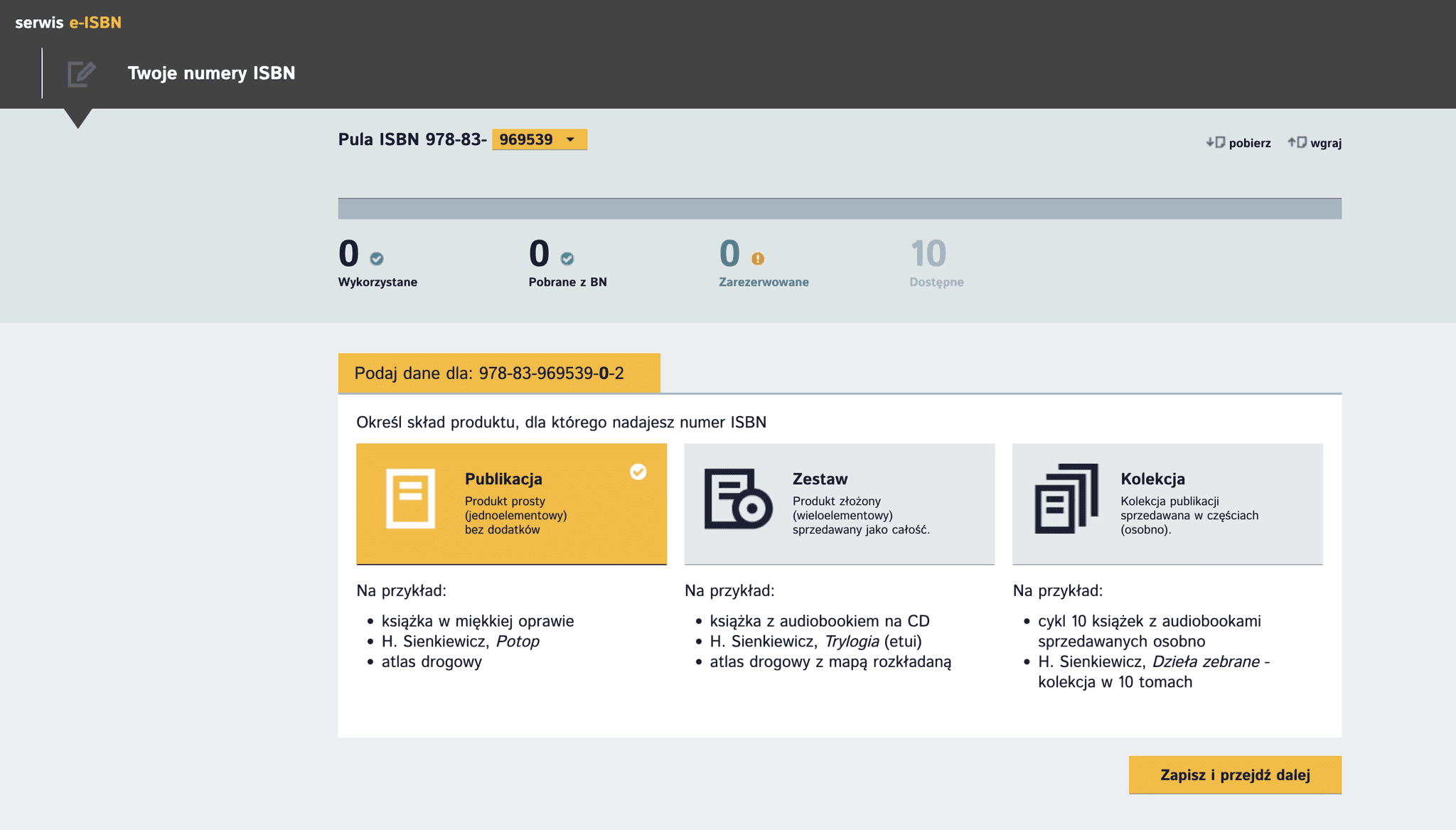
The interface of e-isbn.pl
Numbers are not issued one by one, but in groups of 10, 100 and 1000. Obtaining a book number for publication in the future comes with some obligations: a copy from each edition must be given to libraries at the expense of the publisher. In our case - from our own pocket.
You can also reserve 10 numbers for yourself and never use them. But to get an ISBN code, you must first make a book.
TEAM ASSEMBLY
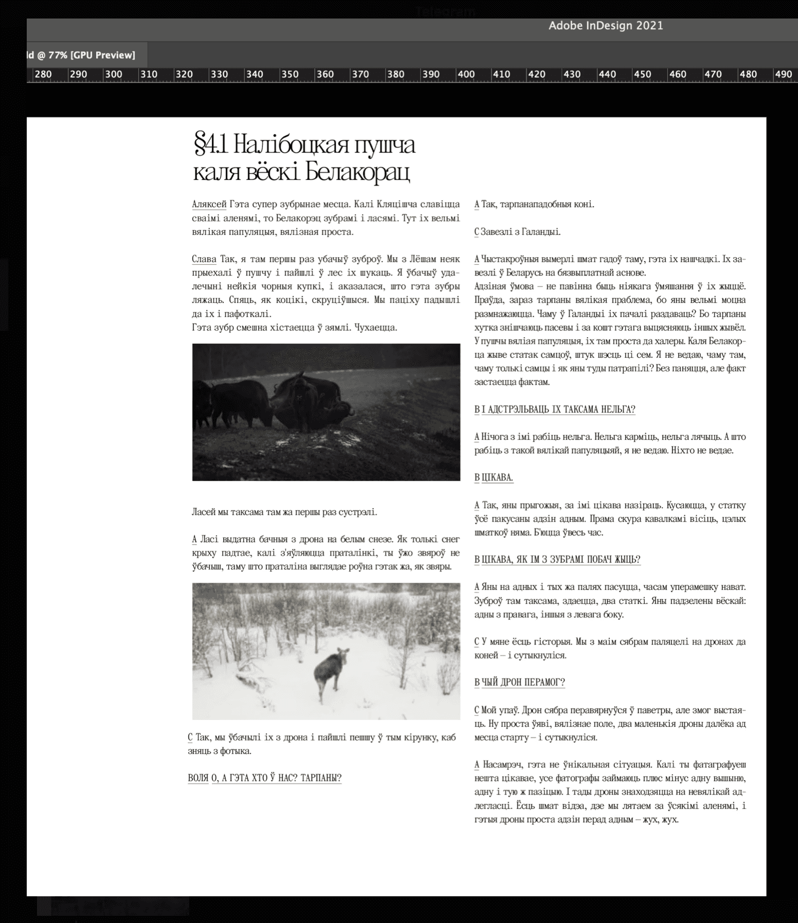
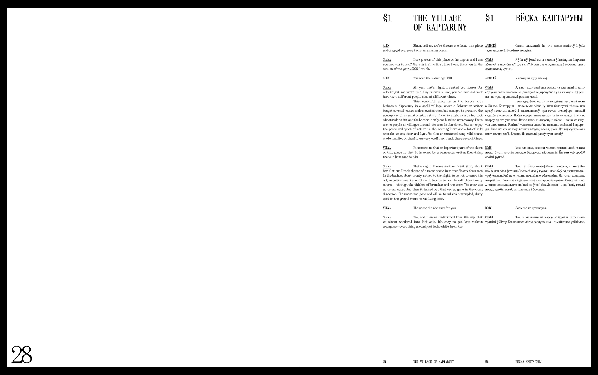
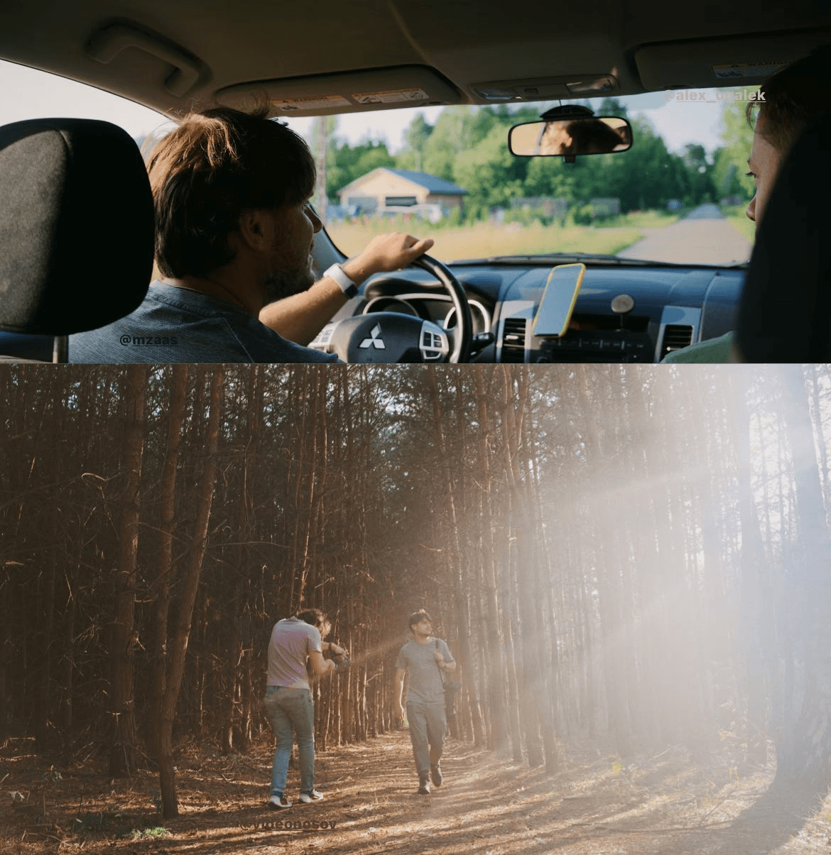
Work on the book began when I met one of the authors of the book, Slava (his Instagram). We spoke for the first time on the 14th of October 2022.
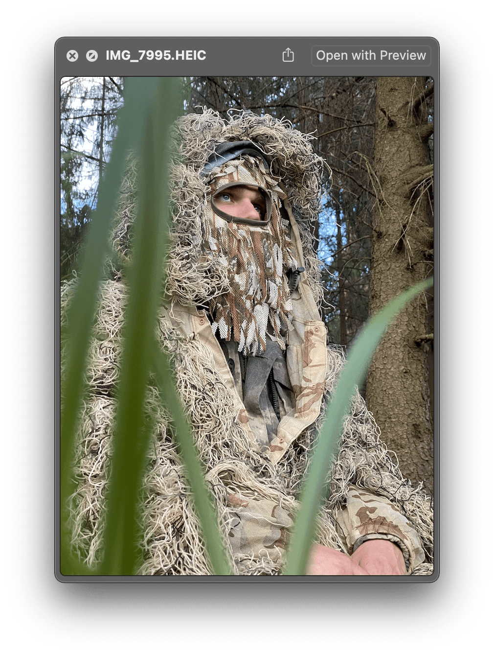
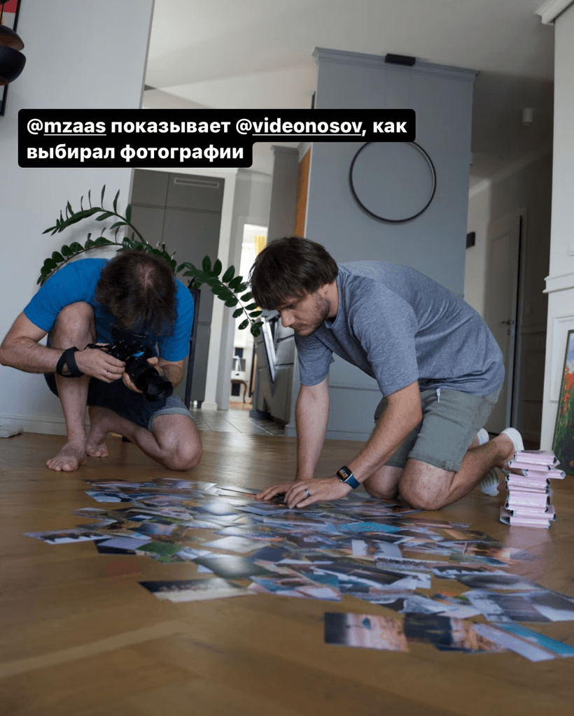
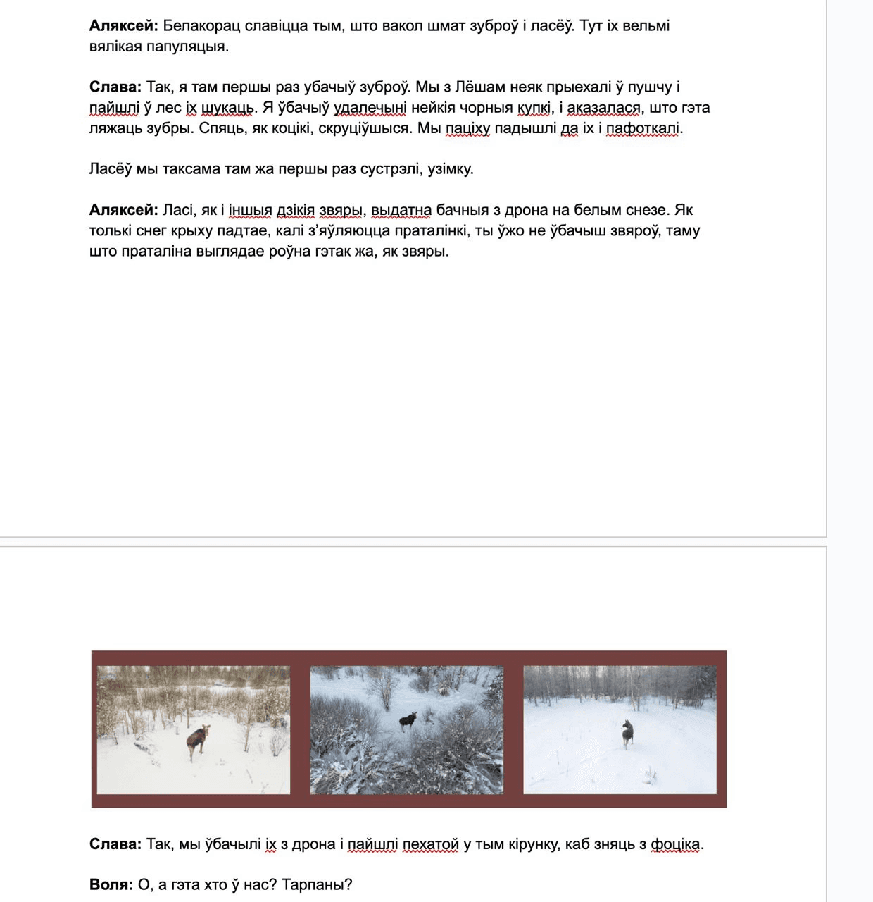
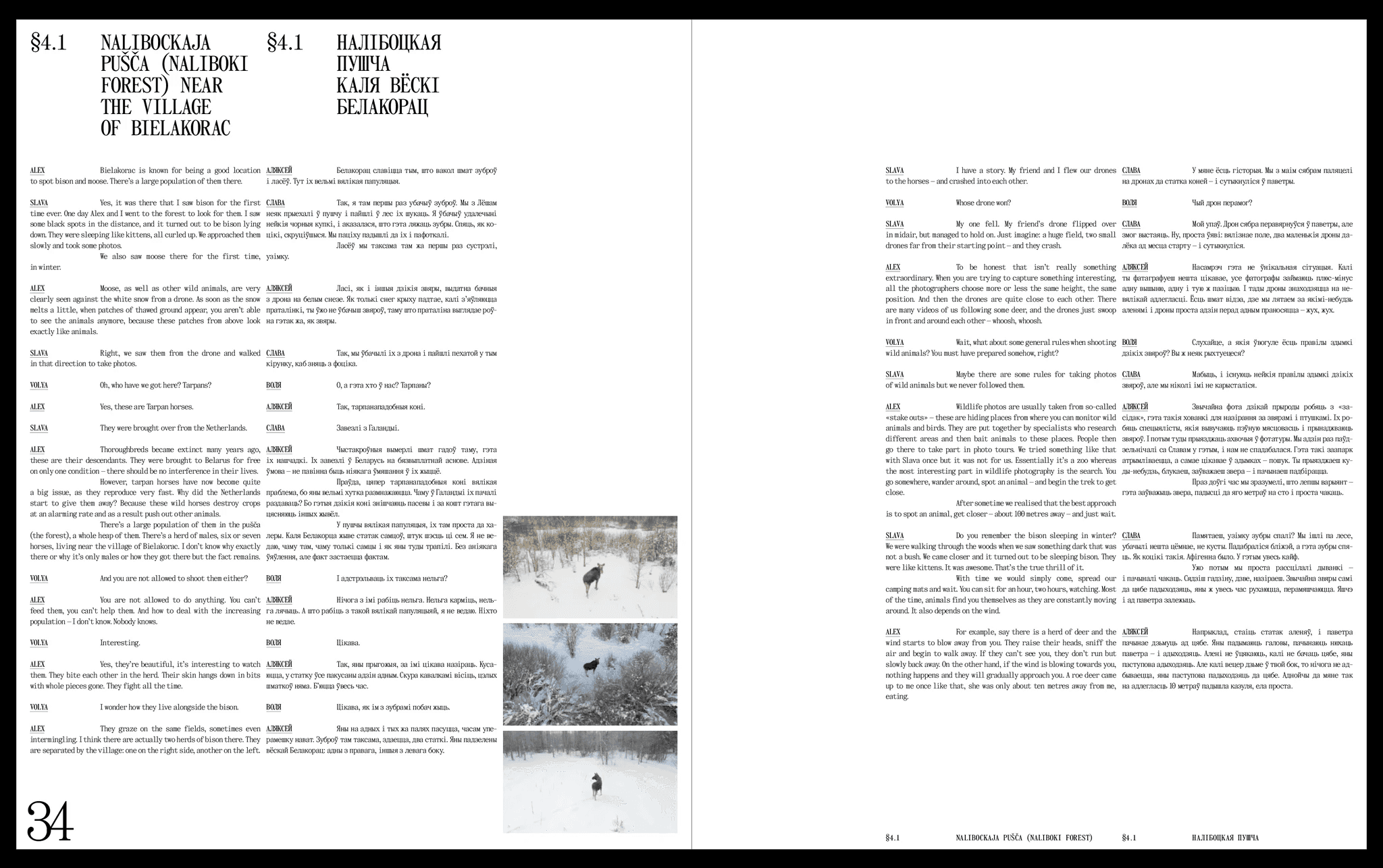
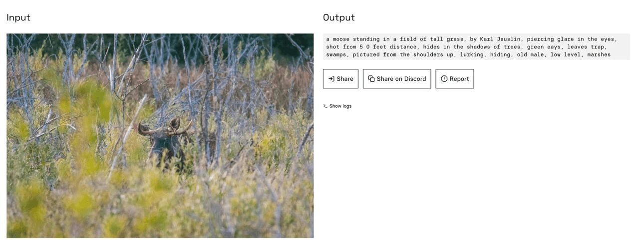
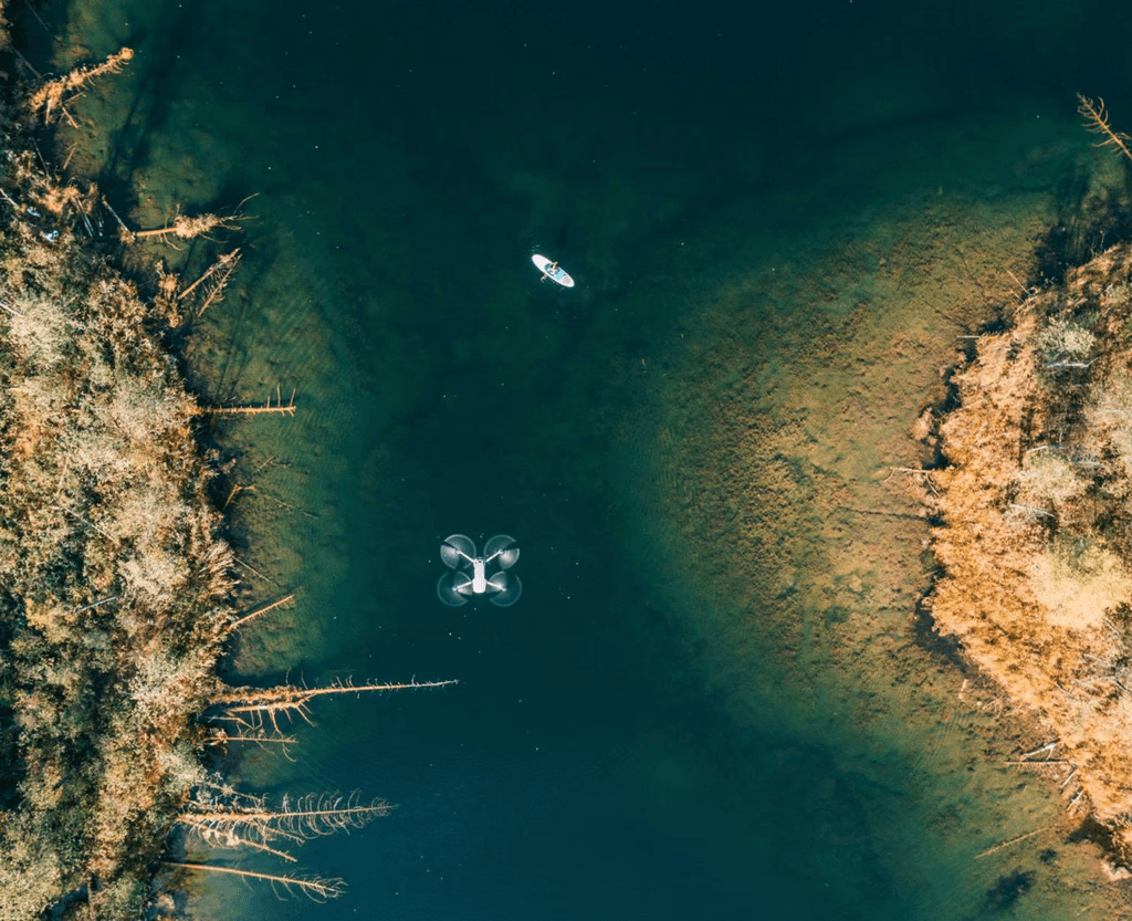
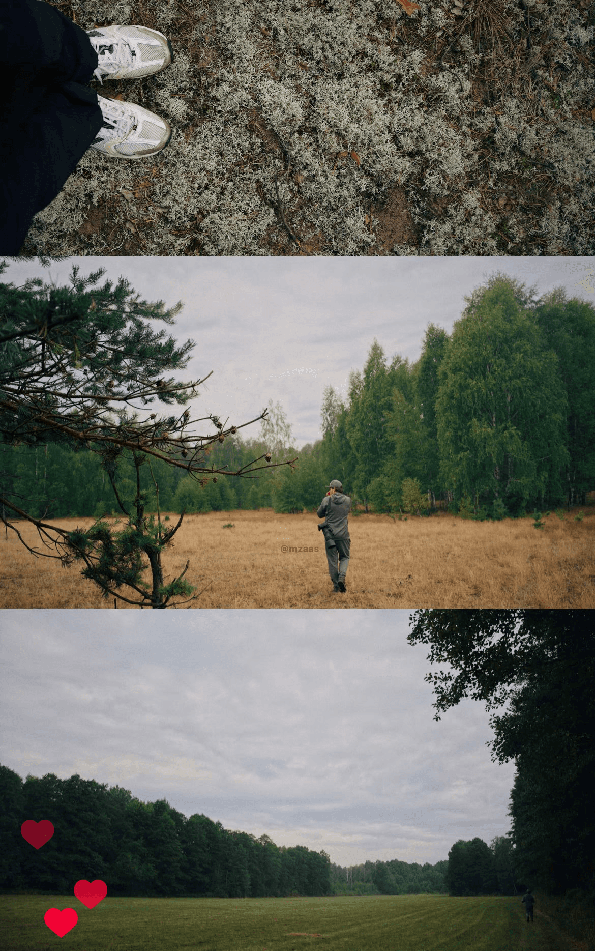
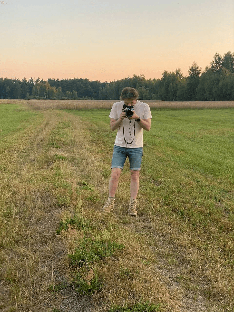
Slava lies in wait for an animal
Slava spent 10 years travelling around Belarus, with friends and on his own, and taking photographs of the nature and wildlife. After our first meeting, I asked Slava to share some more photos with me. Slava shared 3 folders, each one containing more than 1,000 photos.
They were, in his own words, only the “best” photos. So just imagine the quantity of the images that didn’t make the cut.
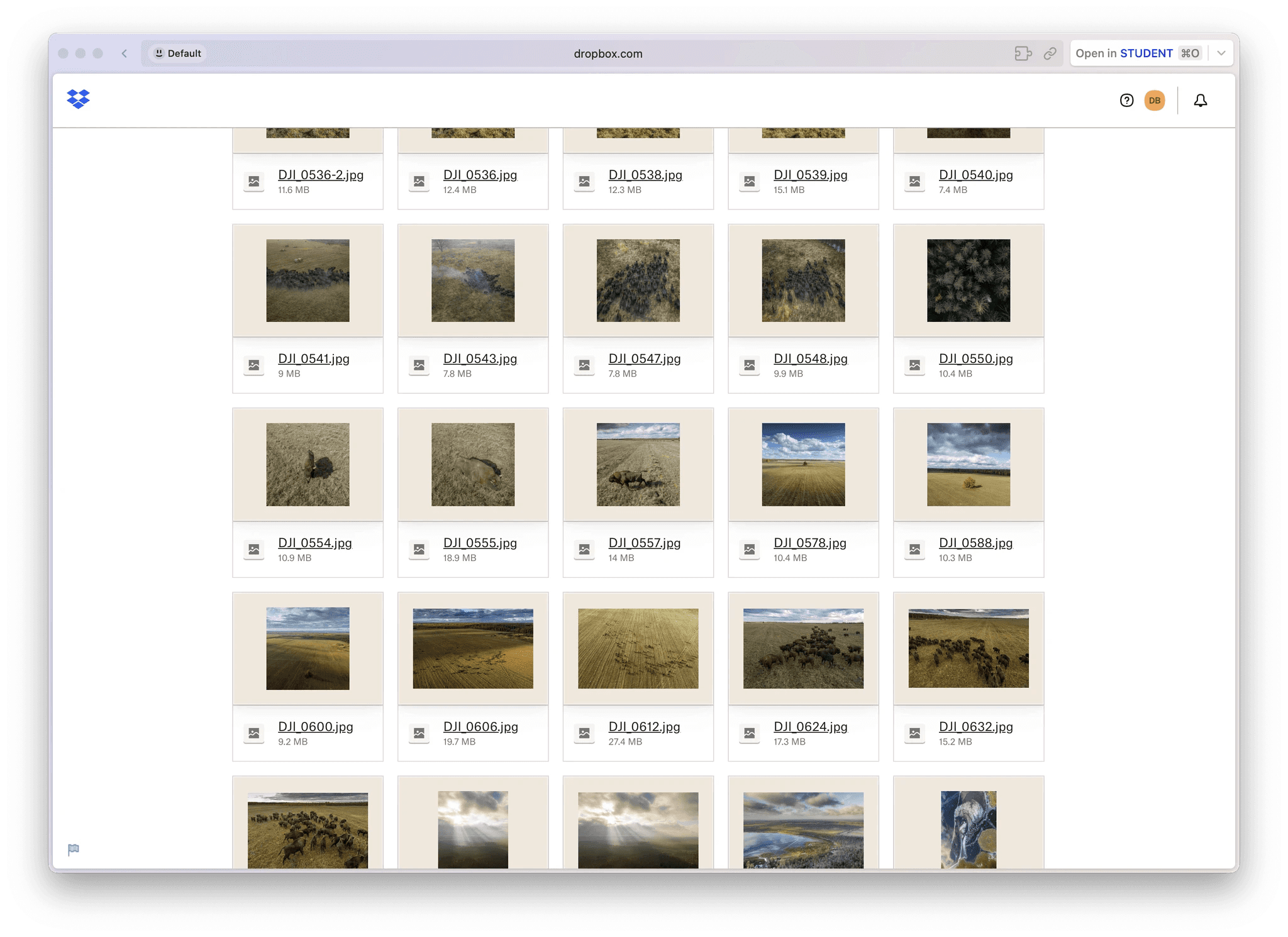
One of the folders with the preselected “best” photos
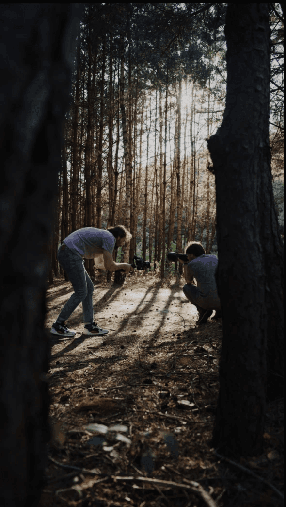
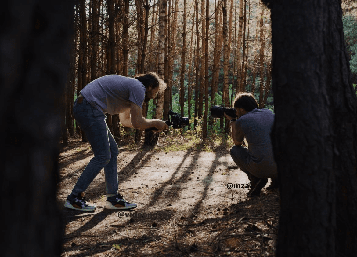
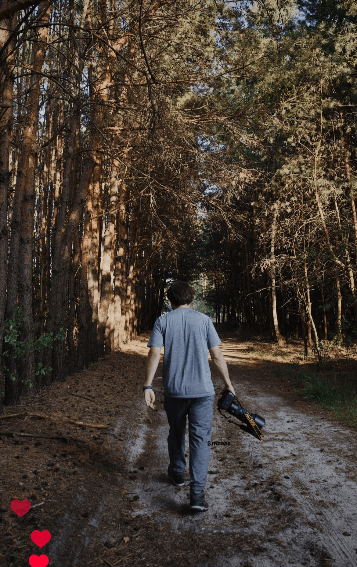
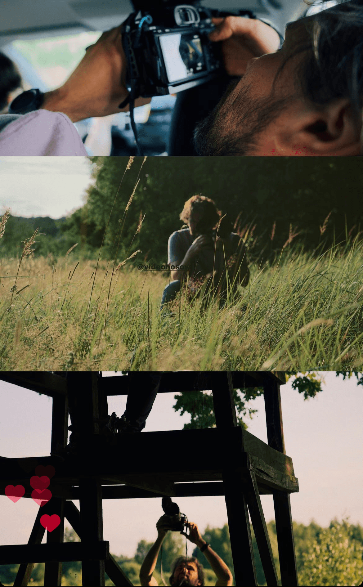
He also put together a whole archive of behind-the-scenes footage from his trips: one gigabyte of photos and videos of the guys wading through the swamps, sleeping in fields and just hanging out in the wild.
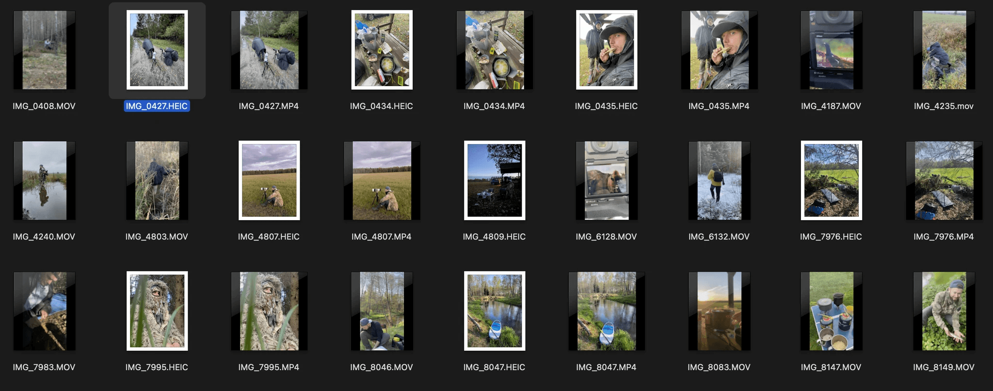
Some of the behind-the-scenes photos
Shooting a film about the book at Slava’s house
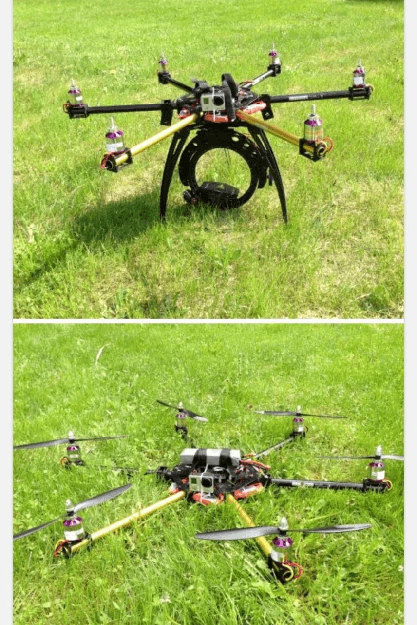
Slava’s first drone
Slava wanted to make the book with the friend with whom he had travelled and taken photographs. He invited him to participate in the project: that is how I met the second author of the book — Alex (his Instagram).
A mock-up
We decided that making a book with just photographs would be boring, and it would be better to record some stories about the guys’ travels. Stories about how and where all this footage was captured, so that the abstract shots of the landscape could be filled with the life that lies within them.
At the time I didn’t know what it was. I do now — this is a chalk quarry.
Another shot. Of a swamp?
To turn the memories into stories, Slava invited our editor, Olya Polevikova, to take part in the project.
Slava, Olya and me
Olya arranged the calls, went through all the photo archives together with the guys and recorded some stories, that were later transformed into stories for the book.
The first drafts of the stories were in Russian.
They were then rewritten, translated into Belarusian and English, and finalised.
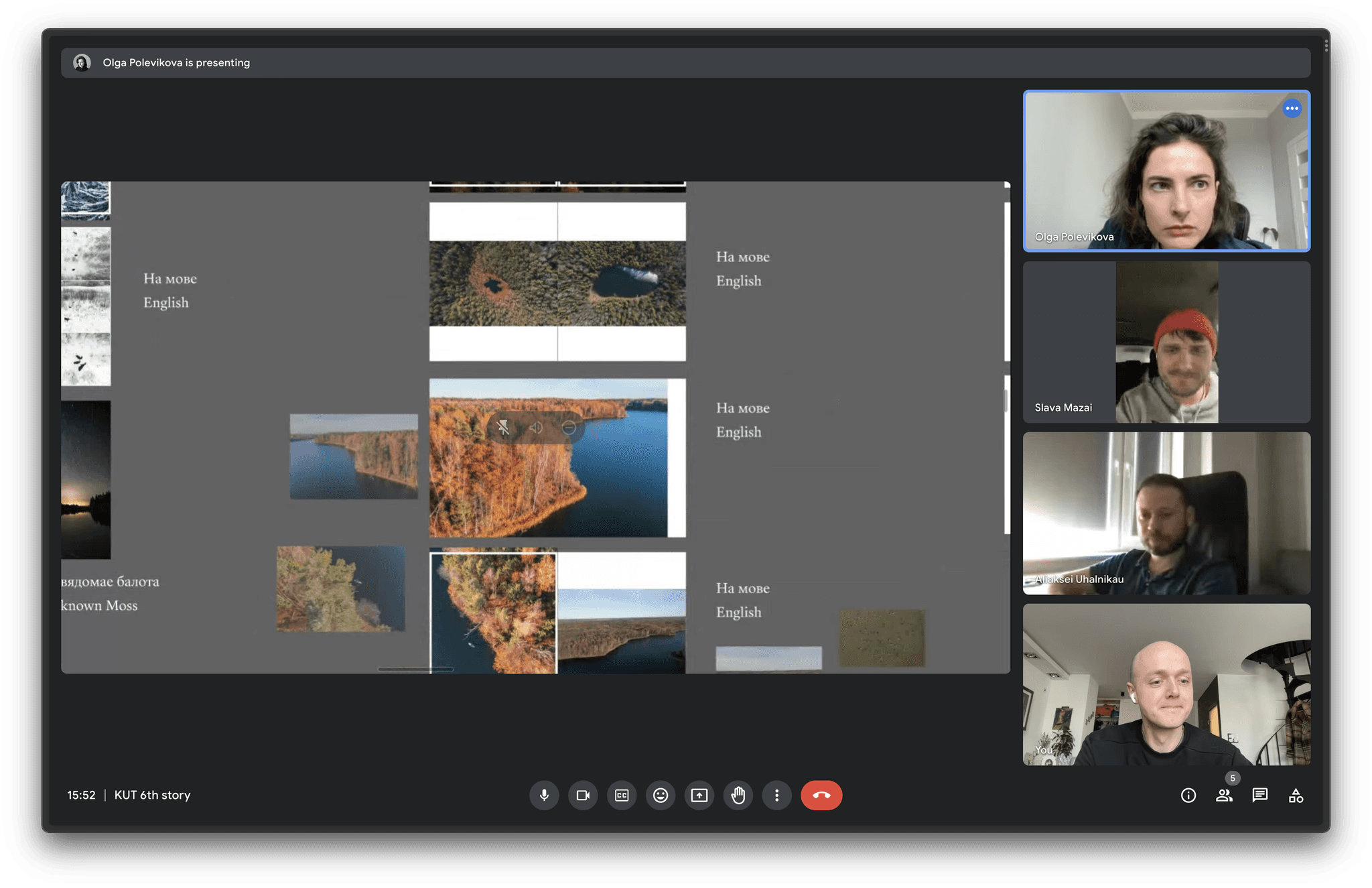
A Zoom-interview where Olya looked at the photos and recorded the stories
A spread of the book with the recorded stories
An attempt to avoid using a human editor (creator — Slava+ChatGPT)
A photo from the last interview
Drafts of the text in Google Docs
I would like to slightly digress here: after meeting Slava, I found myself face-to-face with an unusual problem. Having assessed the volume of the gathered material, having listened to Slava and having seen the level of attention to detail with which he treats things, I understood two things: the book will be very expensive and it will take a very long time to make.
I had the opportunity to get involved in a very long, complicated and most likely financially suicidal project. We were planning to make a ridiculously expensive book with photos of Belarus.
Would even a single Belarusian understand why they are in need of such a book? Would they be prepared to buy it for such a sum?
I was able to assess the cost of this book due to my experience: I had already made some books before, big ones, small ones, cheap ones, and expensive ones too. It was clear that in this case the book would be neither cheap nor small.
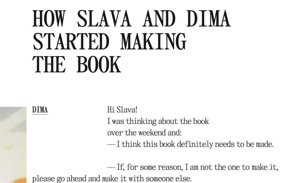
I took one day to think about all this and sent Slava the following message:
The message I sent to Slava that got the project off the ground
I don’t know what happened. Some kind of understanding that what we are about to do is really important and really cool, and that nothing else really matters. From that moment on a group chat about the project was created. We began to brainstorm book titles, concepts, various approaches and, in general, talk about the fact that we will make this book.
THE BOOK TITLE
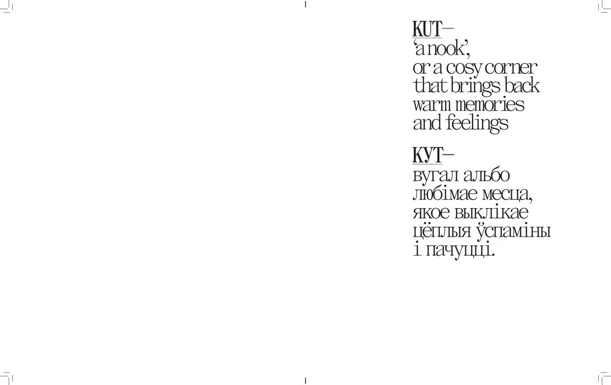
The name “KUT” came about rather by accident:
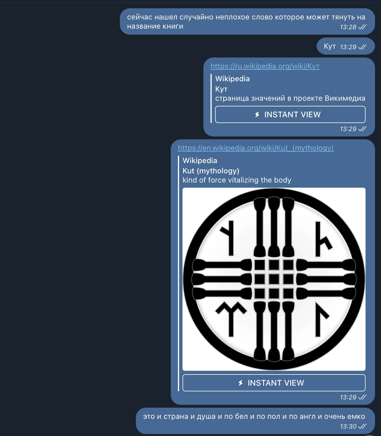
A screenshot of a message from Dima with the book title
Slava created a group chat
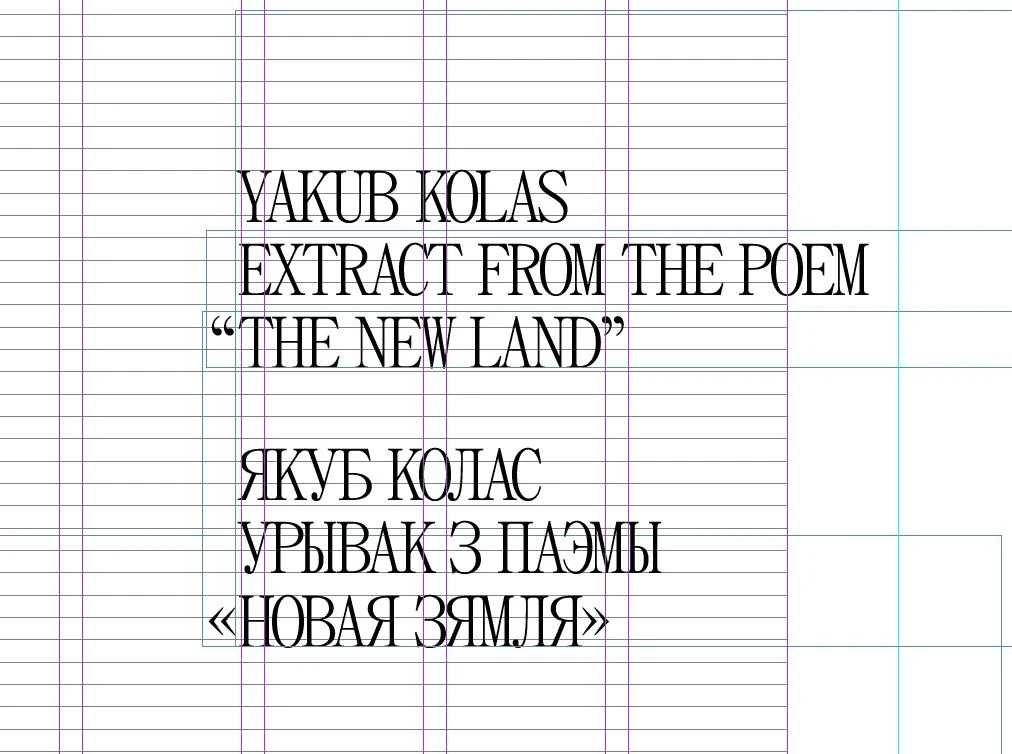
At the time, I didn’t pay too much attention to it, but every Belarusian had to learn by heart a fragment of Jakub Kolas’s poem which includes the lines “My native kut, so dear you are to me…”. In Belarusian, “Kut” means “corner” or “nook”.
Now it seems that the name fits both our project and the lines of this poem perfectly.
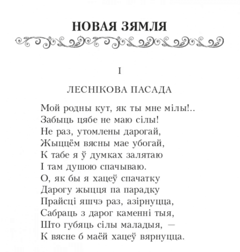
An excerpt from Jakub Kolas’s poem “New Land”
So, Slava’s friend and co-author of the book, Alex, joined the project and we had our editor, Olya. We began to work on collecting photographs and stories.
I asked the guys to gather some references in the form of books or other printed materials in an attempt to understand how they see the visual solution of our future book, to understand what they prefer and so on.
A postcard that Slava bought online
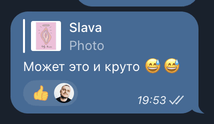
At one point during the process we came across something unexpected — Slava googled the word “KUT” using English letters and found that it has a different meaning in Dutch.
Where we left it :)
DECIDING ON THE SIZE OF THE BOOK
In the publishing world, the size of the book layout is really important. It determines two principal things: the cost of the book and the size of the future product.
Book sizes are not just “created”, they are based on existing formats. At home, we print things on standard A4-sized printers and buy A4-sized paper - we don’t just invent page sizes every time we need to print something. It’s the same with books: there are standard and exotic book formats.
The book “Jak Zrobić Książkę” from Oficyna Peryferie
For a more in-depth look, I recommend reading the book “Jak Zrobić Książkę?” from the publisher Oficyna Peryferie. They explain in detail how to make a book with your own two hands.
For our future book, I had a very clear understanding: we need to choose a size that would make the book a very big book. But at the same time a size that wouldn’t cause the cost of the book to skyrocket.
Imagine that you have a standard sheet (or roll) of paper. You can use it all, or you can fold it in half, or cut off 1/3, and so on. The less you cut off and throw away, the more efficient the production of the book will be.
The paper you choose also plays a crucial role. It can be expensive, cheap, white, yellow, thick or thin, in sheets or in rolls.
The printing press is also very important. It has limitations on the size of the print. The process of stitching or gluing is also extremely important – it also has size limitations and affects the cost of production.
Choosing the size shouldn’t be something you do on your own but something done in agreement with your publishing house (or whoever is your publisher).
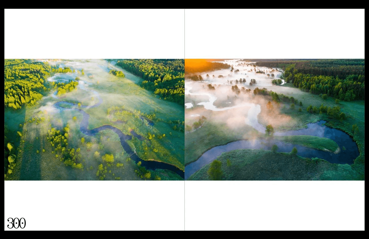
The screenshot above shows how the printing cost is affected by increasing the book size by 1cm in width. 300x244mm — A versus 300x254mm — B.
I suggest making the book square:
Fantastic Man Magazine, Netherlands
Fantastic Man Magazine, Netherlands
I have been involved in self-publishing for a couple of years now and right from the very beginning of this project we knew where we would print it and which paper we would use.
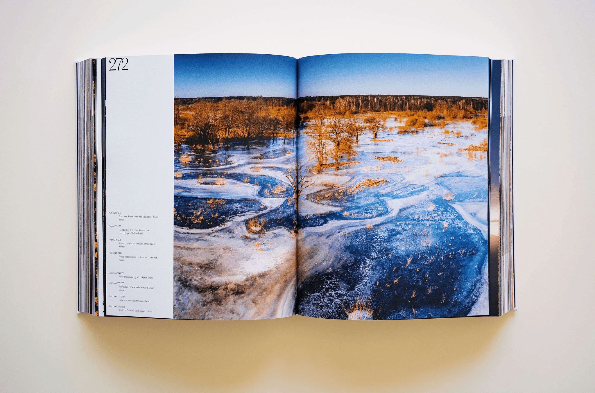
We decided that: the size of the book will be 300x244mm and the paper would be designer paper — Munken Print White 1.5 g/m2.
From my Instagram
The texture of the paper used in the book (Alex)
A macro shot of a page in the book
A macro shot of a page in the book
THE BOOK STRUCTURE
I created a project in Figma, added the guy to the space and we began to put together a mood board.
Fonts, maps, picture of other books (Figma, shared project)
References
We didn’t make much progress in collecting references during the one year of work. It turned out that the picture above was the only mood board that I, as a designer, was able to get from the guys.
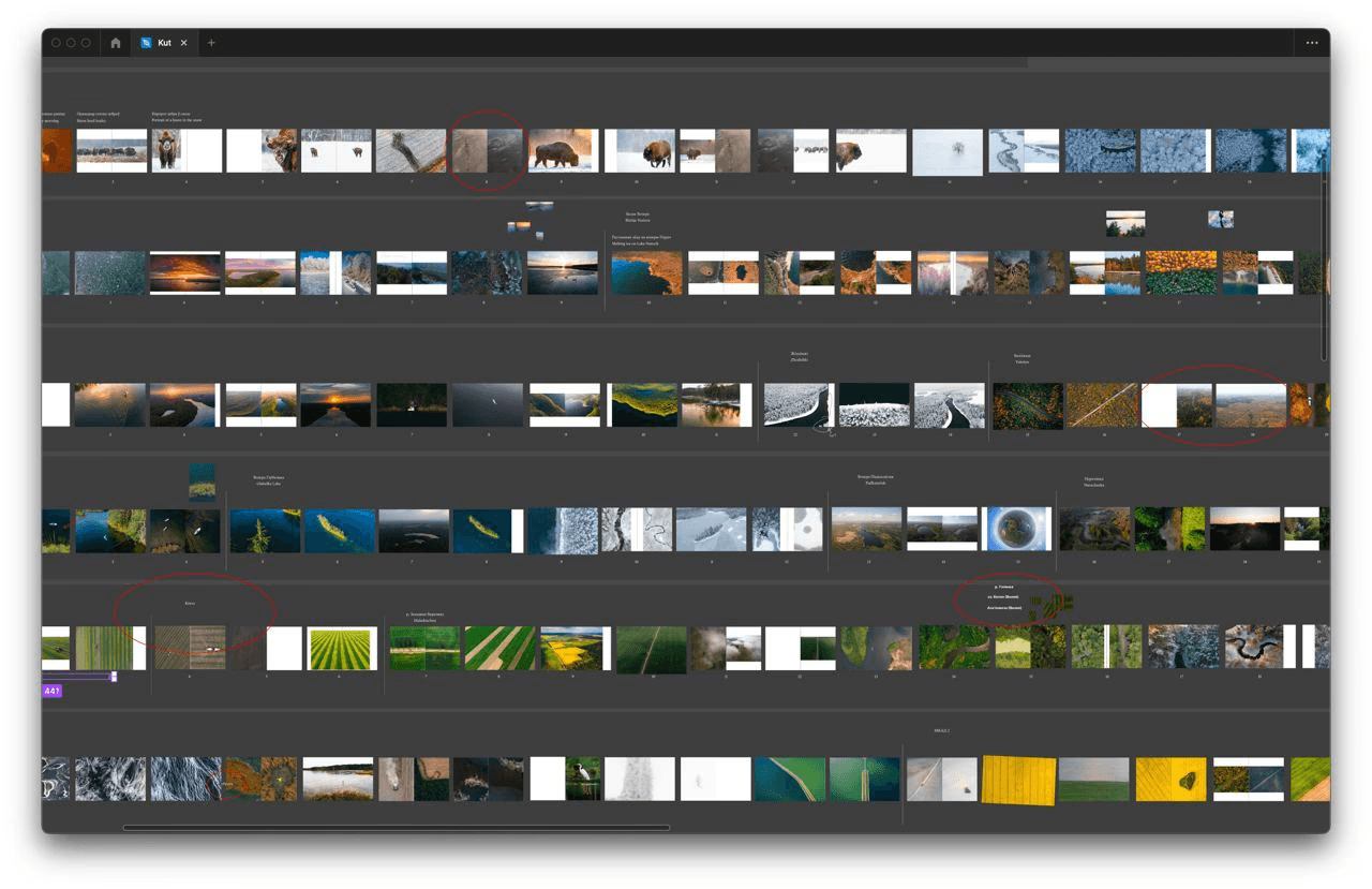
Having said that, we started working in Figma on the structure of the book almost immediately. It was difficult as we had a huge pile of photos that needed to be grouped somehow.
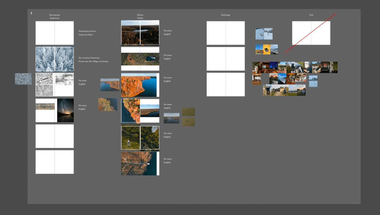
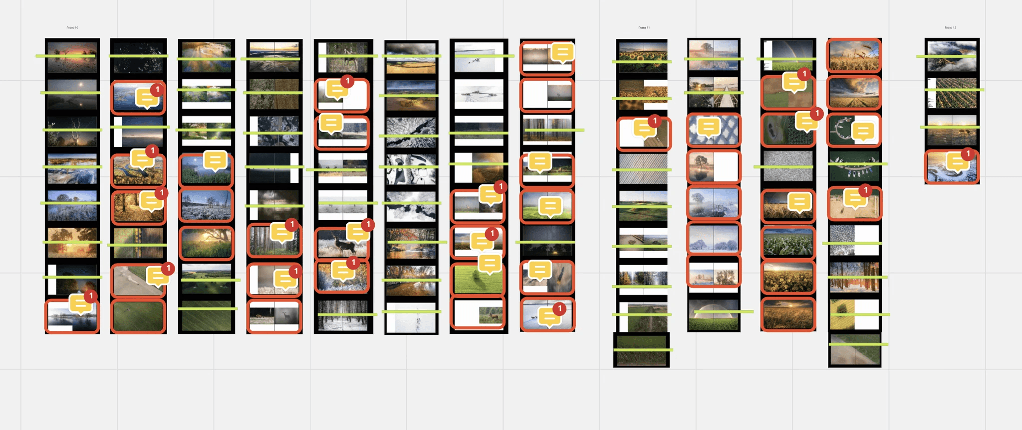
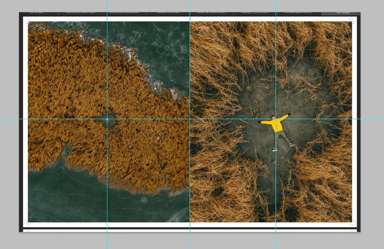
We created rough page layouts and potential book spreads and began adding photographs. We moved them around, trying to lock down ideas. Some of the first drafts looked like this:

Draft layouts in Figma
Draft layouts in Figma
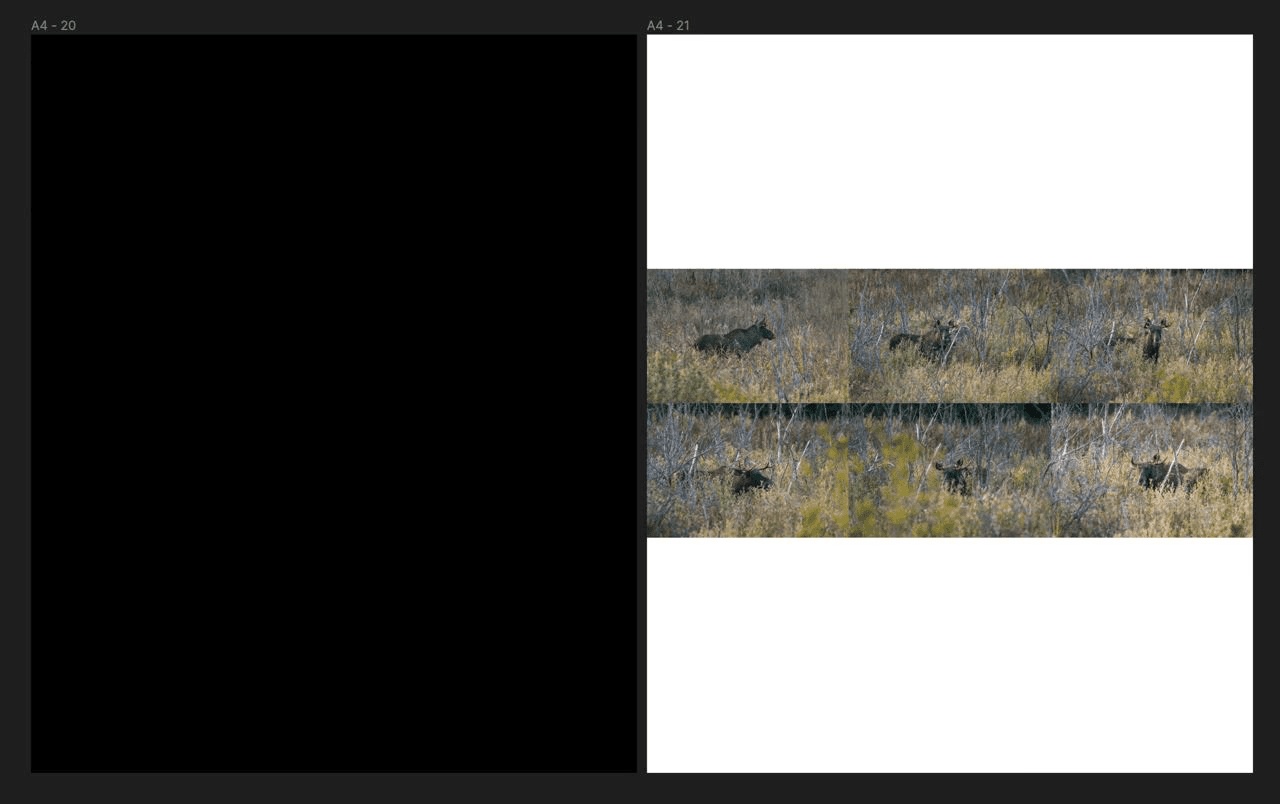
You can see QR-codes on these layouts. Initially, we thought that they would link to locations on Google Maps (for example, to the village of Kaptaruny) or to videos on YouTube (for example, to a video about how we photographed that moose).
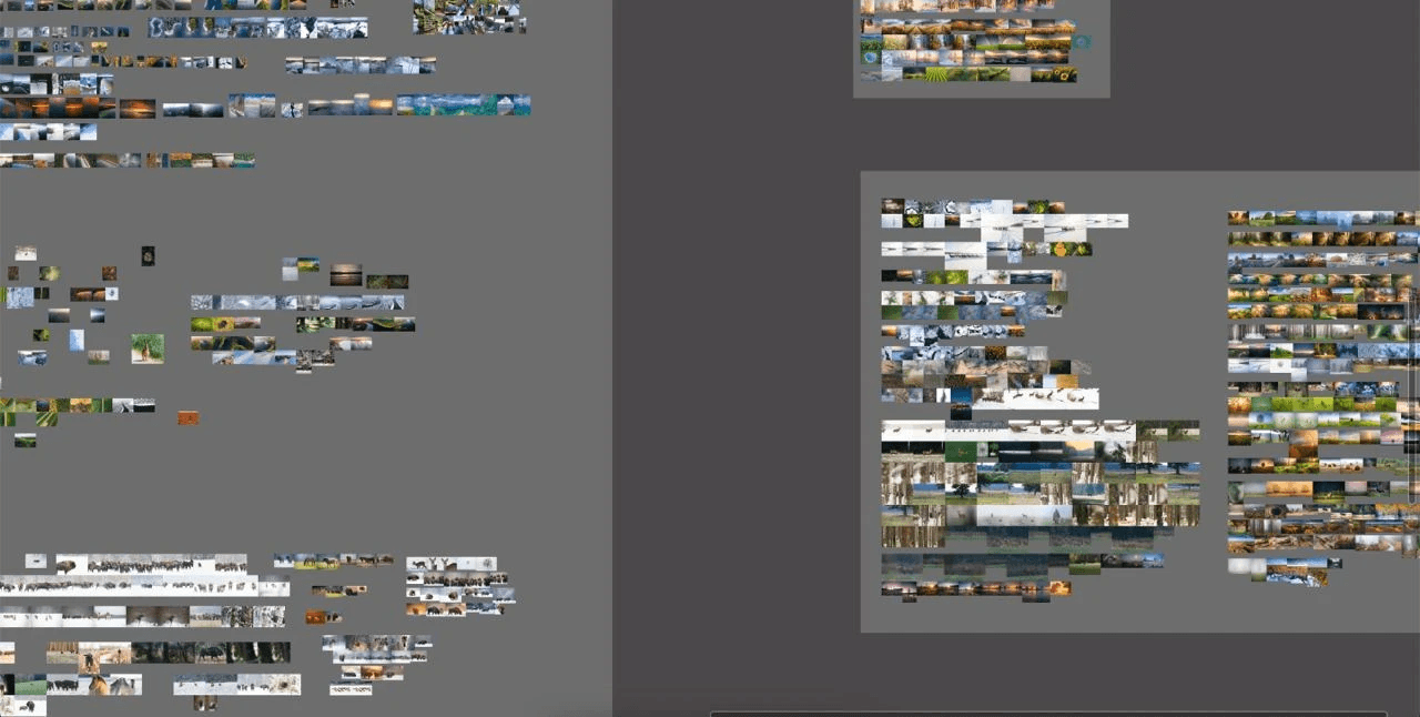
Gradually, more and more photos were being collected in Figma.
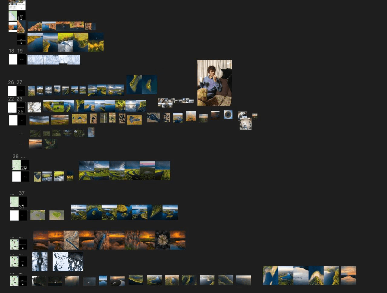
Photos in Figma
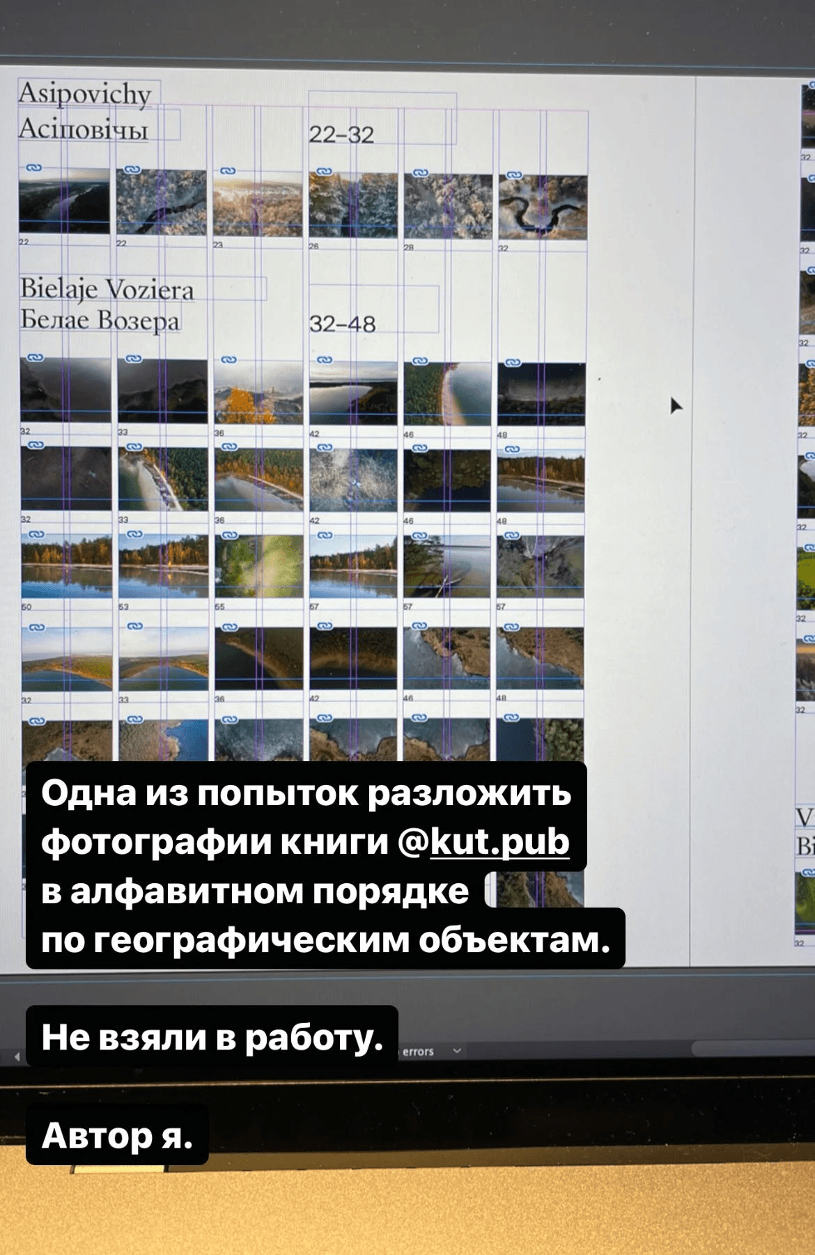
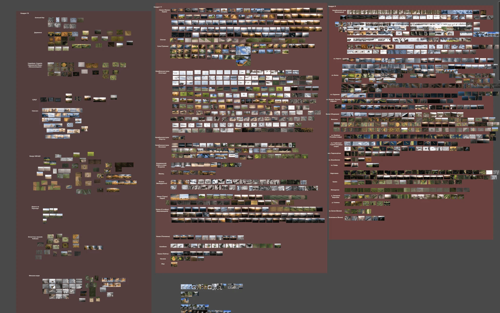
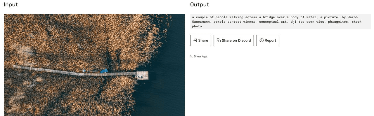
An attempt to group photos by geographical locations
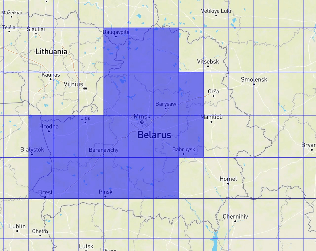
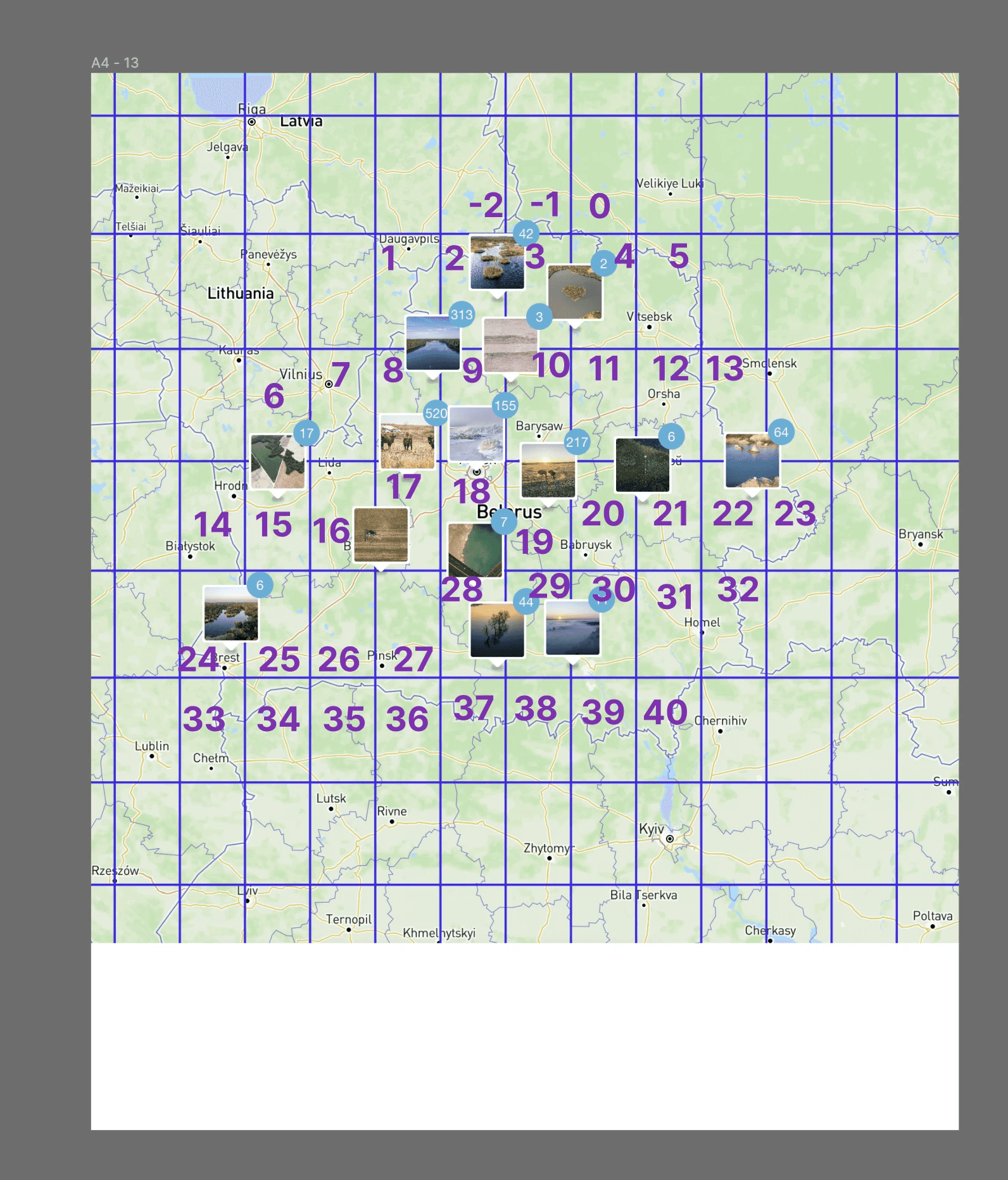
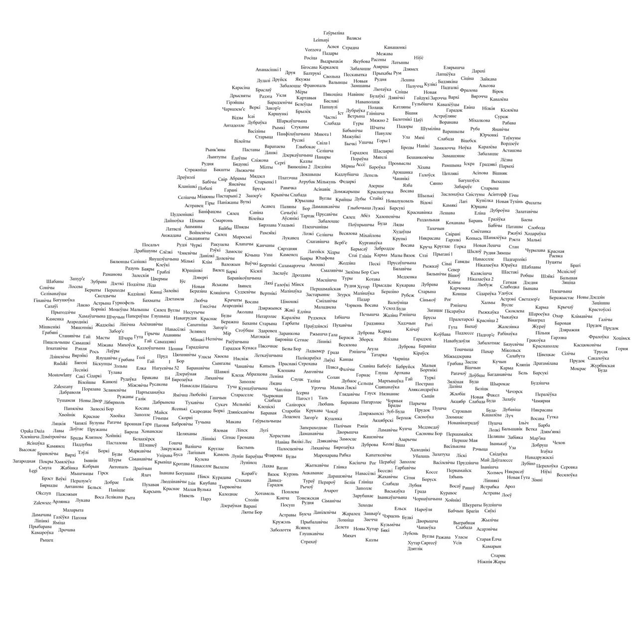
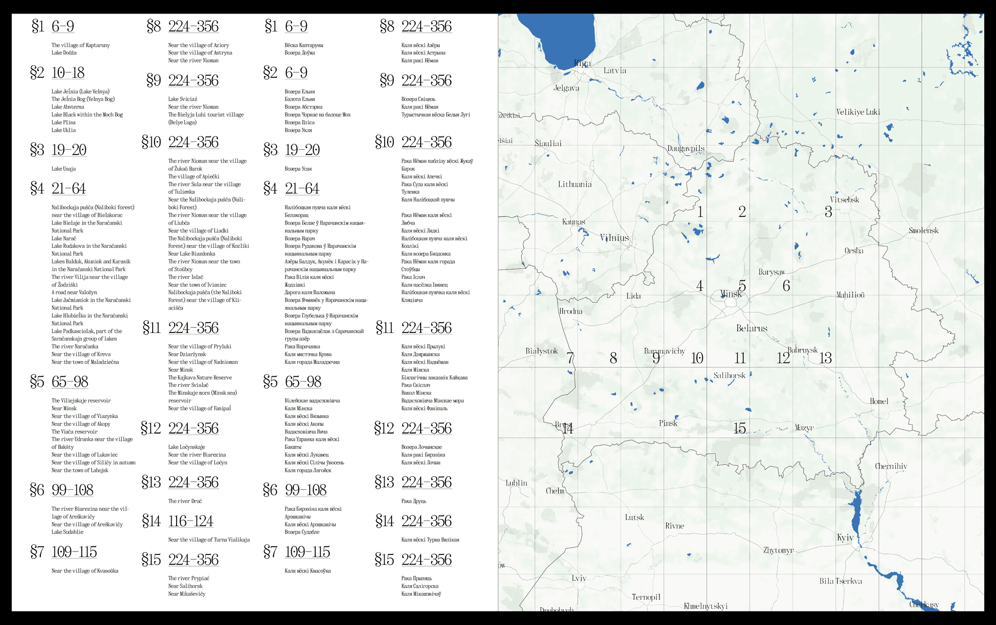
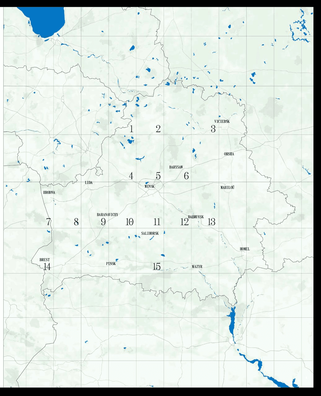
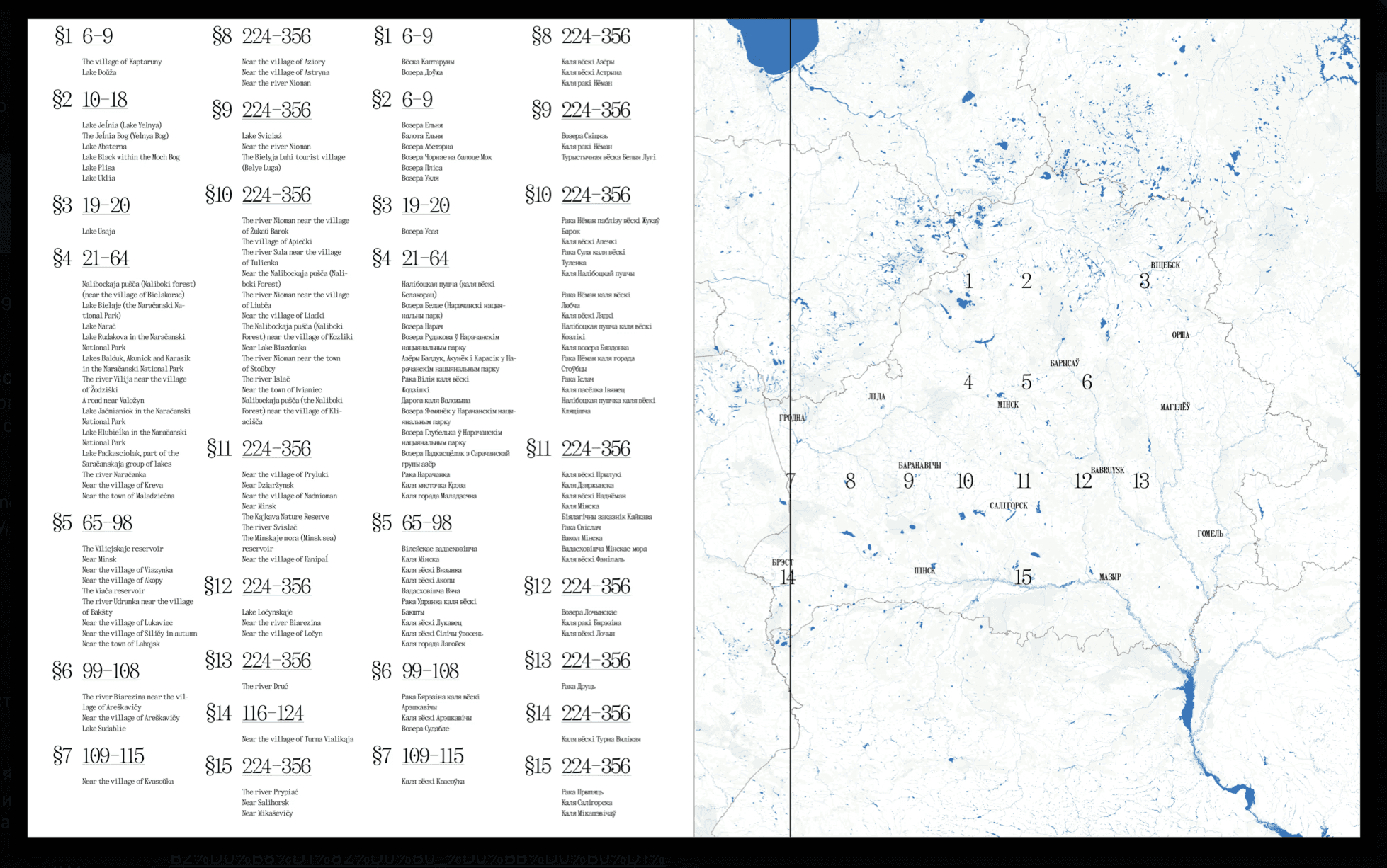
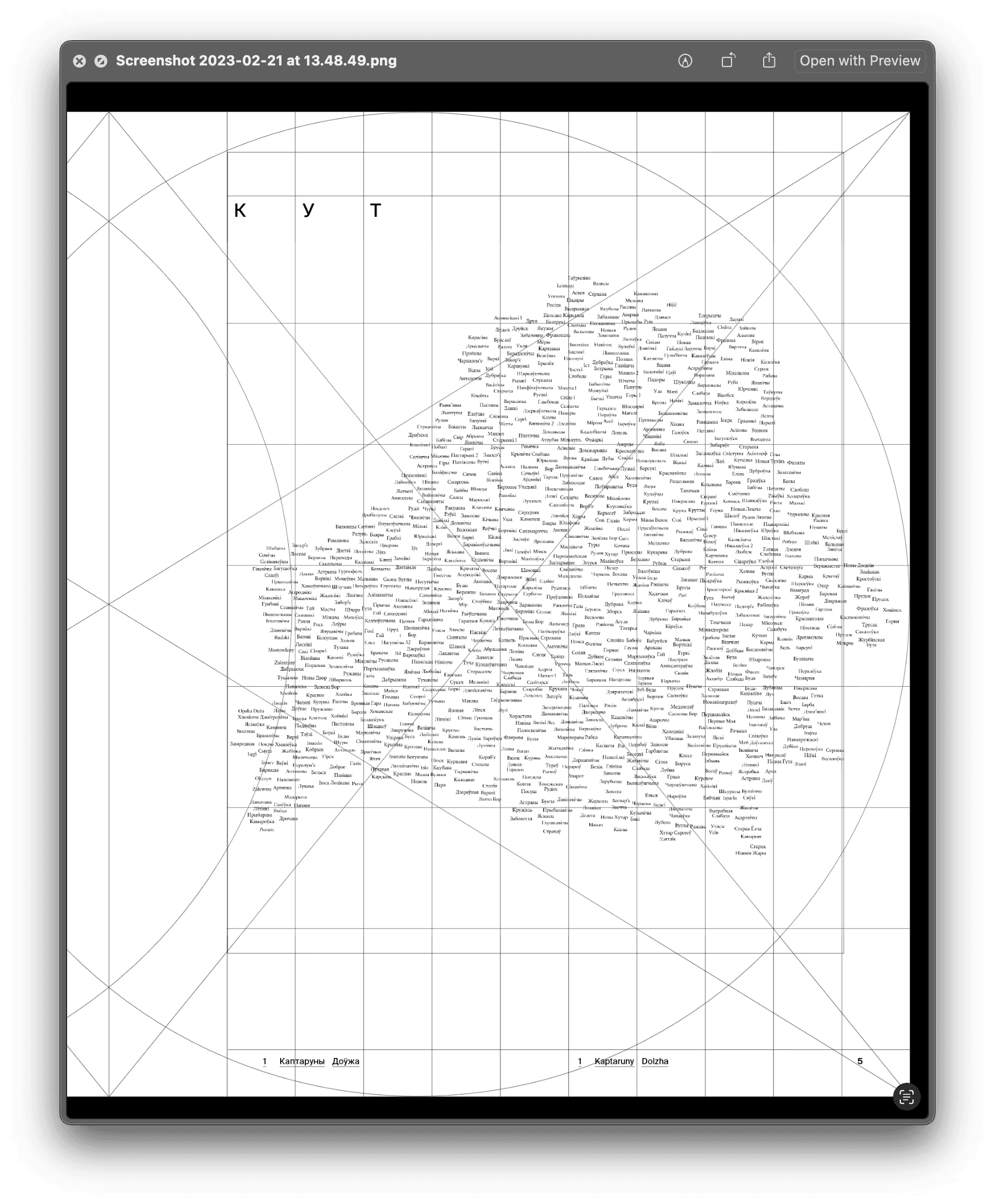
During the first two weeks, we decided that the book would be in Belarusian and in English, that we wanted to have beautiful maps in the book and that the maps would pinpoint the settlements near which the photos were taken.
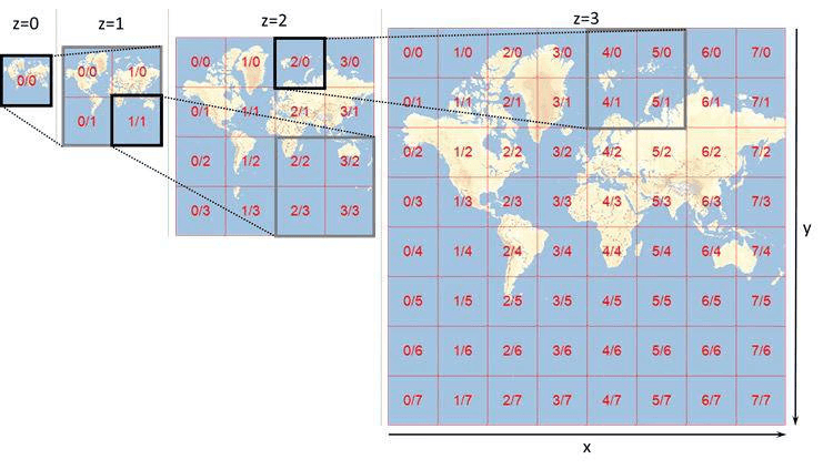
As we collected more and more photographs, it became clear that most of the photos were not related to any kind of settlement at all. More often than not, the photos were not taken in a village or a town but in a forest or some place near a river. The idea to use a coordinate grid raised. Funnily enough, the idea was first brought up while we were somewhere on the road and I drew it with children’s crayons right on the asphalt:
A message to Slava (Dzima)
Slava proceeded to create a space in Photoview to arrange all the photos on the map and began adding our photographs to it.
At the same time, we began researching how exactly should our coordinate grid look like.
The coordinate grid idea was accepted
Here we are looking for printed materials which use coordinate grids in one way or another (Slava).
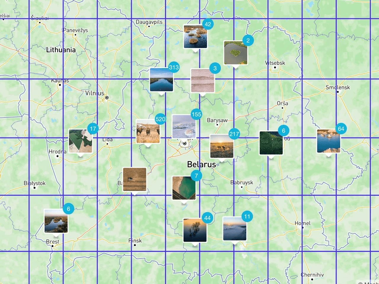
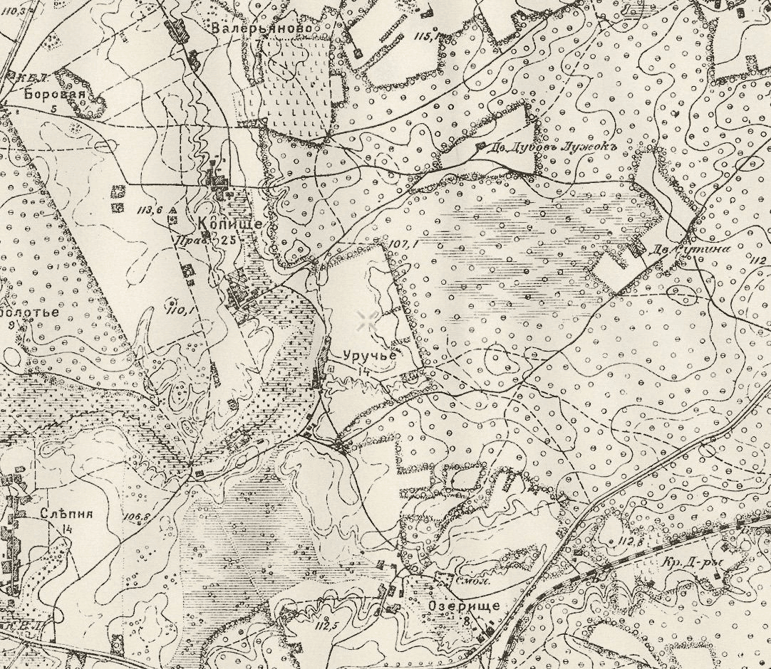
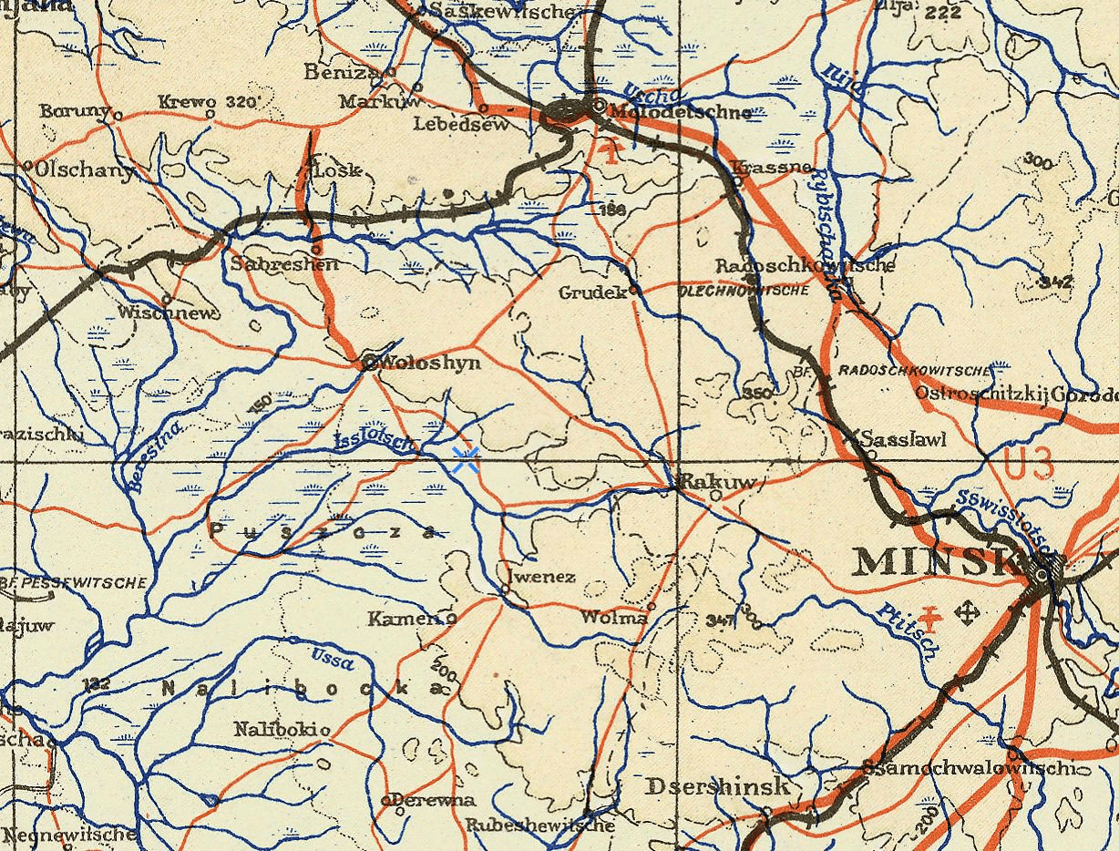
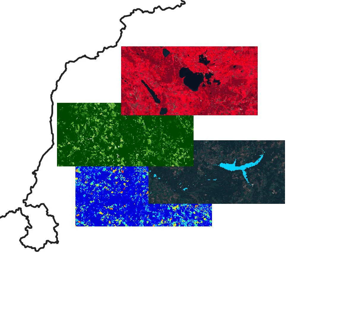
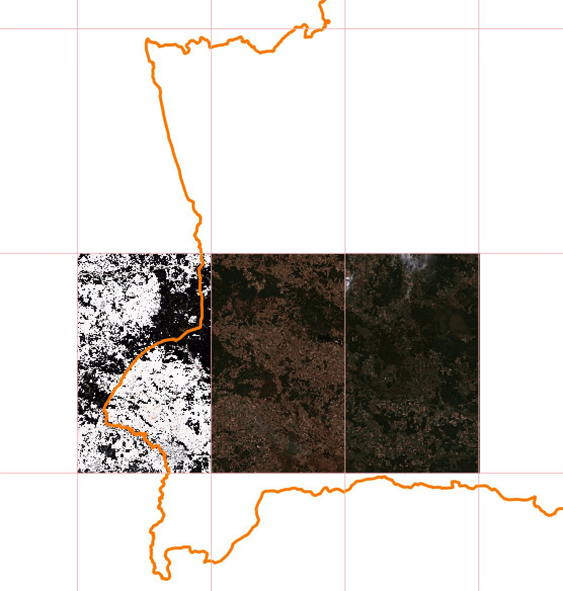
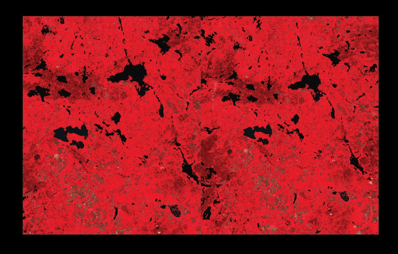
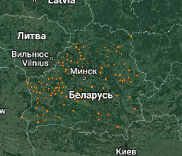
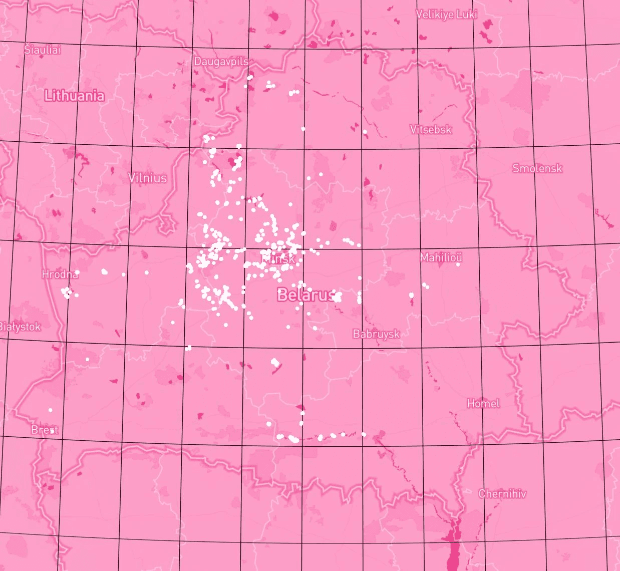
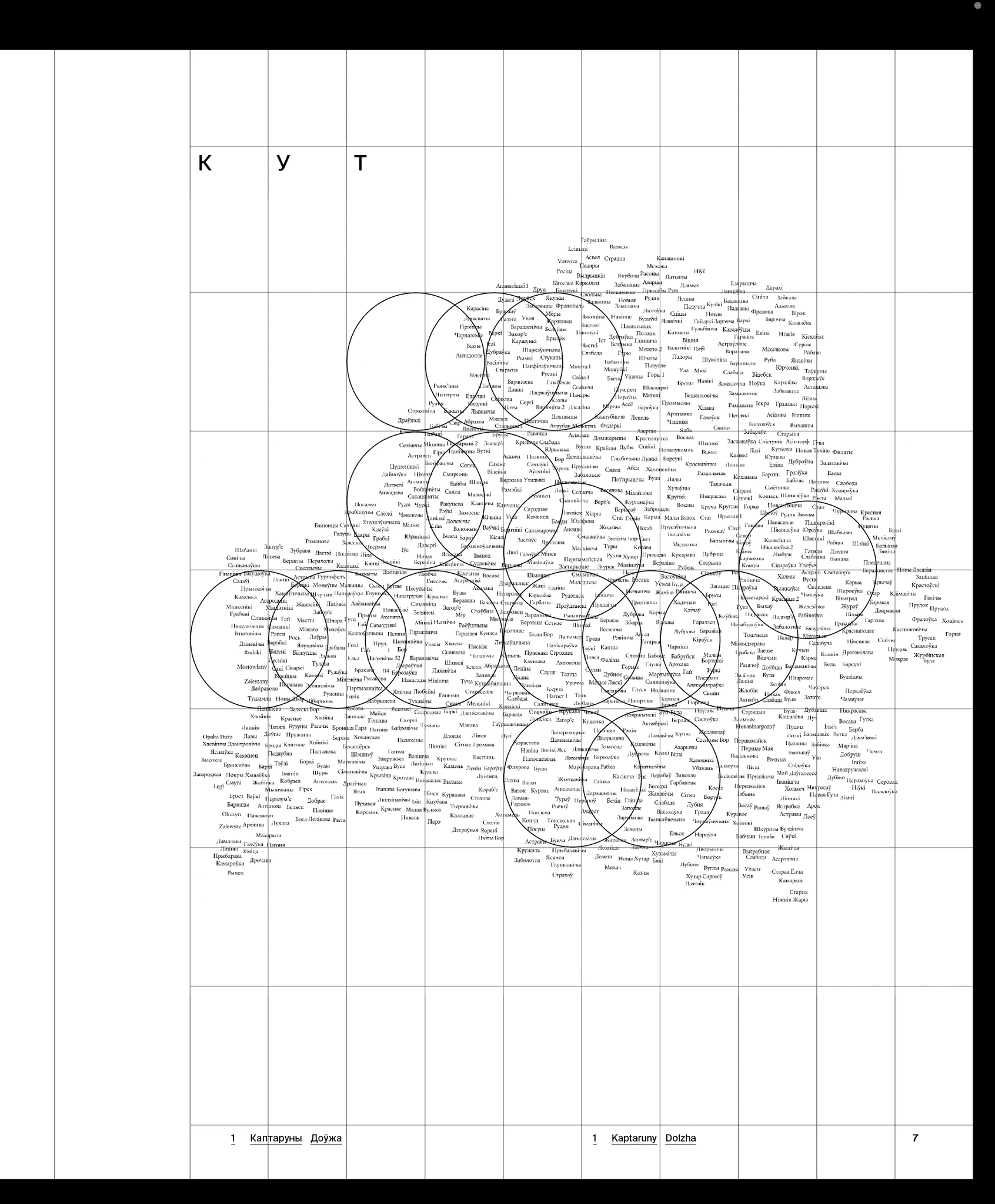
To test the idea, it was crucial for us to understand whether or not we have photographs that would cover the whole of Belarus, or would we have many gaps. In this picture, Slava is roughly trying to estimate which places have photos and which do not:
An estimate
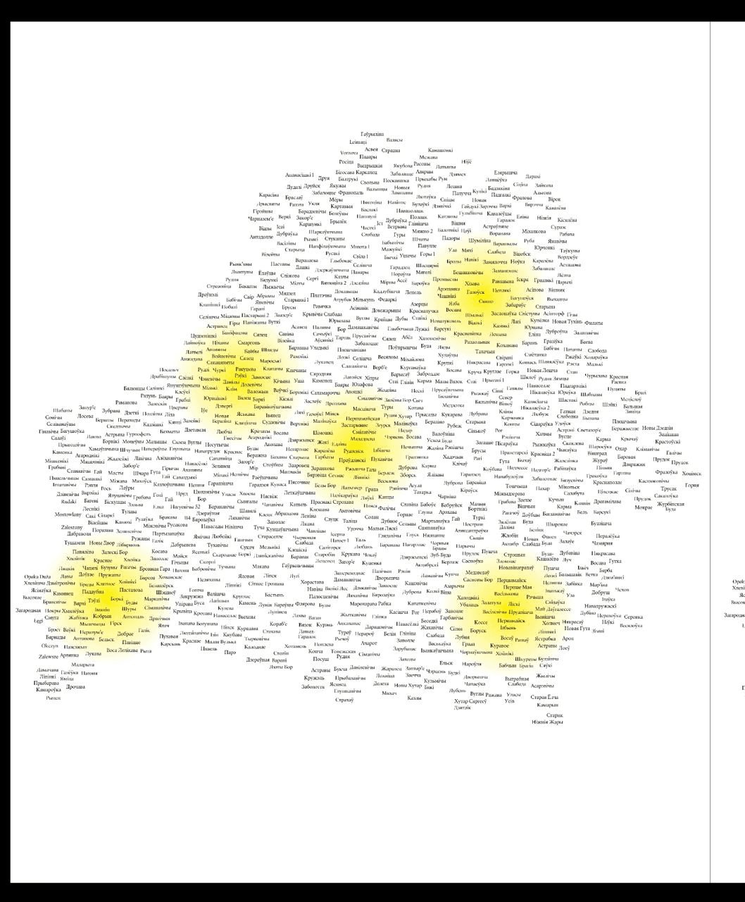
Each module’s page numbers are shown on the map (Me)
Screenshots from Lightroom with photos with geolocation tags
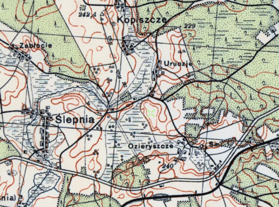
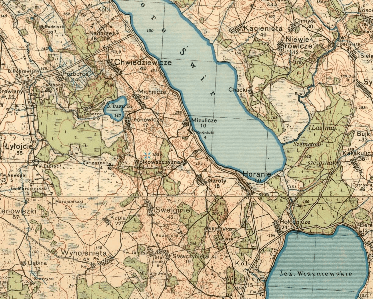
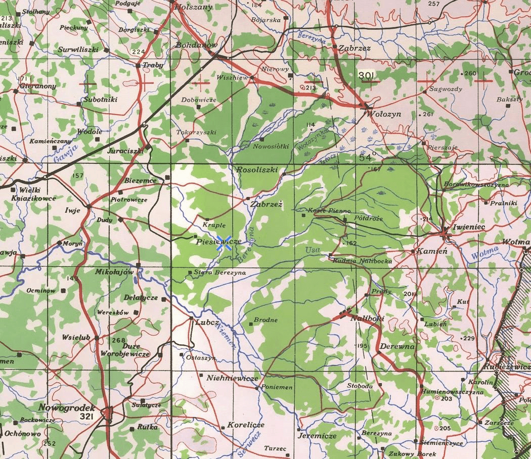
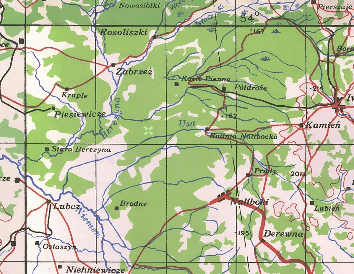
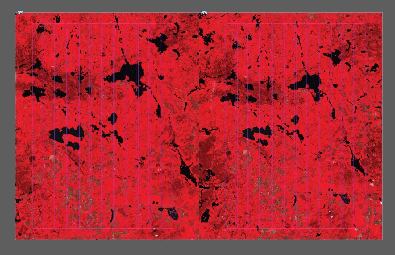
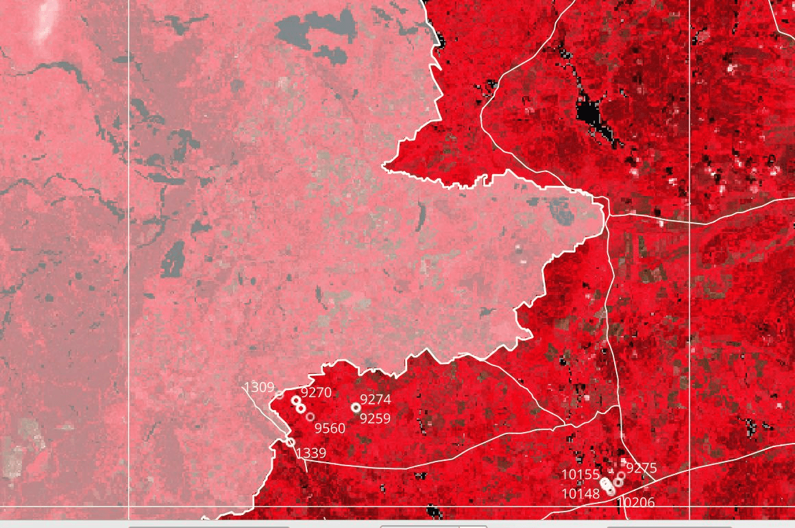
A more accurate placement of photos on the map using QGIS (Slava)
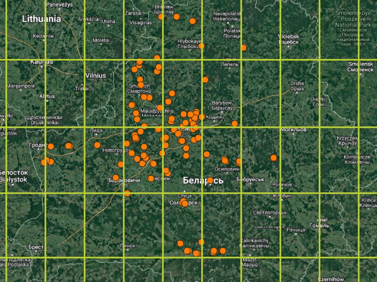
A more accurate placement of photos on the map using QGIS (Slava)
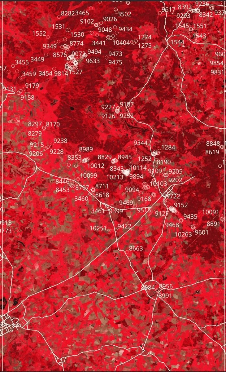
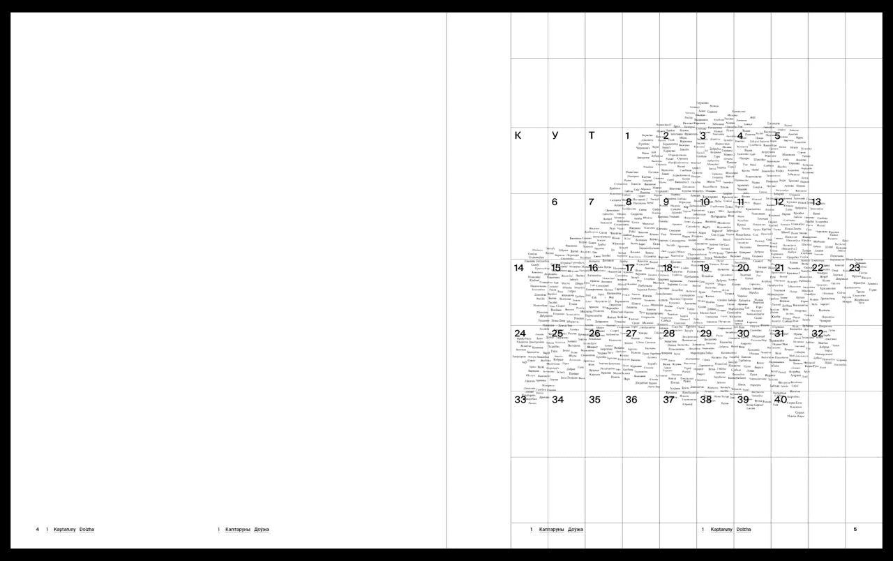
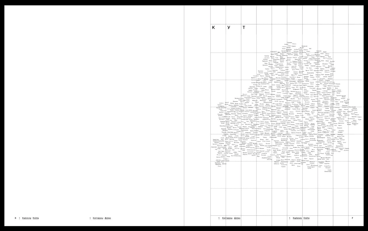
Alex numbered all the grid modules on the map in such a way that we would have the numbers of future chapters of the book:
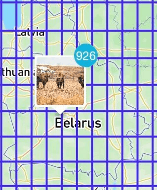
The first thousand photos on the map (Slava)
In Figma, Slava and Alex began to break up the photos into modules with each grey rectangle representing a module of the grid on the map.
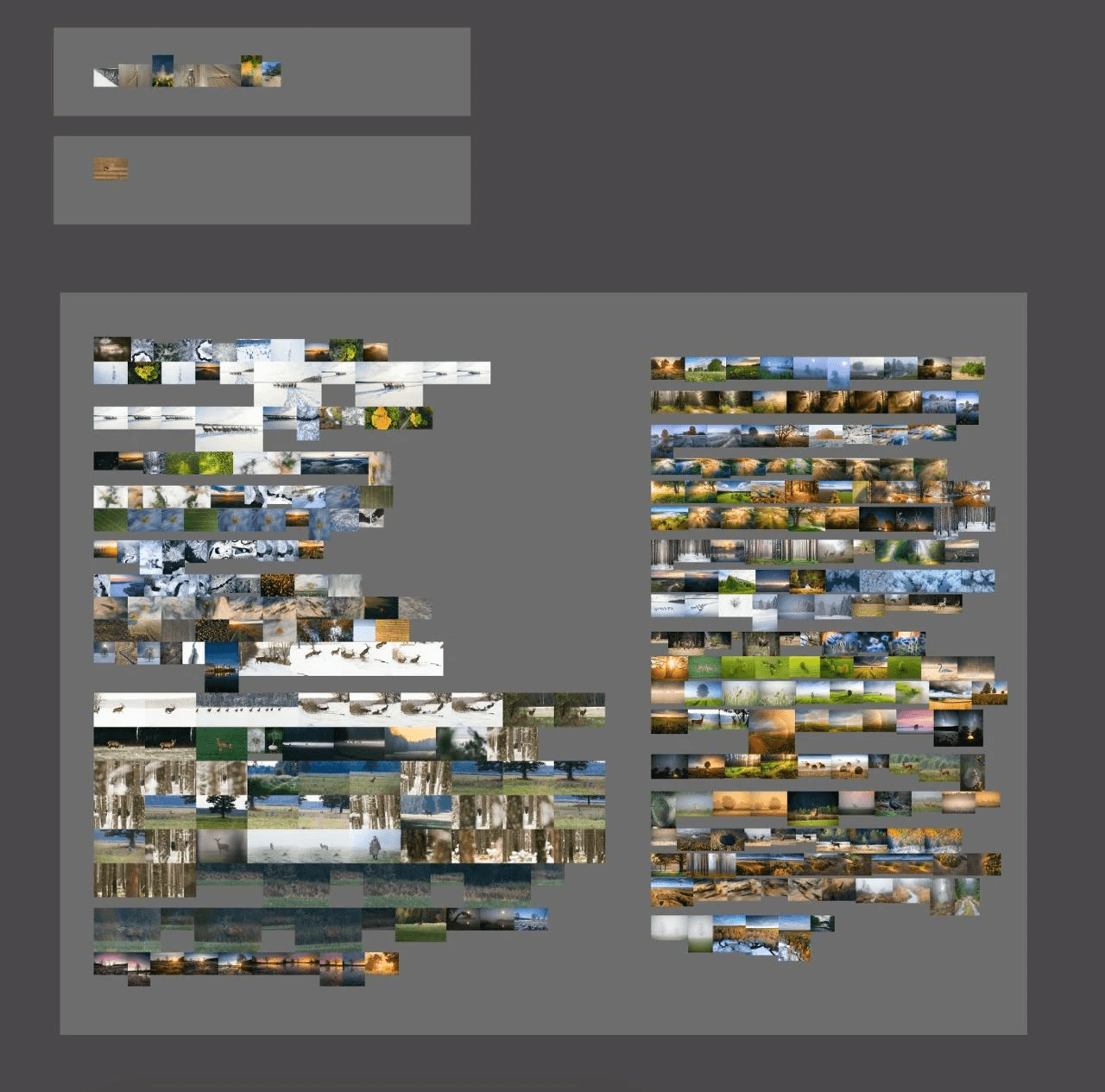
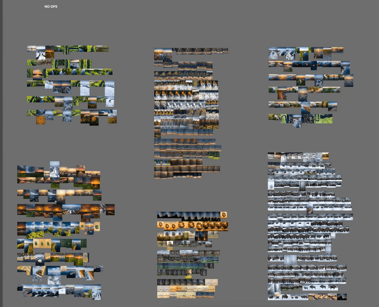
Since most of the photos turned out to be without GPS-coordinates, Slava and Alex had to manually classify them into modules.
This took about 5 months to complete.
From the very beginning we encountered a problem: the photographers and the designer had different opinions regarding the photos.
At one point, I took a bunch of photos from the first chapter (about one hundred), chose the most beautiful ones in my opinion and tried to create a draft layout of the potential future chapter. This is what I came up with:
After talking to the team, it turned out that I had chosen the ‘wrong’ photos - meaning not the best ones. I had left quite a lot of empty space whereas the photographs wanted the photos to take up as much space as possible. We decided that it would be best to choose and arrange the photos together.
We redesigned one of the pages.
Before
After
We started working together to arrange the photos
The result of the joint work
The result of the joint work
The result of the joint work
The result of the joint work
According to the grid of coordinates we organised the photos
Putting the drafts in order
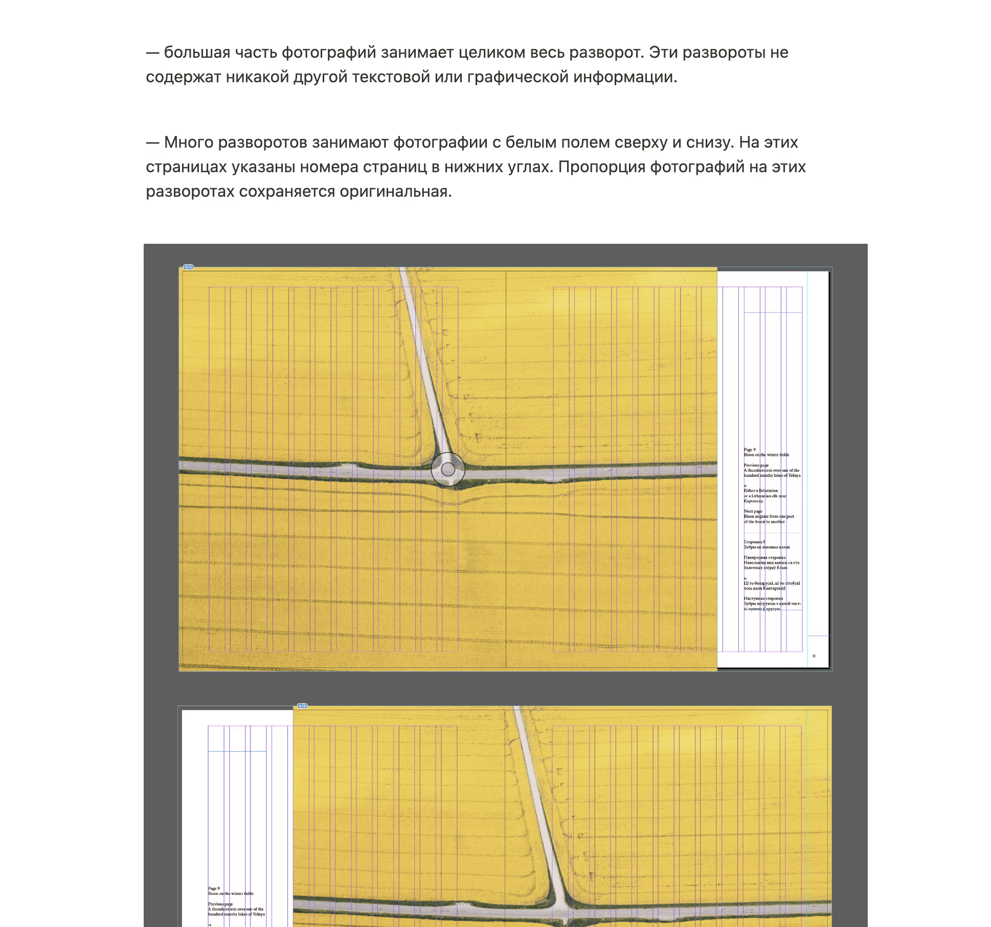
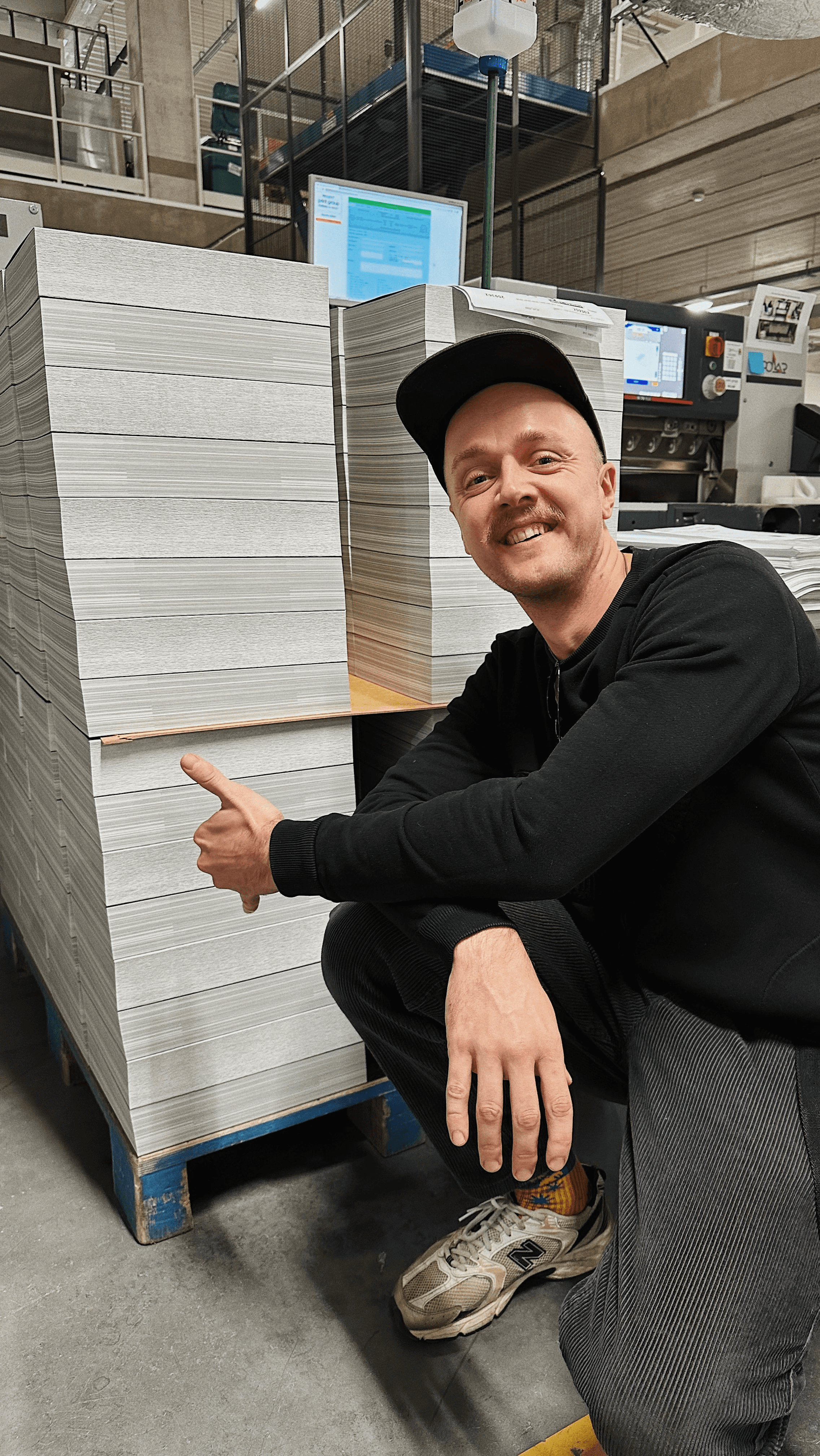
After selecting the best photos, we saw that there were too many of them. We were limited by the thickness of the book: the machine that would glue the pages together has a limit of 6cm for the width of the book. From experience, I knew that technically it would be possible to make the width 6.5cm, despite it being wider than the official limit. As we were going to use very thick designer paper which was similar to cardboard, we could not make more than 550 pages.
“So many photos”. A still from the film about the book
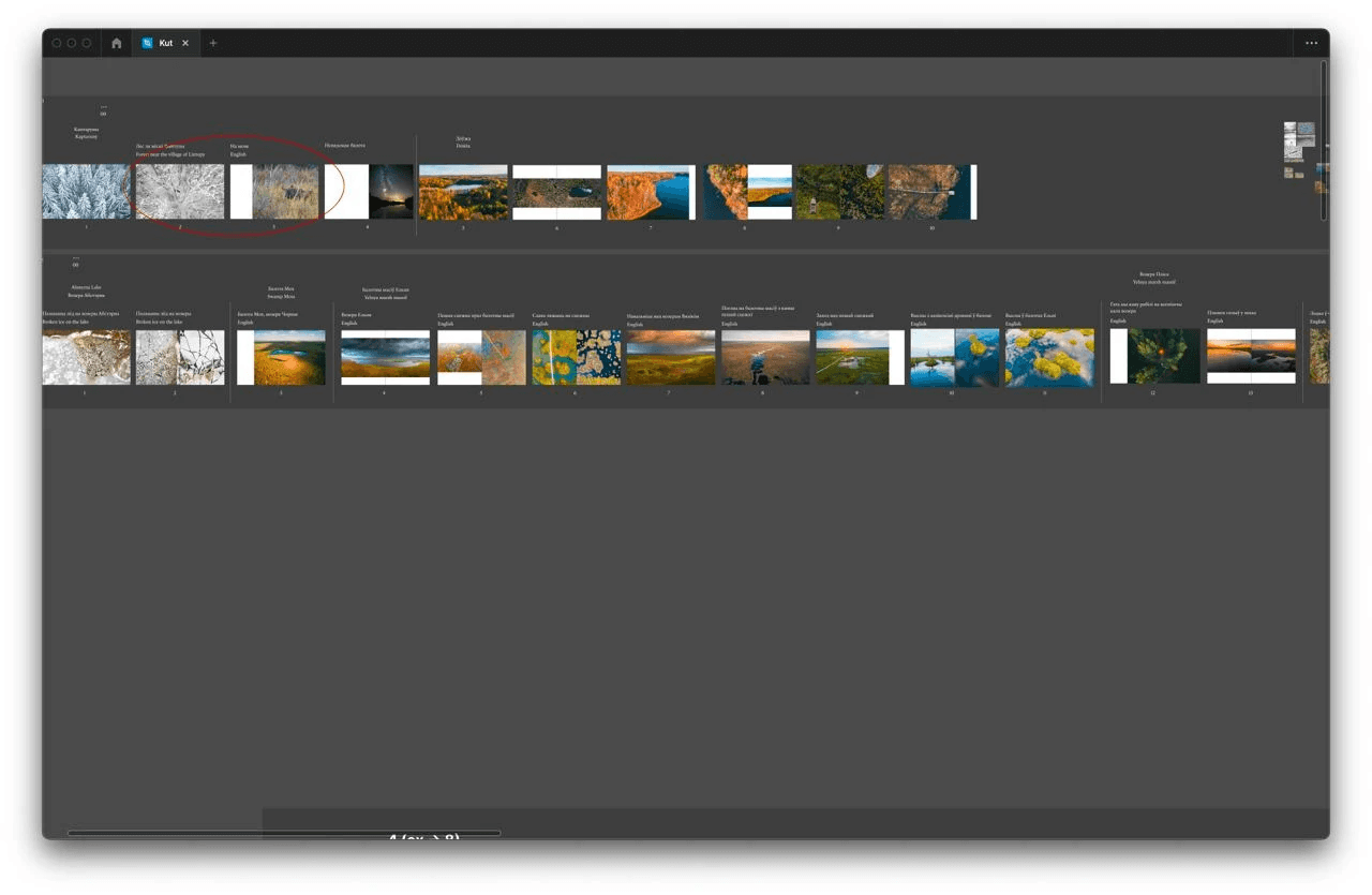
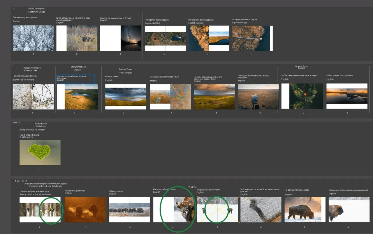
There were 1,100 chosen photos. And we had to get rid of half of them. To do this, we decided to use the following labels.
Slava crosses things out in red, Alex in blue. Green — should remain.
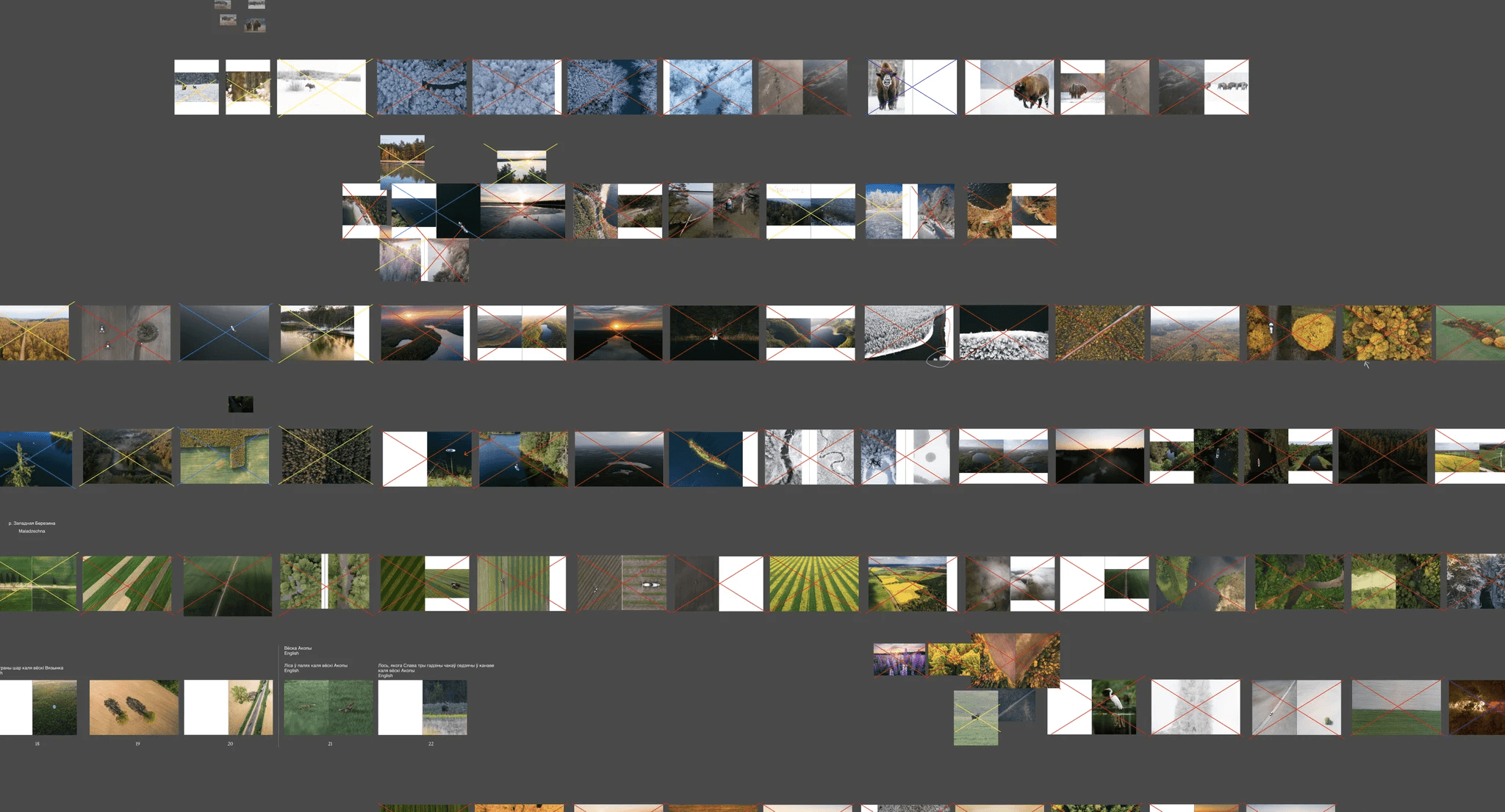
Deleting photographs
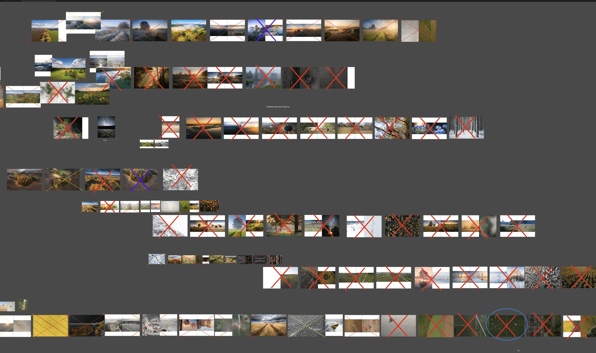
Deleting photographs
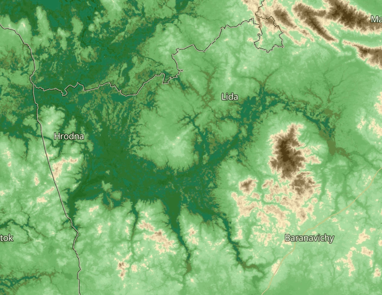
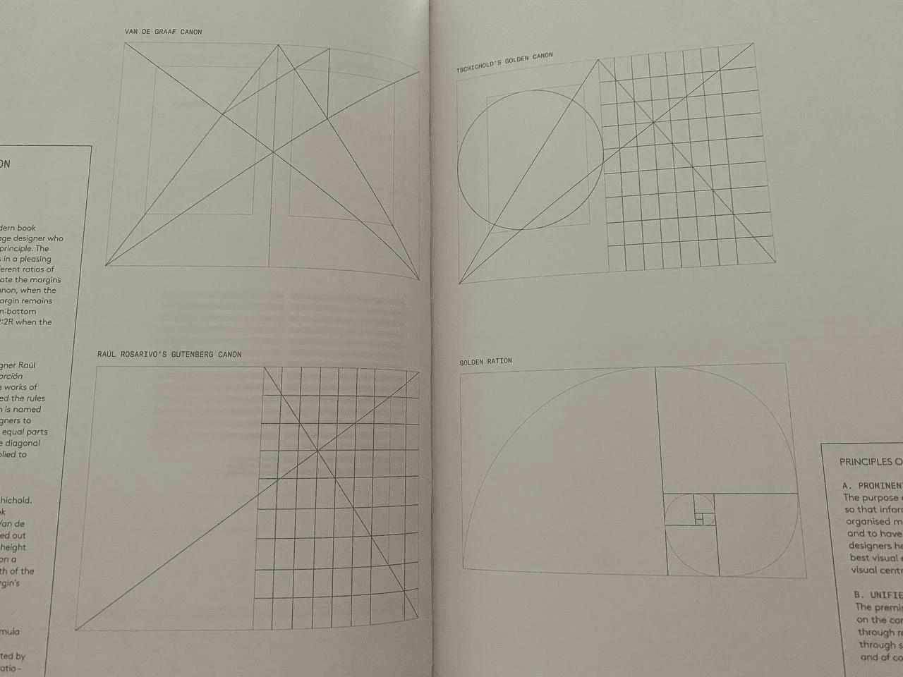
DEVELOPING A SOLUTION FOR THE MAP
Right from the very beginning of our work on the book, we had the idea of making a beautiful map. So for almost a year we looked for various options of what kind of map we could have in the book.
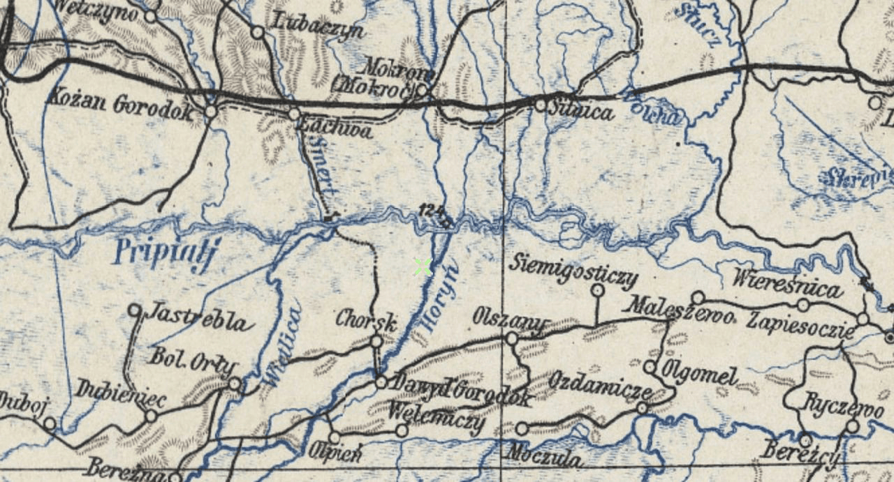
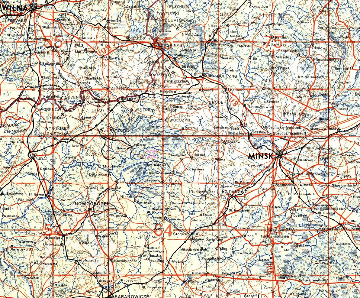
The collection of references for the map from printed publications (Di) and old maps (Slava):
Atlas wysp odległych — Schalansky Judith
Atlas wysp odległych — Schalansky Judith
Atlas wysp odległych — Schalansky Judith
1665, From Slava’s archives
1797
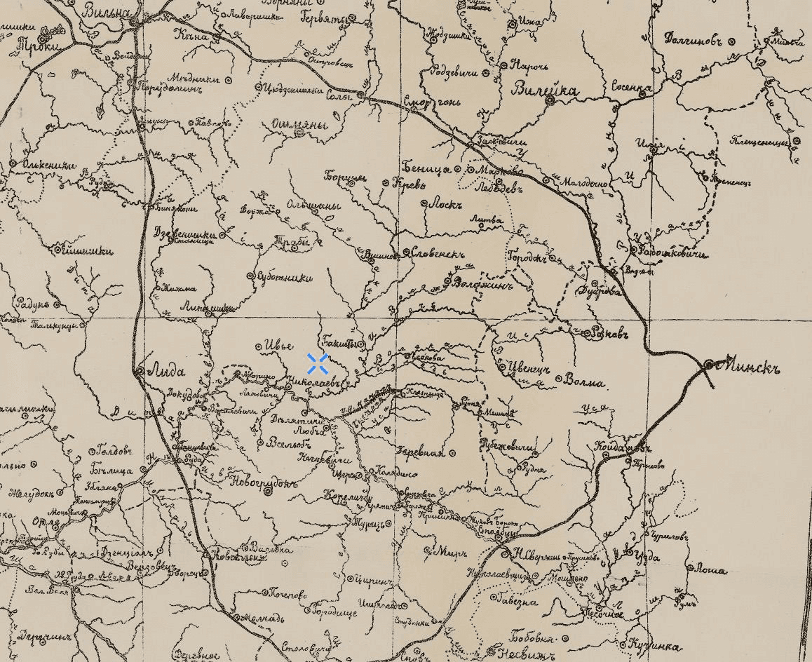
Map of the Nyoman River Basin 1902
1907
1910
1933
A pre-war Polish topographic map of central Belarus 1933
A Luftwaffe flight map from 1941. European part of the USSR.
1943
A British military map of Europe during the Second World War 1943
A British military map of Europe during the Second World War 1943
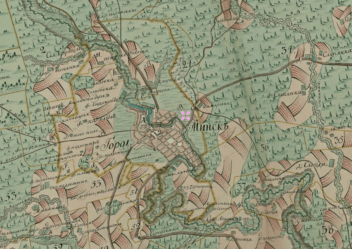
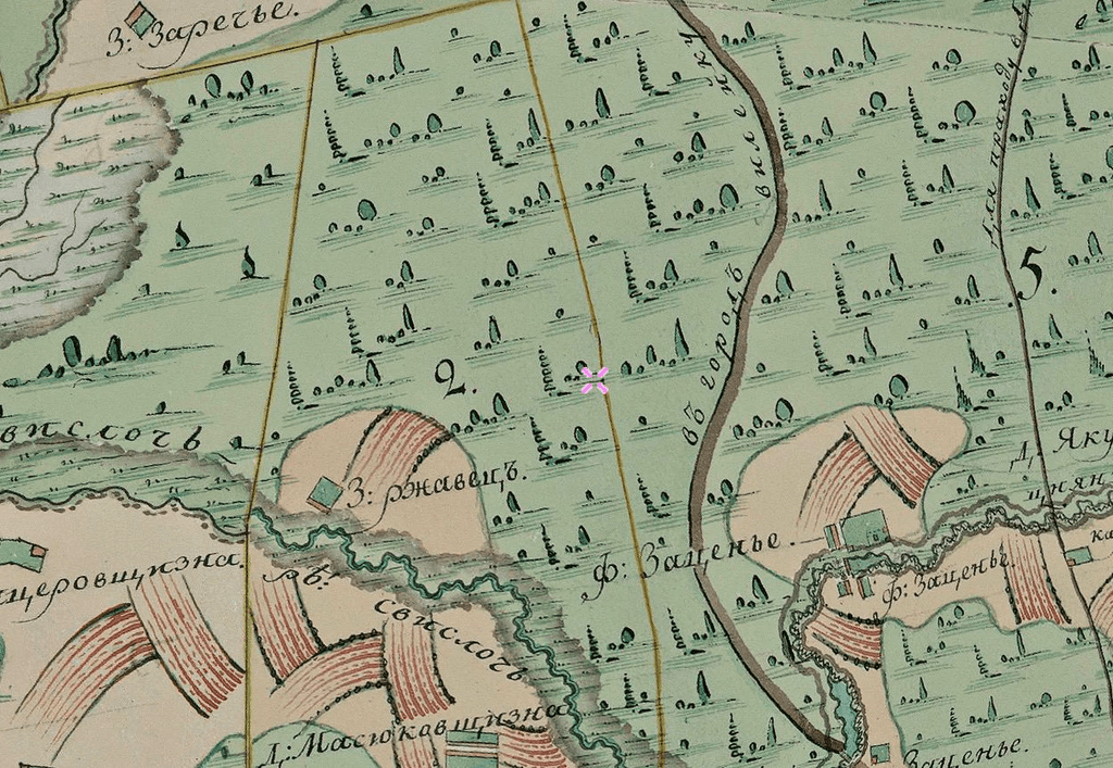
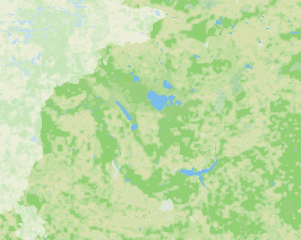
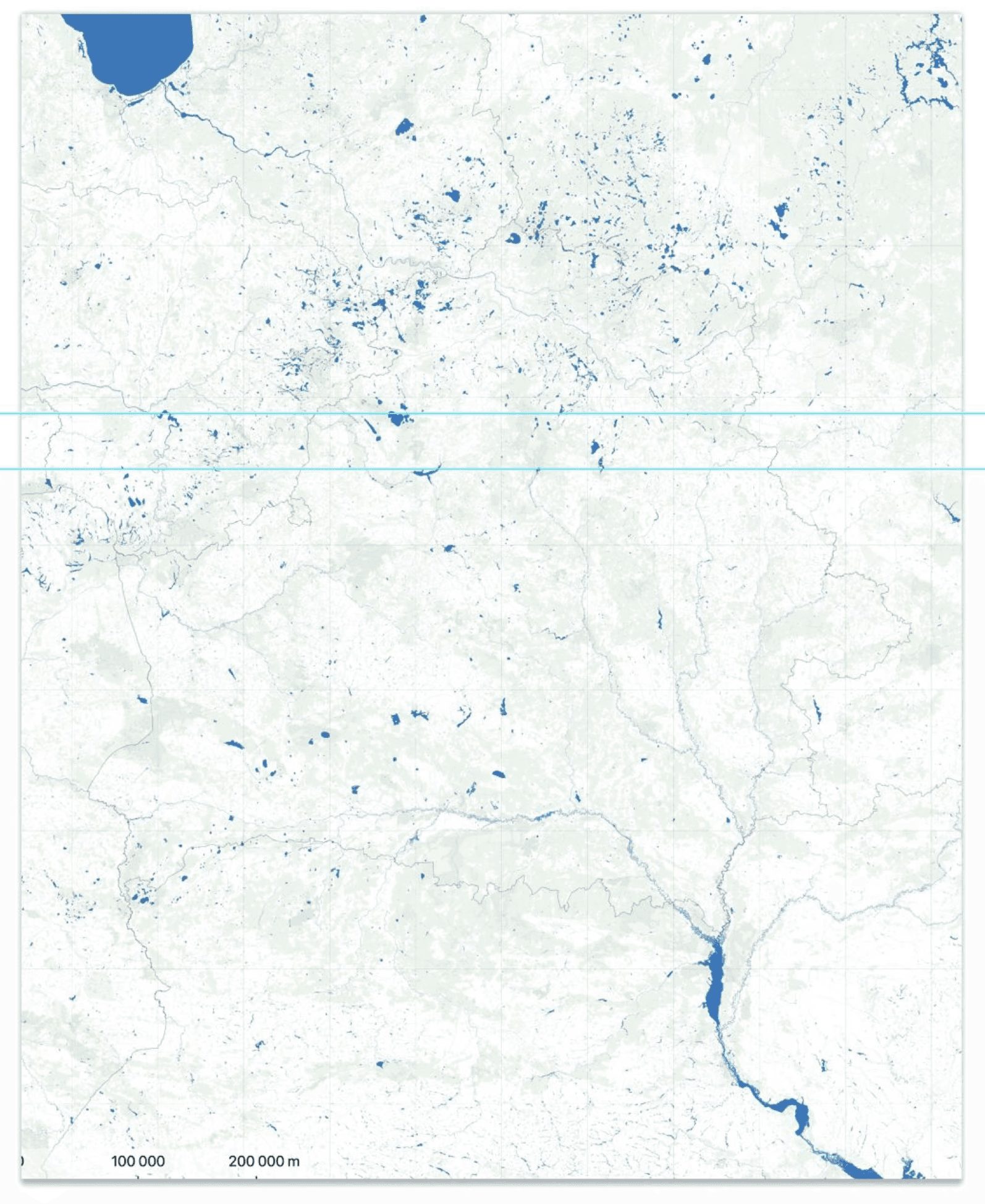
While studying these references, we decided that a book about nature should show natural places of interest on the map: rivers, lakes, forests. Meaning that it should not focus on settlements.
At first we decided that we wanted to make one general map for the whole book and separate, larger maps for each section of the book.
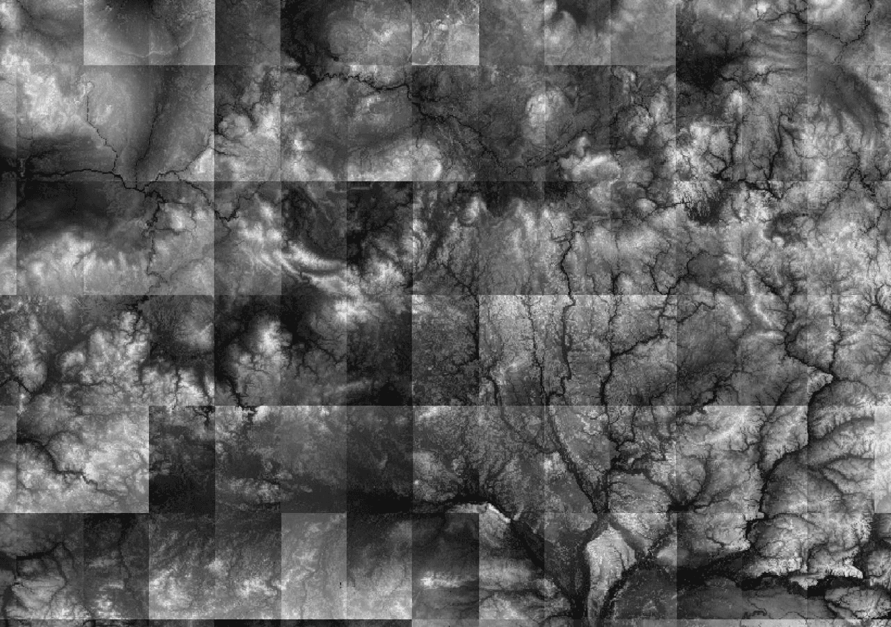
Here Slava is making a map for the book using Mapbox. He is removing towns and roads, leaving only the nature:
Trying to see if there is any relief in Belarus on the map
Inspired by the beautiful images of the islands, I asked Slava to add the relief to the map.
My message to an acquaintance who drew maps
Slava found names of settlements in Belarusian
A reference of a beautiful map illustration
Slava even made a beautiful map. That is, he took some raw data from somewhere and tried to render it onto a map according to his own rules. Slava tried to explain it all to me, but it was way too complicated.

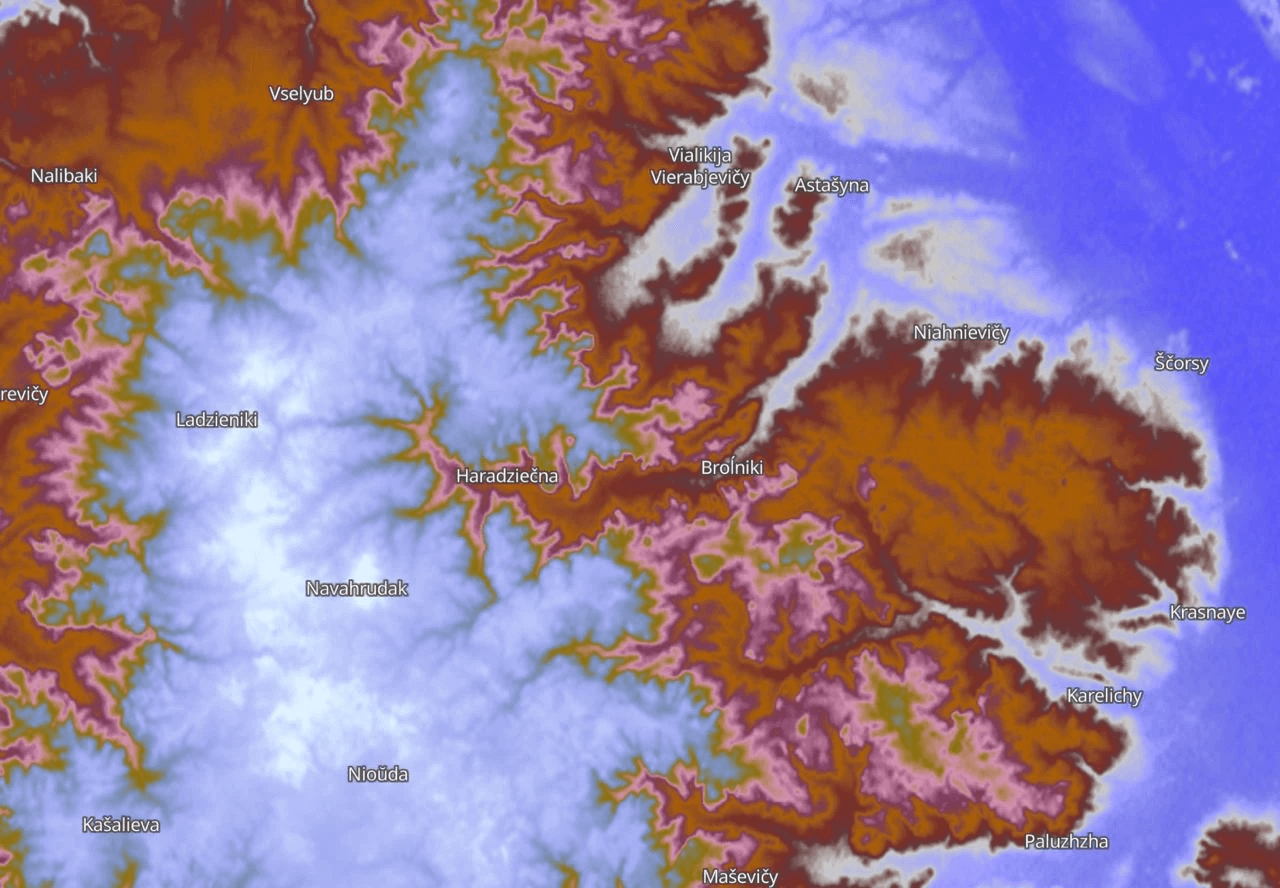
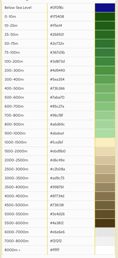
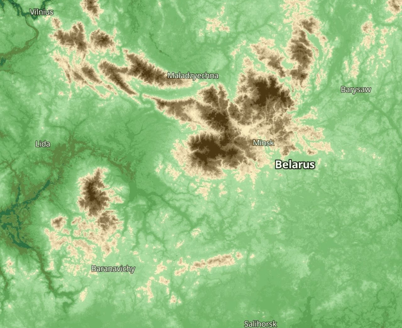
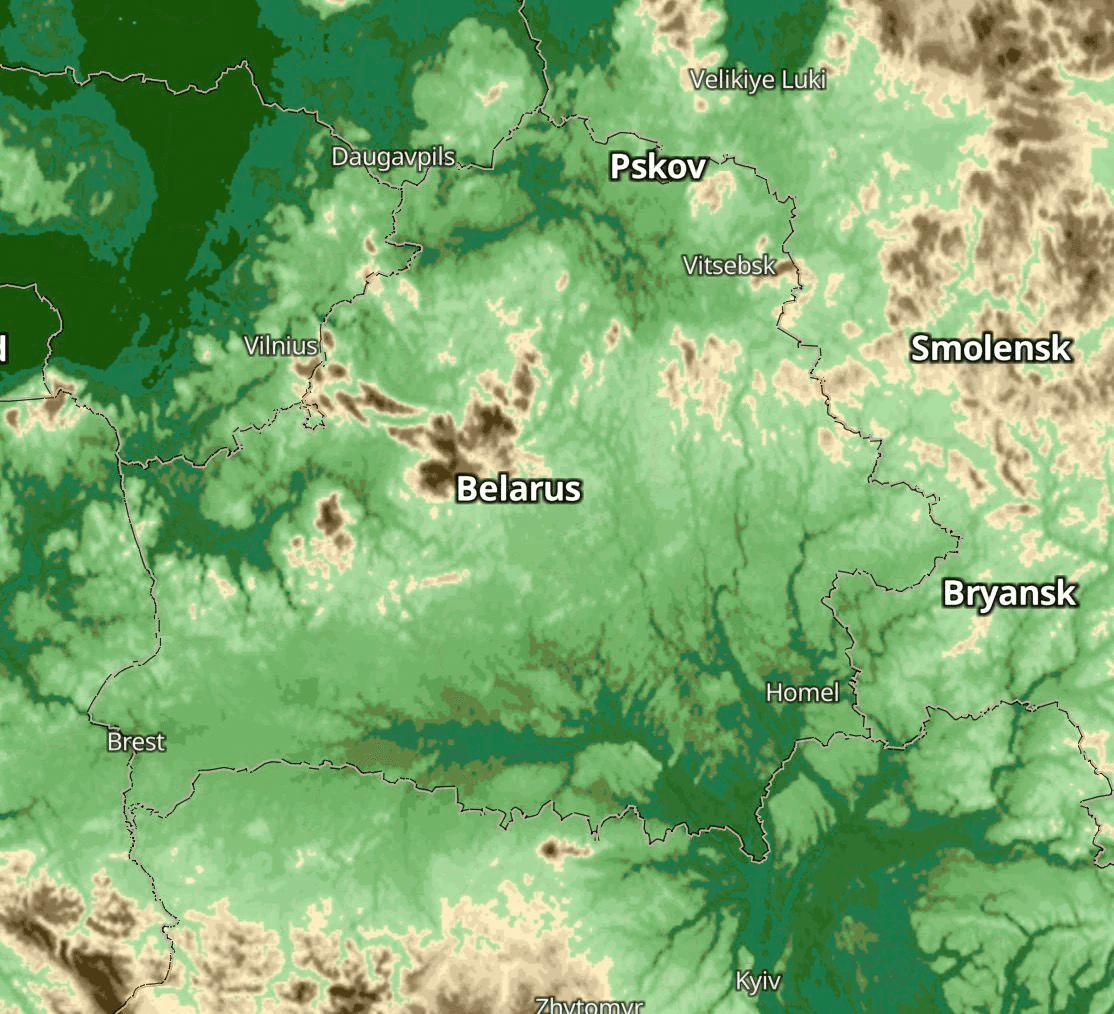
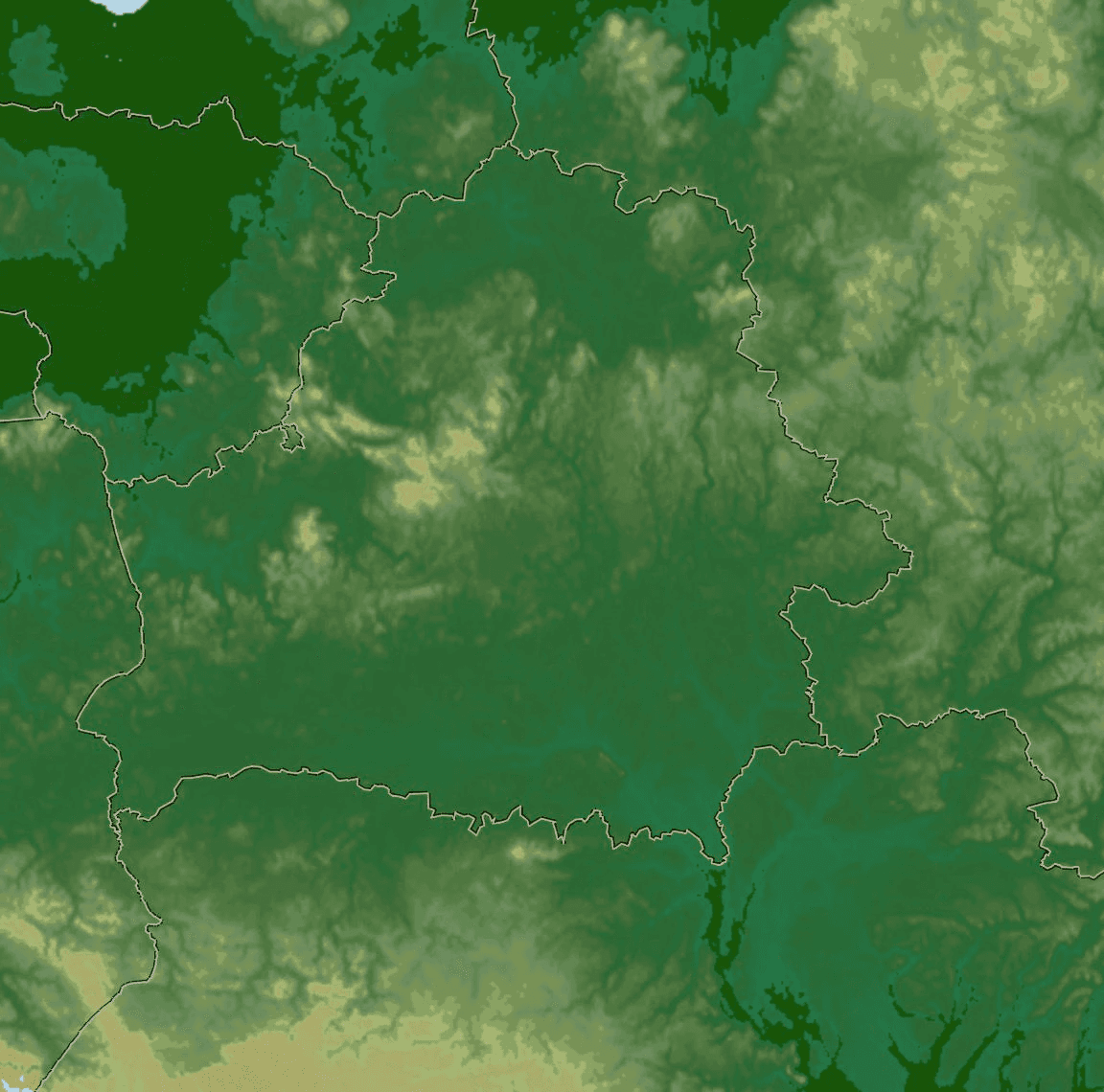
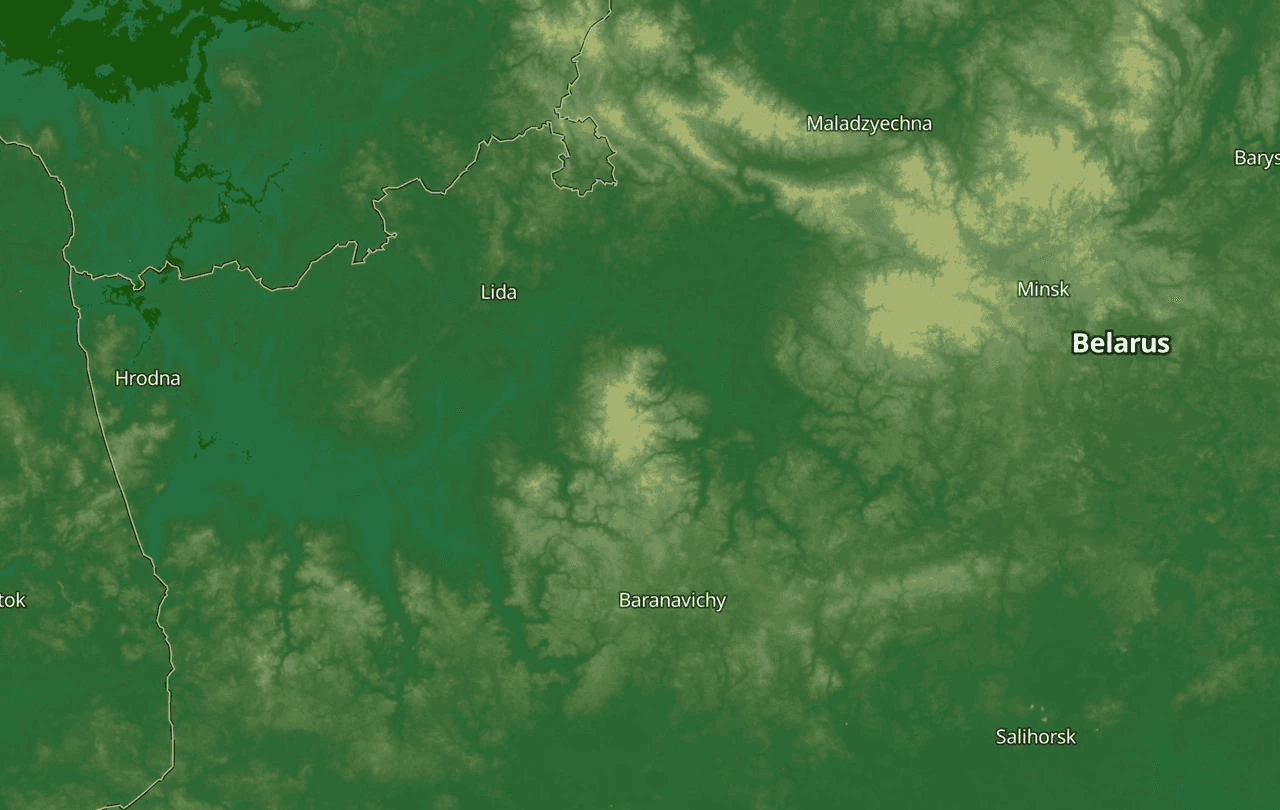
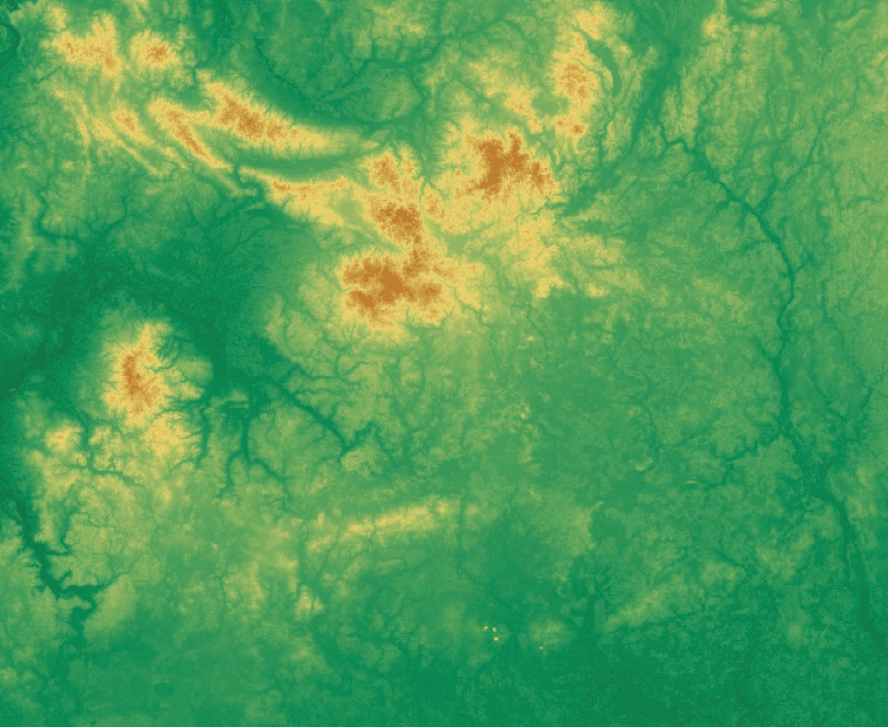
The relief
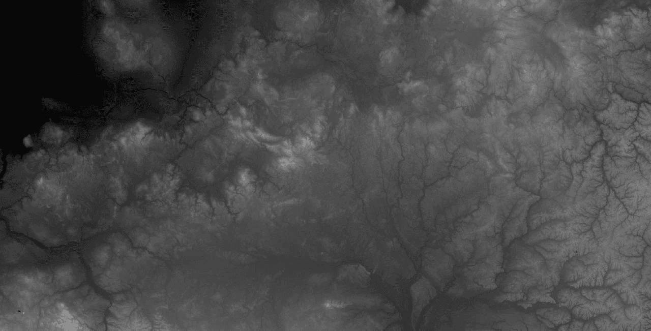
The blended relief
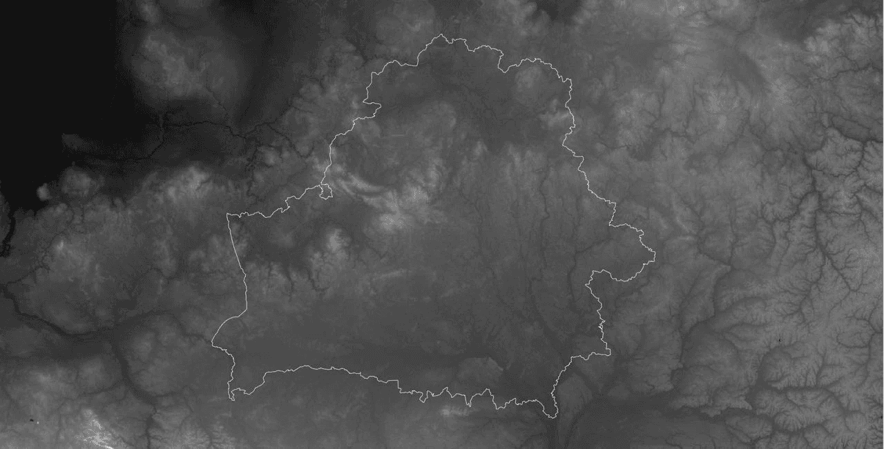
The contour of Belarus on the relief
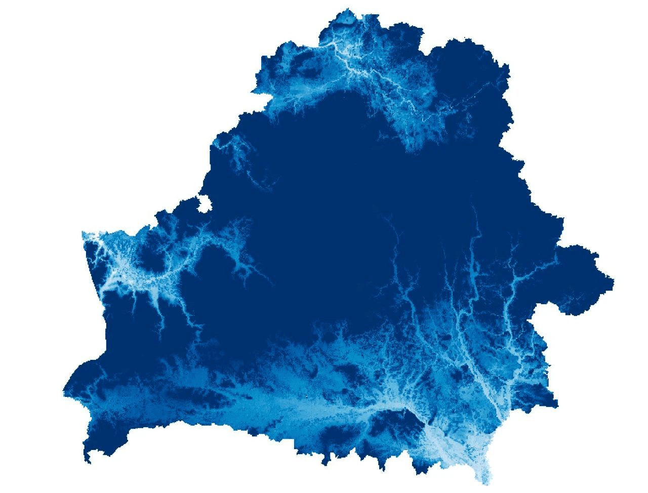
River basins
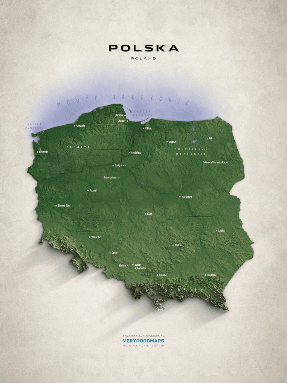
Reference maps
Colour references for the map (Source)
Colour references for the map (Source)
Lake Narach
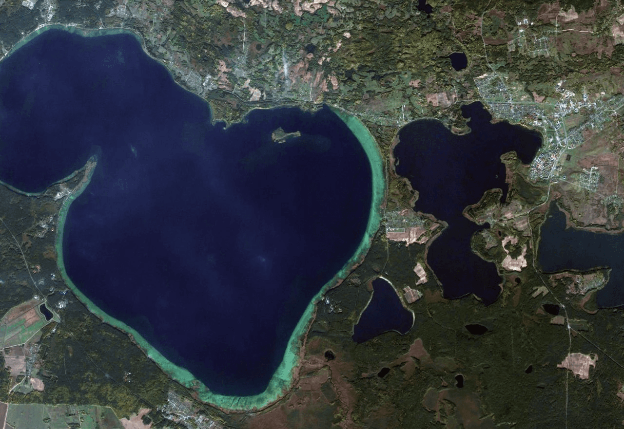
Lake Narach
The Jelnia bog, false color
The Braslav lakes
Lake Narach in winter
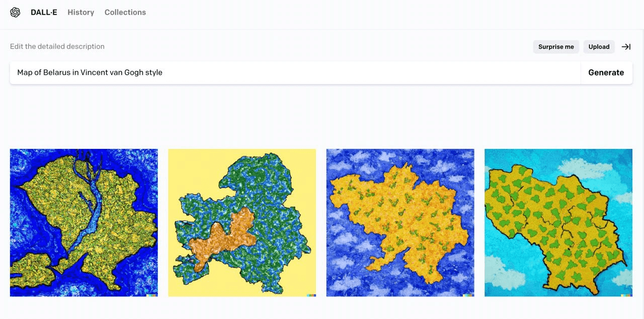
DALL-E and Midjourney for map creation
Midjourney
Midjourney
Midjourney + Photoshop
An idea to make the map from different layers (Slava):
An idea to add road routes to the maps (partially developed but not used)
An example of a route
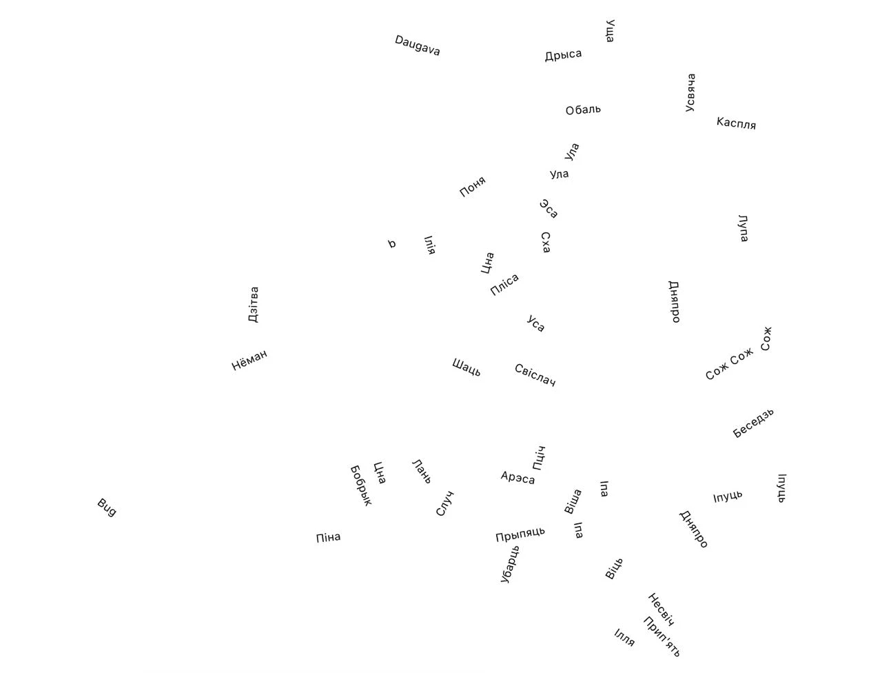
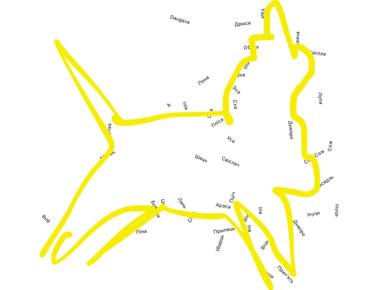
The rivers of Belarus in words on a map (Slava)
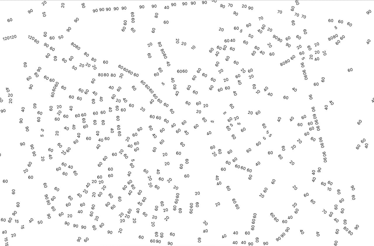
Max speed on roads (Slava)
Dzima: "I see a unicorn.”
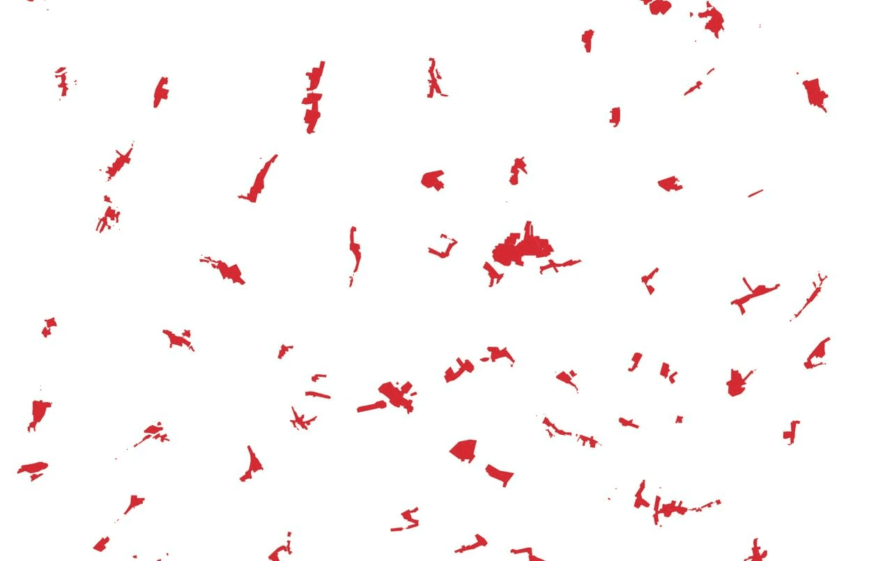
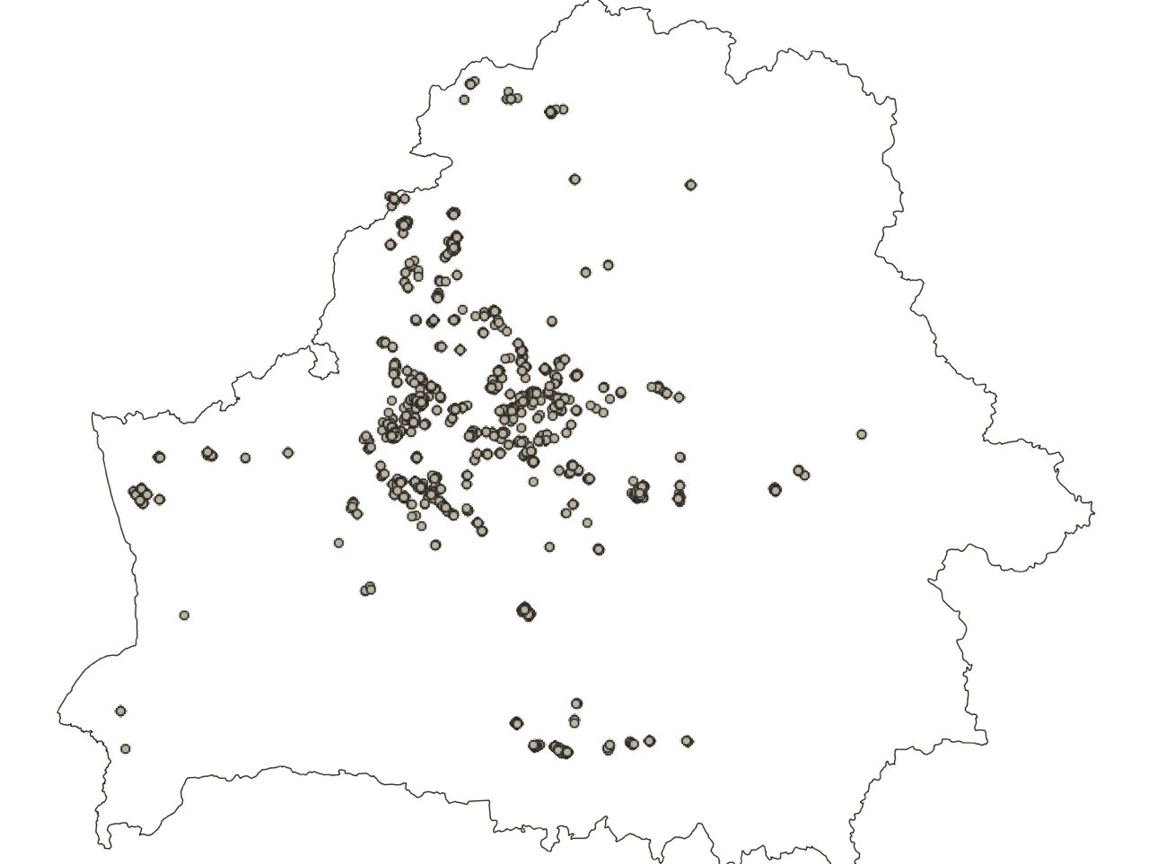
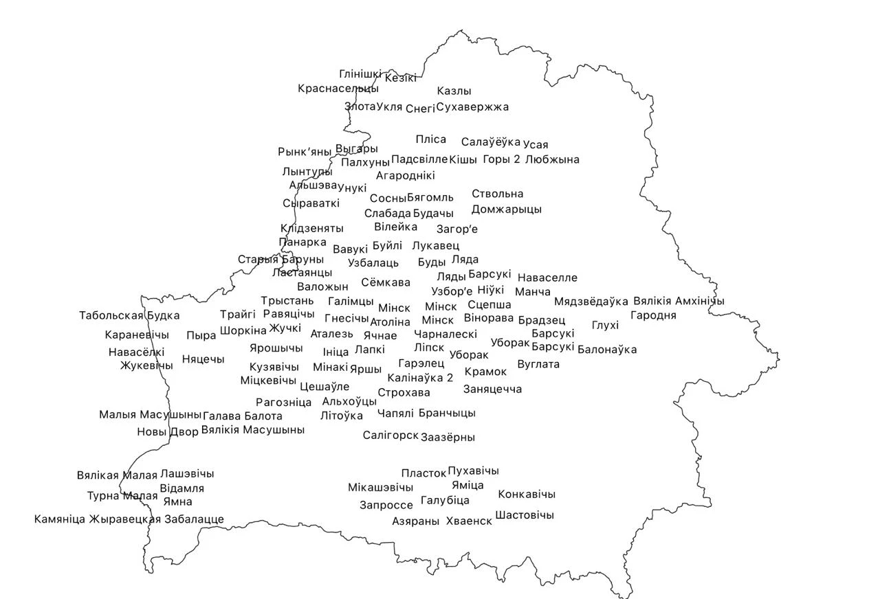
Villages
Cities and villages
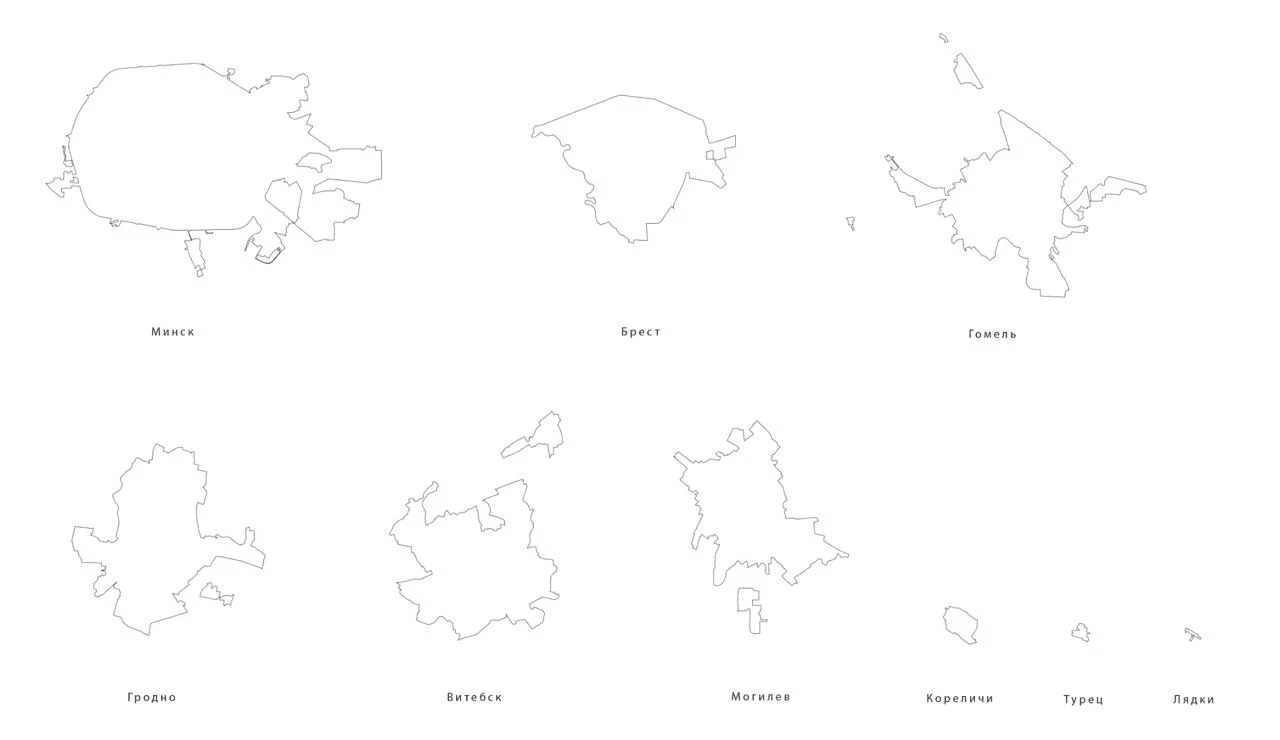
Settlements with the name “Navasselki”
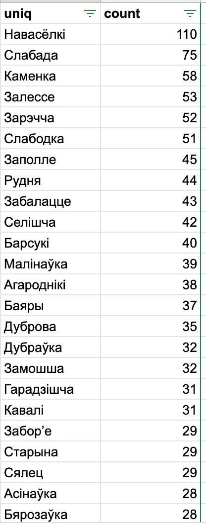
The most popular settlement names in Belarus and their quantity
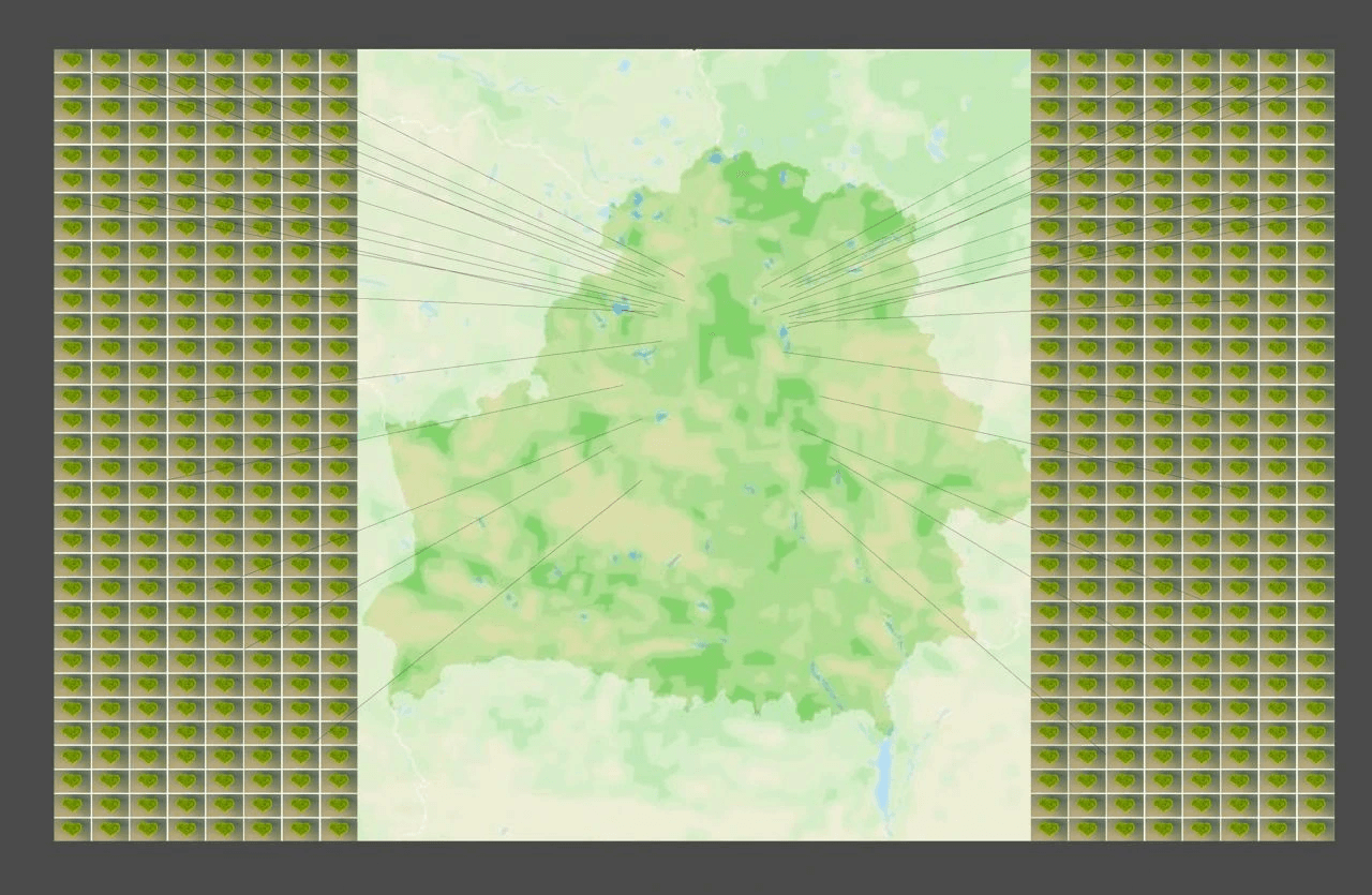
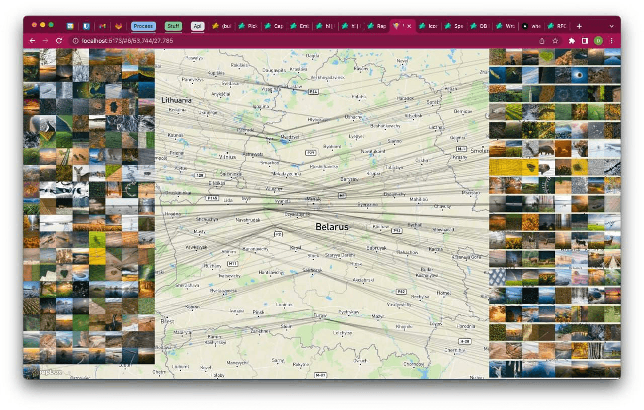
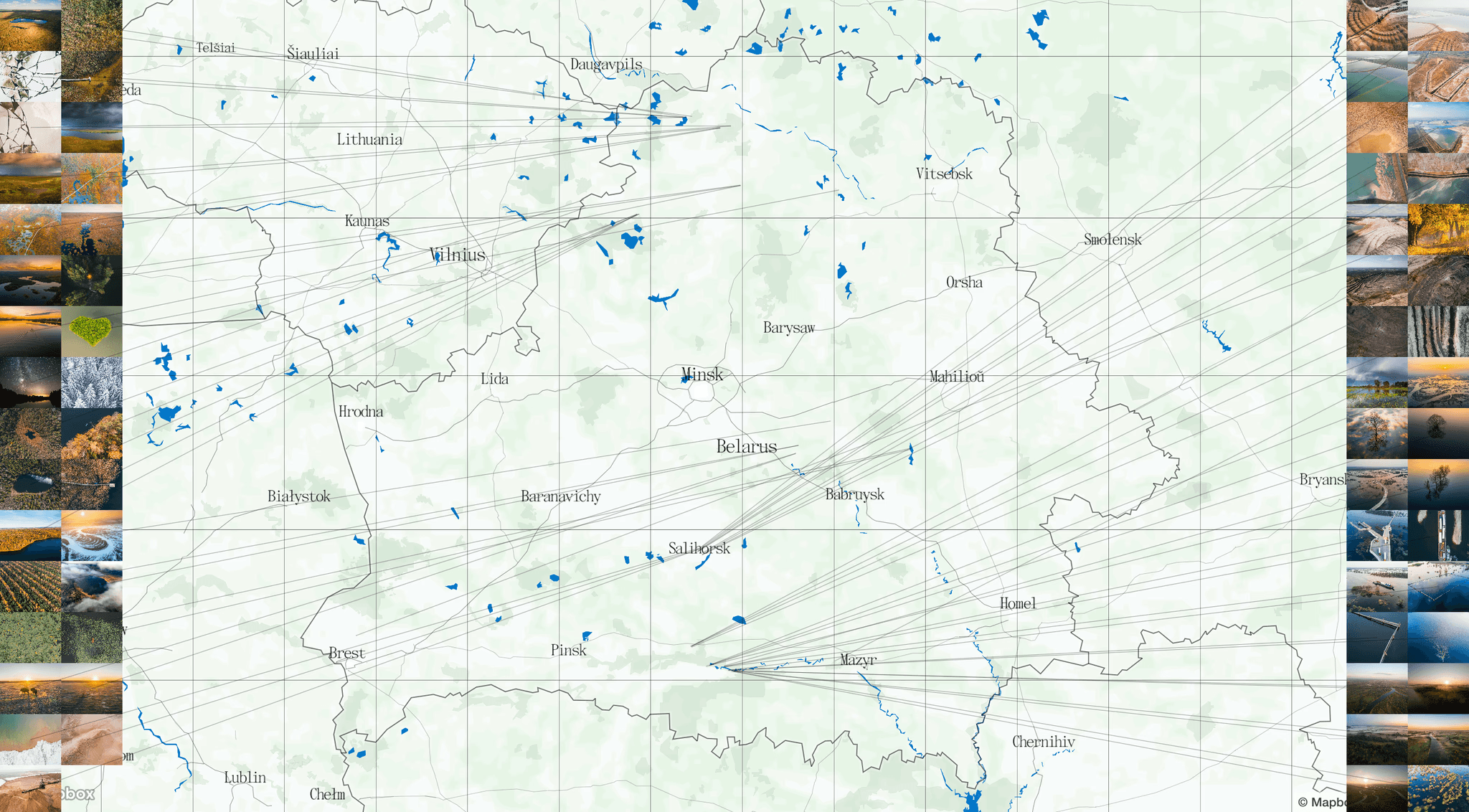
Photos from the book on a map
Settlements near which the photos were taken
At the time, Slava made a million different maps. In the process of searching for the right one, there was an idea to display settlements in the shape of Belarus. This is how another project — Veska — began. “Veska” means village in Belarusian.
Veska
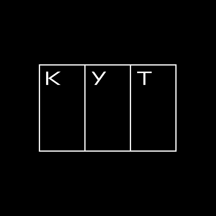
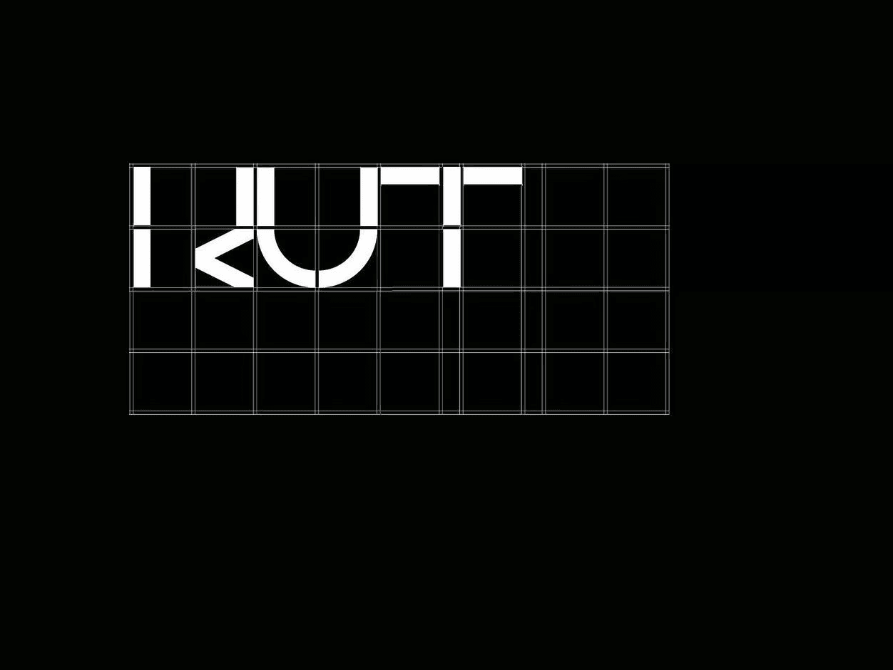
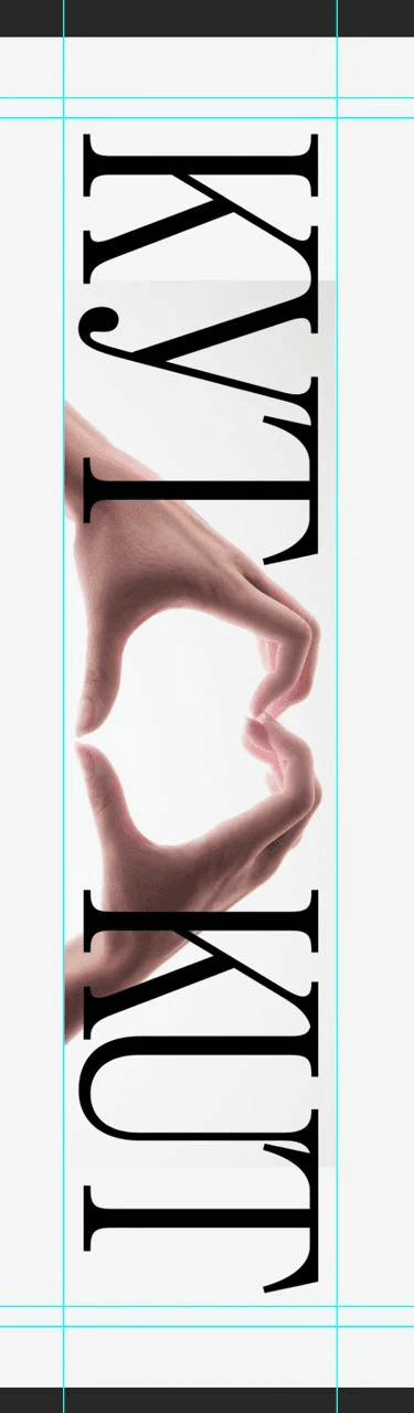
After we overlaid a coordinate grid onto the map, numbered the modules and then added “KUT” at the beginning, the idea for the future logo of the project was born.
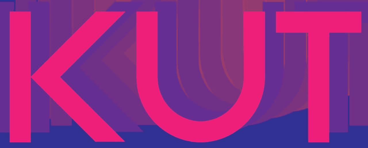
Ikuta Sans
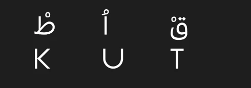
"KUT," written in Belarusian Arabic (above) and Latin (below)
We then had an idea to display all the photos of the book connected to points on a map using threads, like detectives do in films, but it turned out to be too confusing.
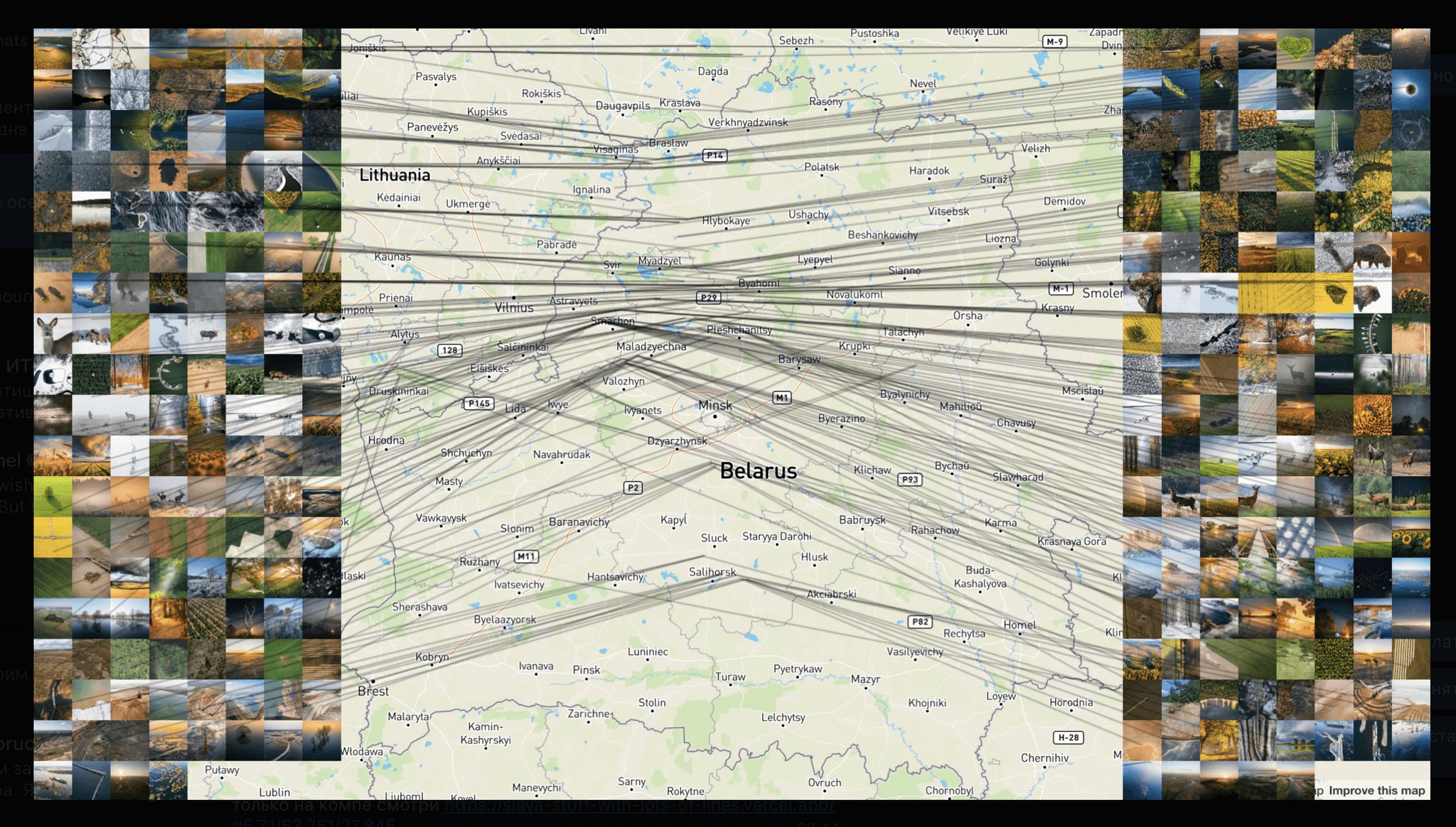
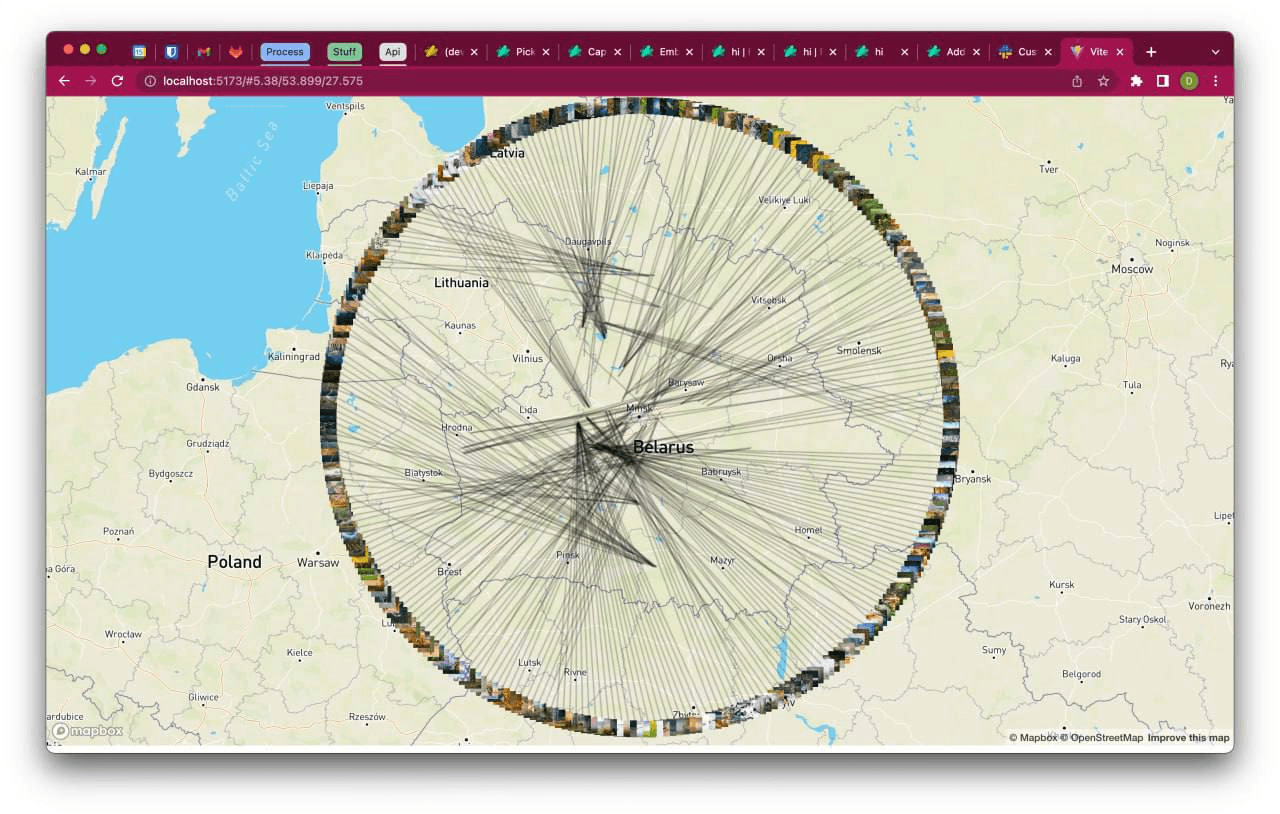
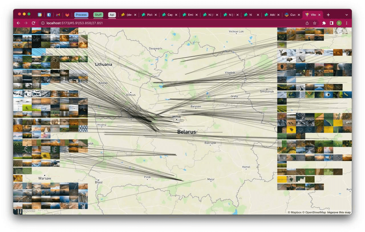
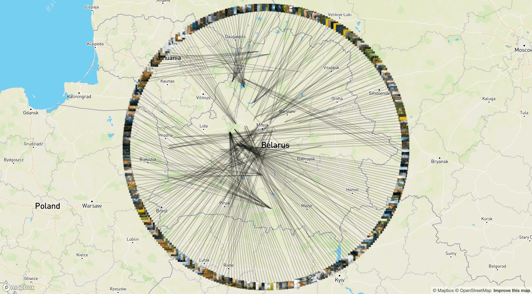
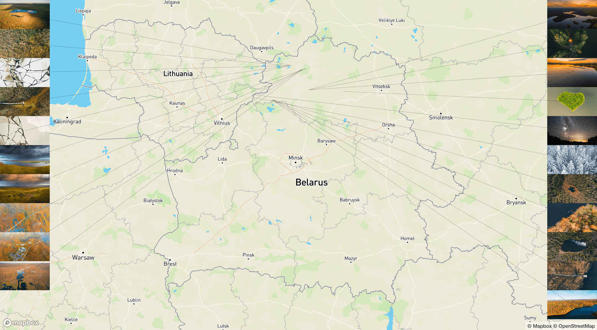
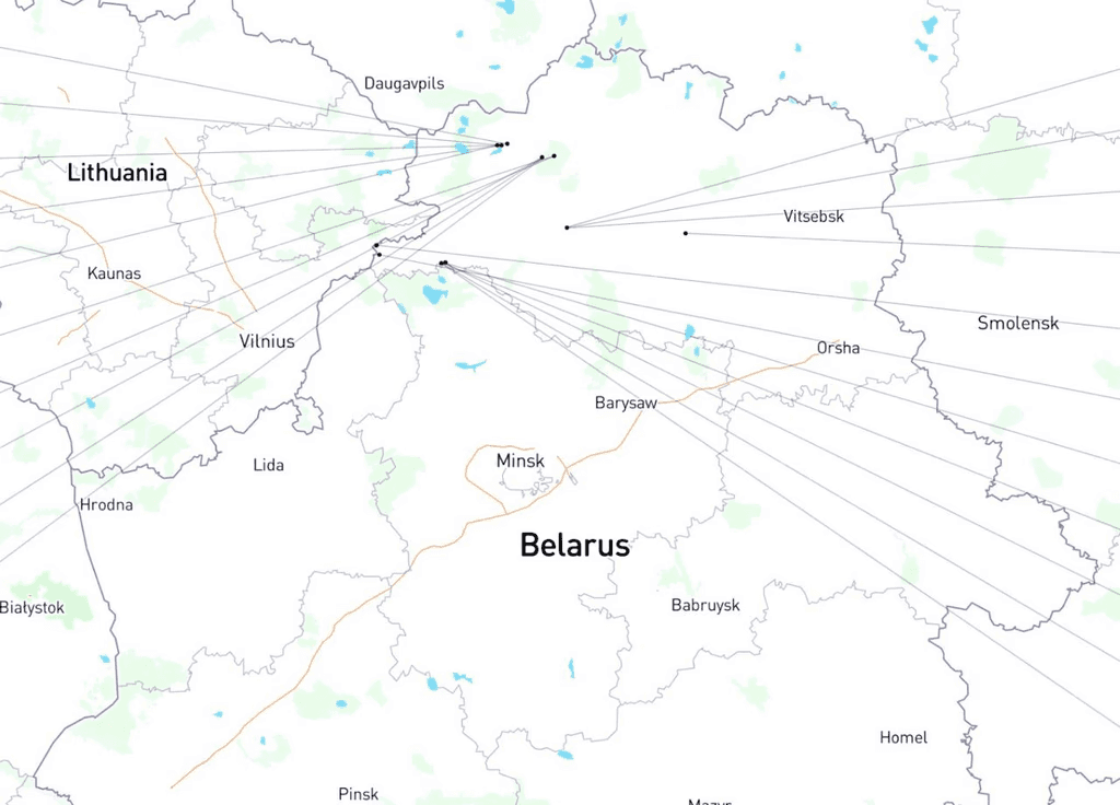
Another meeting to develop the map
The concept of a pink map (Slava), developed partially. Was not used
The concept of a pink map (Slava)
The concept of a pink map (Slava)
The concept of a pink map (Slava)
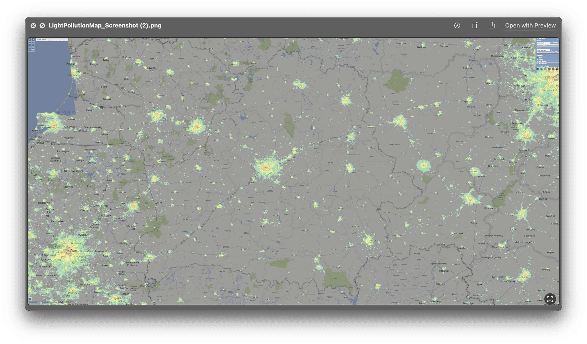
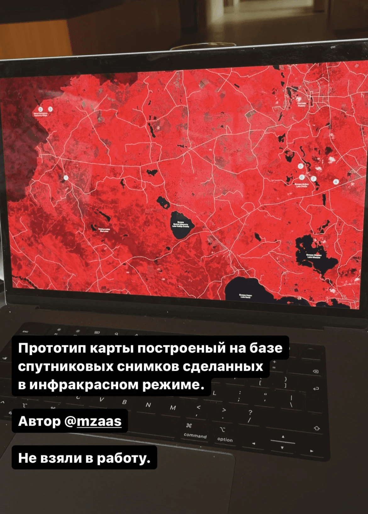
An idea to use a light pollution map (Slava, not used)
Light pollution in Minsk
An interesting side note about Belarus. A map is a projection of a sphere (i.e. the Earth) onto a flat surface. All maps are inaccurate as this projection causes distortions.
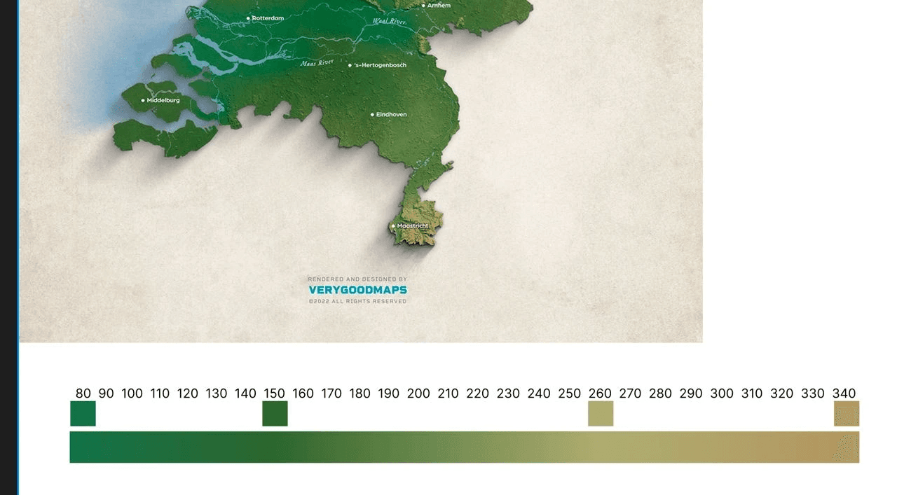
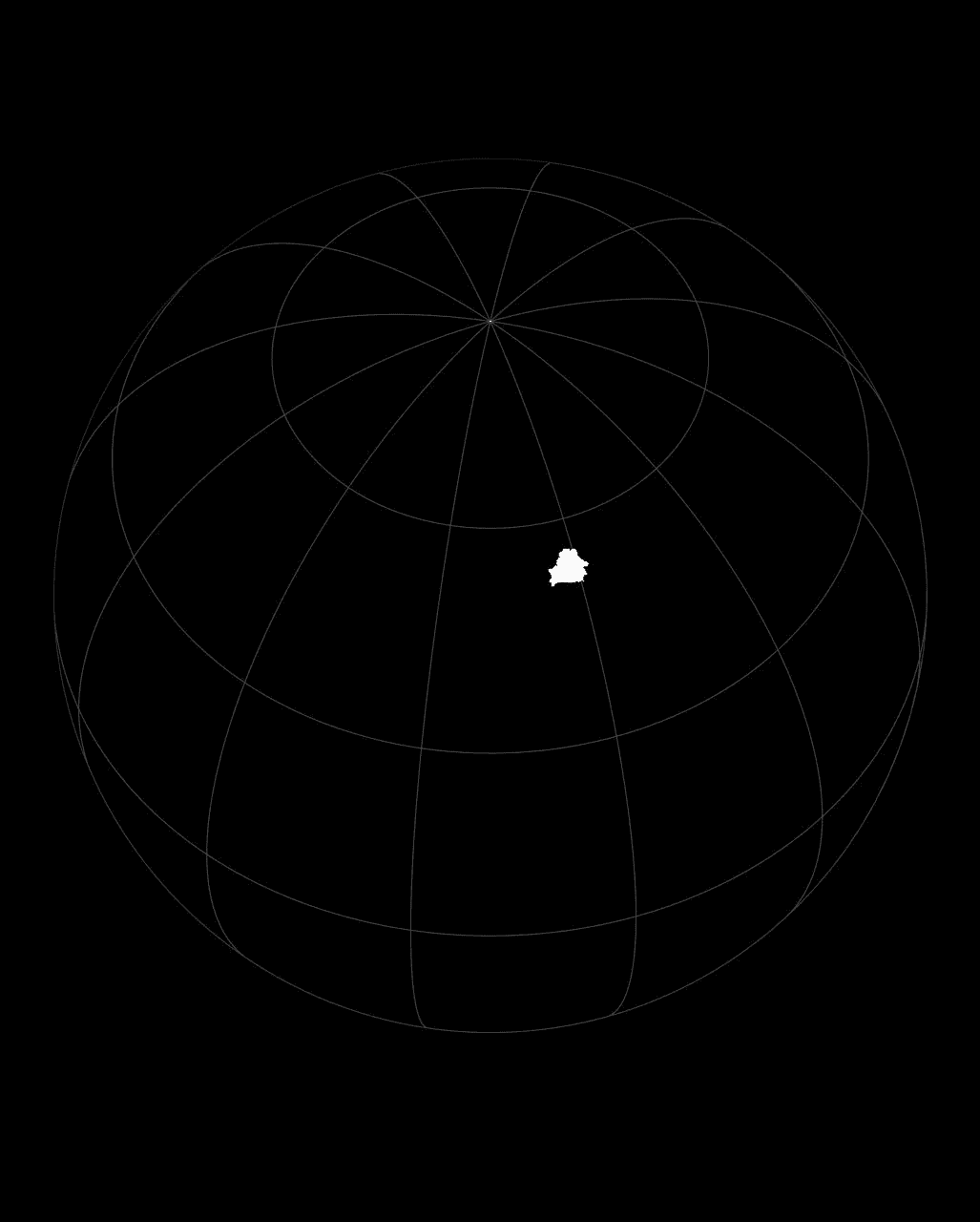
The most popular project is the Mercator projection. We see it, for example, on Google Maps. But there are many other projections. The contour of any country will have a different size and shape depending on the projection used. The contour of Belarus that we are all familiar with with built on the basis of the Mercator projection. I decided to see how Belarus would look using other projections. However, it turned out that, due to the peculiarities of the position of Belarus, the contour stays almost the same.
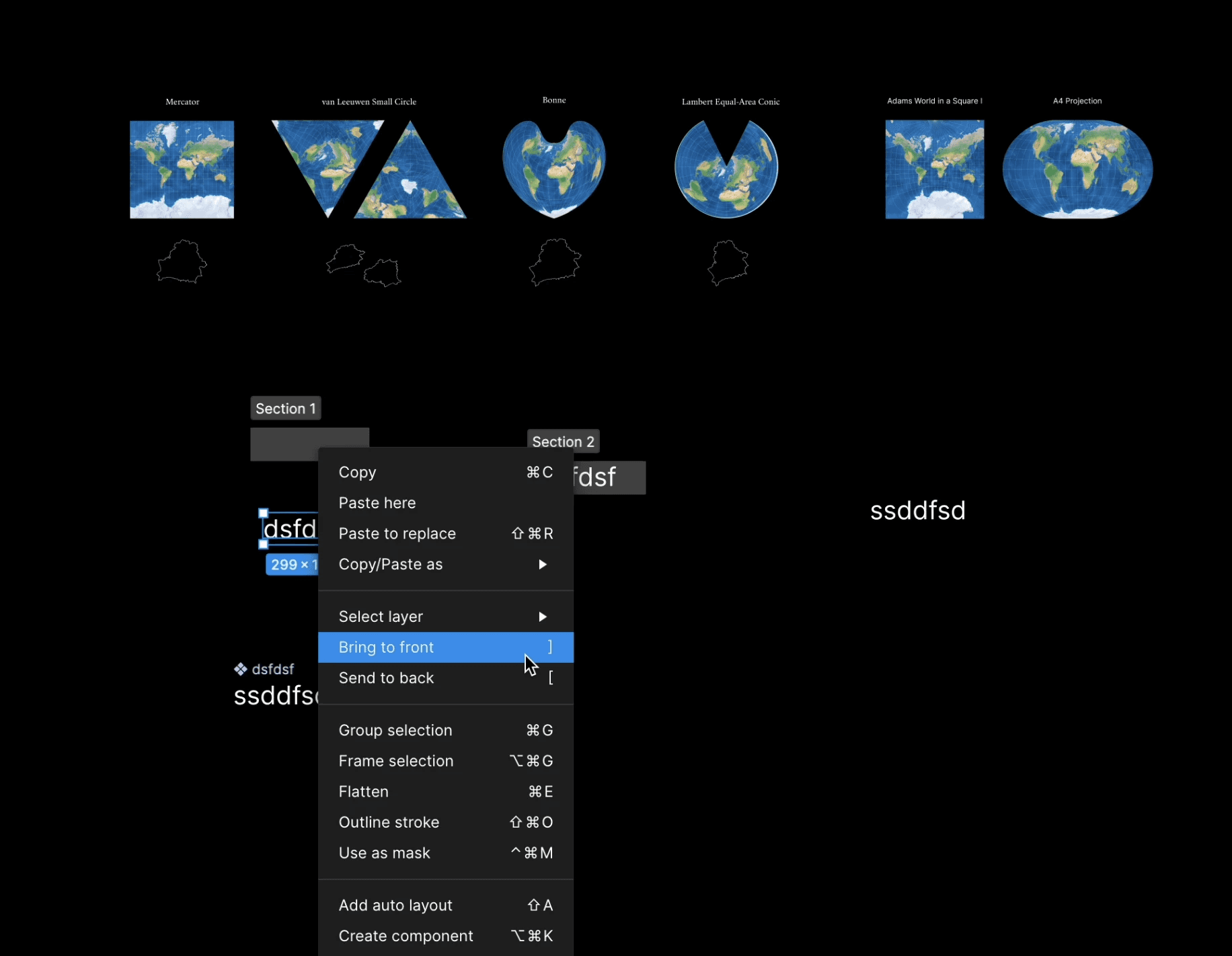
Di explores how the shape of the contour of Belarus looks like in different projections of the sphere onto a flat plane
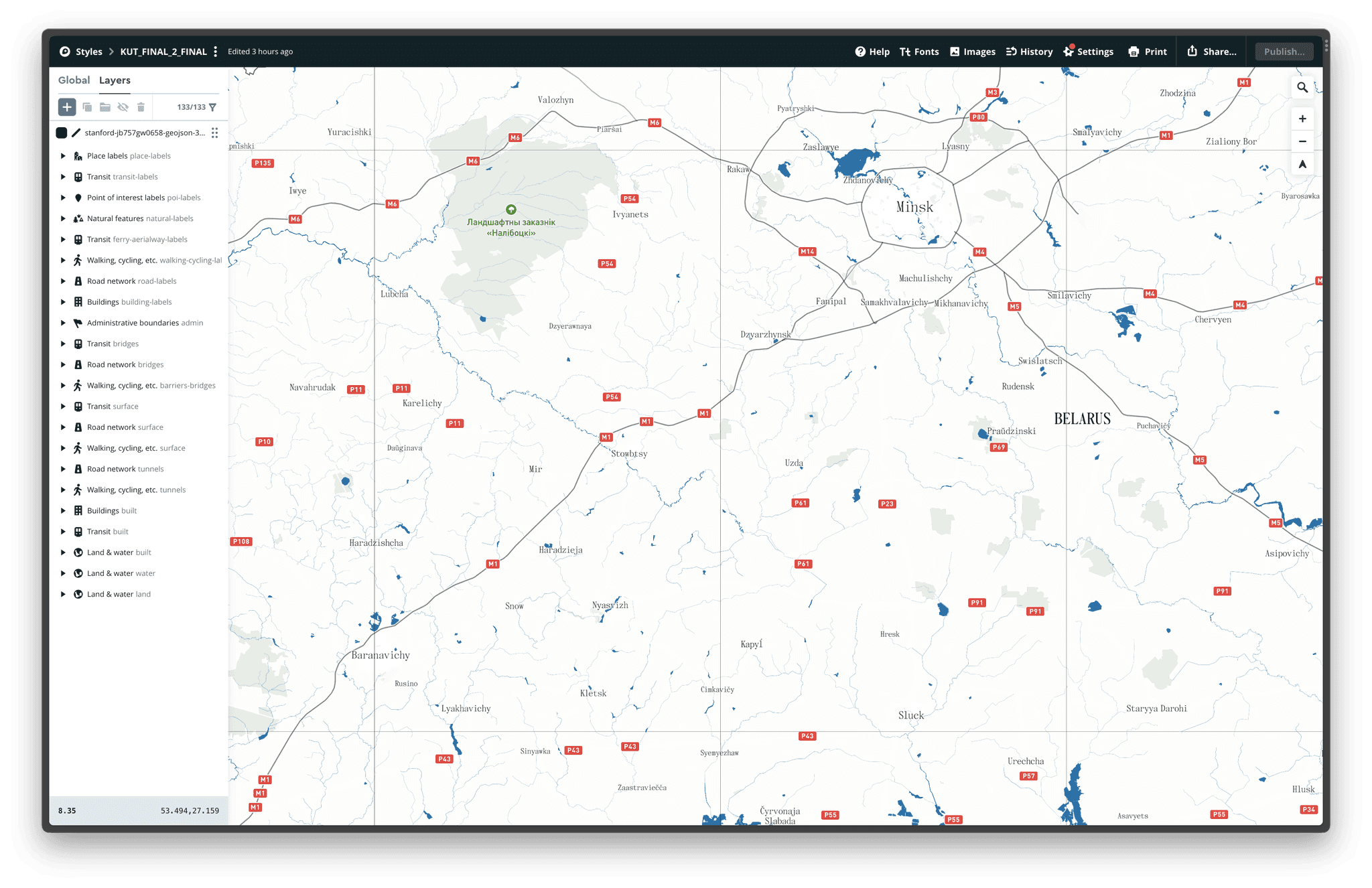
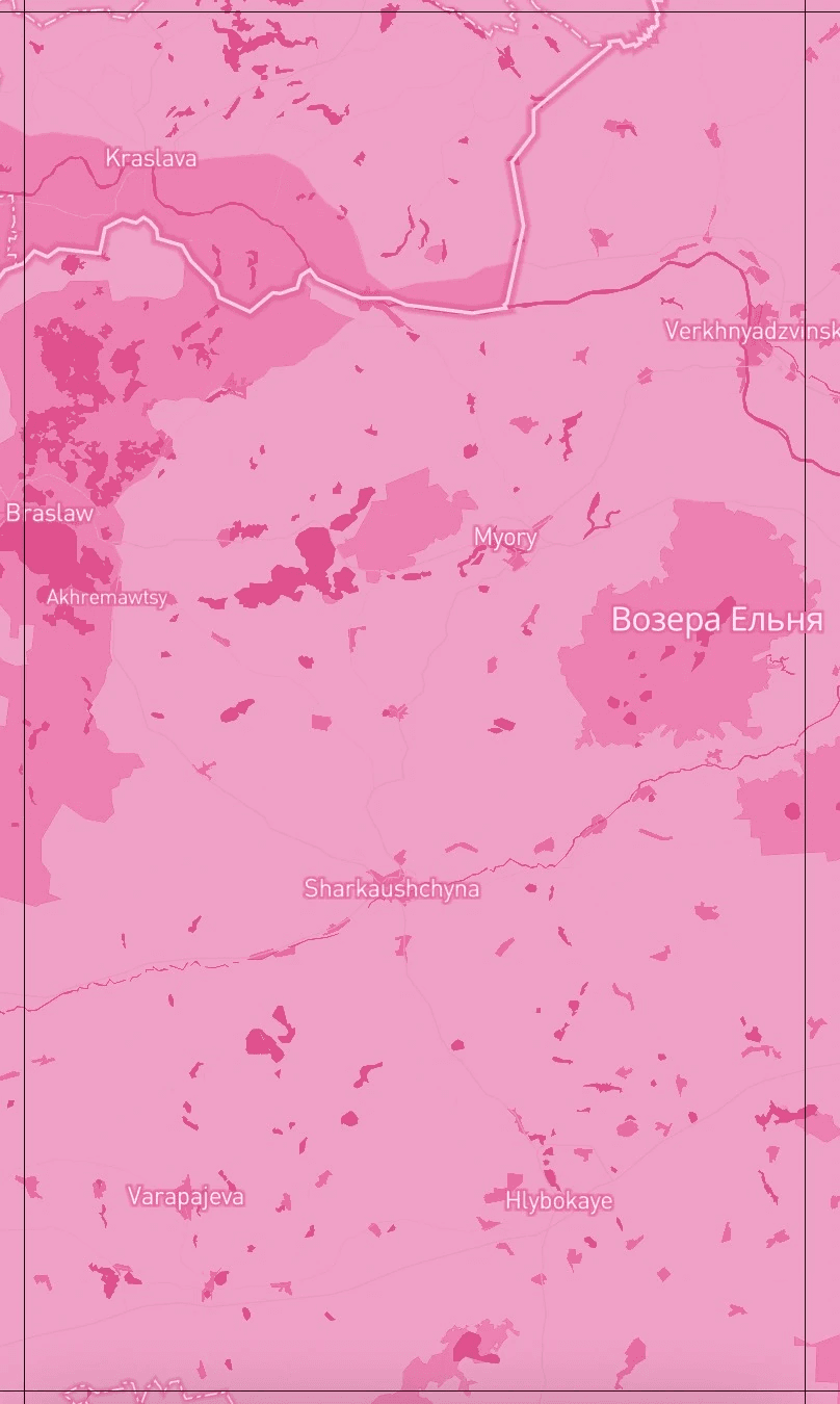
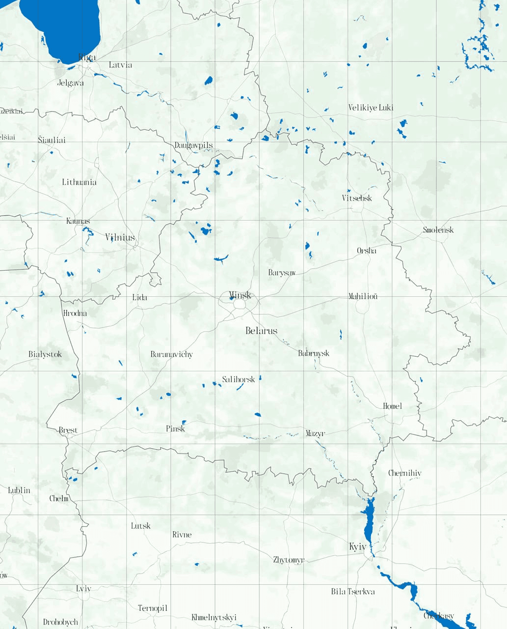
Developing the style of the map in Mapbox
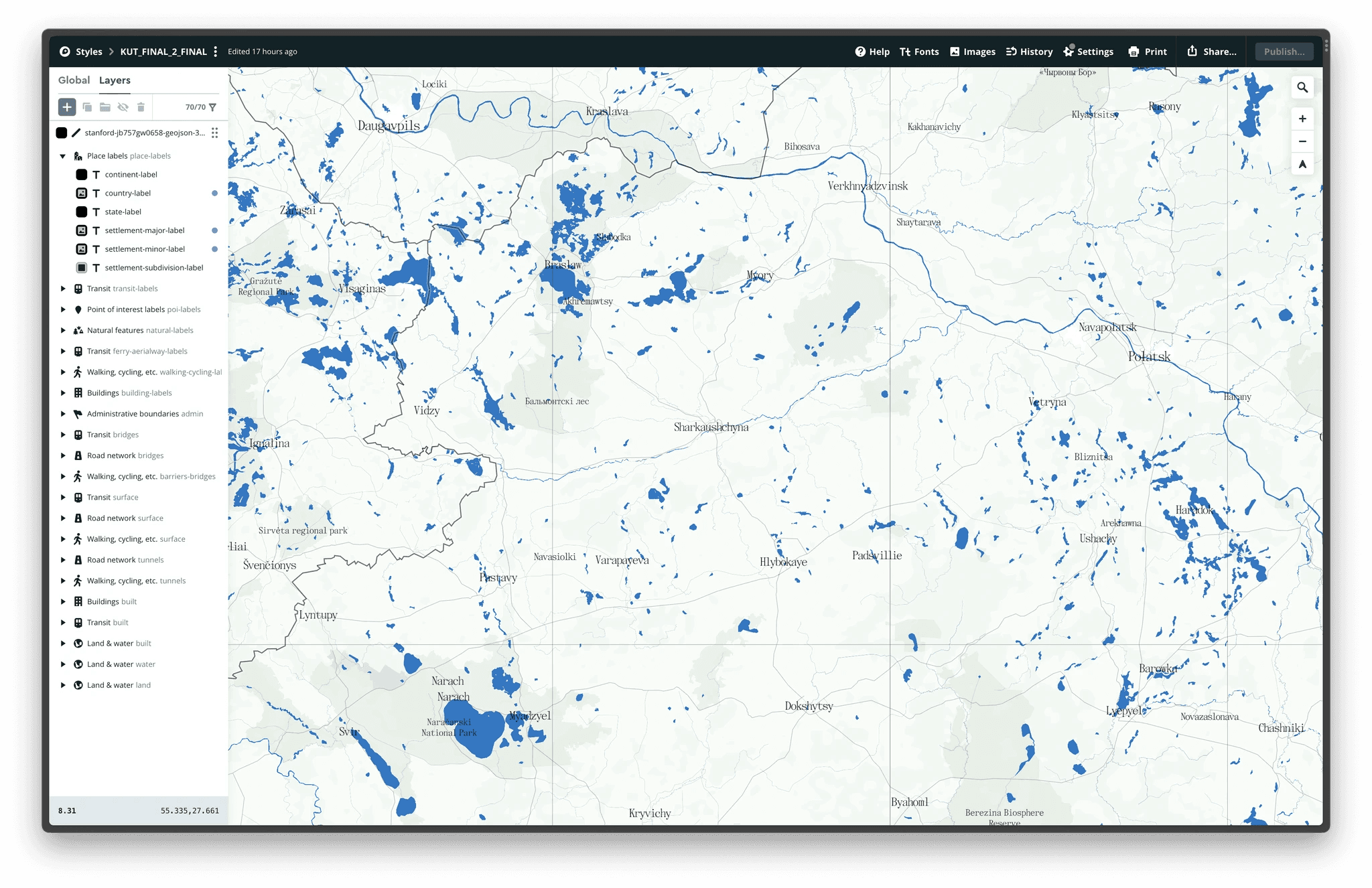
Developing the style of the map in Mapbox
Book contents
The contents in the pilot version of the book
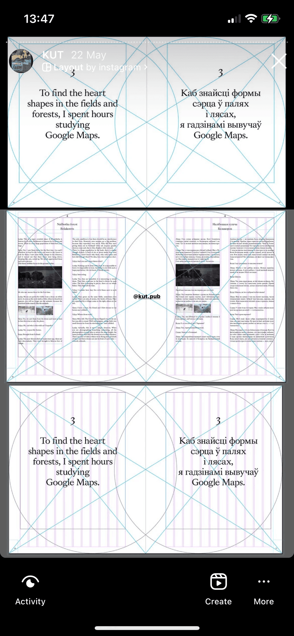
DESIGNING THE READING FLOW (THE UX OF THE BOOK)
We designed the book using the "reading flow" method, by describing use case scenarios. It may seem odd, like, what do you need a method for? It’s a book! You take it and read it. But that’s not really true. Coffee table books are not simply “read” - people flick through them, look at the images, read different parts, look for something and so on.
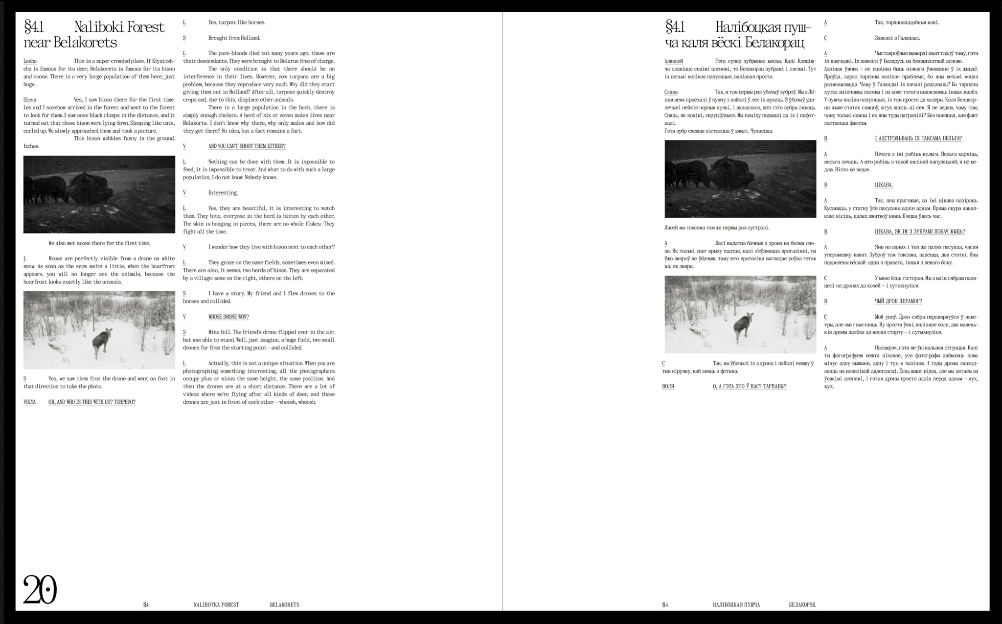
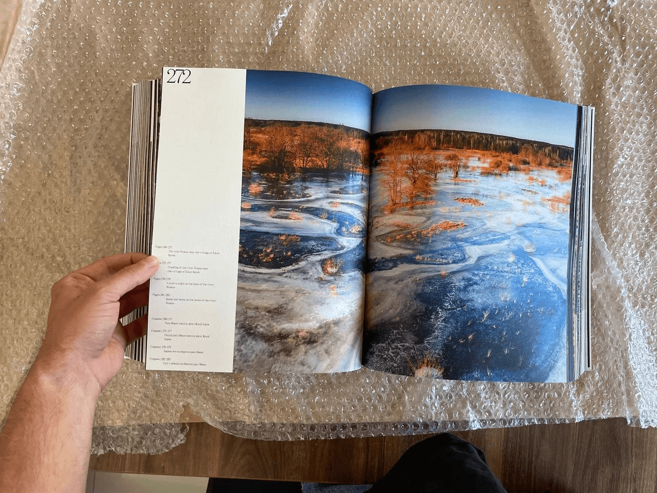
Our book has a variety of “flows”: you can open the book from the end, find a town or village in the index and look at the photo on the corresponding page. You can also just flip through the book and look at all the photographs in order. You can look at the photos as though you are in a museum, sometimes leaning in to read the captions - what the photo is of, where it was taken. You can read only the quotes or immerse yourself in the stories.
First drafts in inDesign, 2022
Step 1. We open the book. A black pastedown and a blank black spread
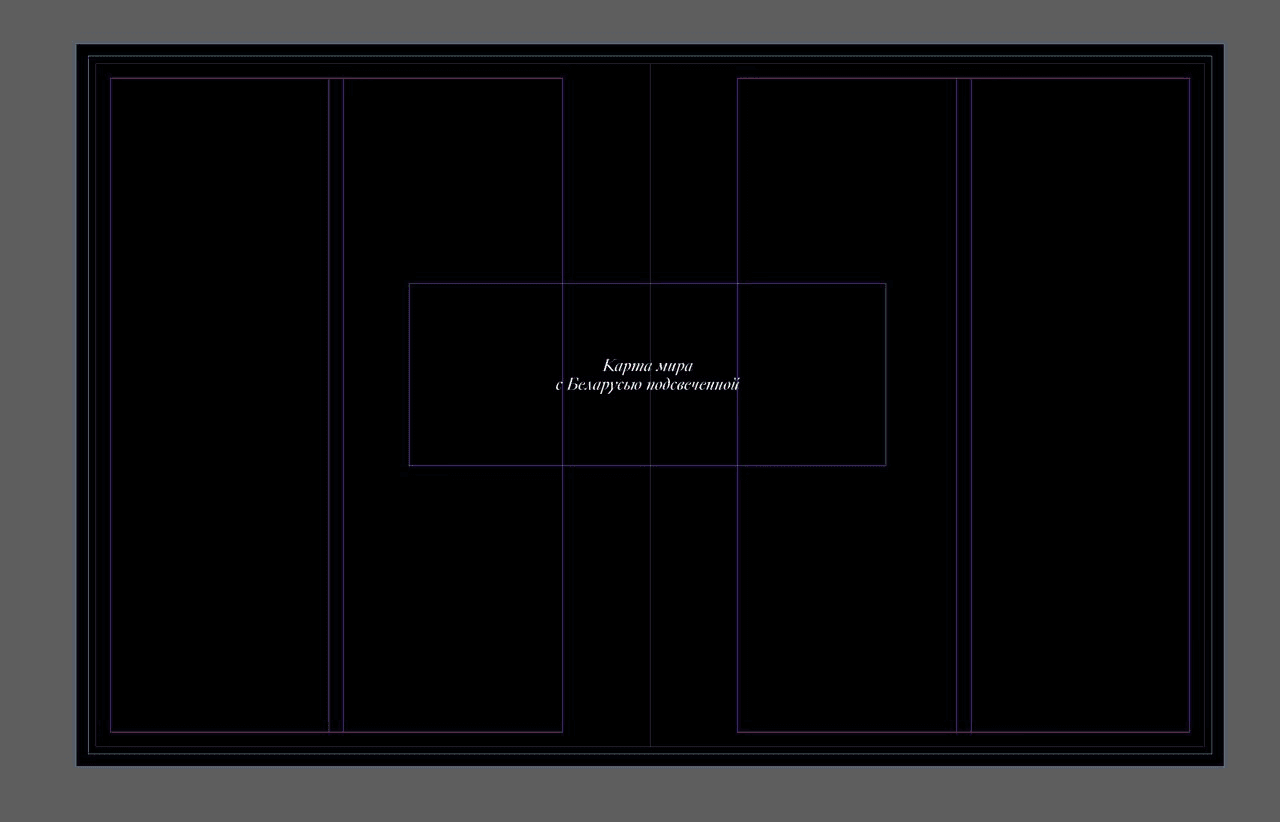
Step 2. We flip the page. A map of the world with Belarus highlighted across the whole spread (the map hasn’t been made here yet - denoted in words)
Step 3. We flip the page. Book title and information
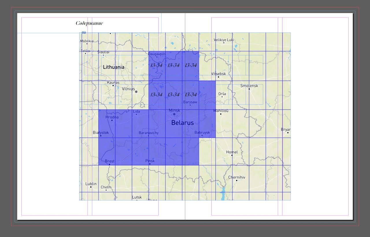
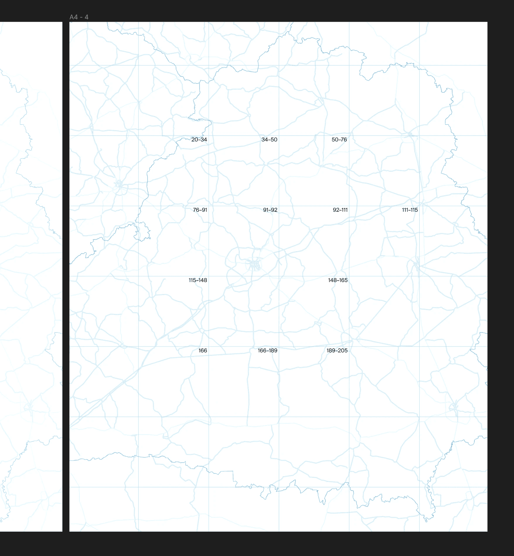
Step 4. Book contents with a map of Belarus and the modules. There are page numbers of the book on each module
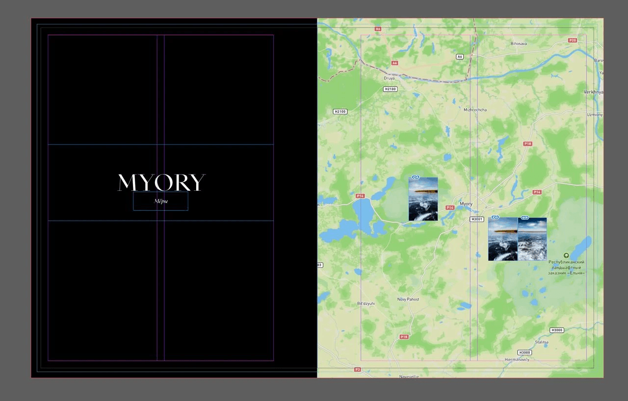
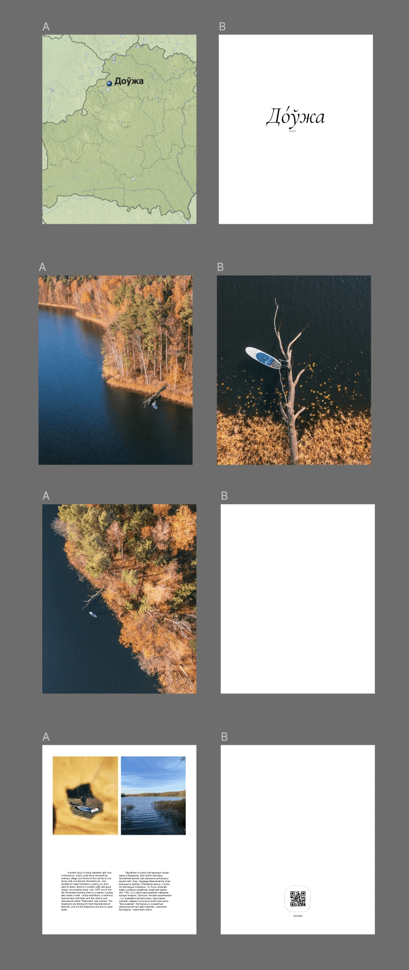
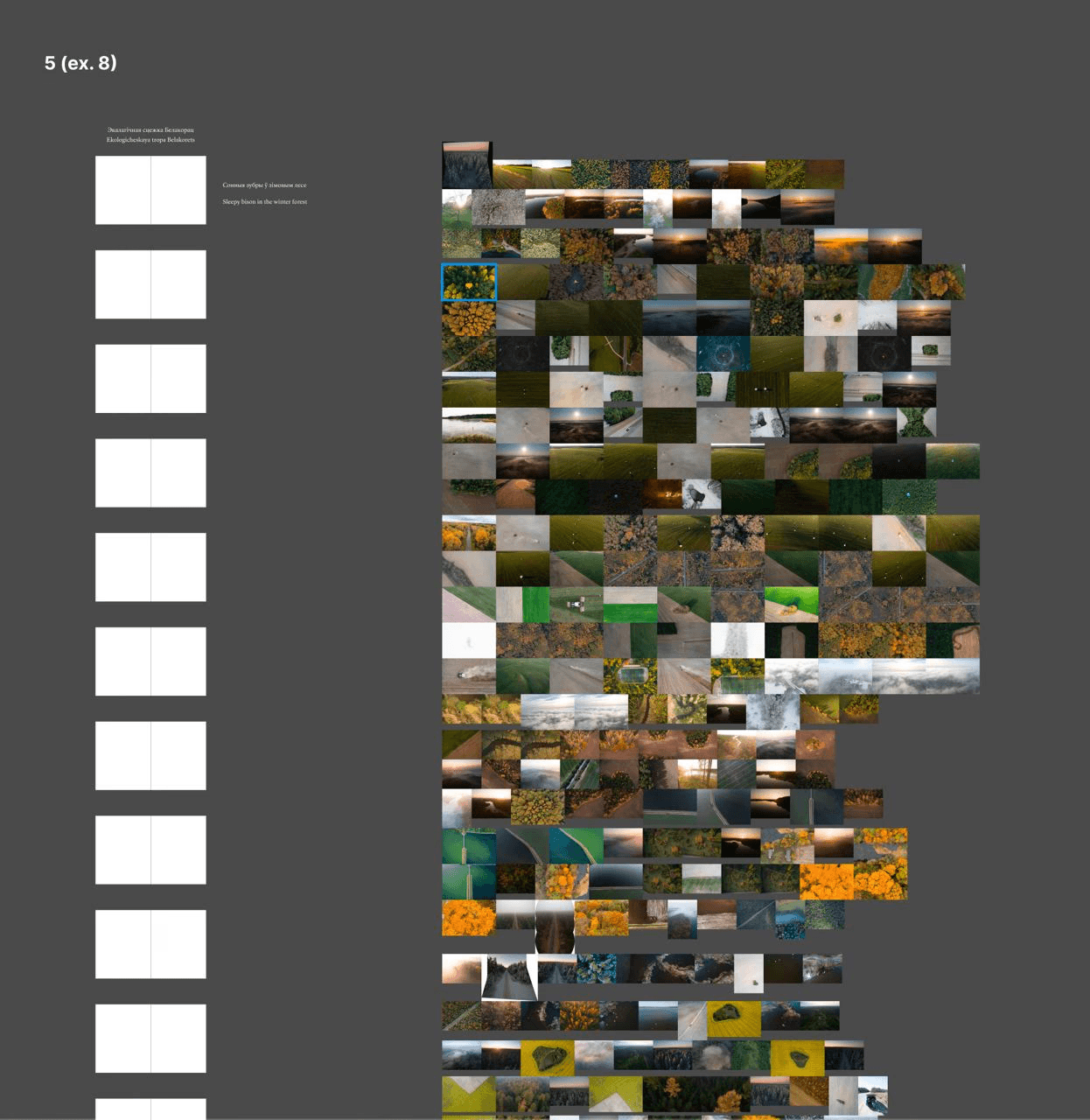
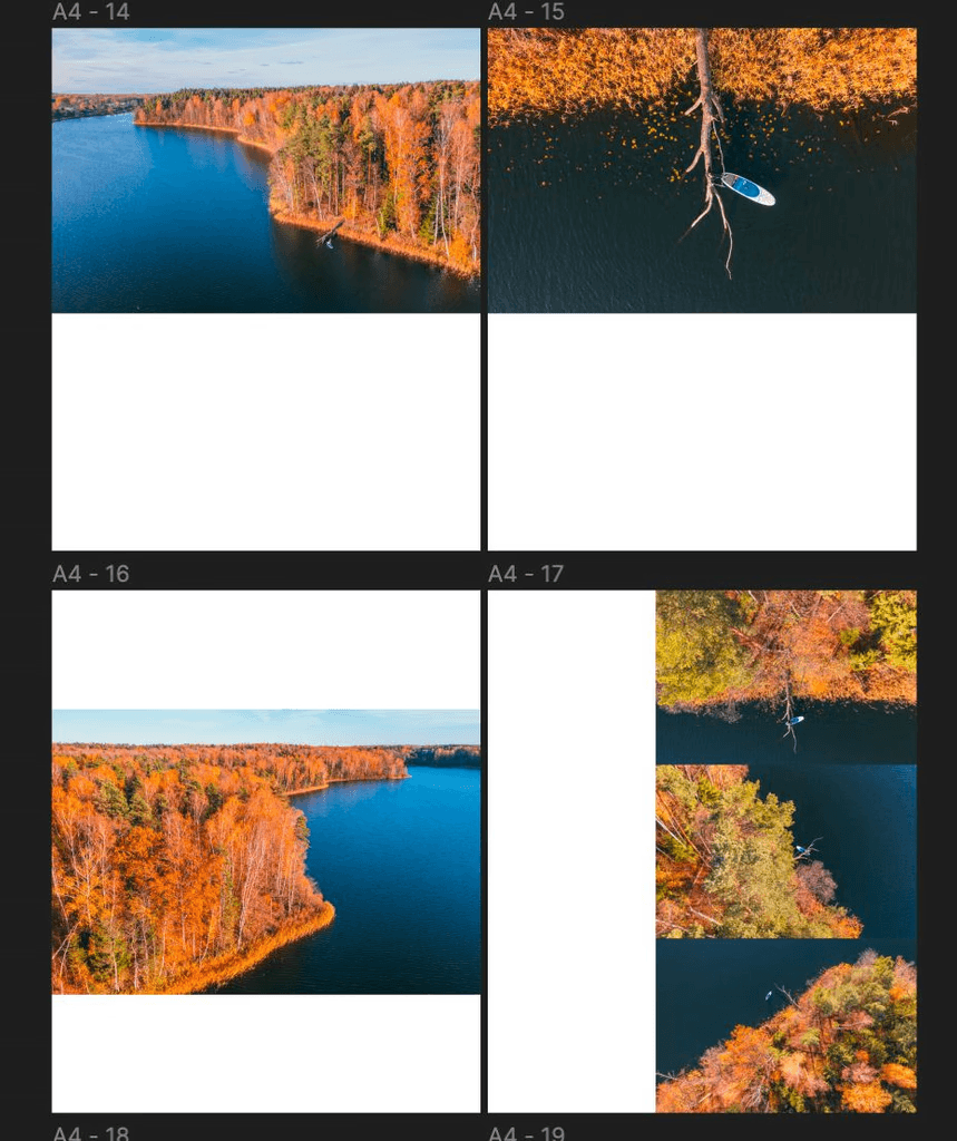
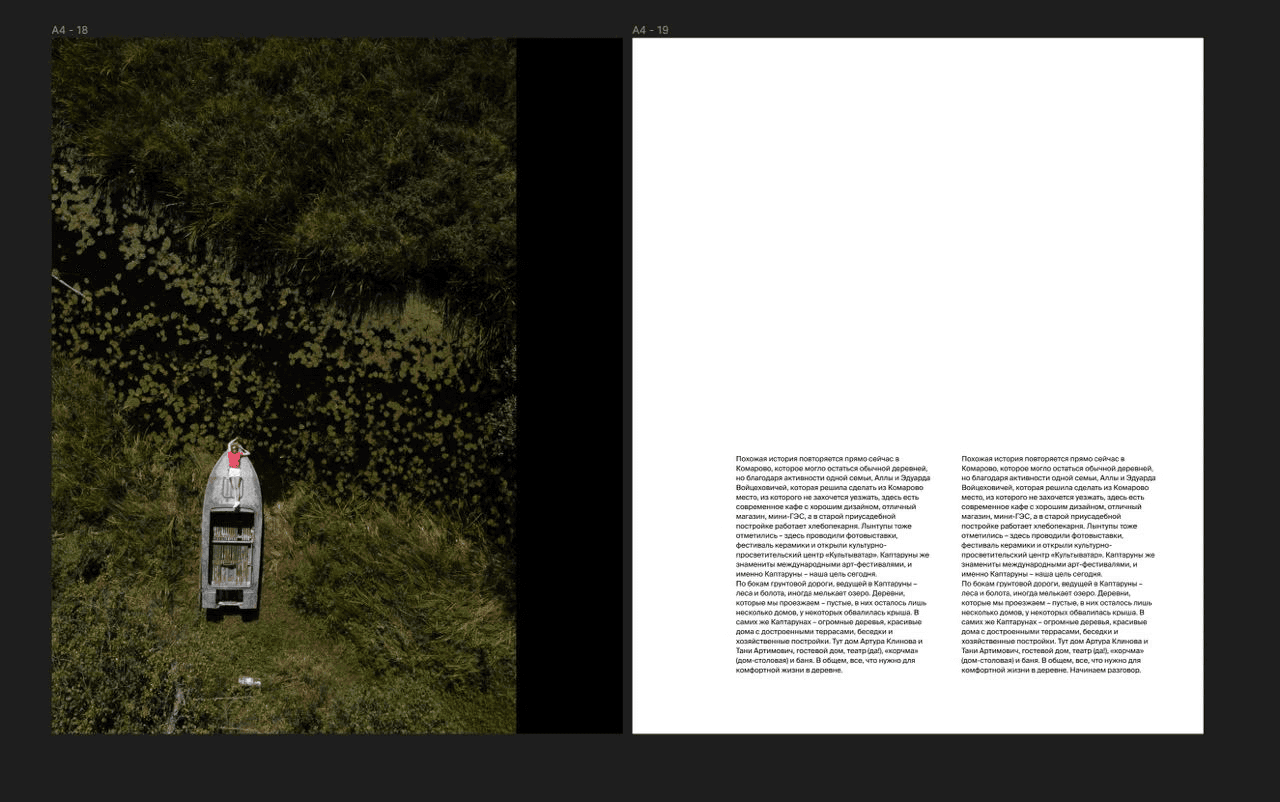
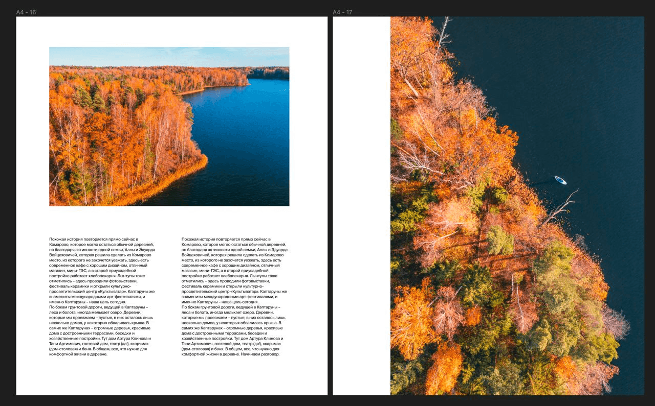
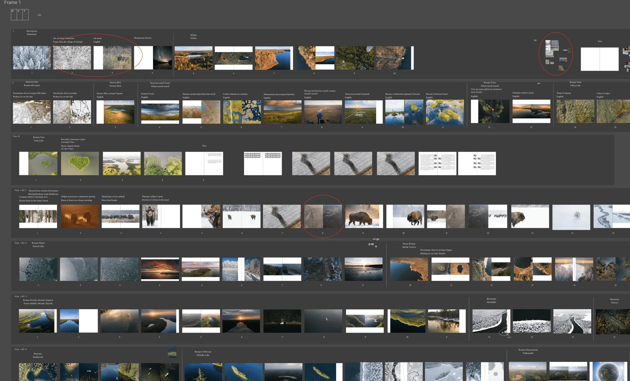
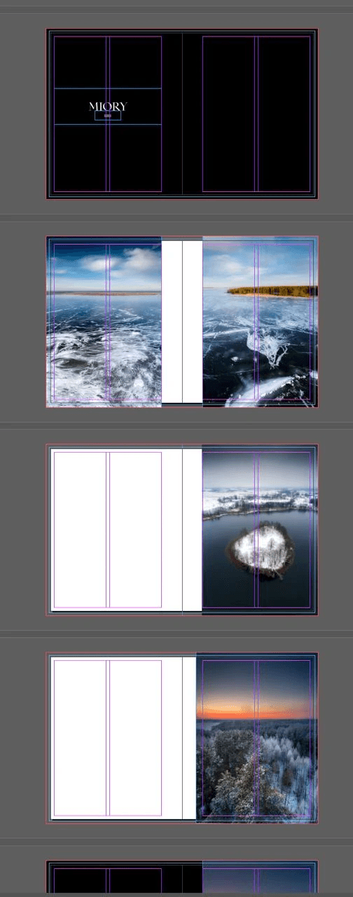
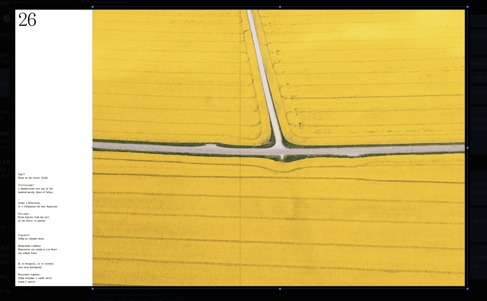
5. We enter into the first module of the grid. The module has a name, for example, “Miori”.
Step 6. We open up the first chapter: behold the beauty
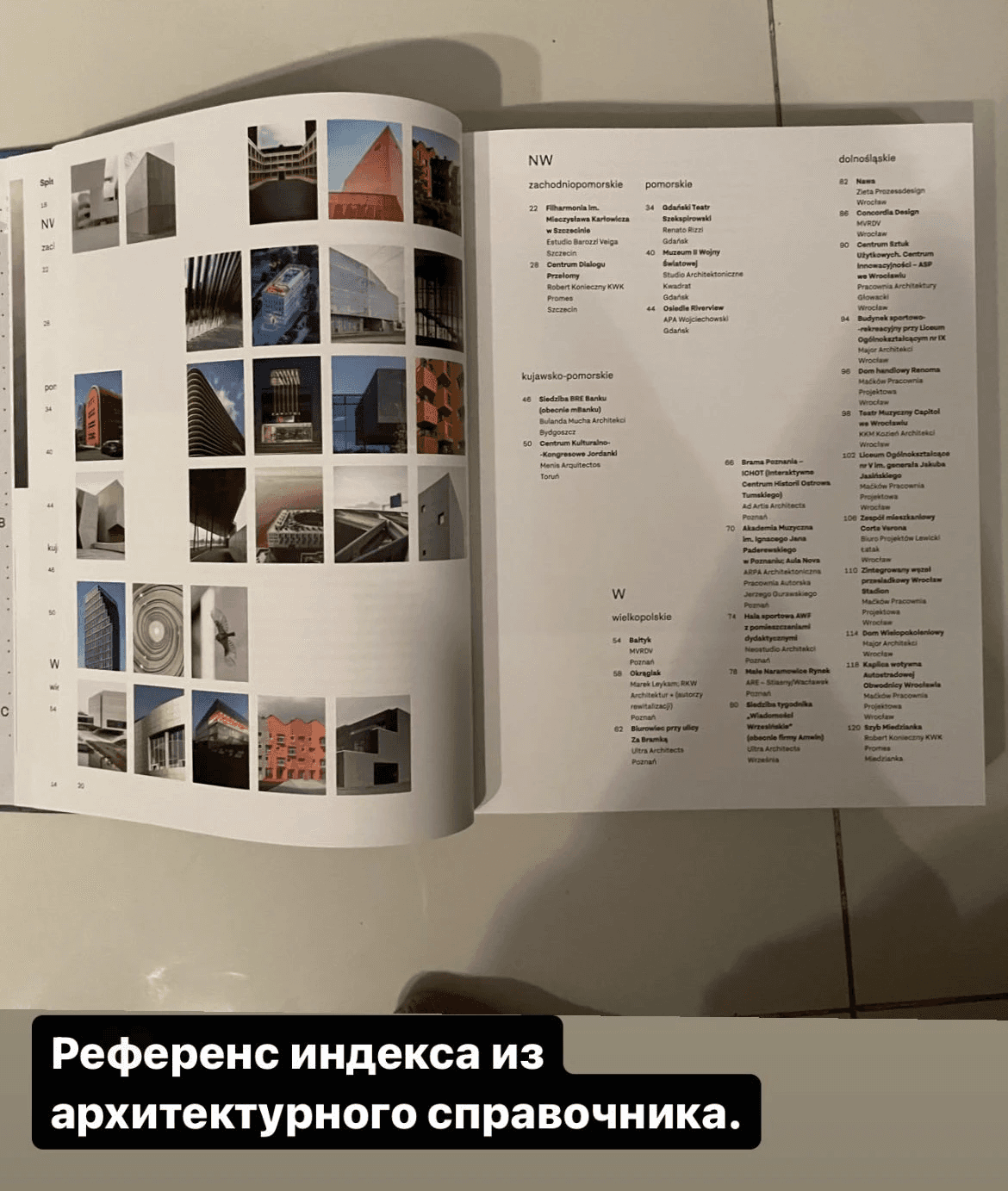
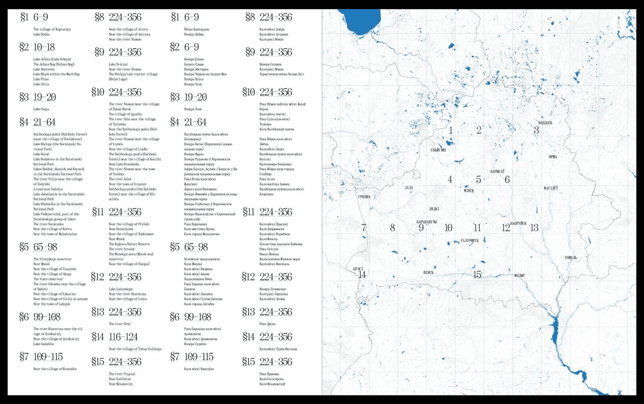
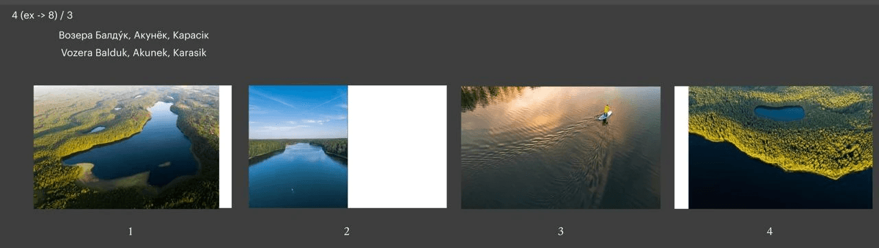
The index at the end of the book to find photos of a specific geographical location.
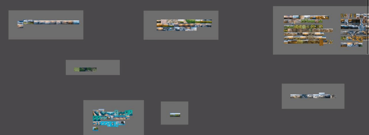
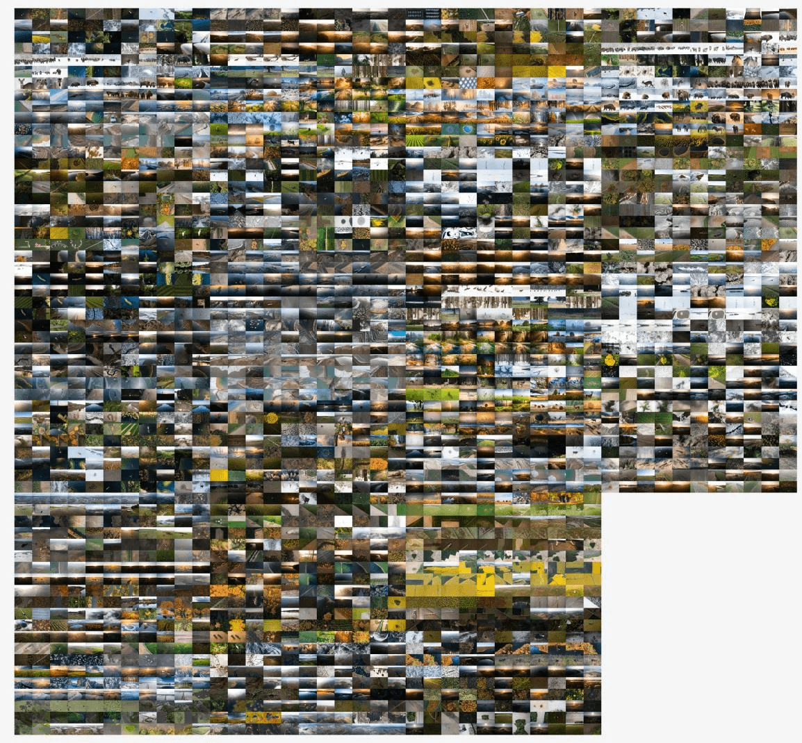
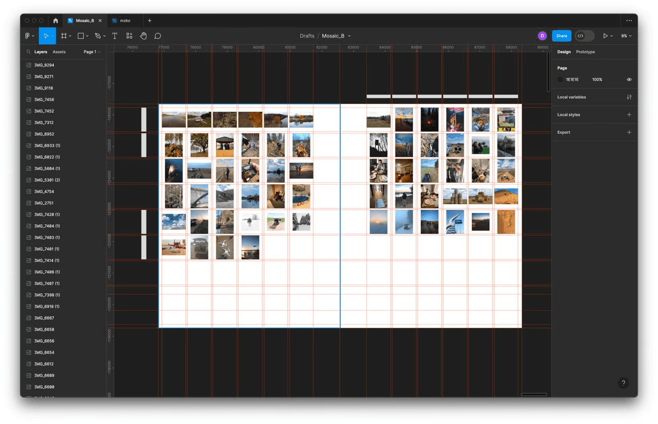
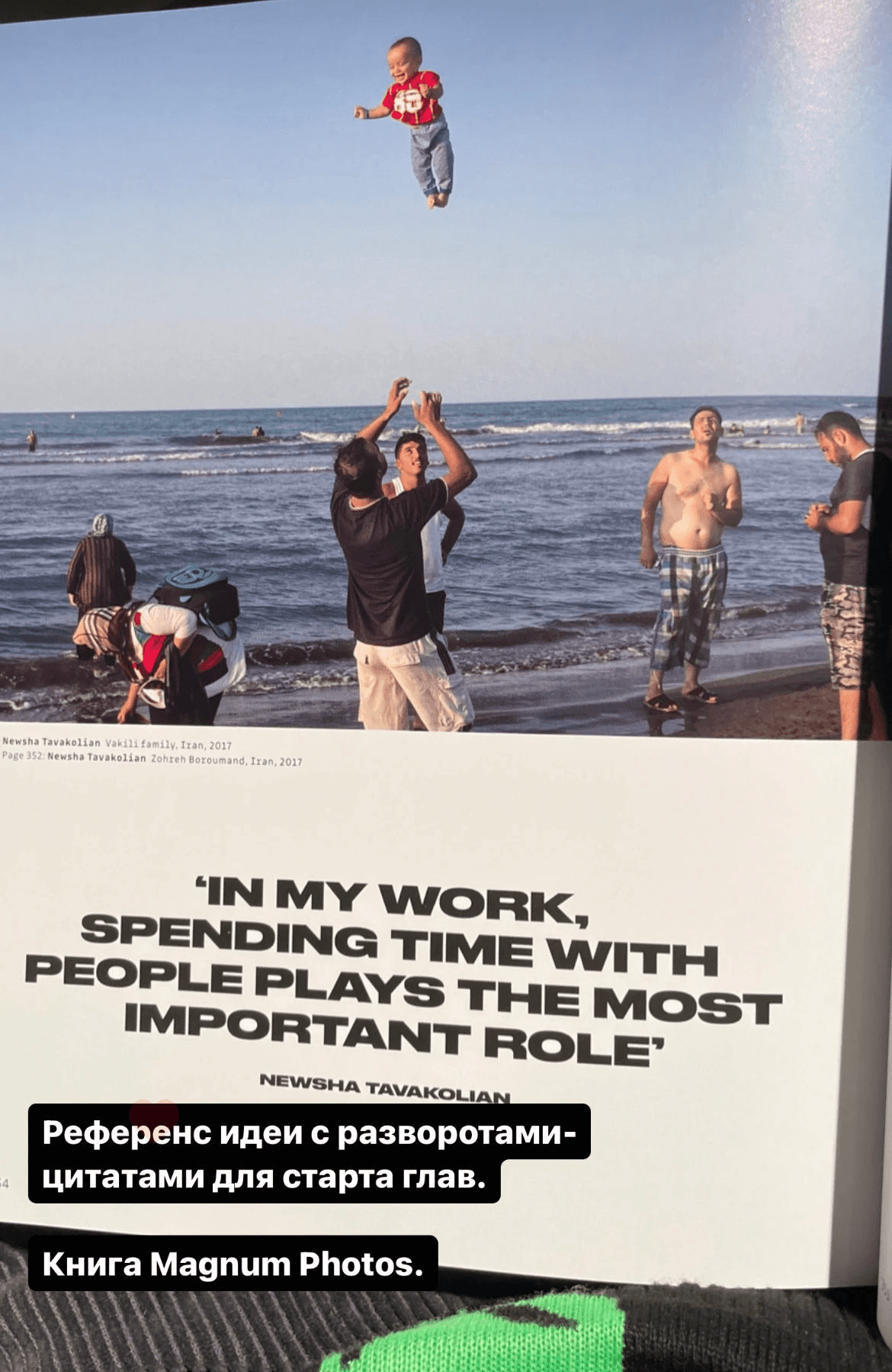
In the book “Magnum Photos” I saw a technique of displaying raw, unprocessed photos from which the photographers then chose beautiful ones. This became the reference for our photography mosaics - the spreads that display our travel photos taken from our phones.
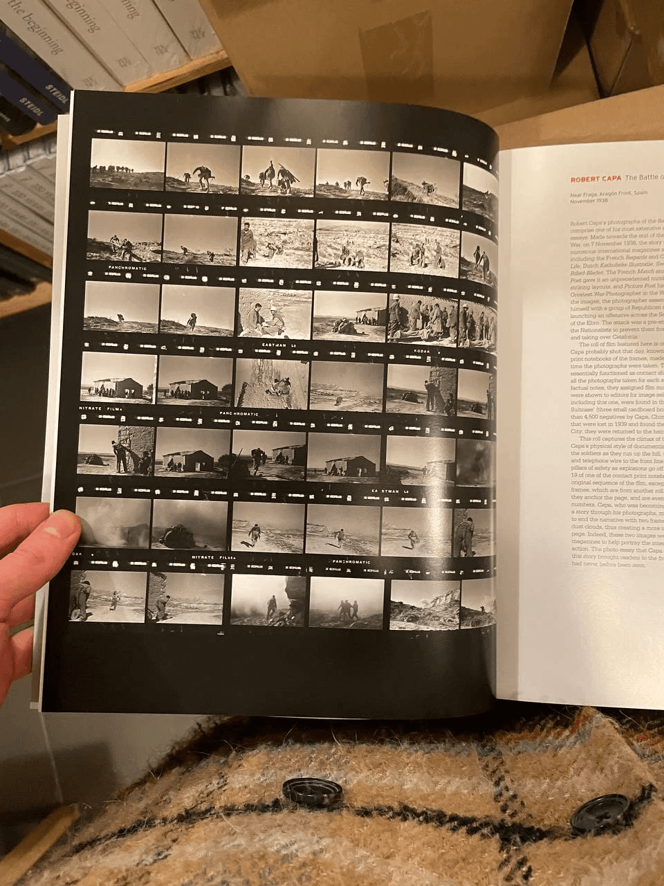
Magnum Contact Sheets
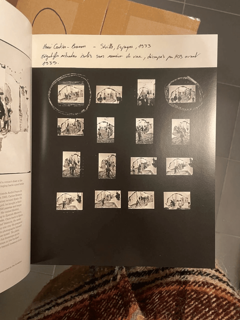
Magnum Contact Sheets
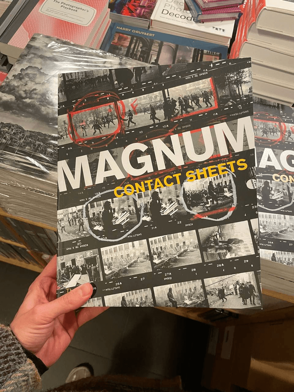
Magnum Contact Sheets
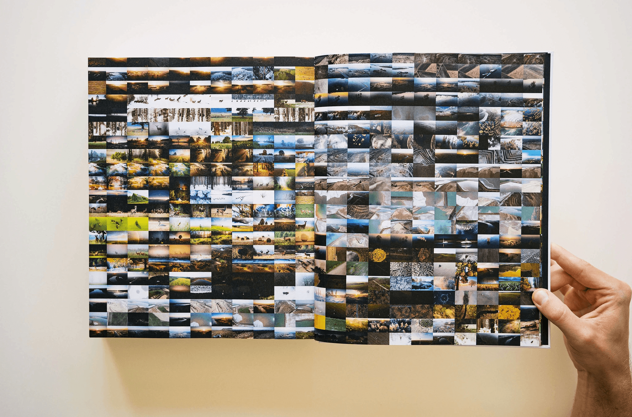
One of the ‘mosaics’ at the end of the book
Development of the ‘mosaic’:
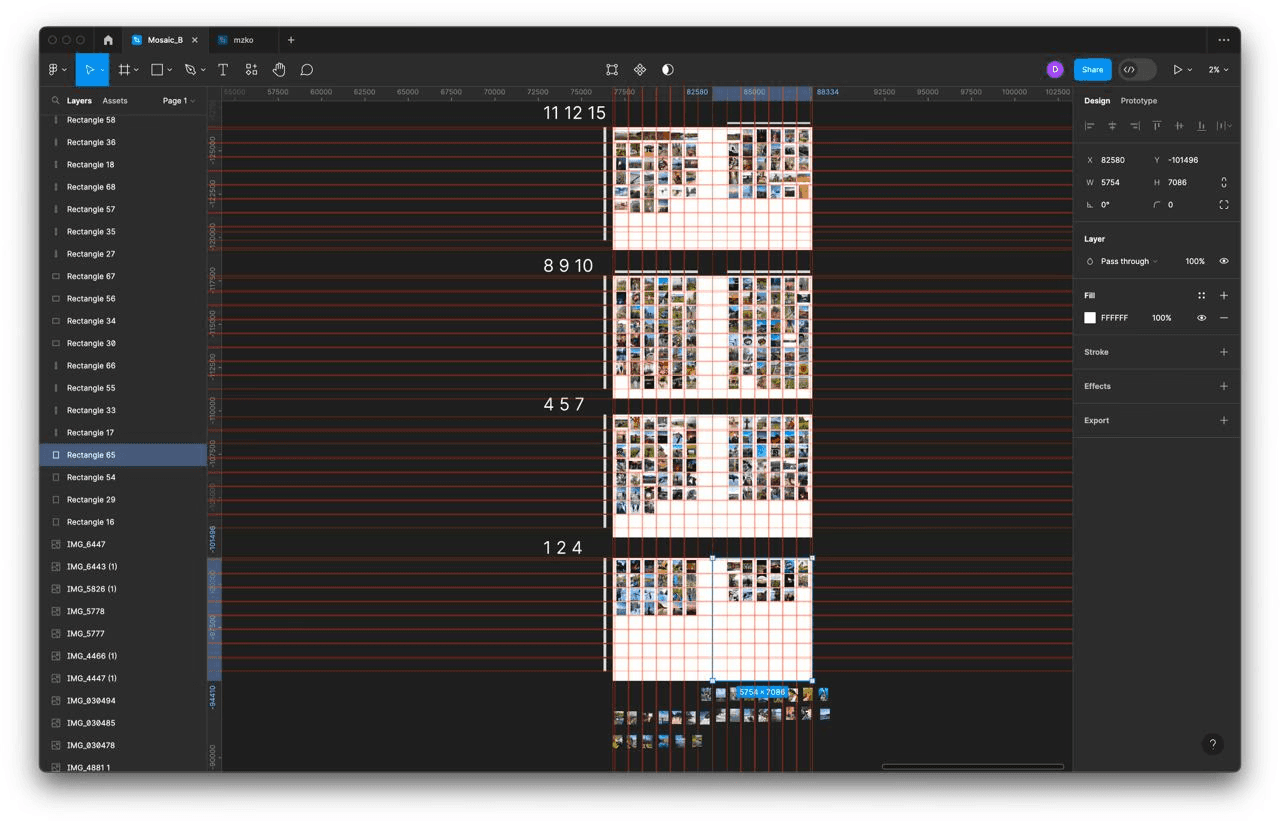
Determining the size of the photo based on the number of photos per sheet
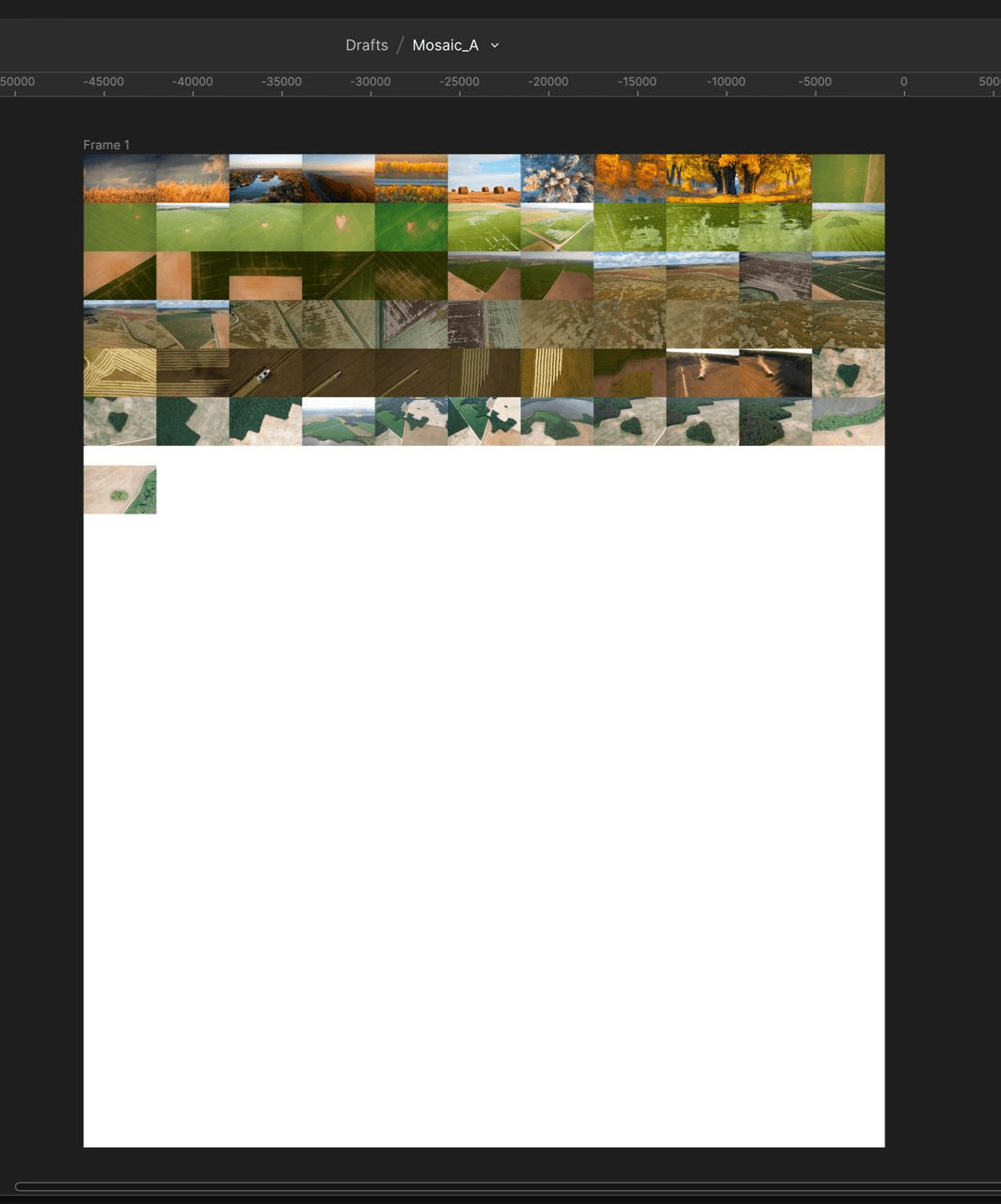
Collecting photos in proportion to the sheet in Figma
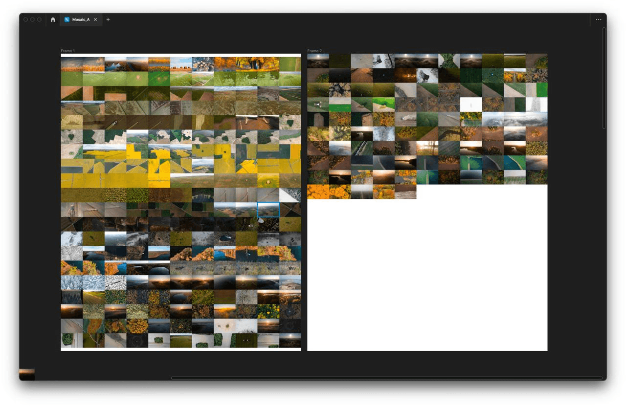
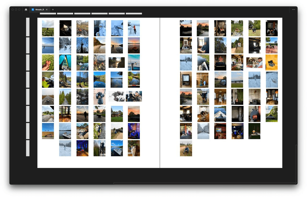
The first spread
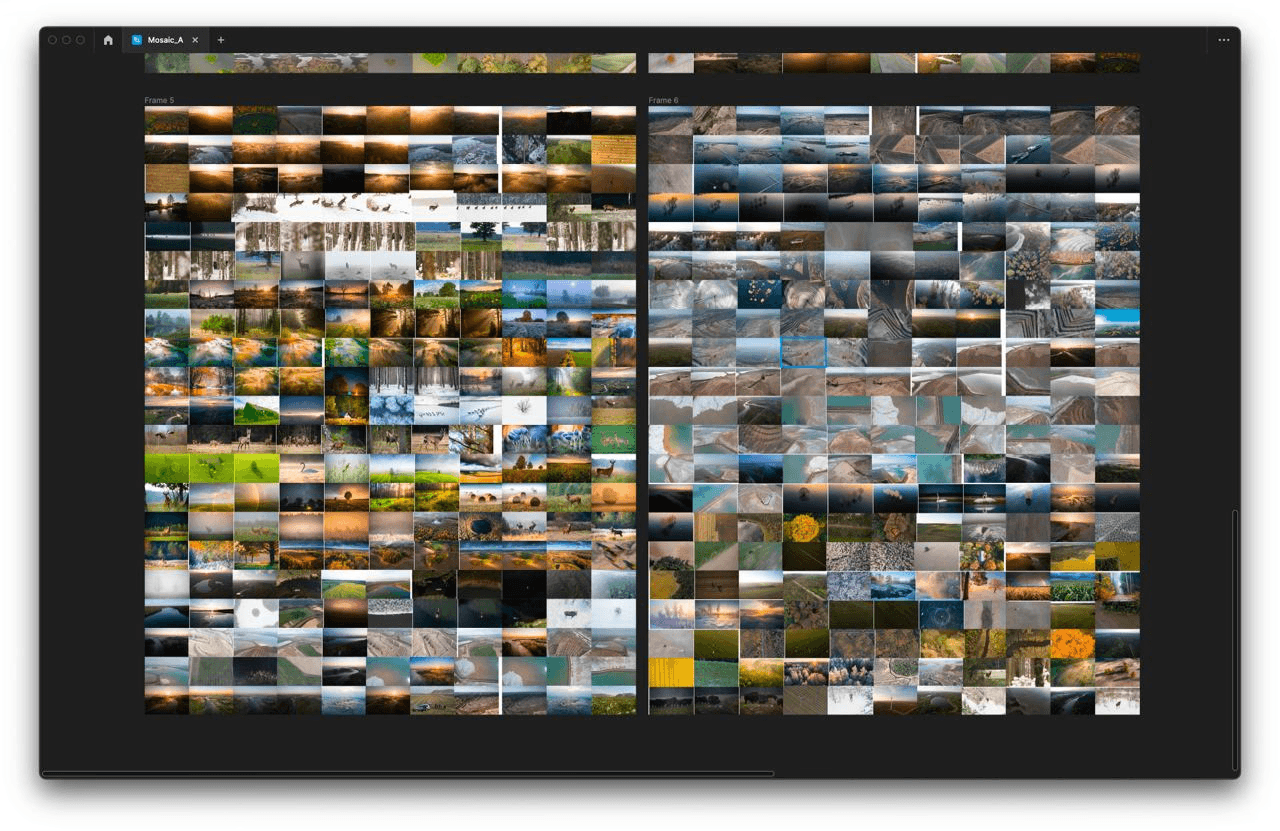
The second one
Ready!
From Instagram
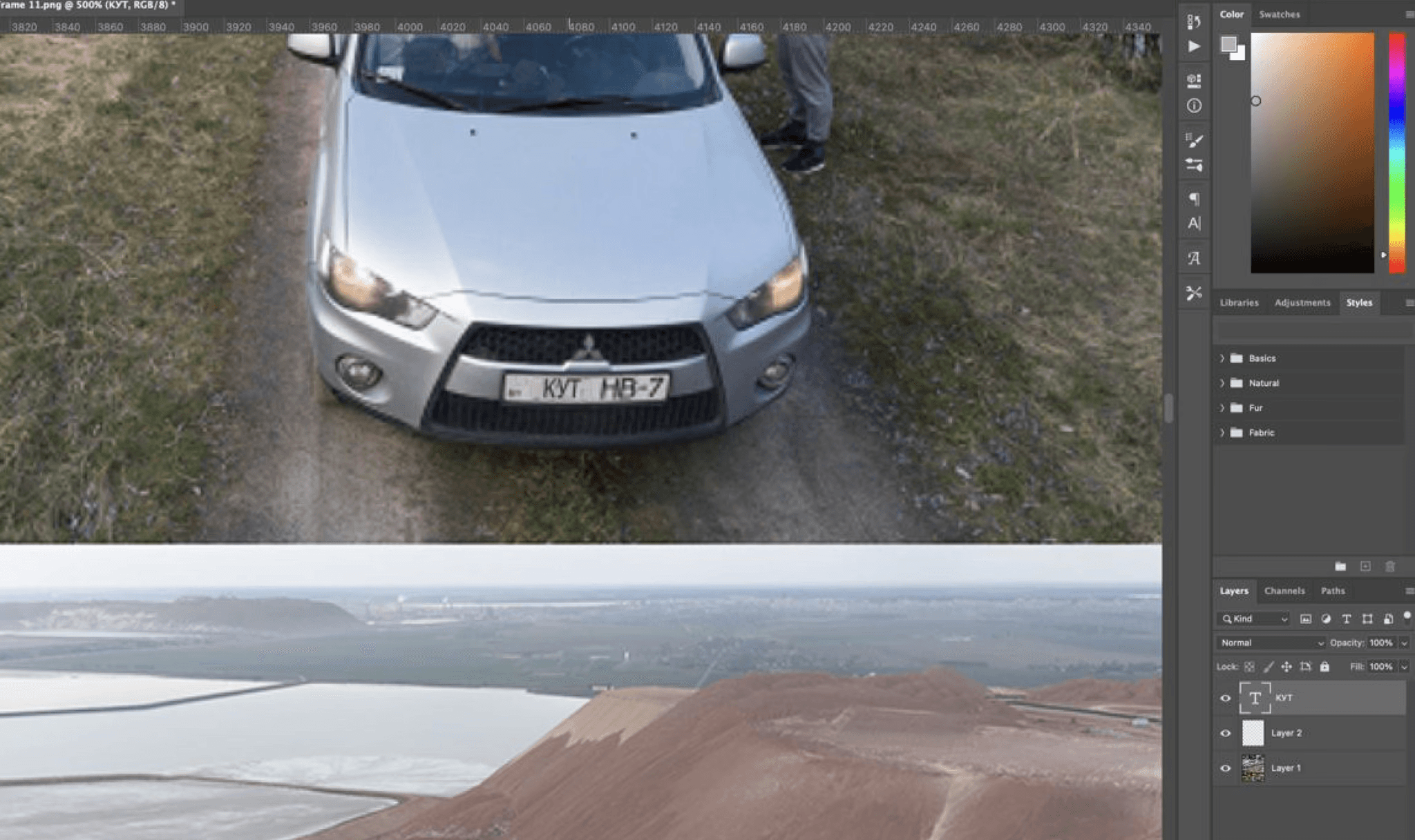
An easter egg: the word “KUT” on a license plate
It seemed like putting this mosaic together would be the hardest part of creating it, but no.
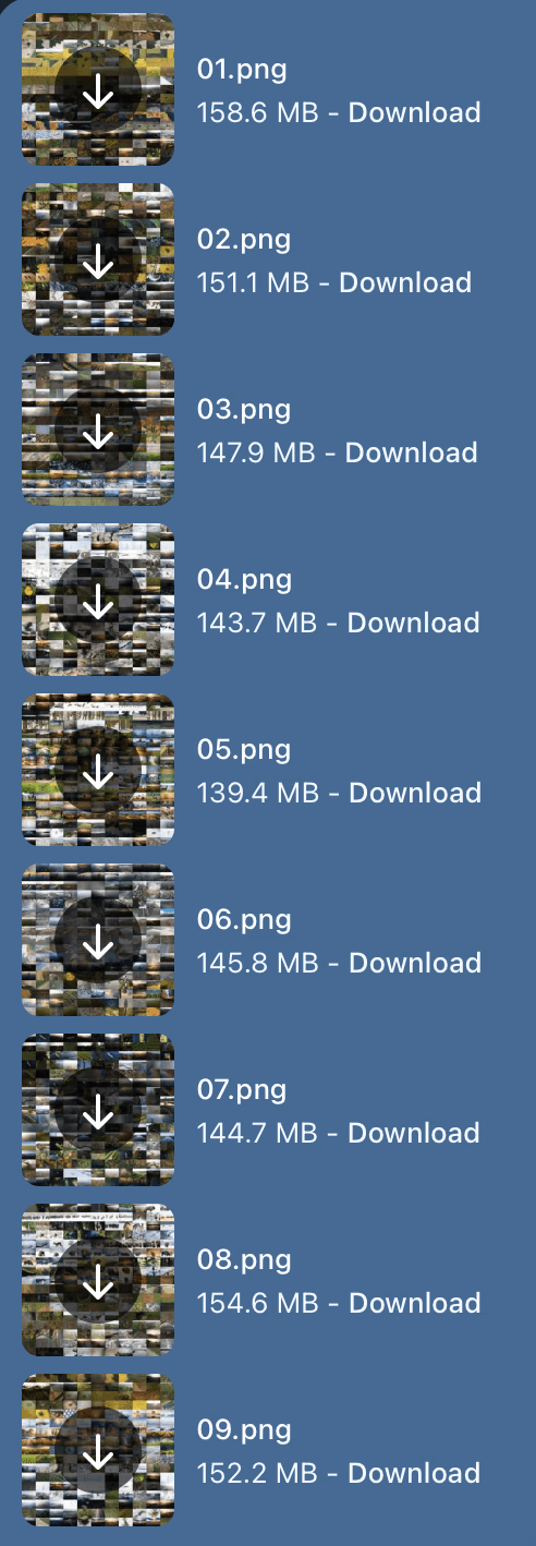
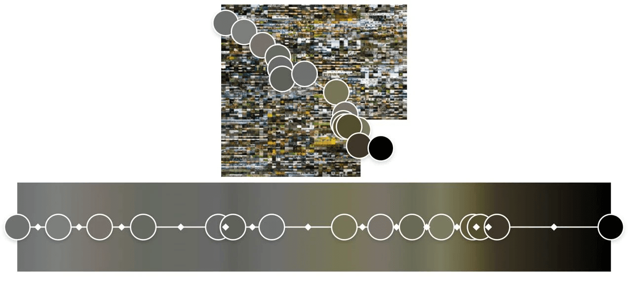
We thought that we would print all these photos without any edits, so that it would be interesting to view the originals. However, when we printed the pilot version, we realised that half the photos were too dark and looked like black squares, while the other half were too light and looked like white squares.
Exposure correction and colour correction of the mosaic photos (40,000x video speed)
There are eight mosaics in the book that feature behind-the-scenes footage. They are spread out among the chapters, along the text. On these spreads, apart from the photos, there are hidden QR codes that take you to the behind-the-scenes videos on YouTube and Instagram.
Developing the behind-the-scenes mosaics
Developing the behind-the-scenes mosaics
Developing the behind-the-scenes mosaics
Some other little things…
A merchandise concept (unused)
An idea to make QR codes for all the photos (Slava, not used)
A puzzle
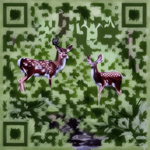
A design option for th QR codes (Slava, stockimg.ai)
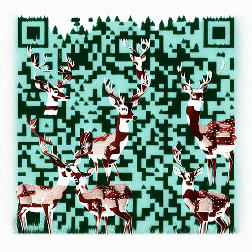
A design option for th QR codes (Slava, stockimg.ai)
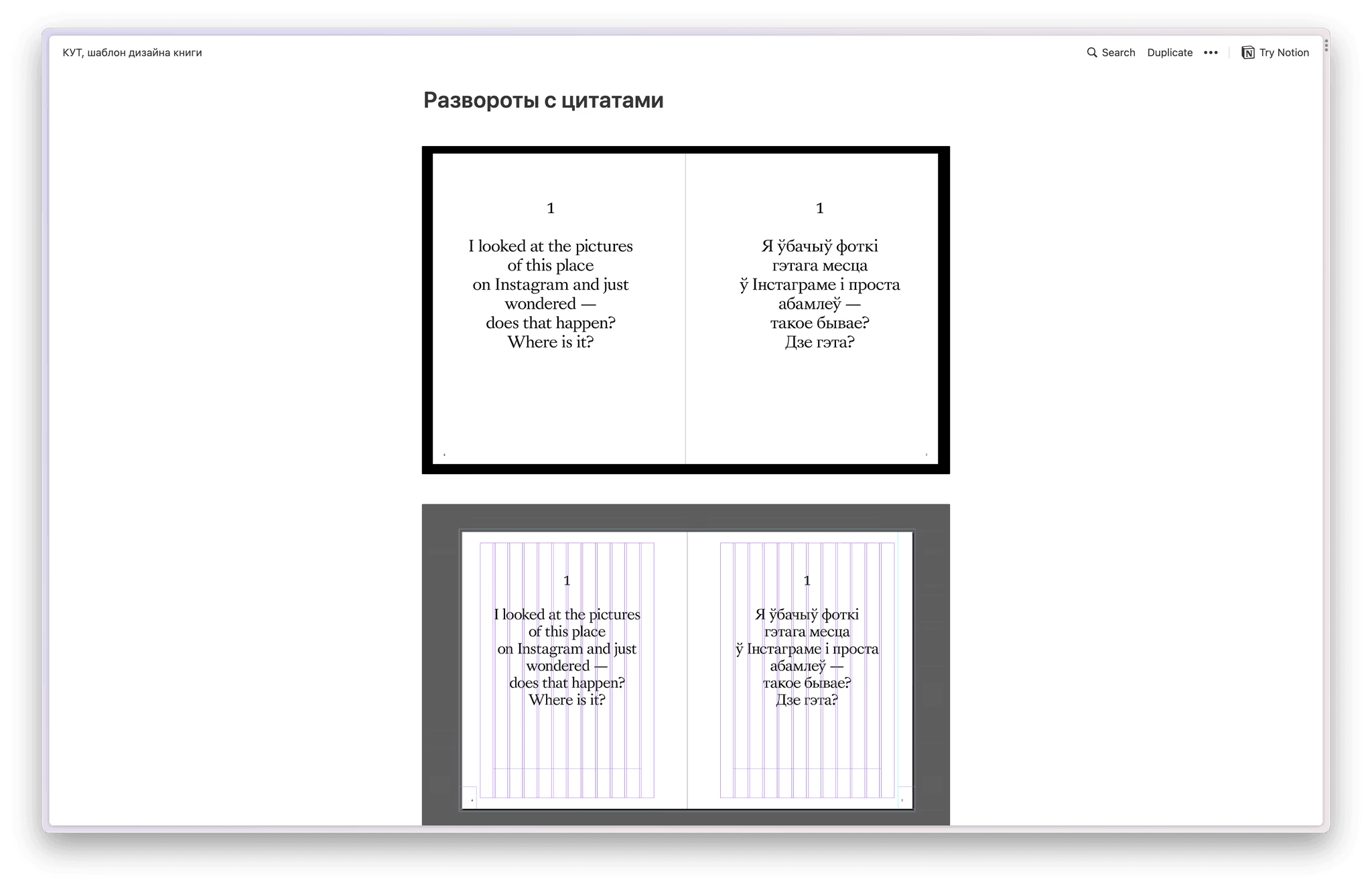
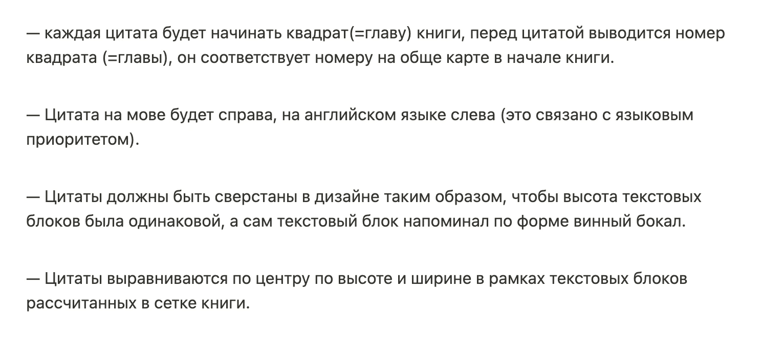
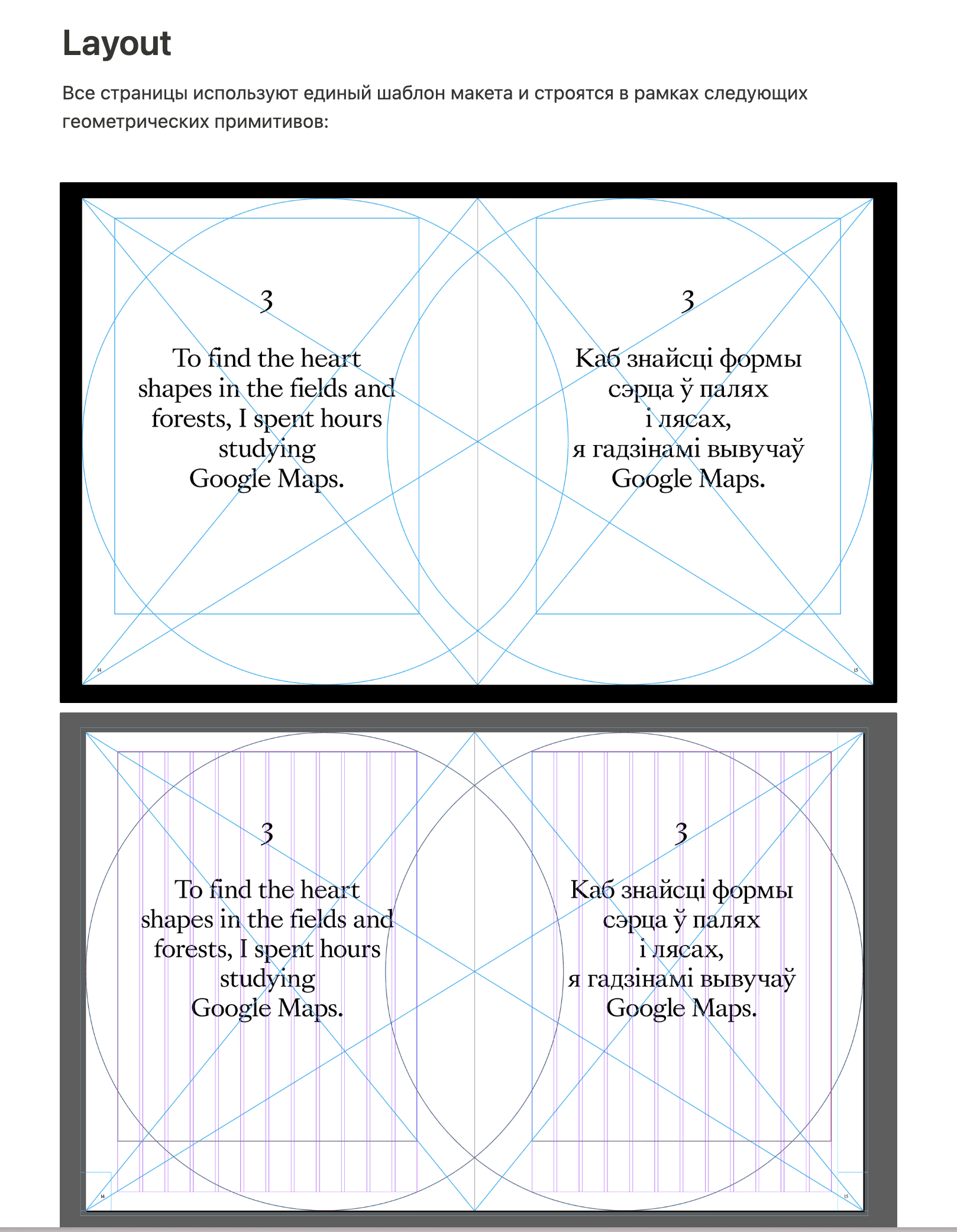
THE SPREADS WITH QUOTATIONS
The spreads with quotations in the book serve two purposes. Firstly, they replace chapter titles. There are 15 chapters in our book, which correspond to the geographical modules of the grid on the map. But these squares have no titles. We worked on the layout of the texts in the book and it appeared that there was another separate flow: when you don't read the book, but just look through it. And then you can't jump into the longer texts, but you can take a glance at a spread with a large quotation on it.
The idea
Reference
Another reference
And one more (Source)
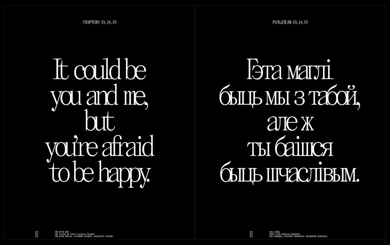
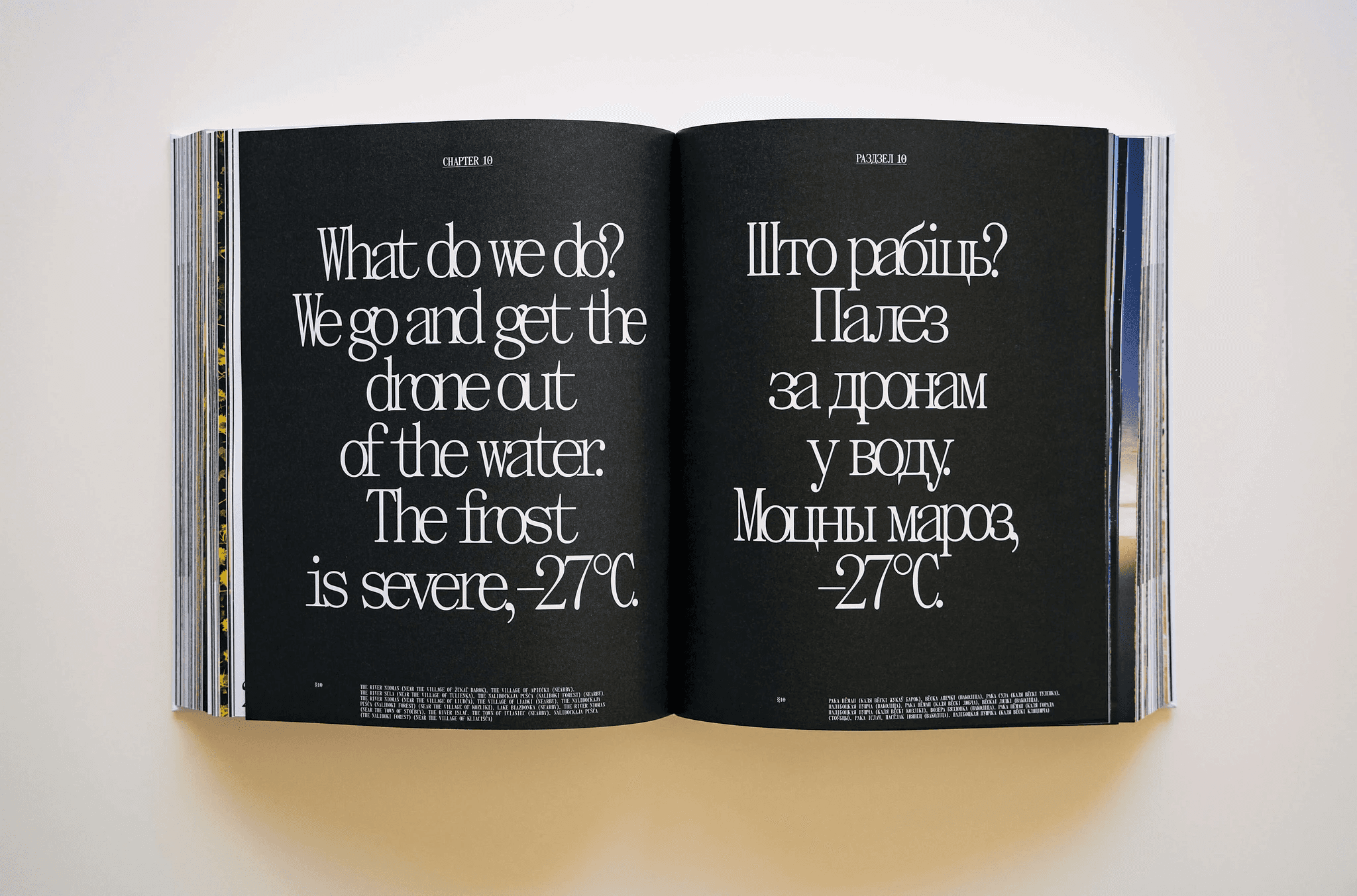
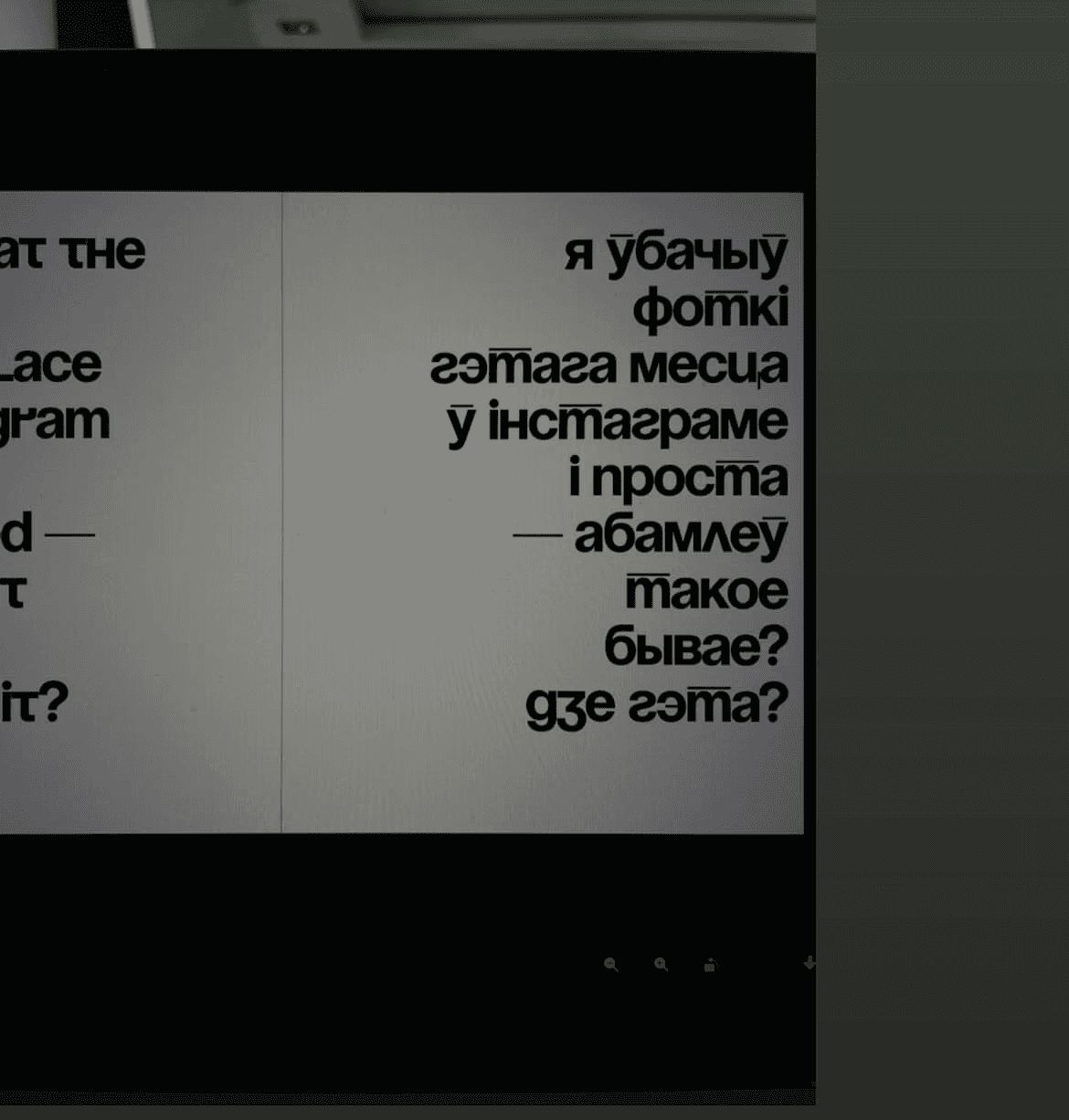
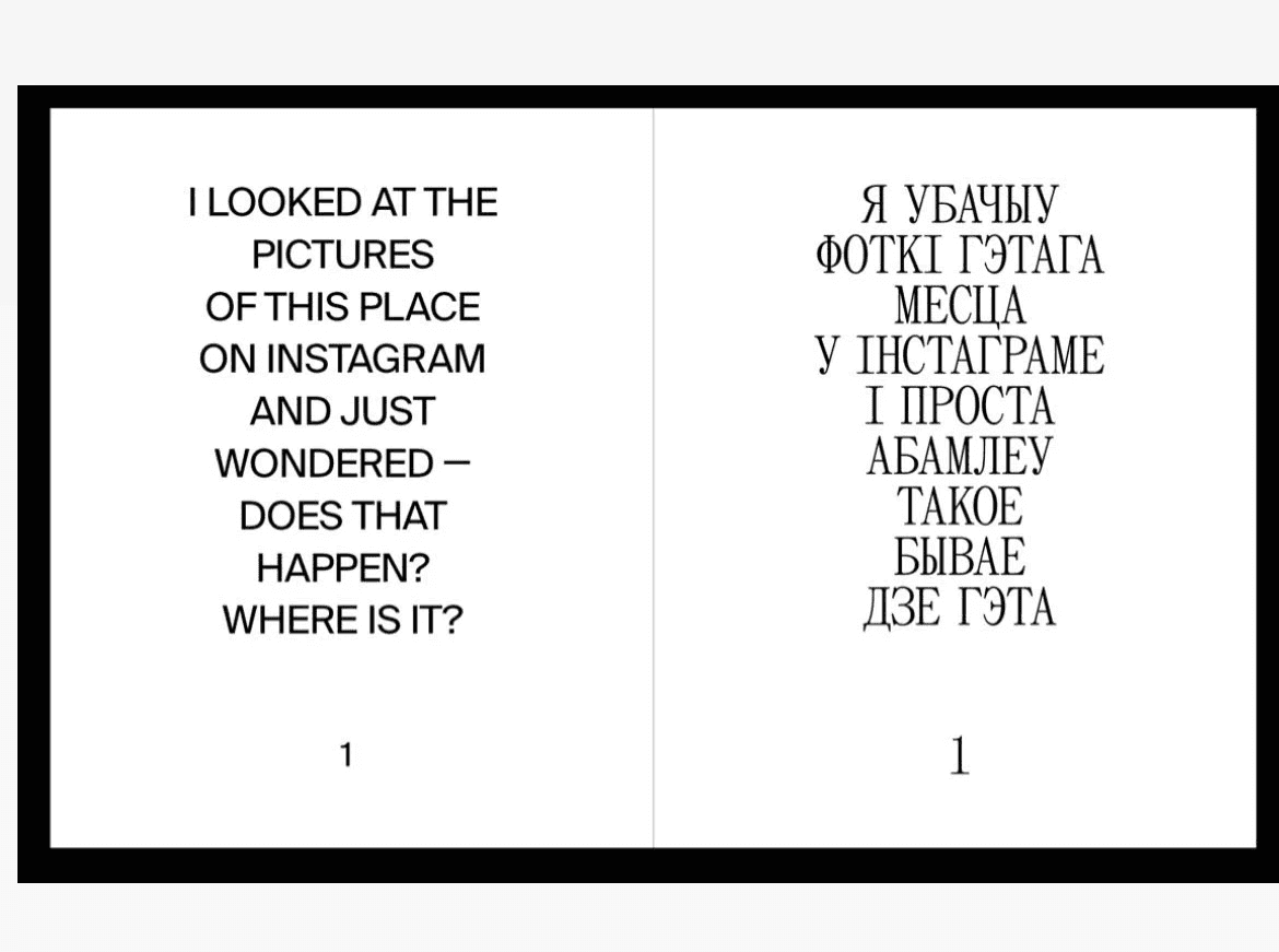
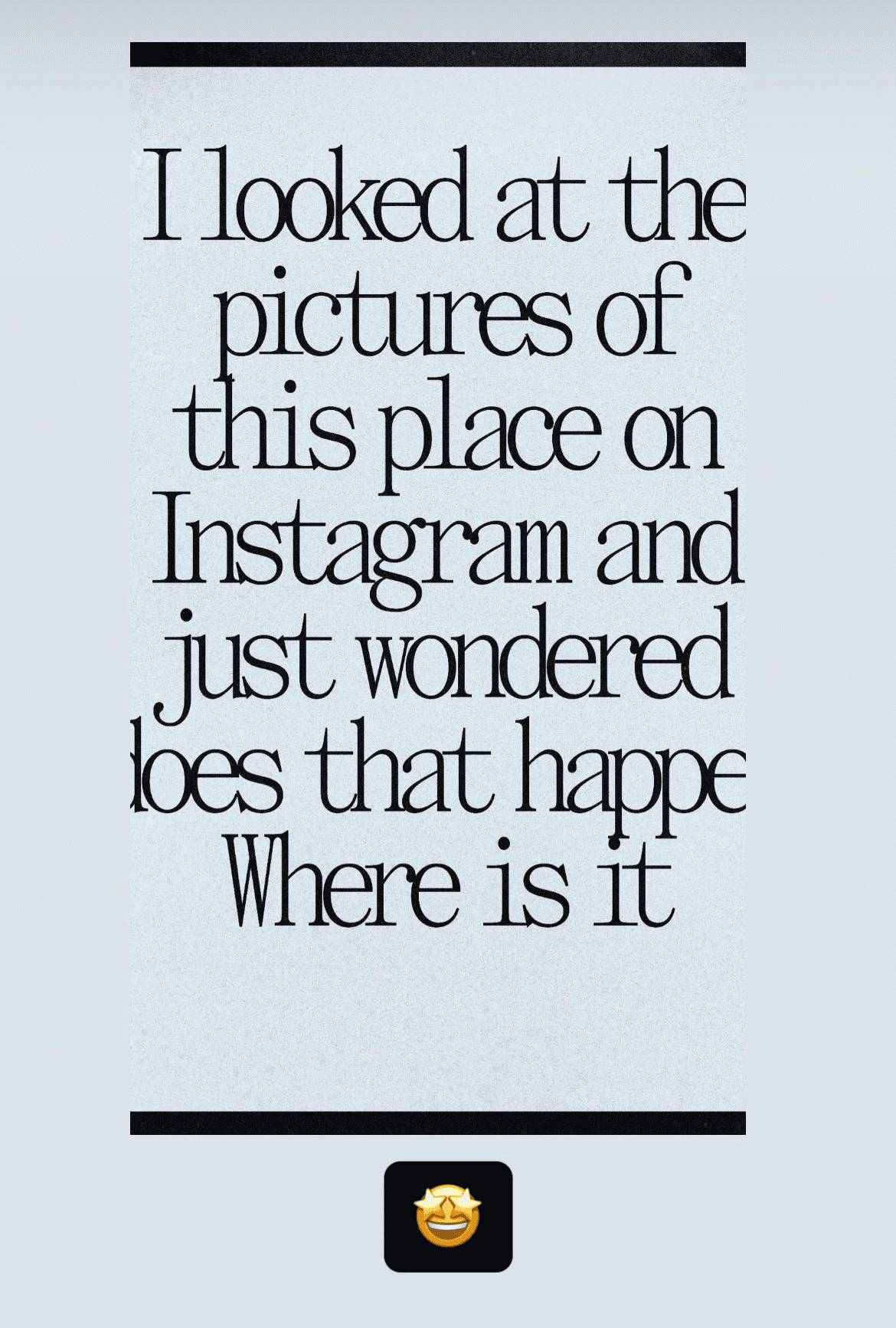
Such spreads contain an interesting quote from the chapter, its number, and a list of settlements or geographical features that are in that chapter (there are 15 of these in total):
Draft
Draft
Draft
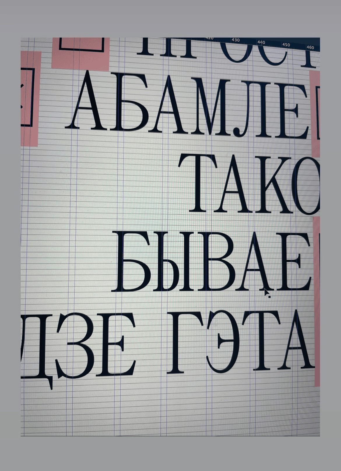
Warning, there is a typo in the text. More on this below
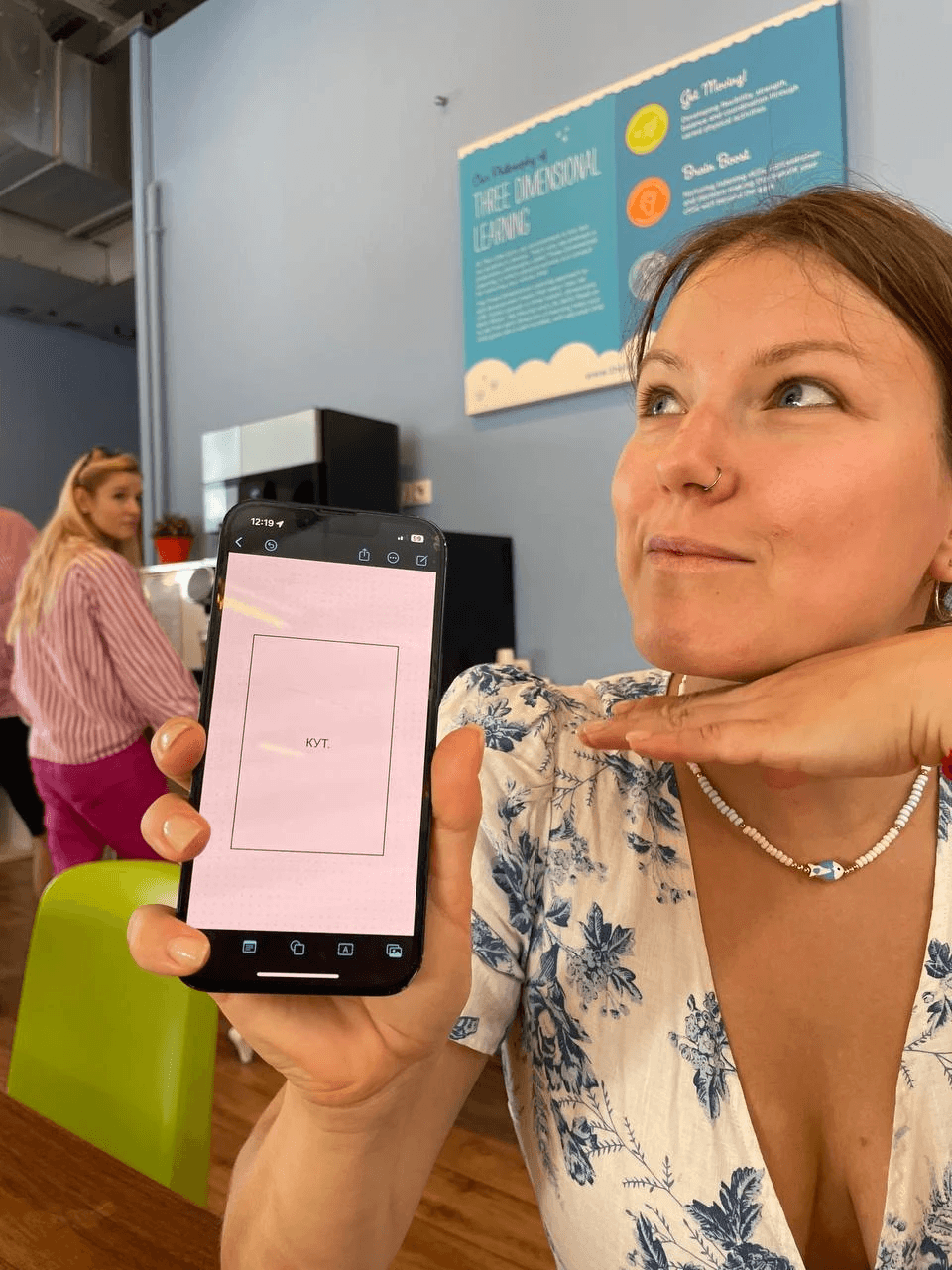
CHOOSING THE FONT
Initially, it seemed that the book should not have some kind of ‘special’ font. The book is about a whole country and is aimed at a very wide range of readers. It seemed that the font should be as classic and as neutral as possible. Nothing too trendy or hipster. I thought that at most we would print the book title with something interesting, and inside the font would be classic. For a long time we worked with a layout that had a fairly neutral font.
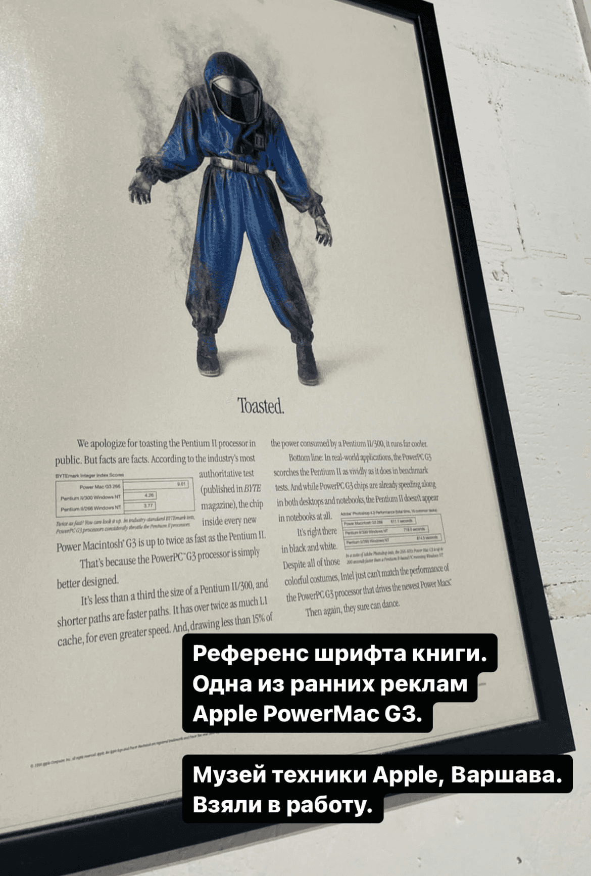
One of the first fonts we worked with. The Sang Bleu Kingdom typeface
But I felt that something was off. It was uncomfortable: the layout didn't match the spirit of the authors, the spirit of the team that was making the book. And it was the font that didn't fit. It had neither boldness nor simplicity.
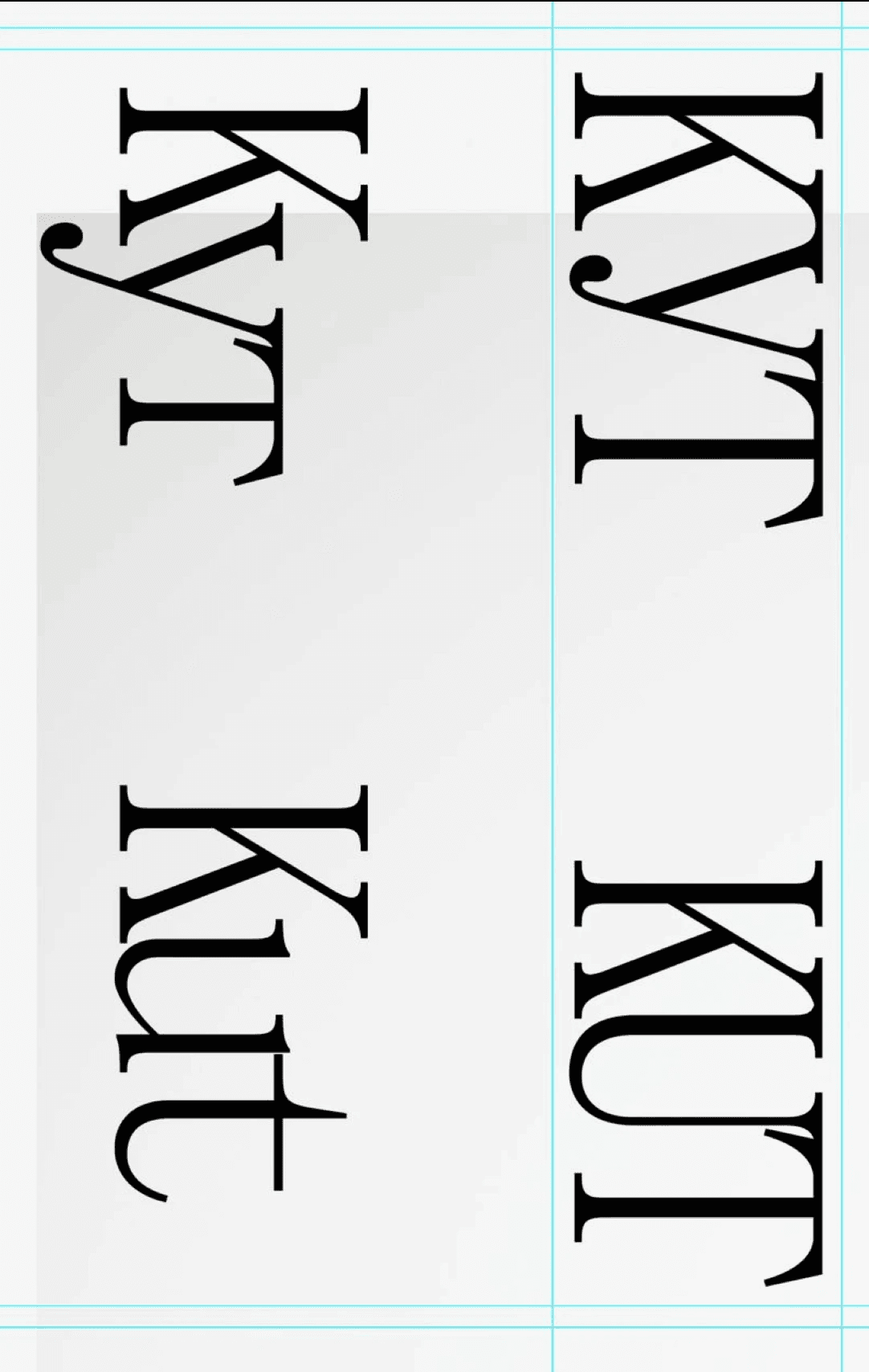
"KUT" using Denis Serebryakov's font "Gik"
"KUT" using Denis Serebryakov's font "Gik"
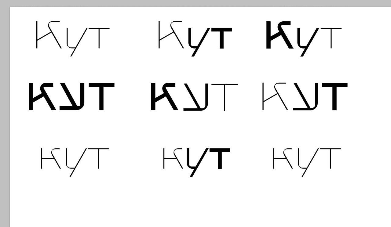
"KUT" using Denis Serebryakov's font "Gik"
A typeface based on modular squares (not used)
We found it!!!
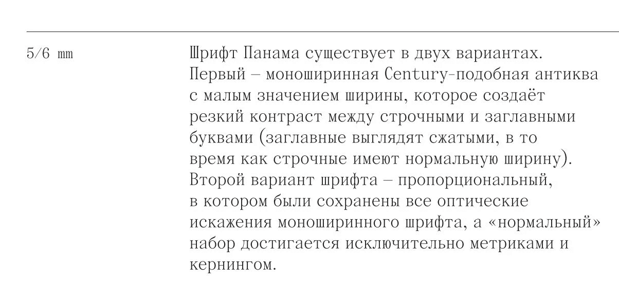
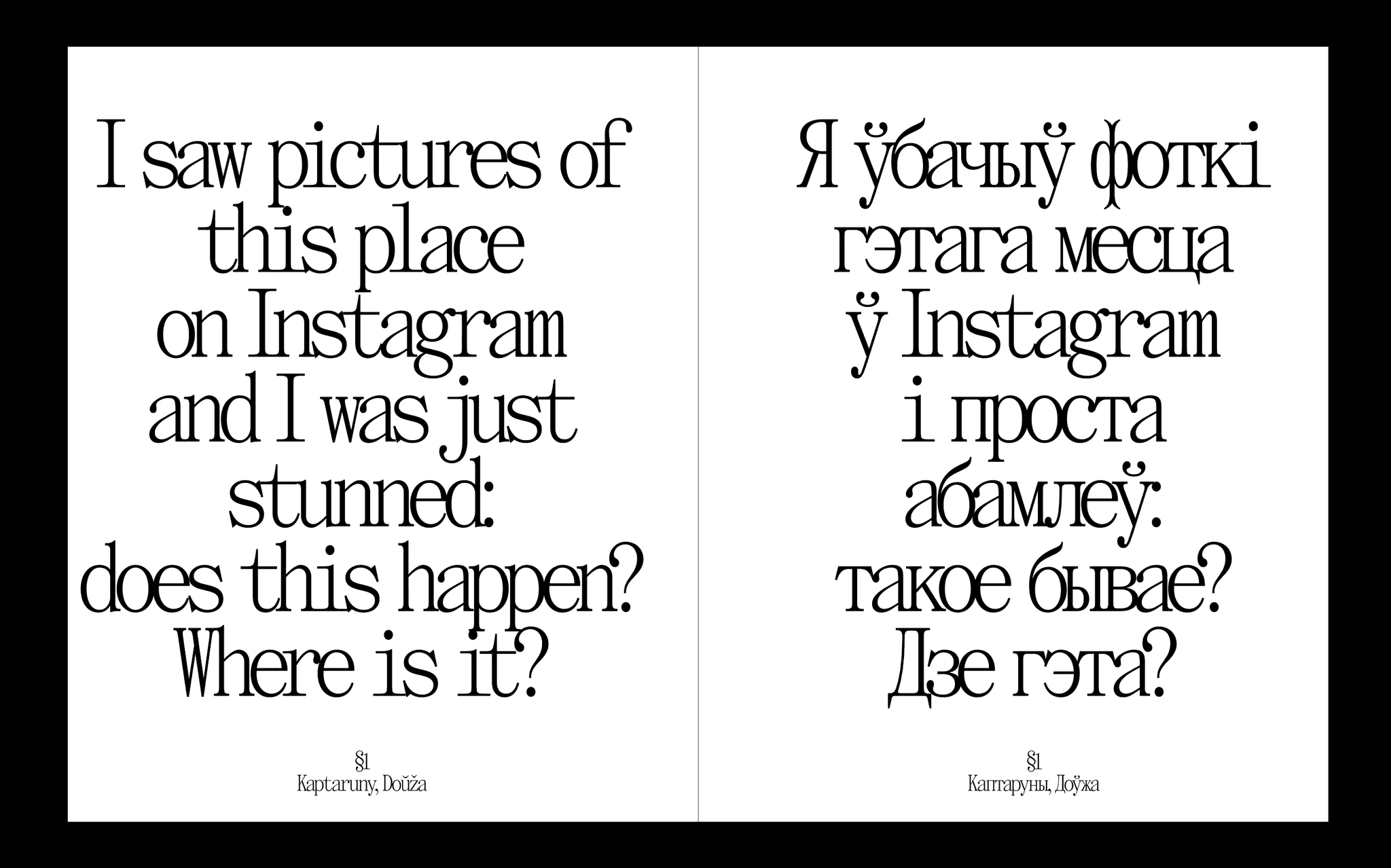
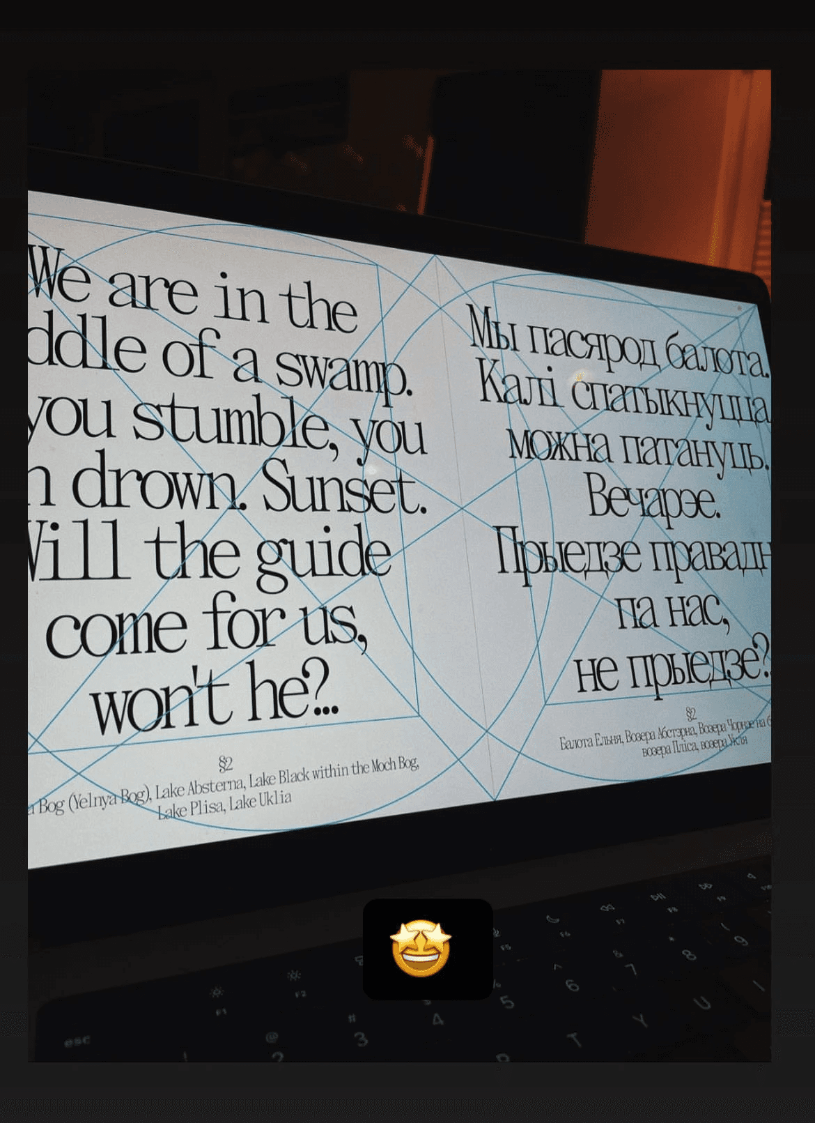
We found it. The typeface Panama, The Temporary State, Roman Gornitsky.
TEMPLATE PROCESSING
From the very beginning of the project, I tried to take into account the possibility that I, as a designer, would not be able to complete the project for whatever reason. For example, I was looking for a job and could go to another country and because of that I would not have the time to work on the project properly.
This motivated me to create templates and descriptions. For example, at one point, when the materials had been gathered and I could have started transferring them into the layout of the book, I created a document called "Design Template". The purpose of this document was so that another designer could take over and proceed without the need to spend a long time immersing themself in it all.
At this point, another designer, Olya, got involved in the layout and helped to collate the entire layout of the book into a single file inDesign. At that moment, I was unable to physically do this work within the required deadlines. Olya transferred the draft spreads from Figma to inDesign. The templates greatly simplified and accelerated the introduction of a new designer into the team.
Documentation in Notion
The rules for constructing spreads
The rules
Construction of the layout
Examples of layout constructions in book layout tutorials (yes, these do exist)
The same in real life
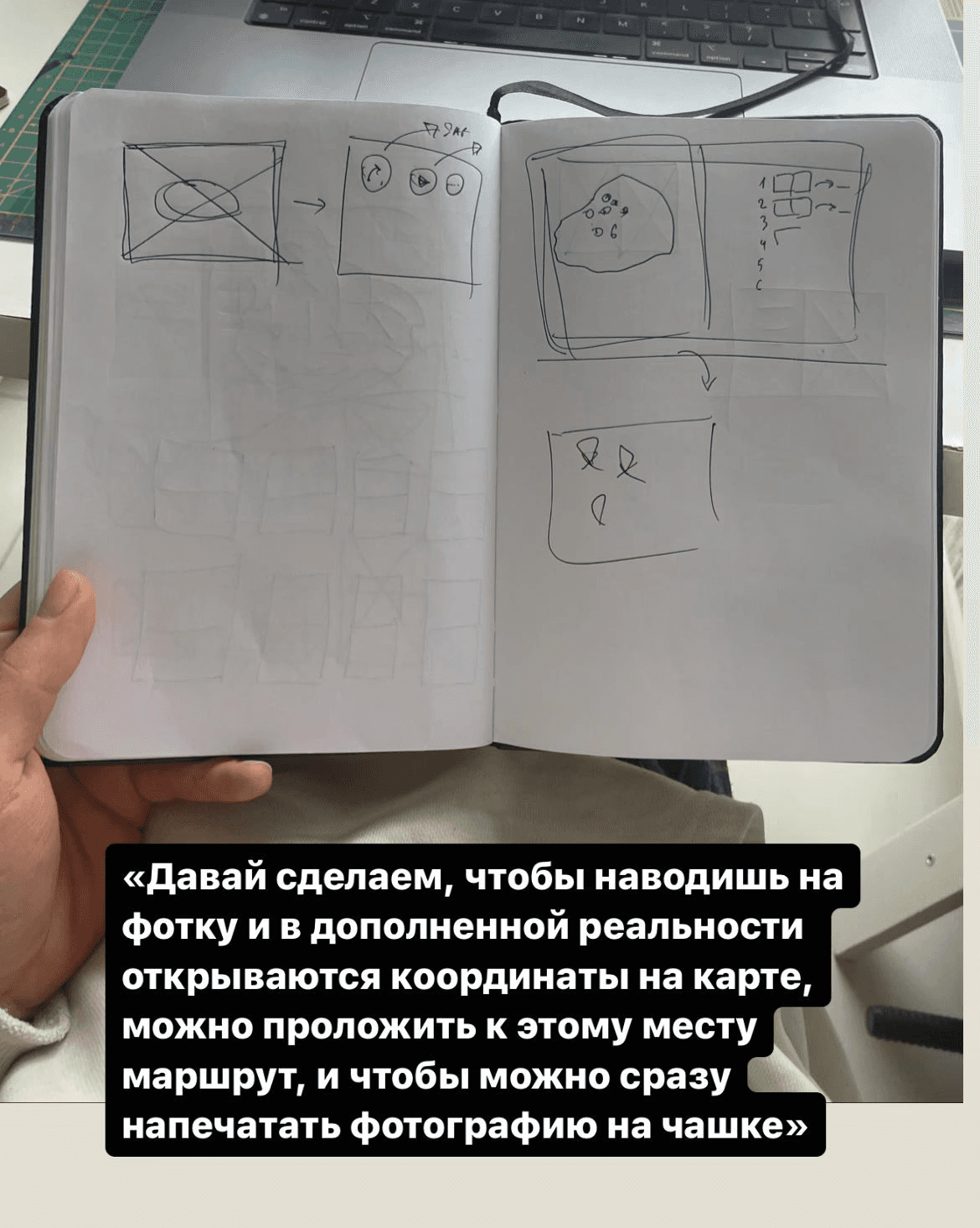
Discussing AR features
Discussing AR features
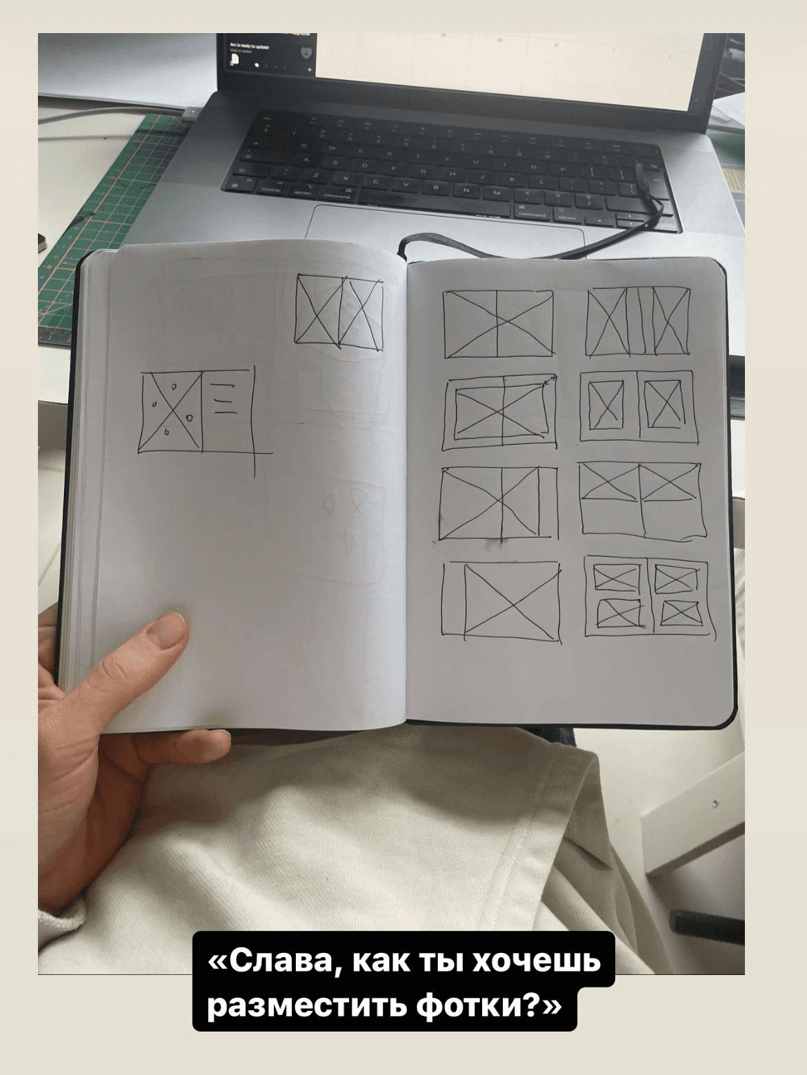
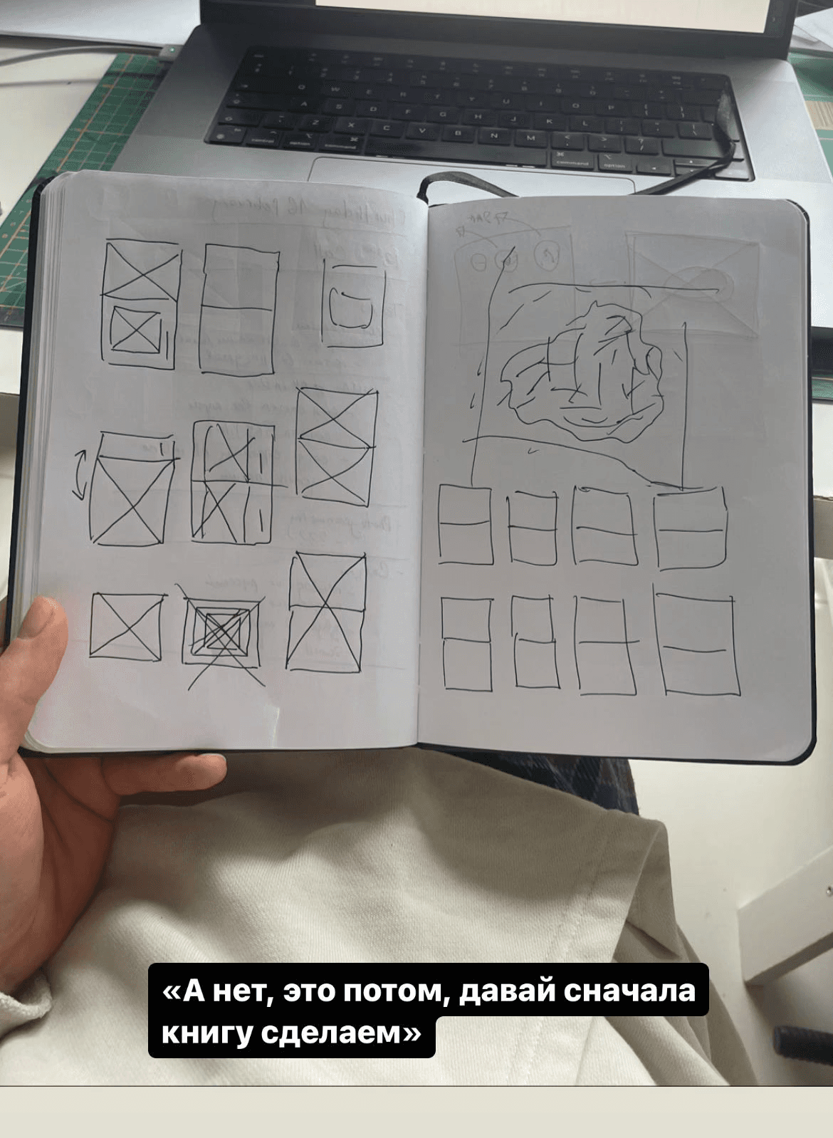
Discussing the templates to display photos
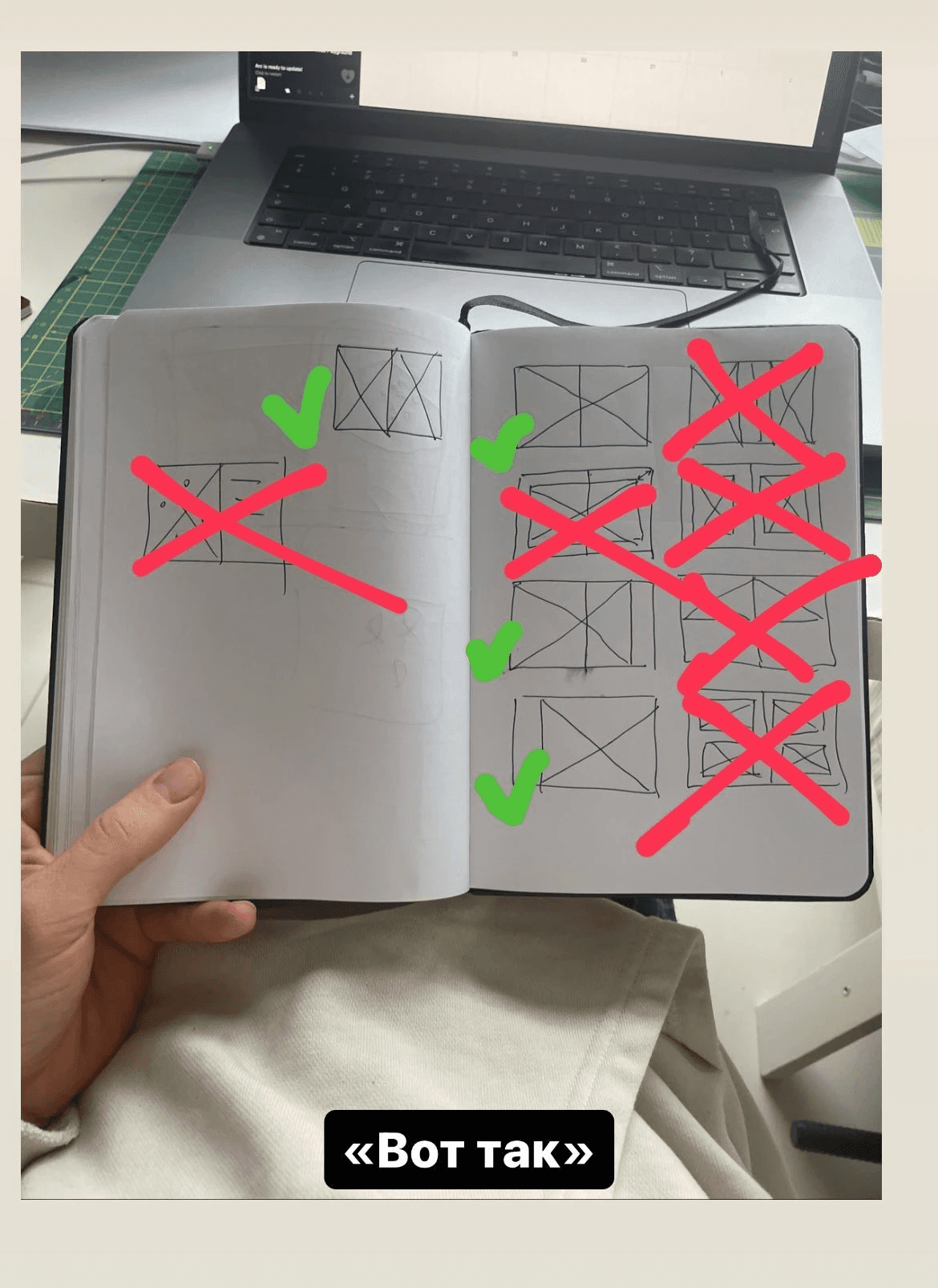
Discussing the templates to display photos
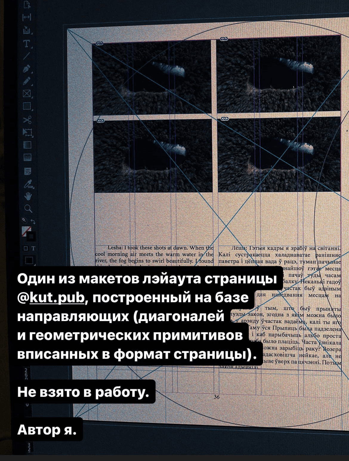
Attempting to use a modular grid to design the book layout
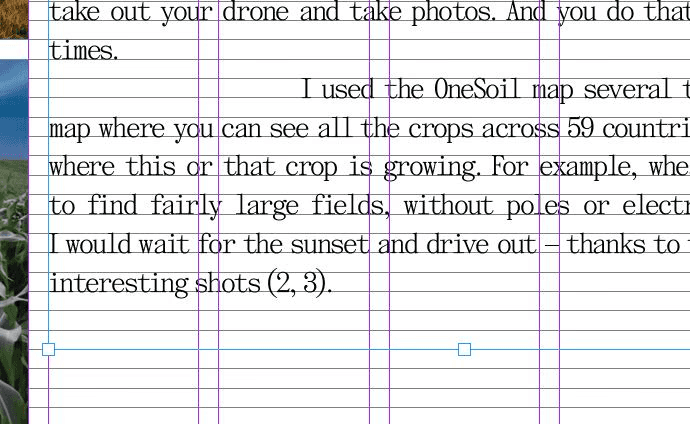
WORKING ON THE TEXT
Relative to the total volume of the book (600 pages), there is actually not that much text: 2 author's one-sheets, i.e. 80 thousand characters, in each language version. But because of the bilingualism and the specific format of both the book and the texts, there were many nuances.
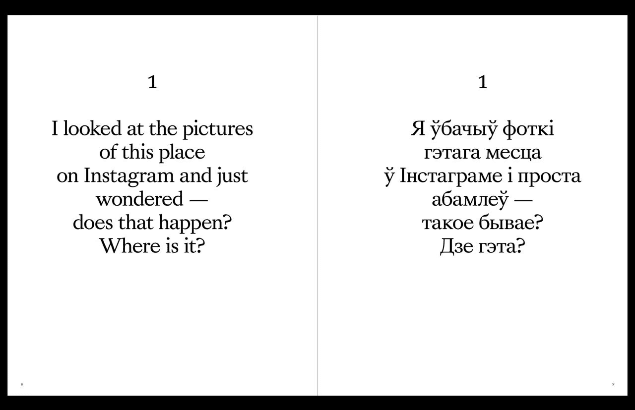
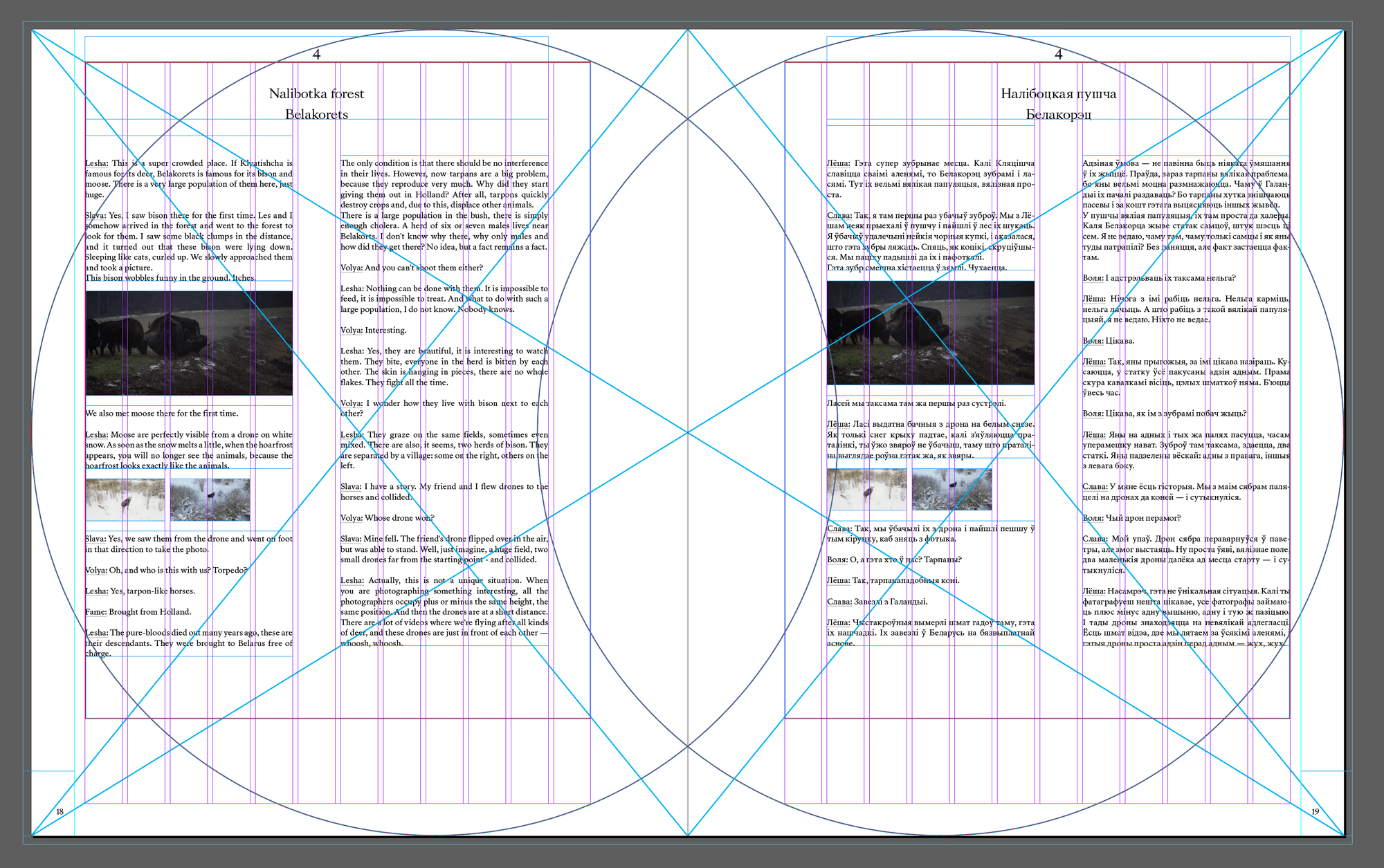
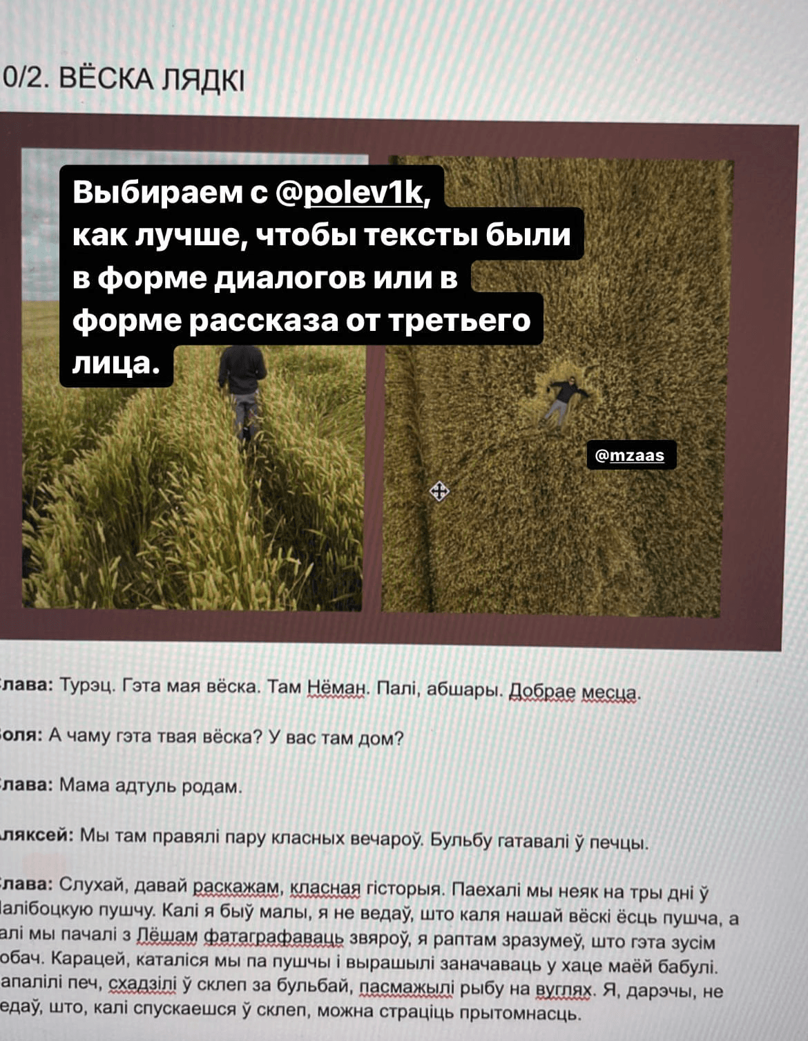
The text in the book is rendered quite unusually. It is basically Olya's dialogue with Slava and Alex. Initially, it was thought that the interviews would be turned into third-person narratives, but after the first drafts, it became clear that this format did not fit the spirit of the book. We decided to keep a more lively and less processed form of dialogues so that it would be clear that these are friends talking to each other. Sharing memories, joking, arguing, poking fun at each other. It was more interesting to read this way.
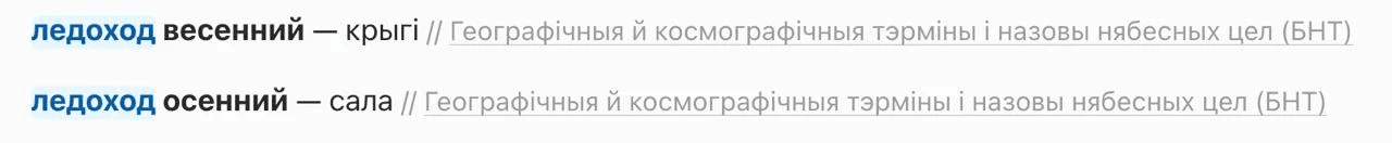
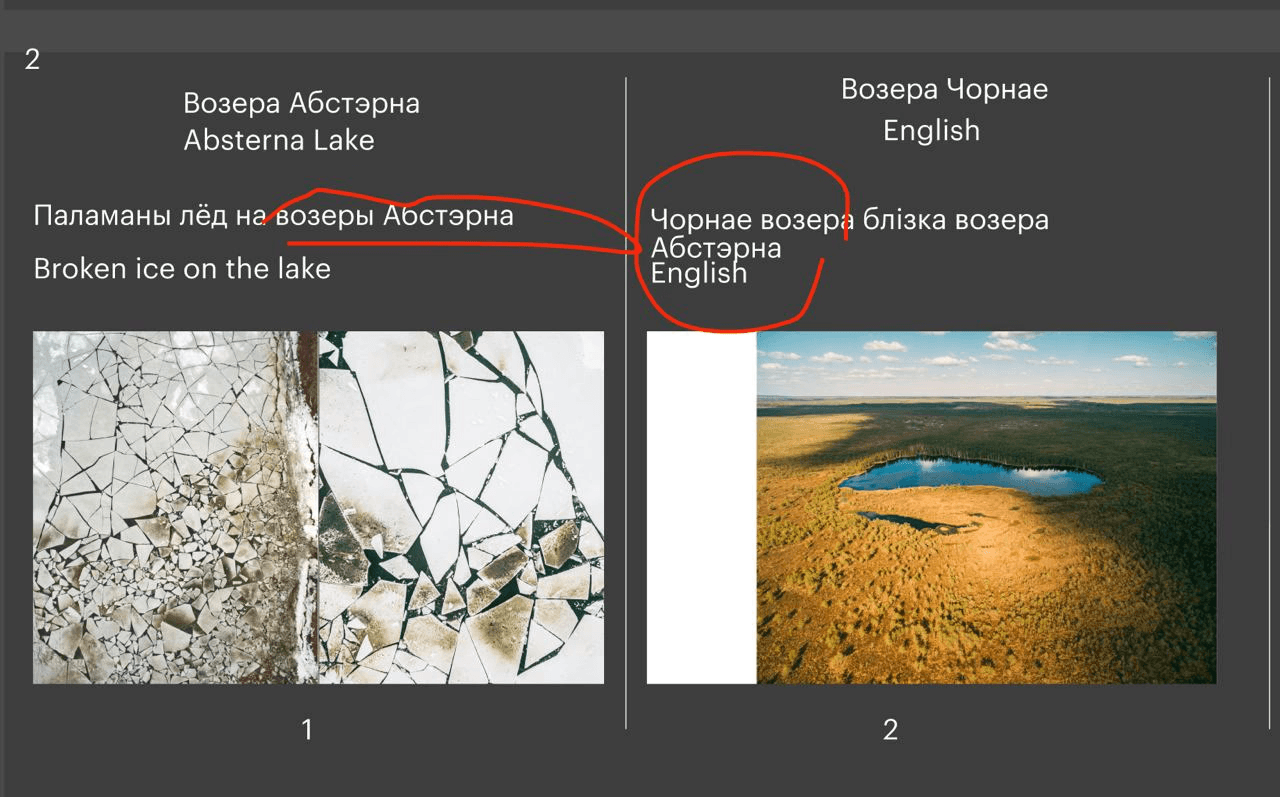
Initially all the texts were in Russian. Olya translated them into Belarusian, and we learnt a lot of new things. For example, the word "ice drift" has two variants in Belarusian:
During the translation, Olya made sure to make edits to the Russian version, as it was intended to be translated into English. Our translator Dasha is bilingual. She speaks both Russian and English natively, with English actually being her mother tongue.
A bit of Jakub Kolas’ poem that we translated ourselves
When the Belarusian translation was ready, it went to Nadia for proofreading and the Russian text to Dasha for translating.
As they both worked on the texts, it was once again crucial to make sure that all the nuances, changes of phrases and subtleties of meaning were reflected in both versions.
An unexpected issue that had to be solved was the way we write Belarusian geographical names. Until 2022, according to the law, all geographical names had to be written in the Belarusian Latin alphabet and had to be transliterated only from the Belarusian language. This rule had existed for more than 20 years. According to a new law, toponyms can also be transliterated from the Russian language, and instead of the traditional Latin script, a simplified version of the spelling can be used.
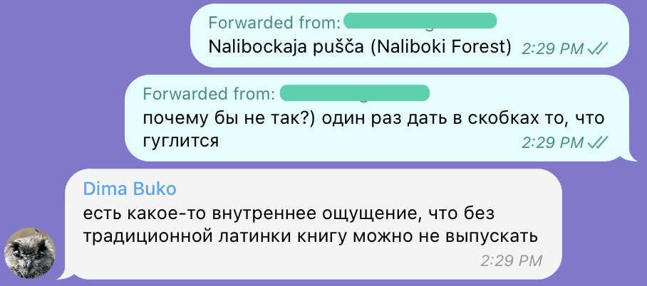
We decided to use the traditional variation, but some toponyms looked quite unfamiliar. For example, the Naliboki Forest was Nalibockaja pušča. We were worried that it would not be very clear to our foreign readers and it wasn’t easy to Google. In the end, we decided to duplicate the most famous places with a translation from Russian into English:
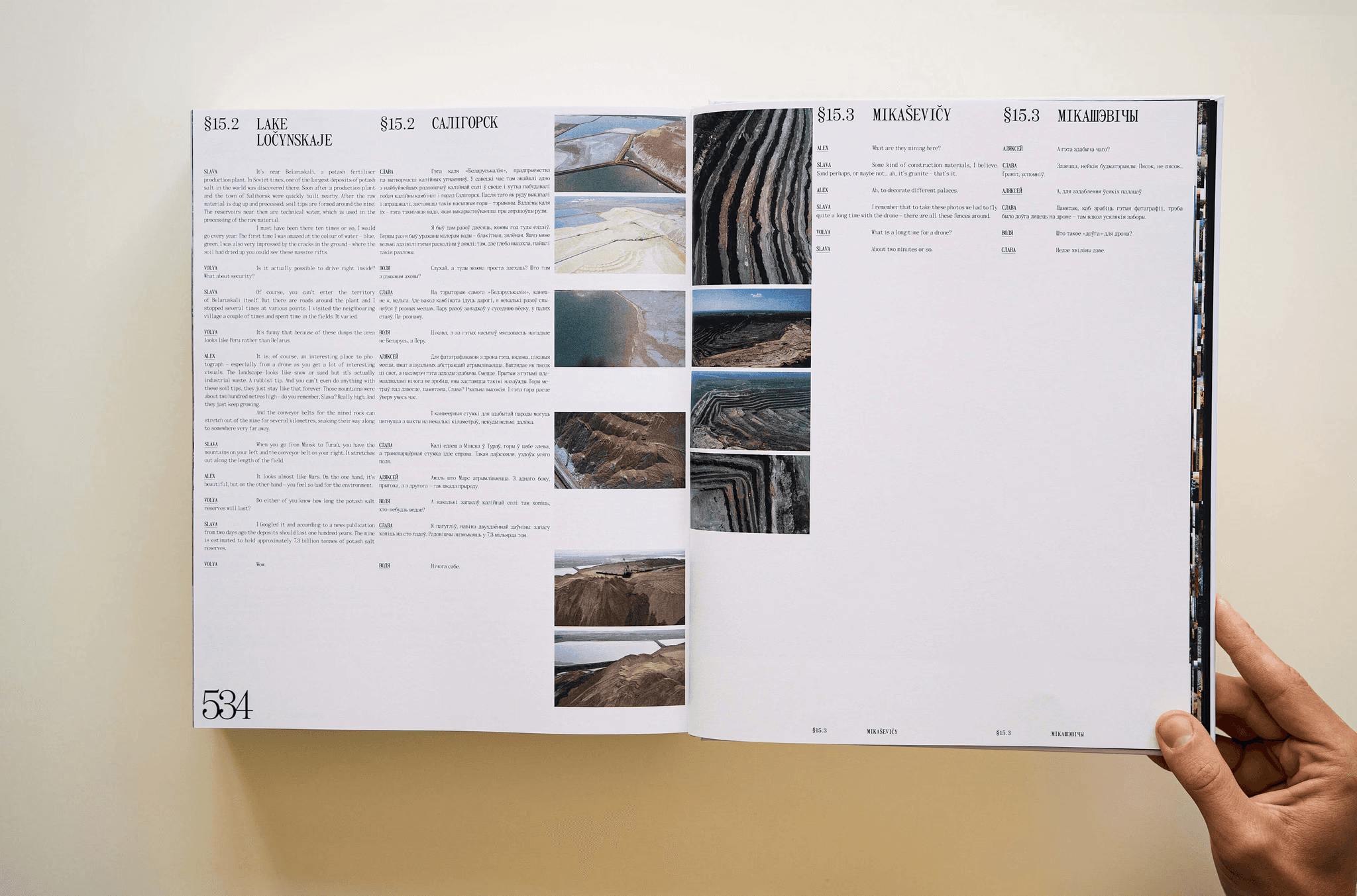
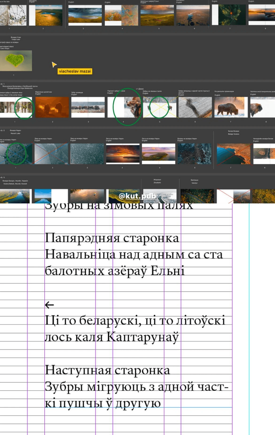
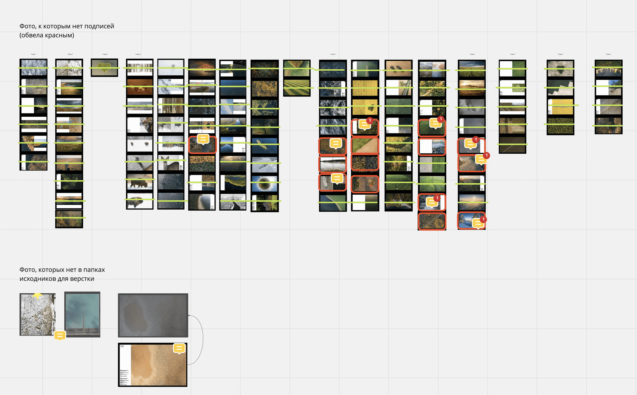
Another very important text in the book is the captions of the photos. In the process of working on the layout, we decided to caption all the photos. May I remind you that there are about 800 of them?
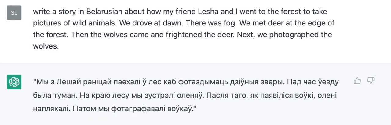
Since the task of "captioning all photos" is extremely time-consuming, we tried to use available models. But in the end, we captioned them all manually anyway.
The photos were first captioned by Olya-the-editor and then discussed with Olya-the-designer to see what was missing. After several attempts they decided on this: a mandatory caption for every new location and a caption for every third photo, if one location has many photos connected to it.
After the pilot version had already been printed, we started to make edits to the final layout. Or, as the proofreader used to say, "catching all the fleas". It took about five iterations so that both texts, Belarusian and English, were identical and sounded good in each language. The last thing that Olya asked me to correct in the final layout, which was at this point practically lying in the inbox of the printers, was the definition of “tarpans” (wild horses).
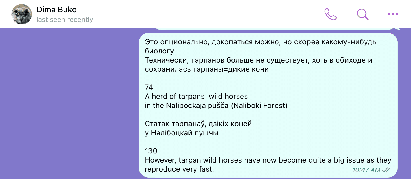
The final edit to the text of the book
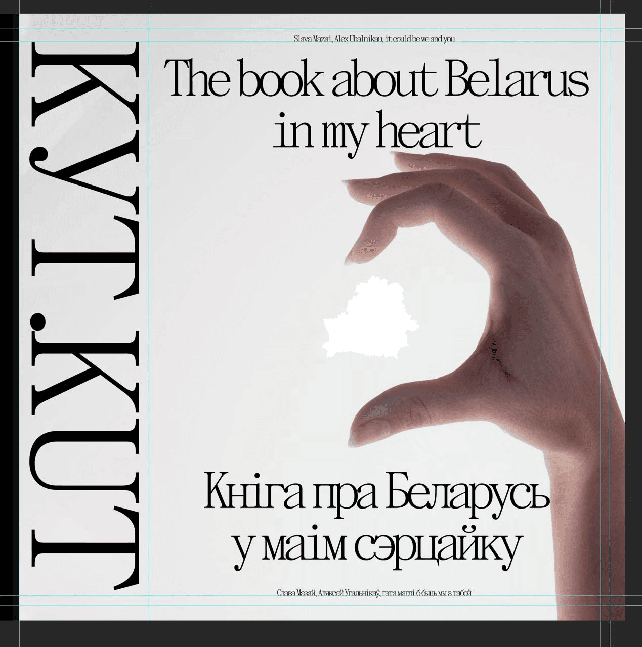
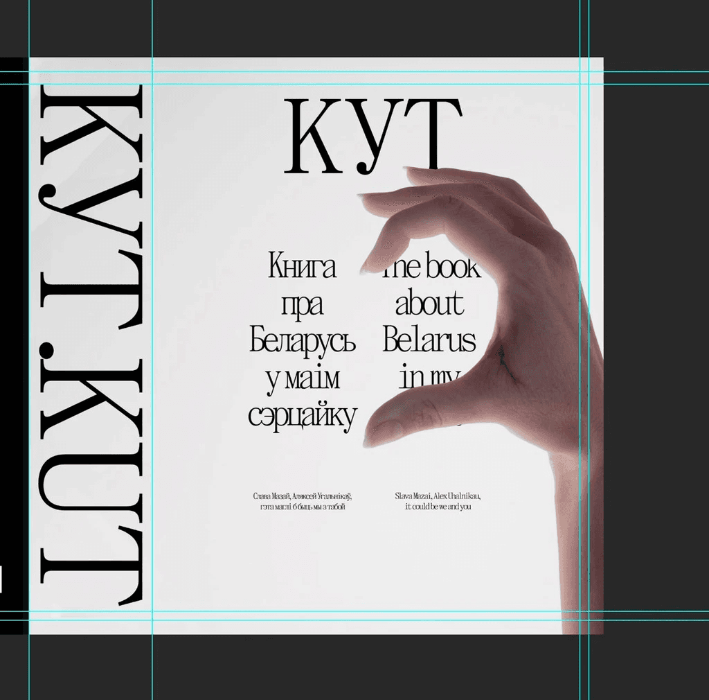
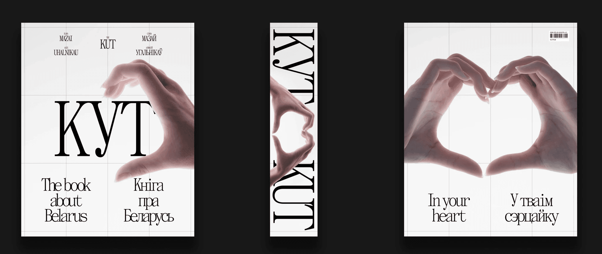
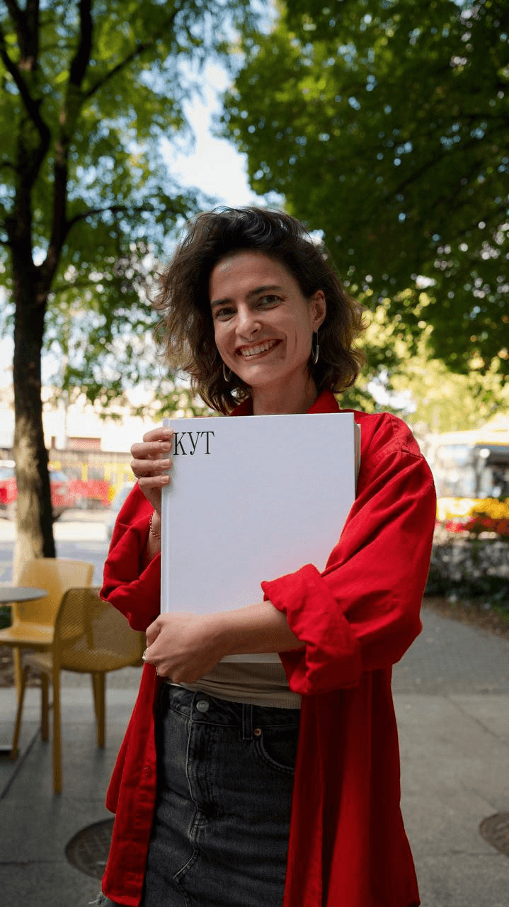
THE BOOK COVER
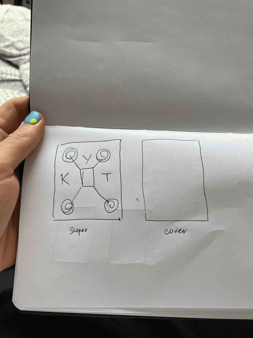
It turned out that making such a simple book cover was not an easy task. Here I want to show the alternative ideas and solutions that didn't make the final cut.
A concept for the cover with a drone. Unused
The drone
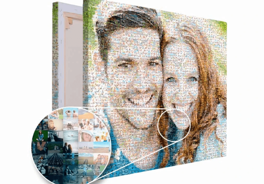
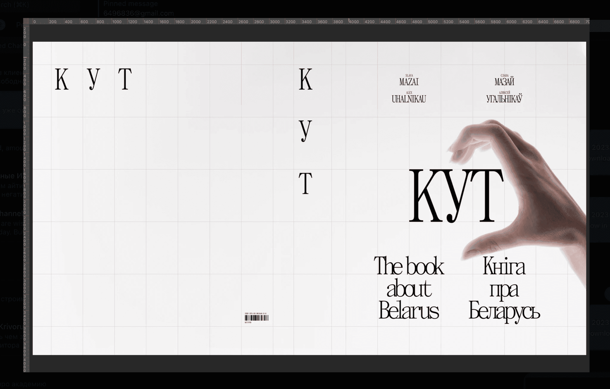
Slava suggested making a cover using all the photos as a mosaic.
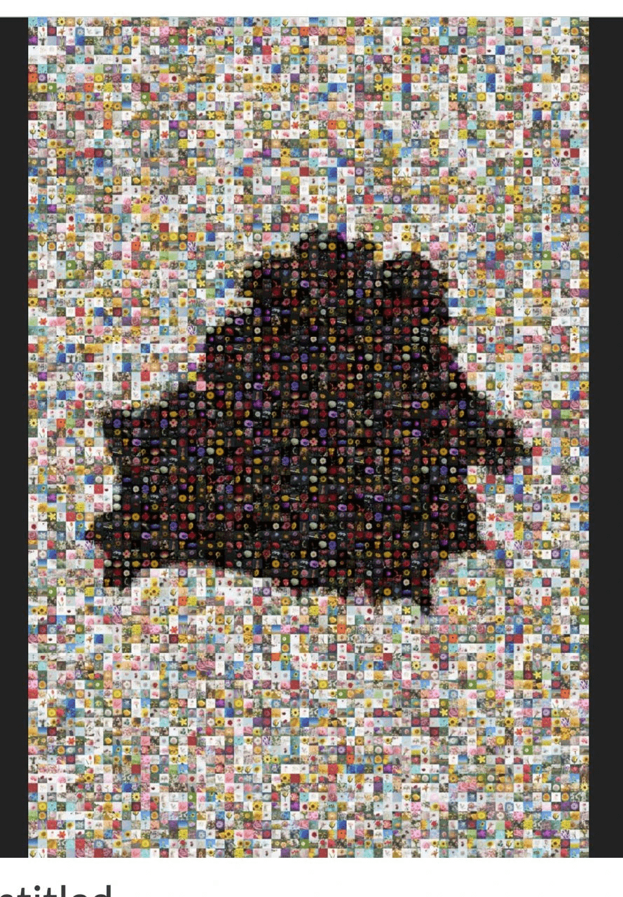
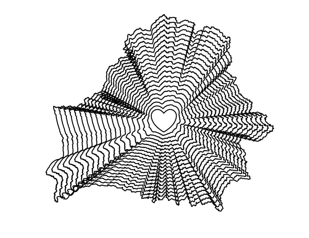
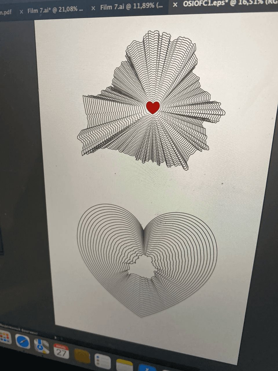
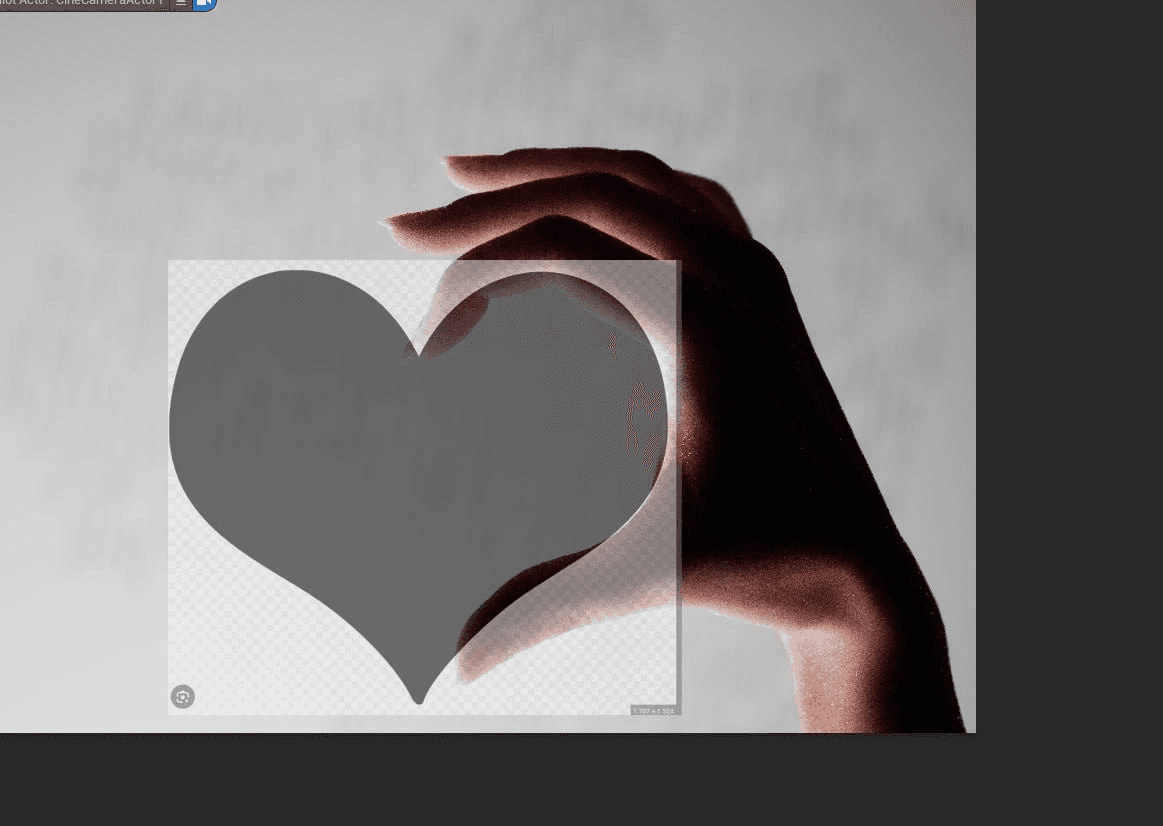
An idea: to put together a heart made from different photos from the book (Valery Belozyorov)
To show Belarus on the globe (Valery Belozyorov)
Reference
Concept
And one more
An idea to create a cover using text (Slava)
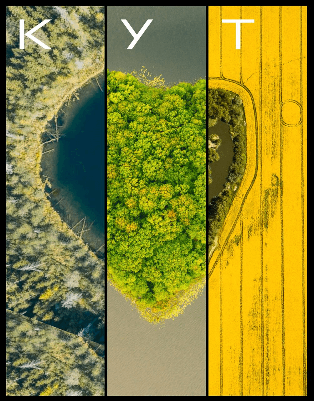
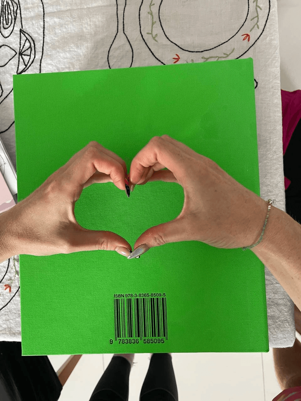
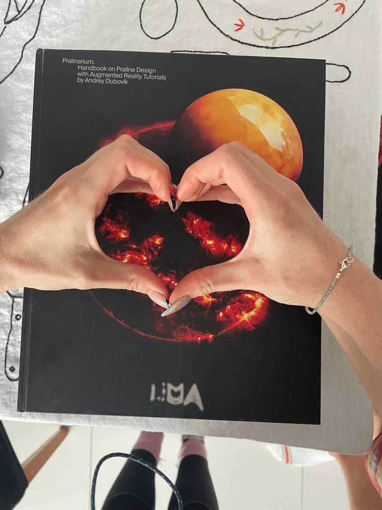
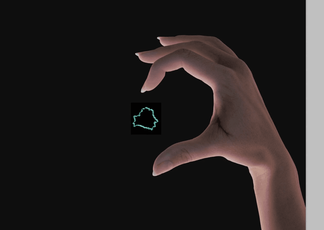
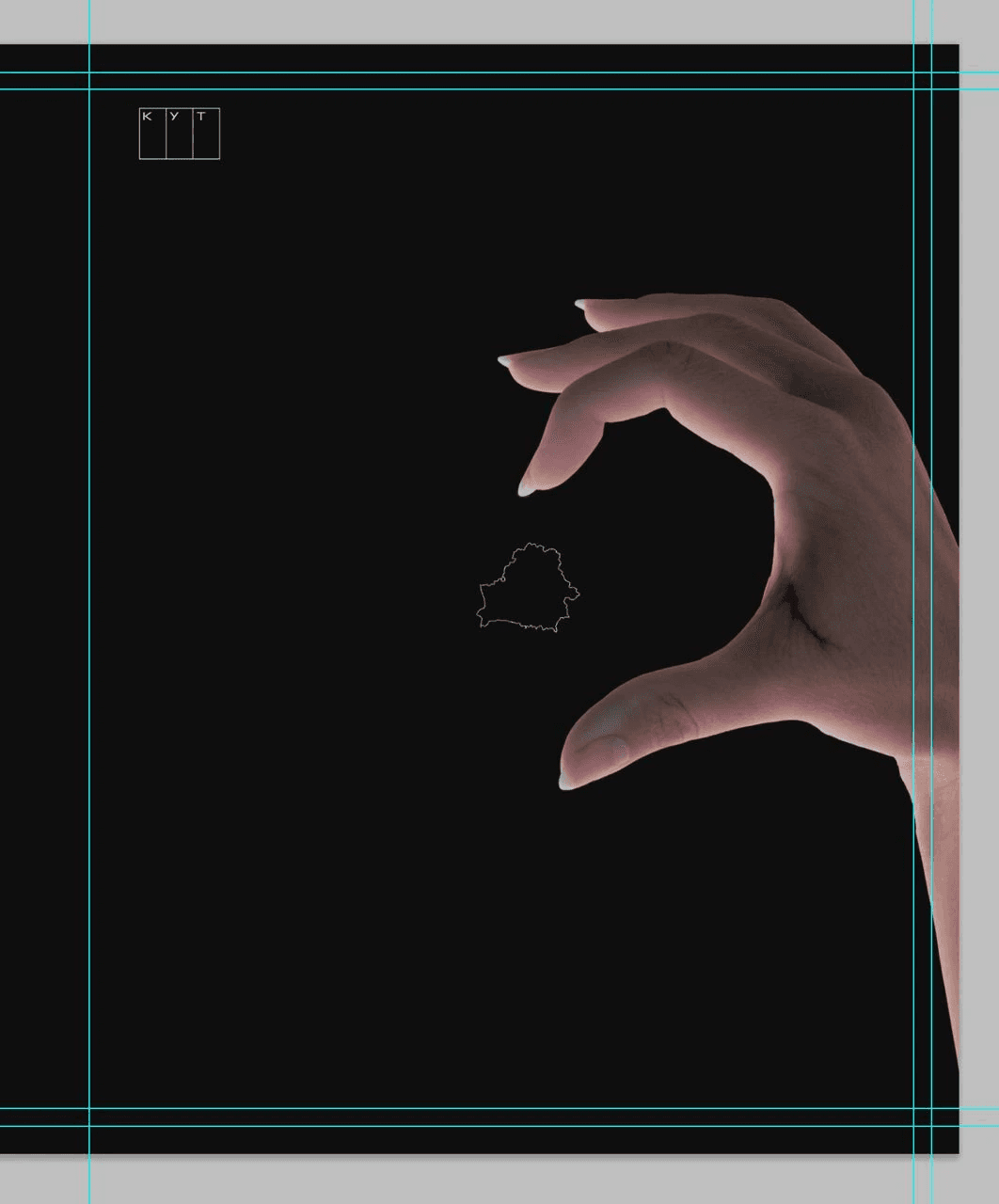
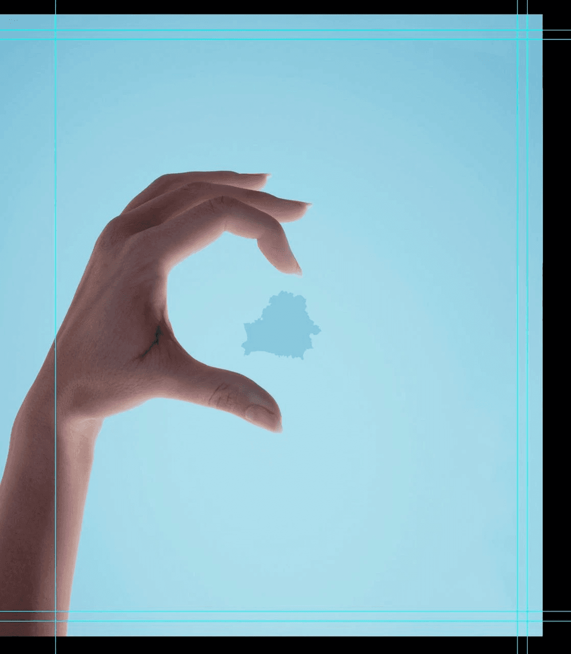
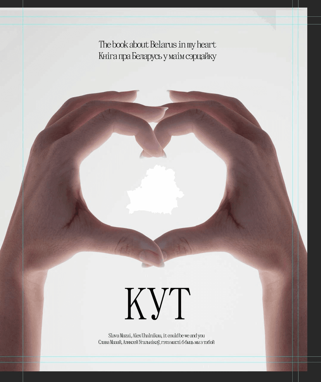
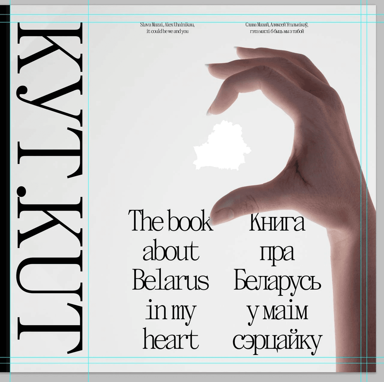
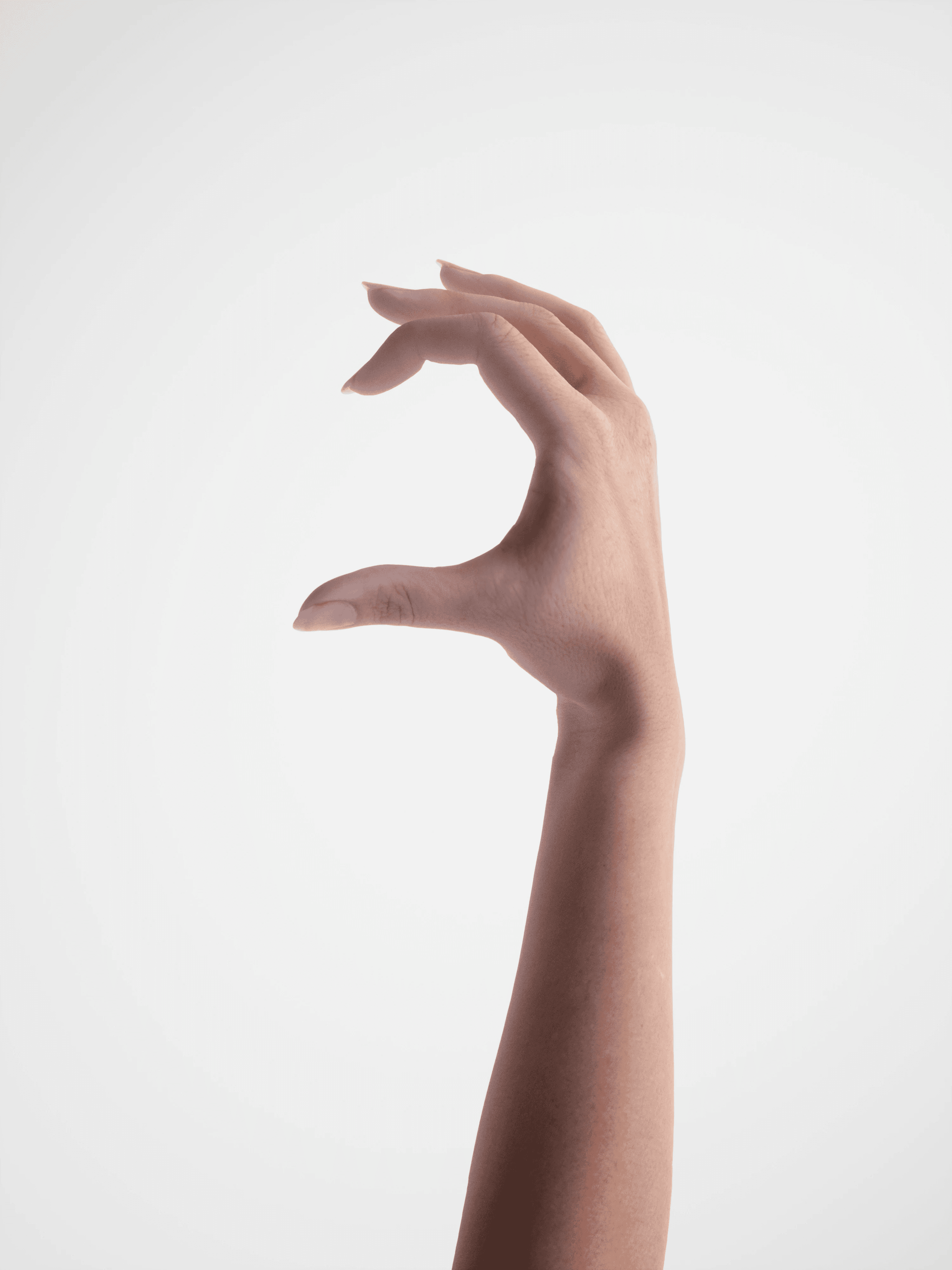
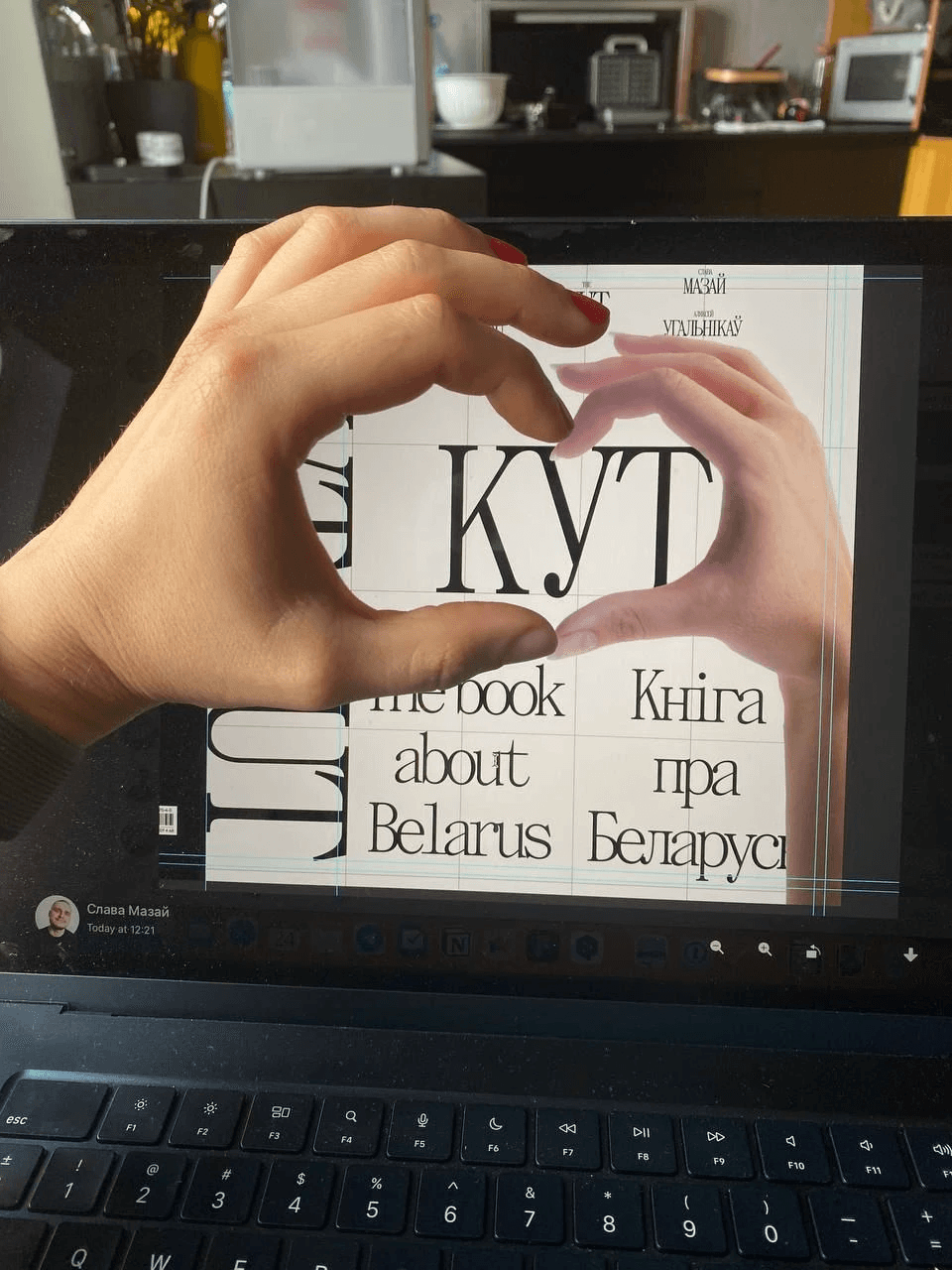
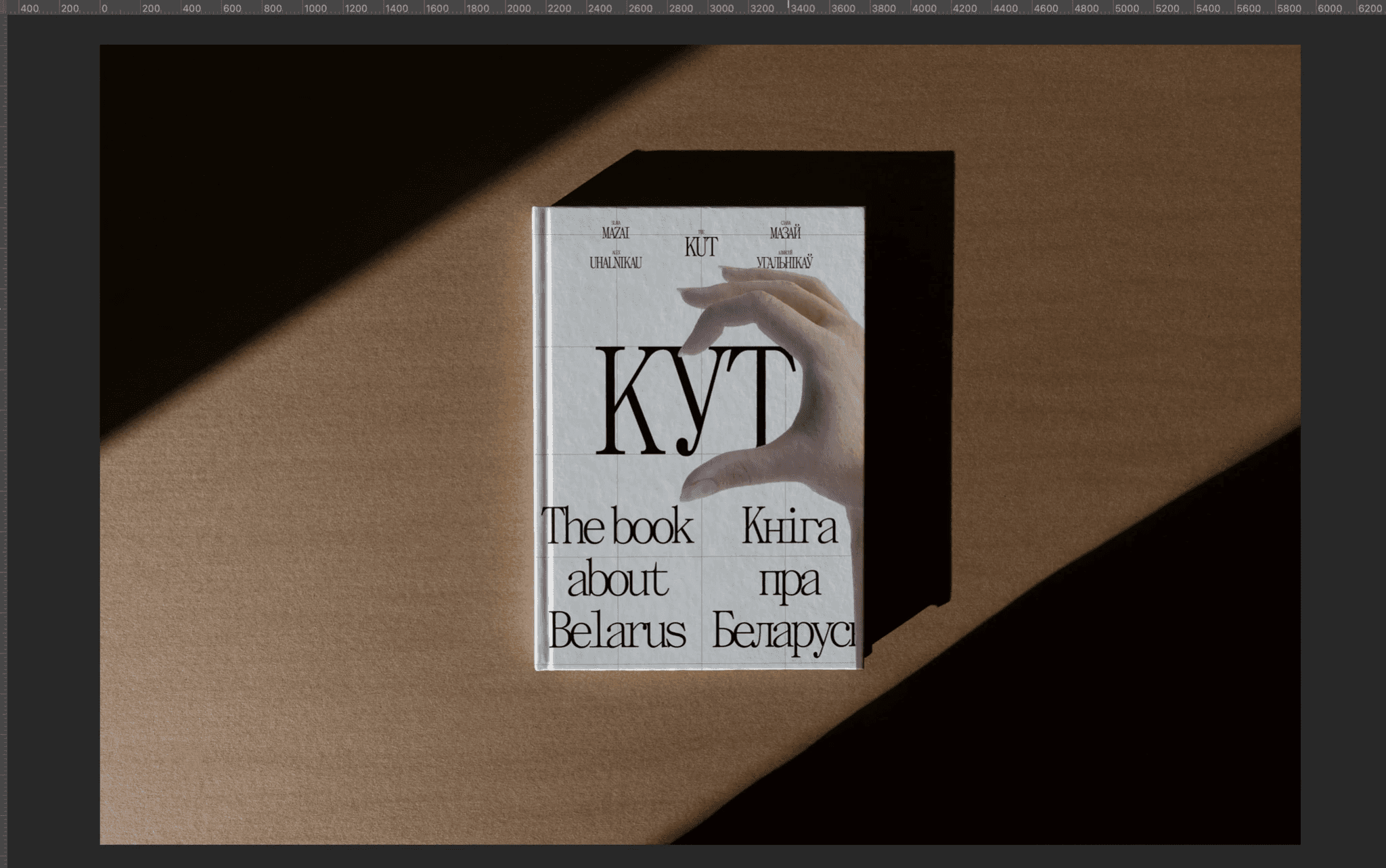
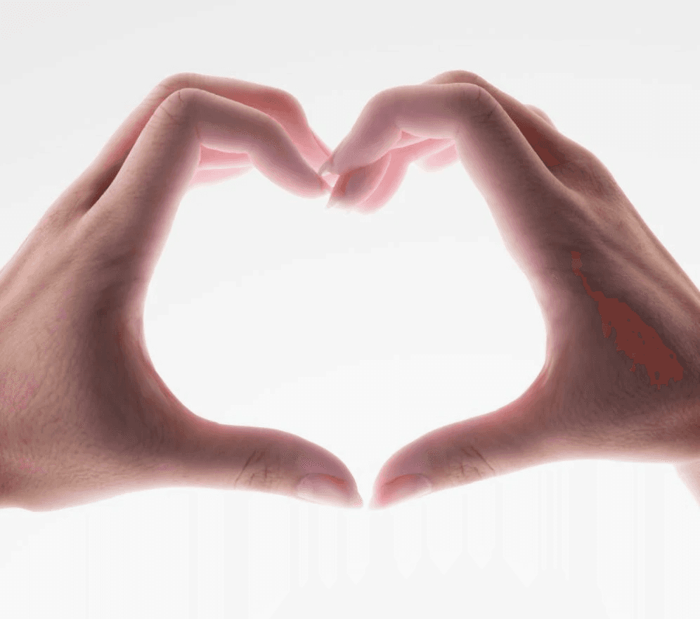
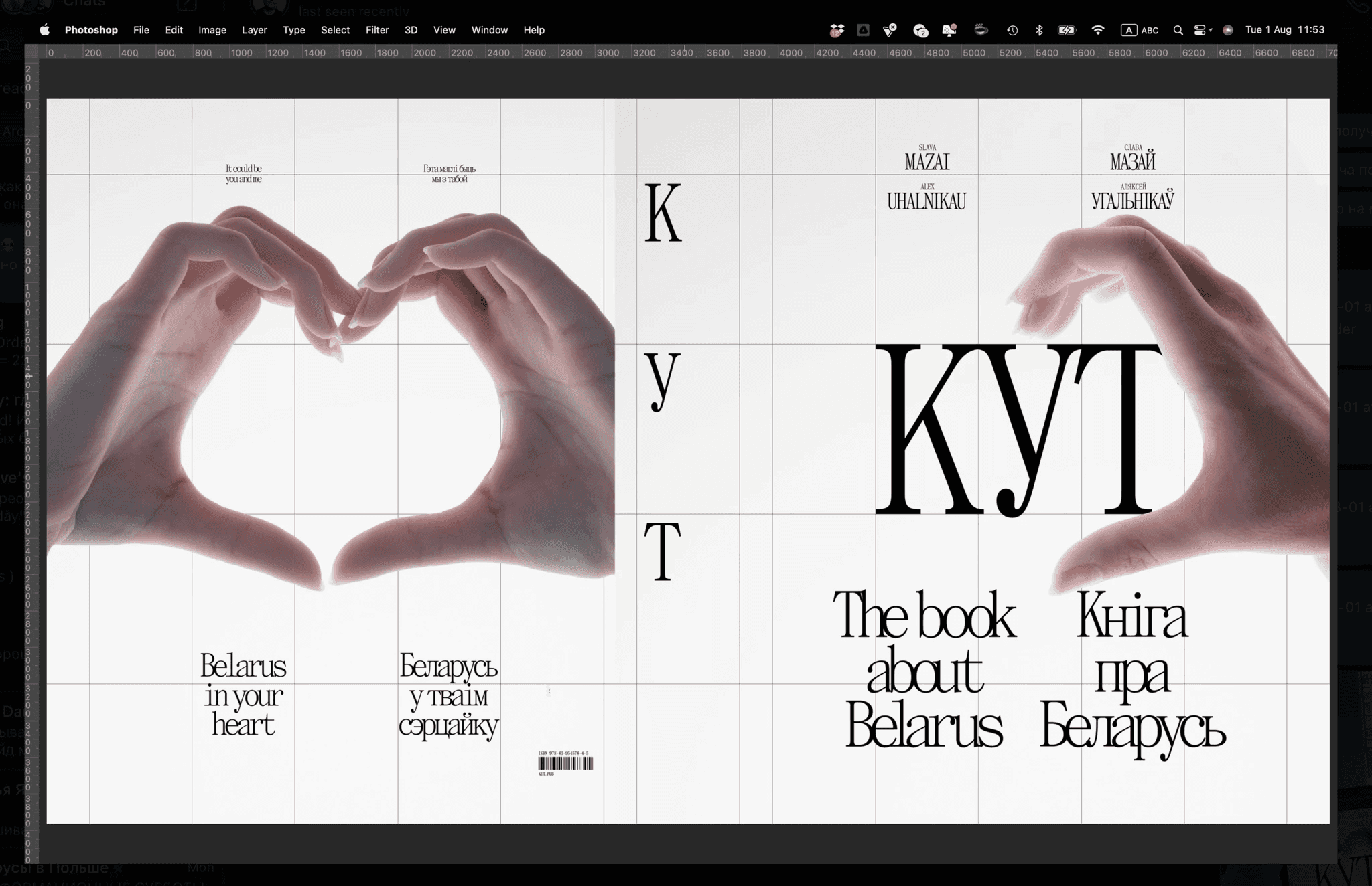
Here's a cover that almost made it to the final cut: making half a hand heart on the cover. The idea was that any person holding the book could put his other hand and get a whole heart. In the heart there would be an outline of Belarus and the inscription "KUT", so that you get "KUT in your heart".
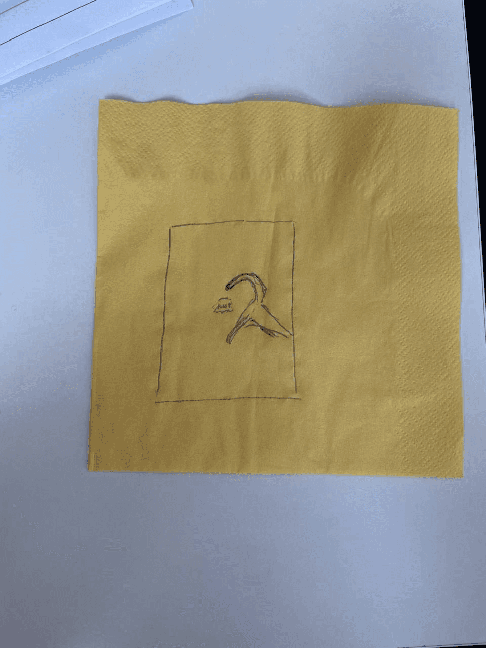
Me and Zhenya Dovnar came up with this idea on a napkin
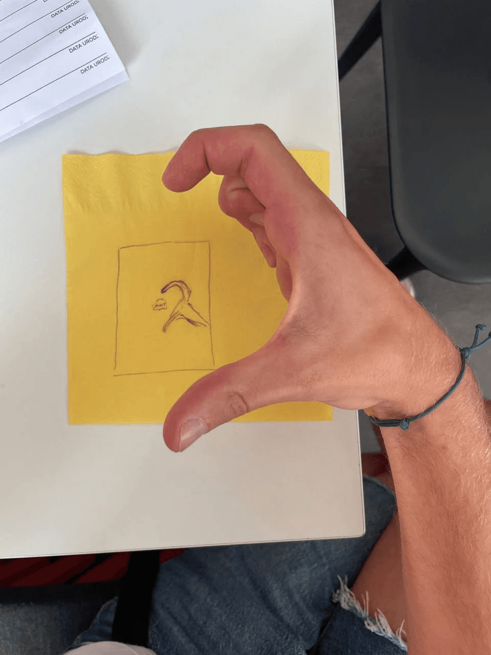
Me and Zhenya Dovnar came up with this idea on a napkin
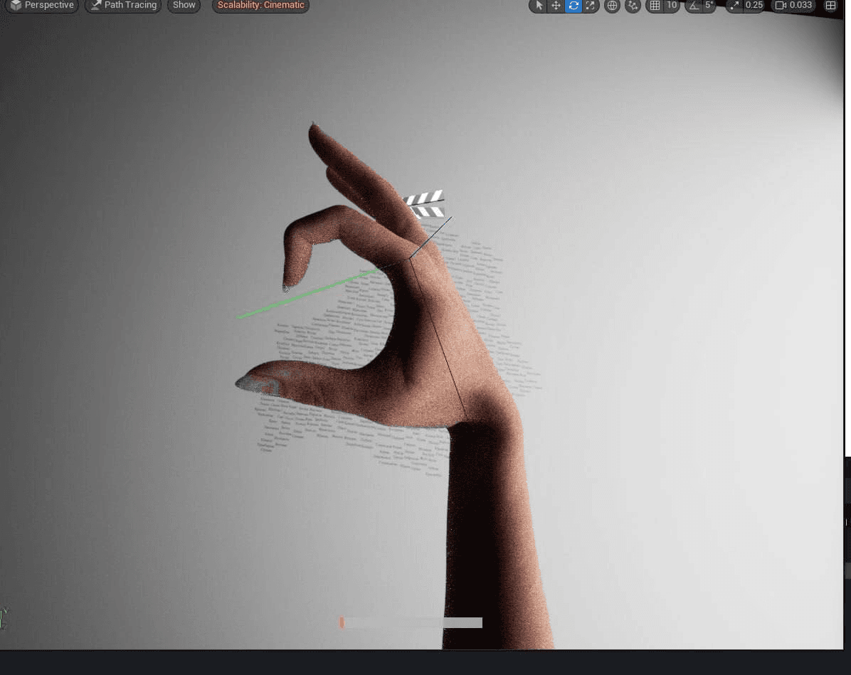
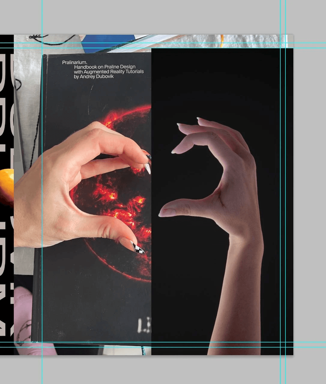
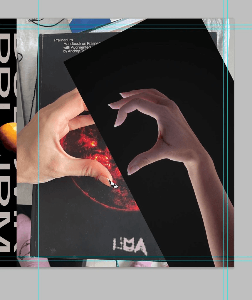
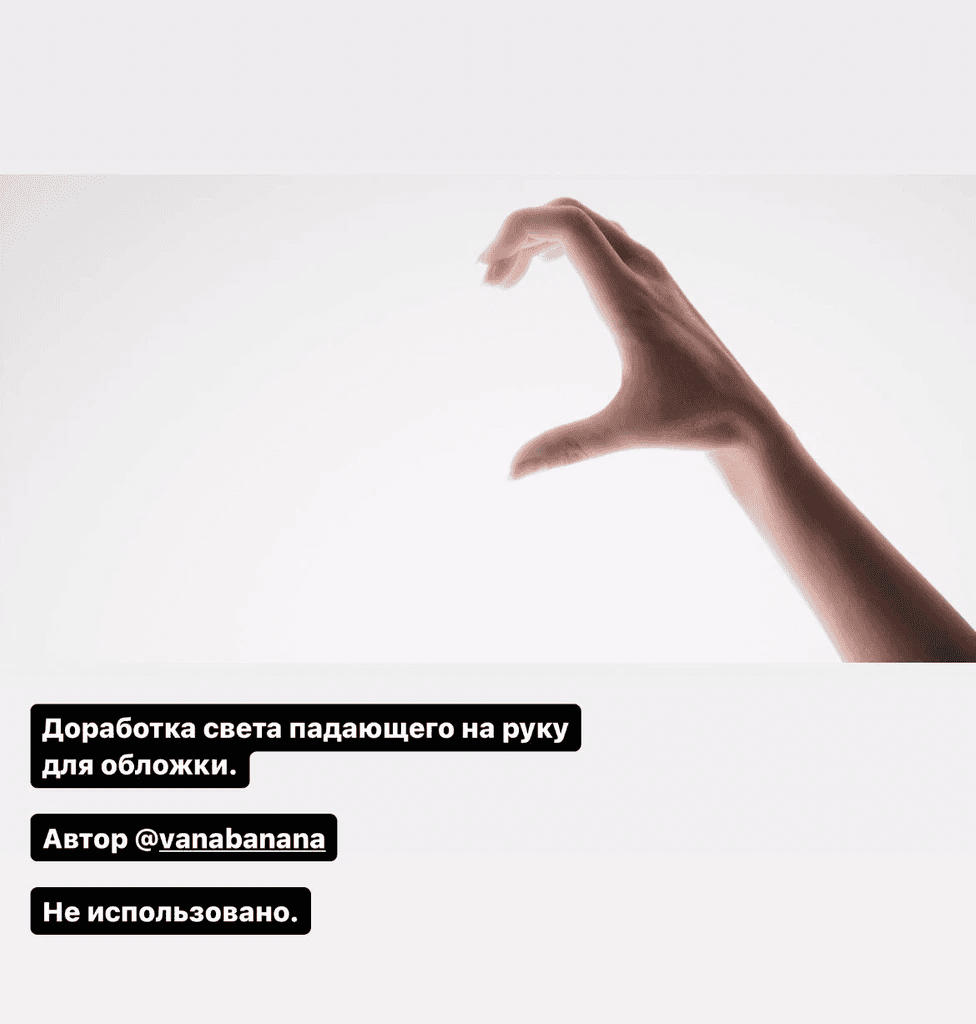
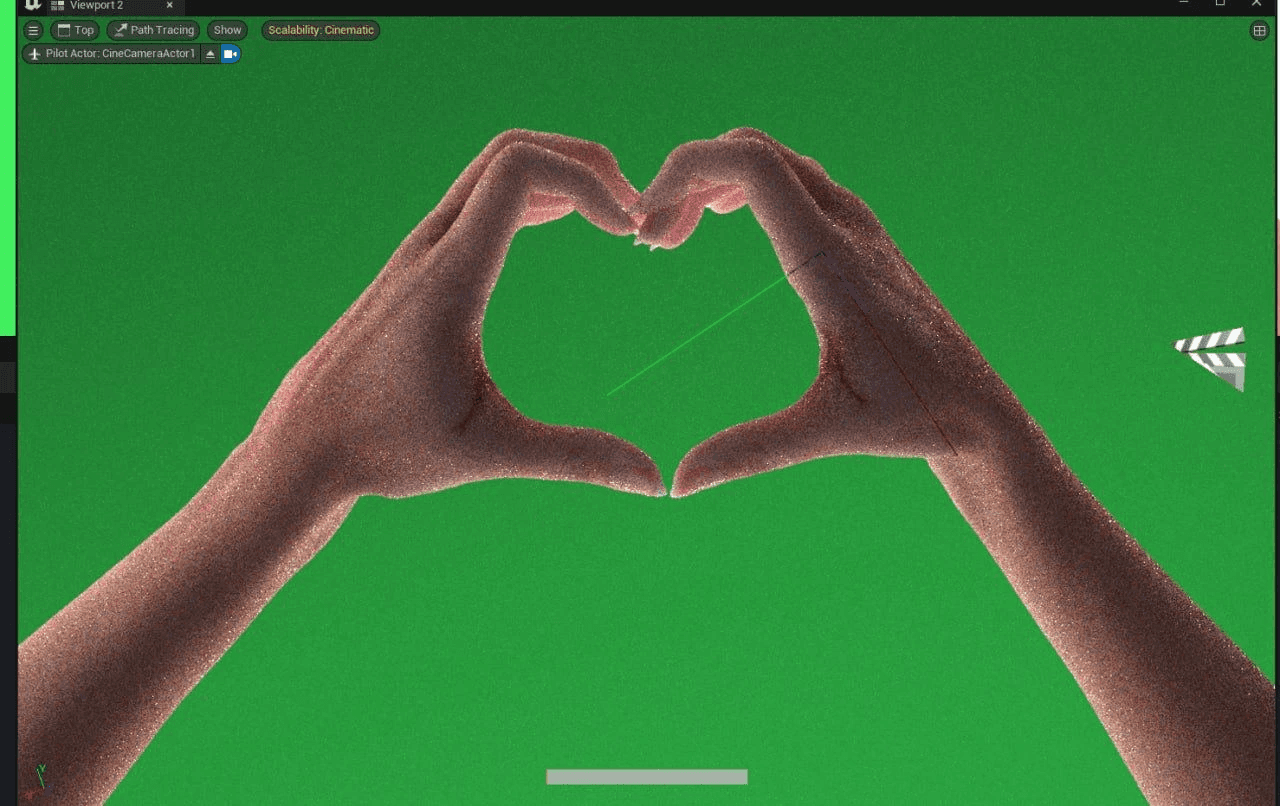
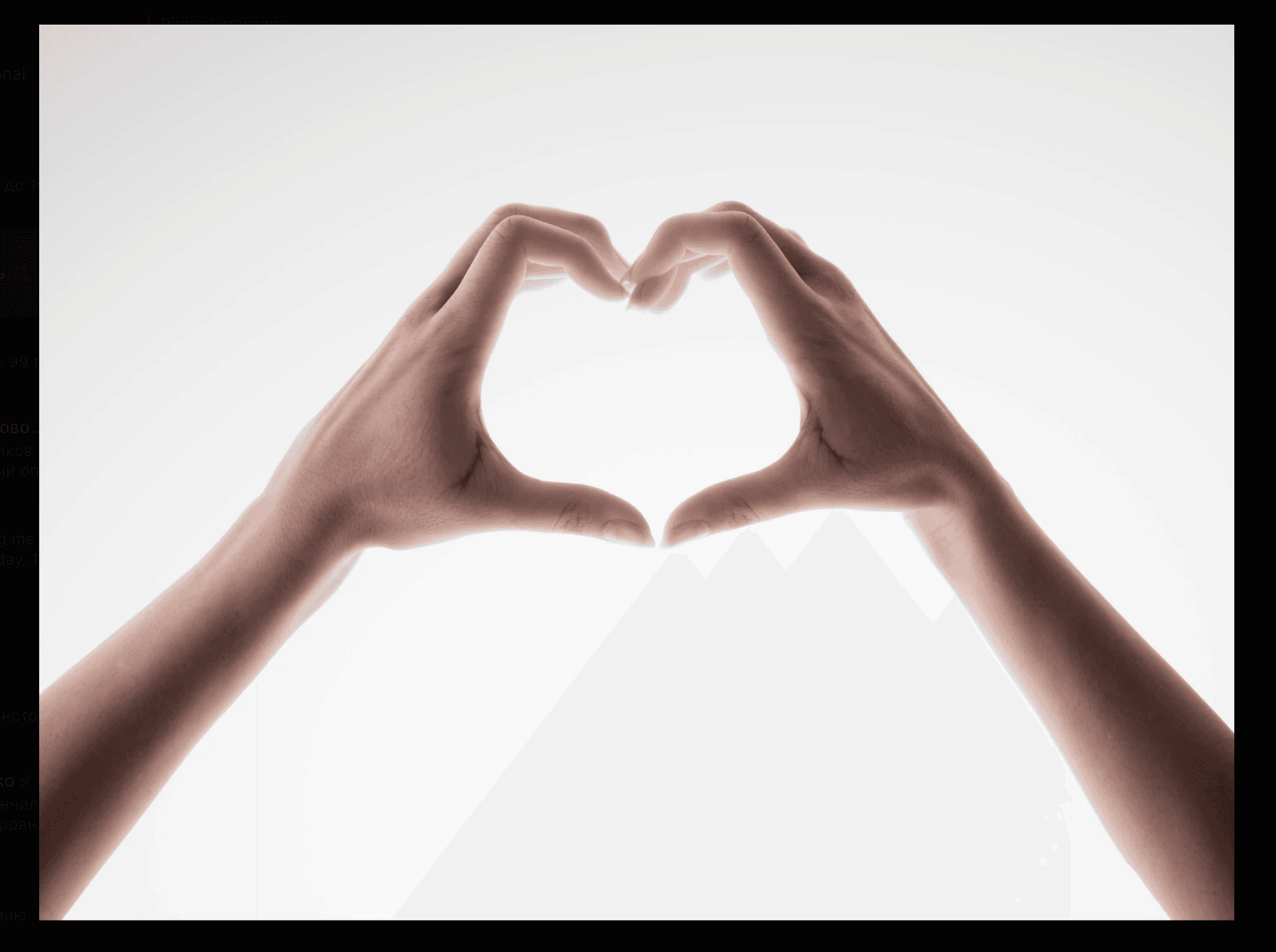
A hand render (Vanya)
A hand render (Vanya)
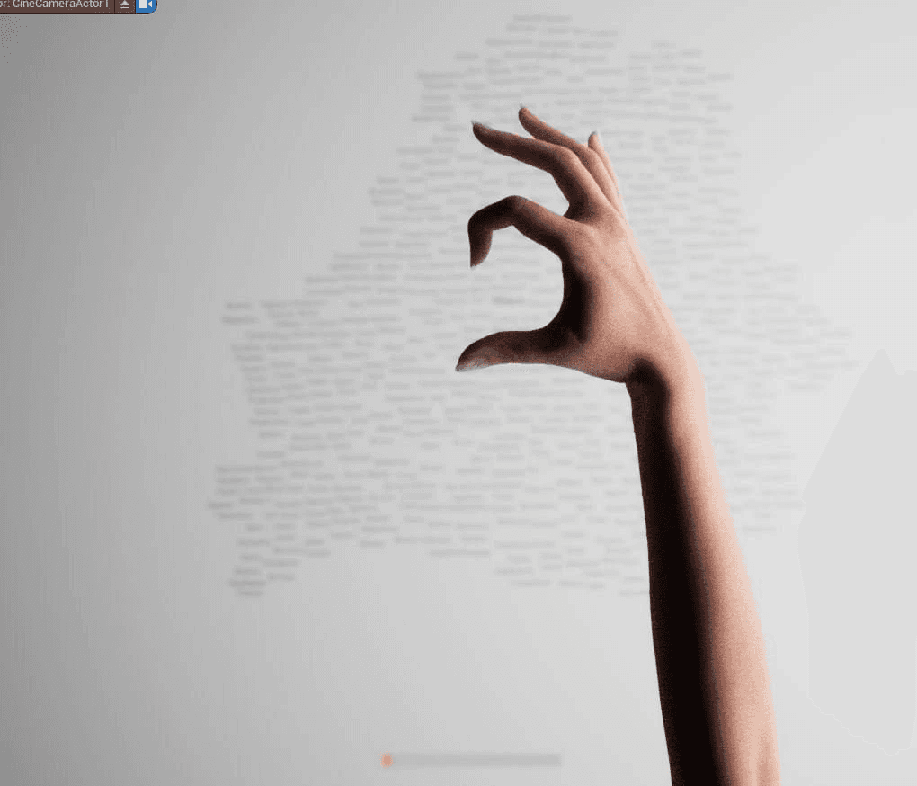
A hand render (Vanya)
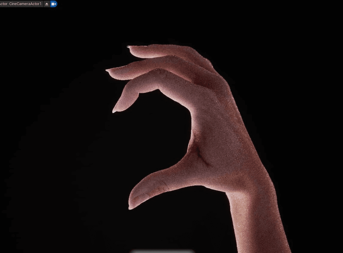
A hand render (Vanya)
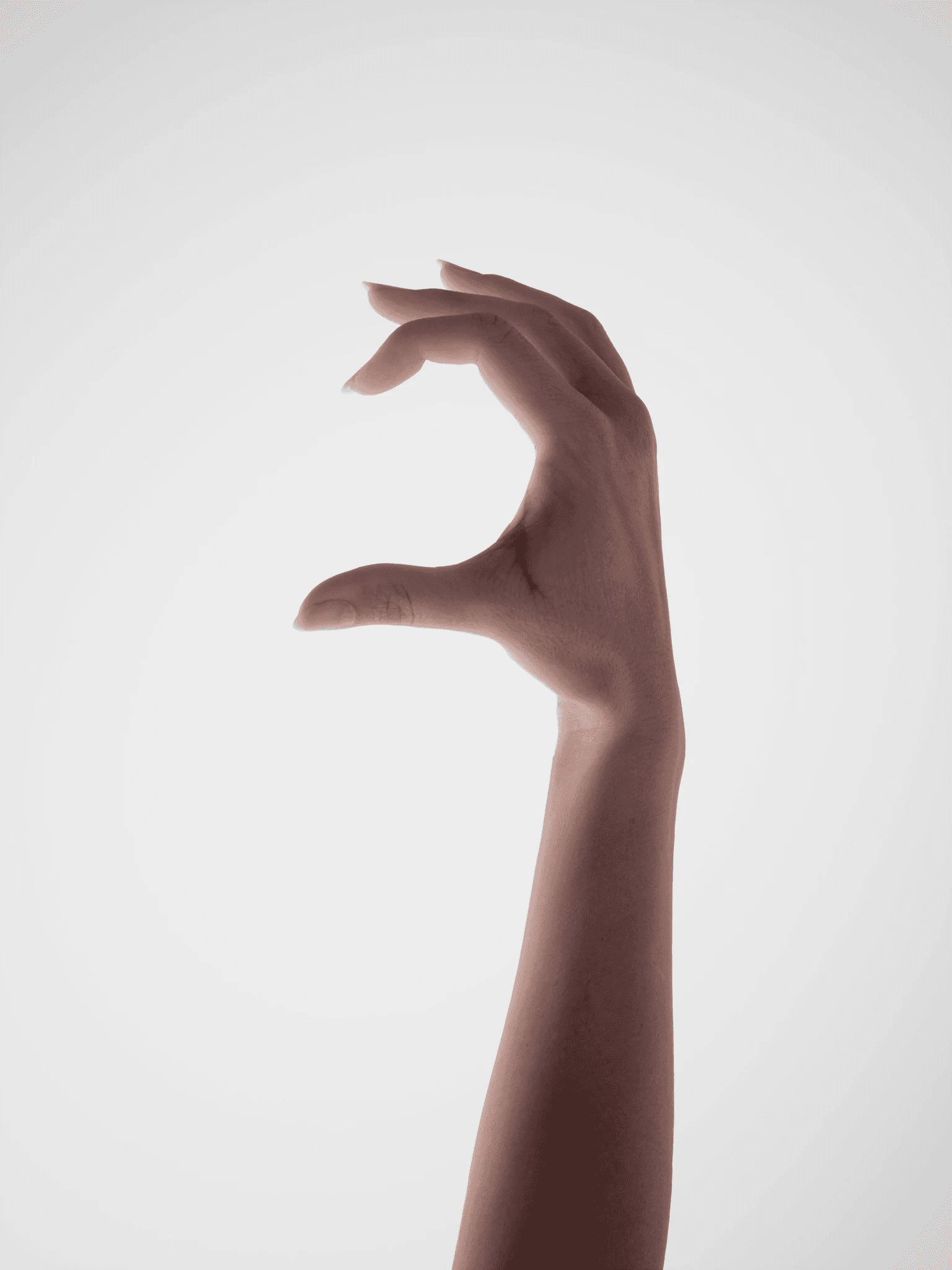
A hand render (Vanya)
Ksyusha from Naviband criticising the heart cover and offering her own version

Sasha Yakovlev
Valery Belozyorov
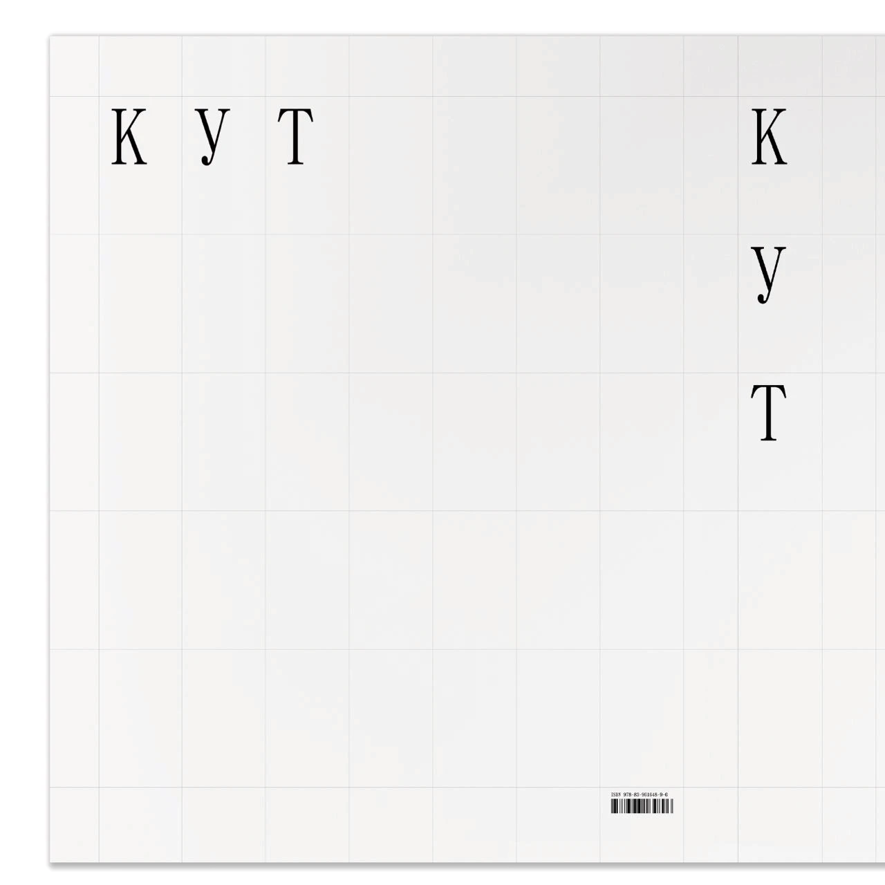
Letting go of all the elements on the cover was really tough.
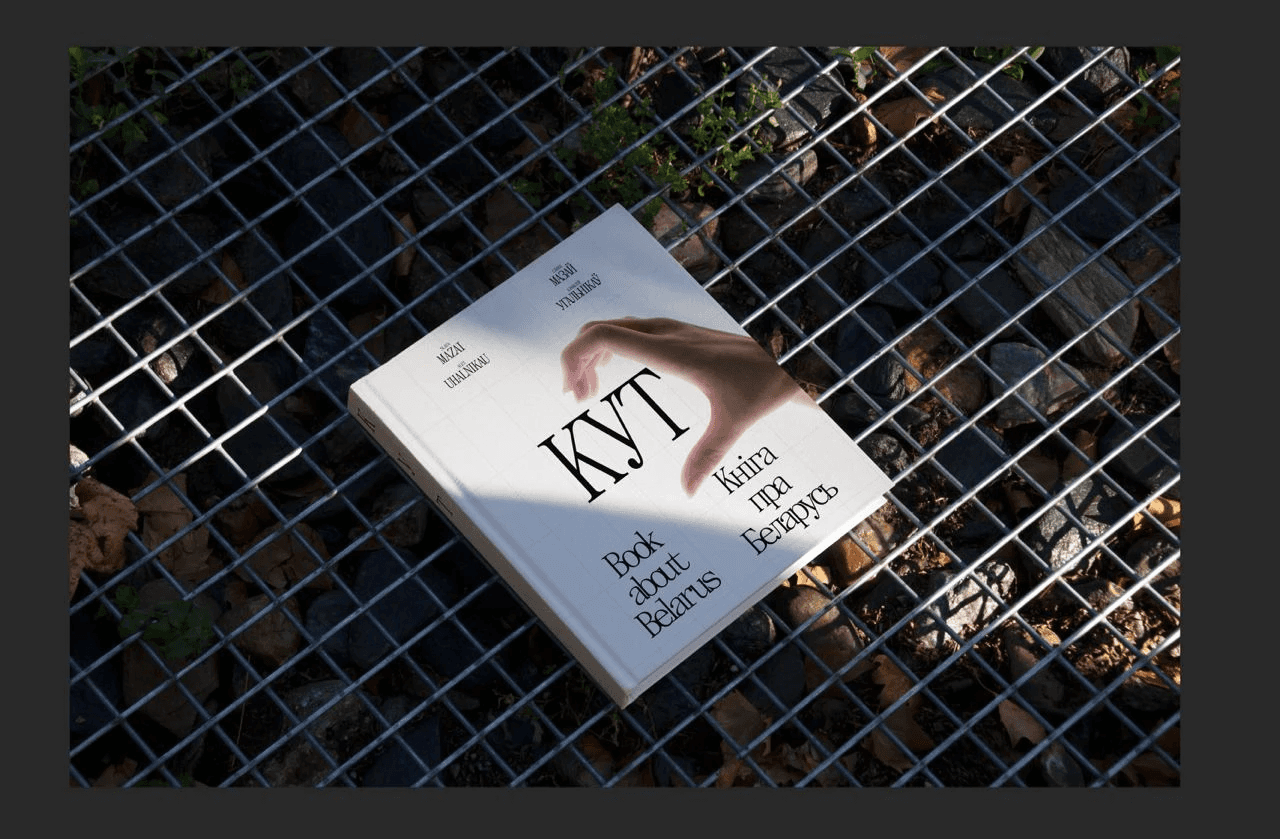
To remove everything, even the authors' names, was a simple and bold decision, which we were not 100 percent sure of. But had a gut feeling that this is how this book about Belarus should look like.
Later, the book started to be called the White Book of Belarus online, comparing it to the Red Book of Endangered Species.
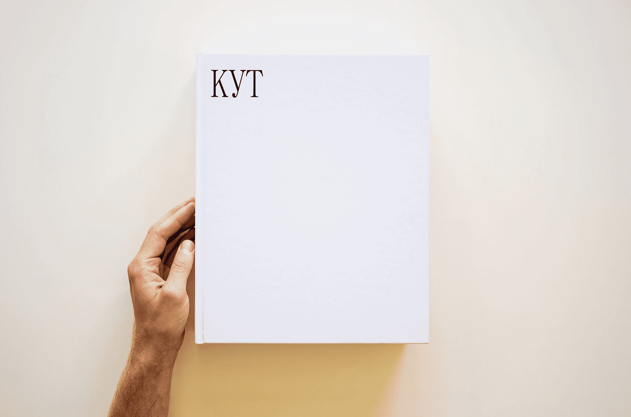
The cover that was printed as the pilot version.
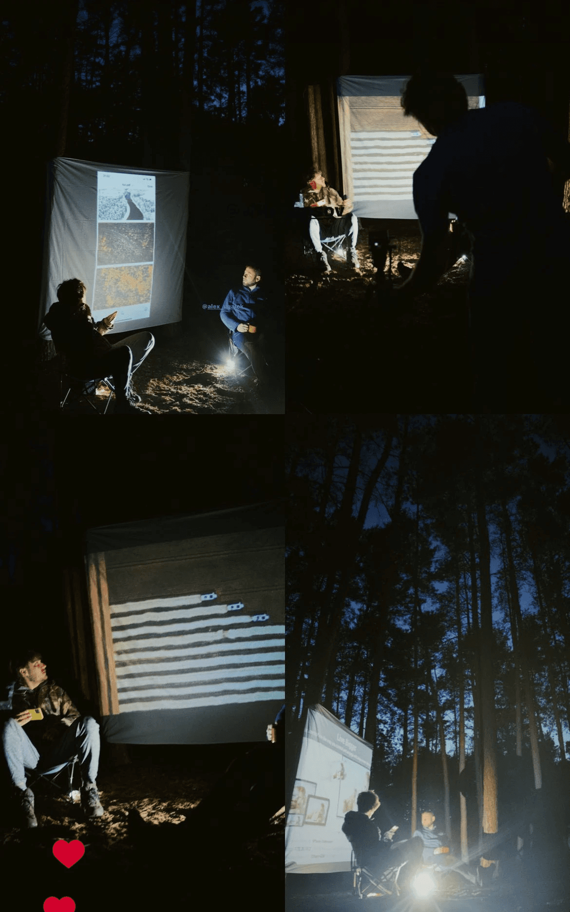
MAKING A FILM ABOUT THE BOOK
Slava came up with the idea of making a film about the book. Filming took place during the late stages of the book, when it was already beginning to take some sort of shape. Slava invited the video director Alex Nosov to make a film about how the book was being made and what it would be about.
Watch the film about the book
PRINTING THE PILOT, WEBSITE, SENDING TO PRINT
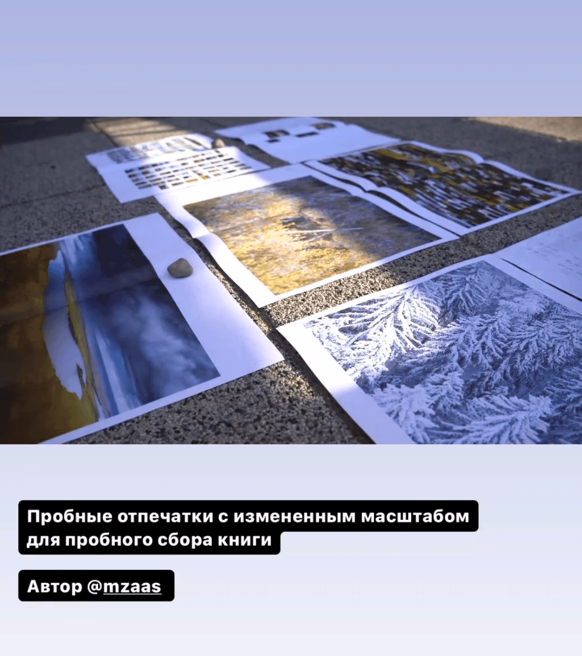
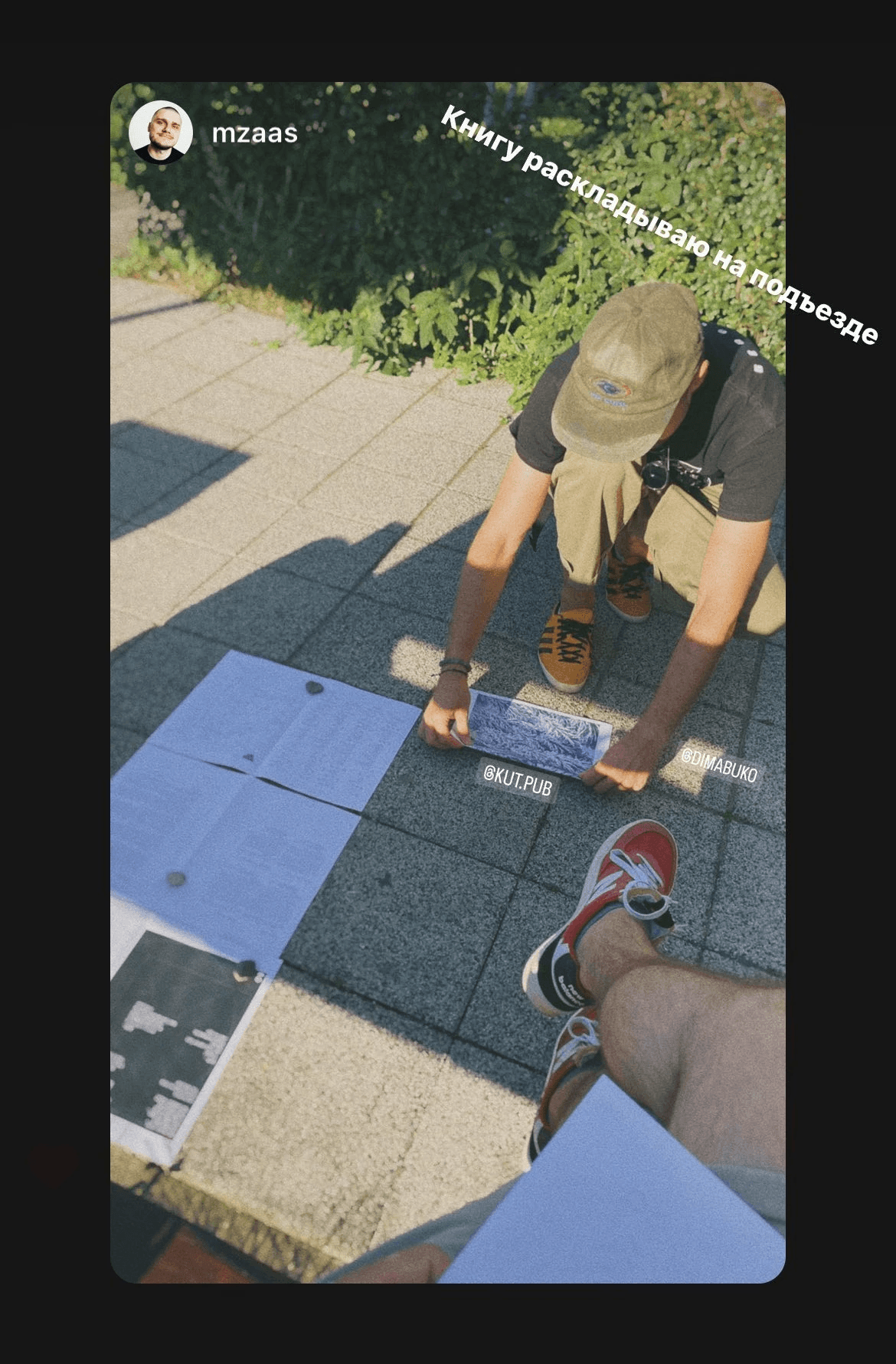
Once we had the book layout almost ready and were finalising details, Slava went to a regular printing centre and printed a few pages of the book on A3 sheets. We folded them in half to get smaller drafts of the future pages of the book. It's hard to say whether this helped us in any way, but we met several times just to lay these sheets out and look over them.
One of the ready versions of the collated layout
One of the ready versions of the collated layout
The layout in process
The layout in process
Aligning Alex on the pages of the spread
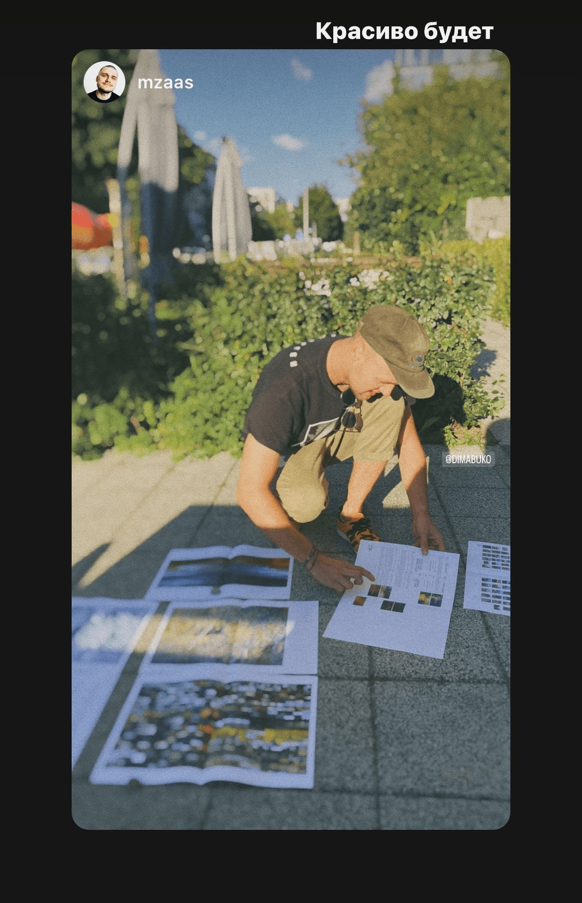
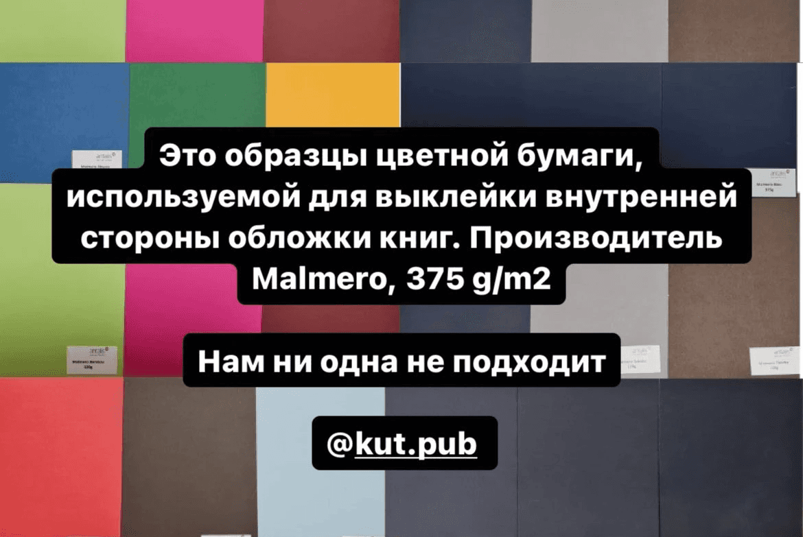
Selecting the paste paper
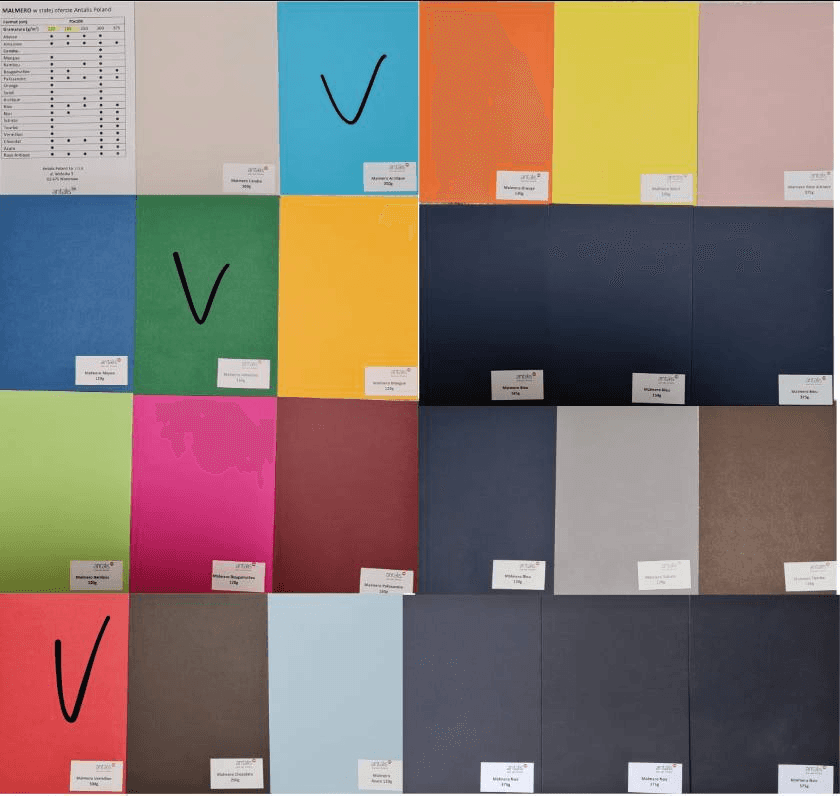
Selecting the paste paper
Choosing photos for the front pages of the book
We already had a complete layout of about 550 pages, the photos were grouped into chapters, the quotes and the text were laid out properly.
But we kept on improving the project and would keep on improving it as long as we had time. We had to set ourselves a deadline for this process, otherwise it would have never ended.
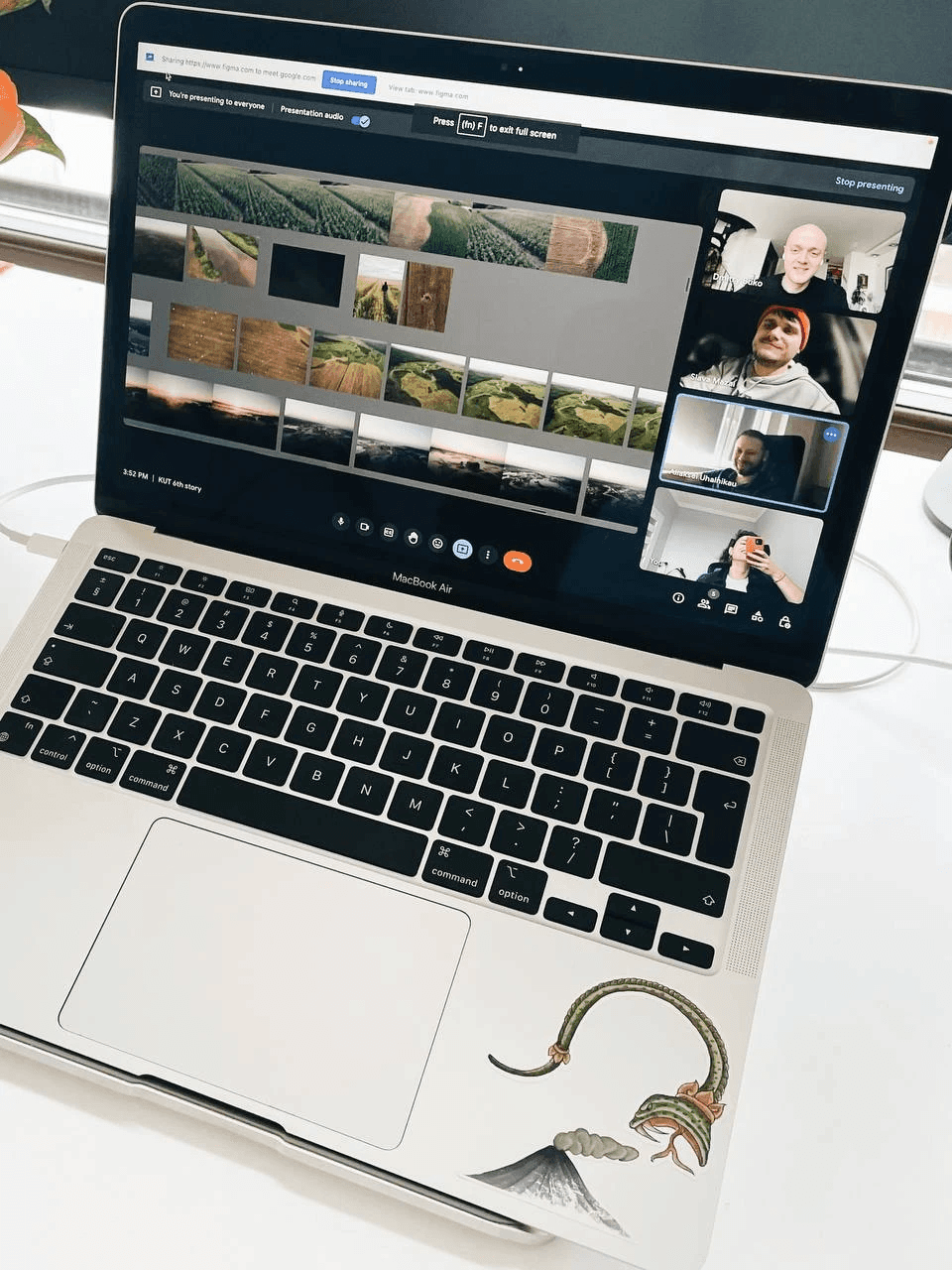
The process of finalising the layout before the pilot went to print. Screenshots from Figma
The process of finalising the layout before the pilot went to print. Screenshots from Figma
The process of finalising the layout before the pilot went to print. Screenshots from Figma
The process of finalising the layout before the pilot went to print. Screenshots from Figma
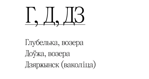
The Belarusian digraph «DZ» in the index
Making edits 24/7, wherever possible
Adding page numbers to the pages
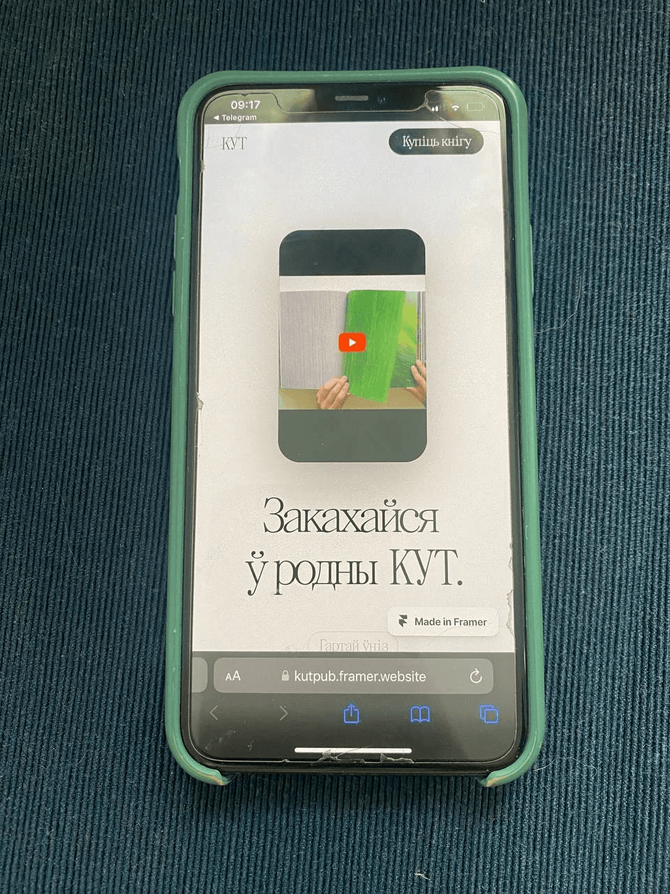
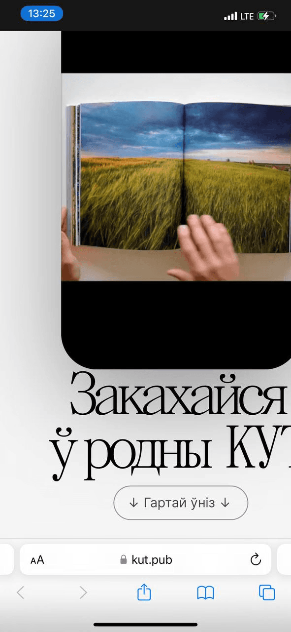
The website for the book was built using Framer. At first, I wanted to make a video where I would flip through the book. And I wanted the website to work on a scroll-to-play basis. So you start scrolling through the site and the book opens. You scroll further - the book’s pages would turn, and an additional layer on top of it would display some text. But in reality the idea wasn’t so great.
A photoshoot for the landing page
A photoshoot for the landing page
Developing the landing page, we had a bunch of bugs in the mobile version
Developing the landing page, we had a bunch of bugs in the mobile version
Bugs in the mobile version
Bugs in the mobile version
The ‘your payment was successful’ page that a user would see after pre-ordering the book
FINALISING THE FIRST COPY
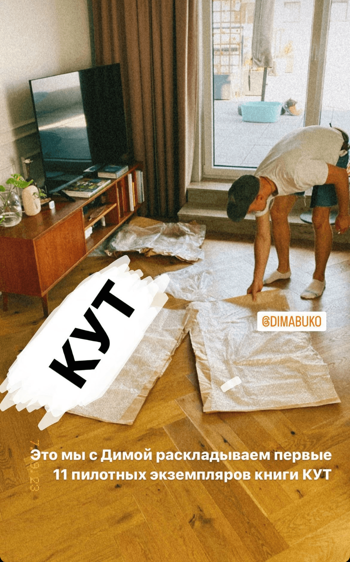
We received the first pilot copies from the printer in September 2023. Or rather, 10 copies. One came by post to my house, and the second one to Slava's. I looked at mine and was mostly satisfied. I called Slava, and he said - I don't like it. I went to his house the next day, got out my notebook, and we started to go over what he didn't like.
What Slava didn't like - most people wouldn't even notice. Inaccuracies in the cutting of the book block, small defects on the covers and pages where they were glued together. We took more than a hundred photos, I divided them into subgroups and sent the comments to the printer. I thought, or rather I was convinced, that they would say "Fuck you". But they promised to redo everything and correct it in the final printed version.
They had some questions for us too: the colouring of the photos, the placement and positioning of some of the shots. We also redid all of this before the print run went to press.
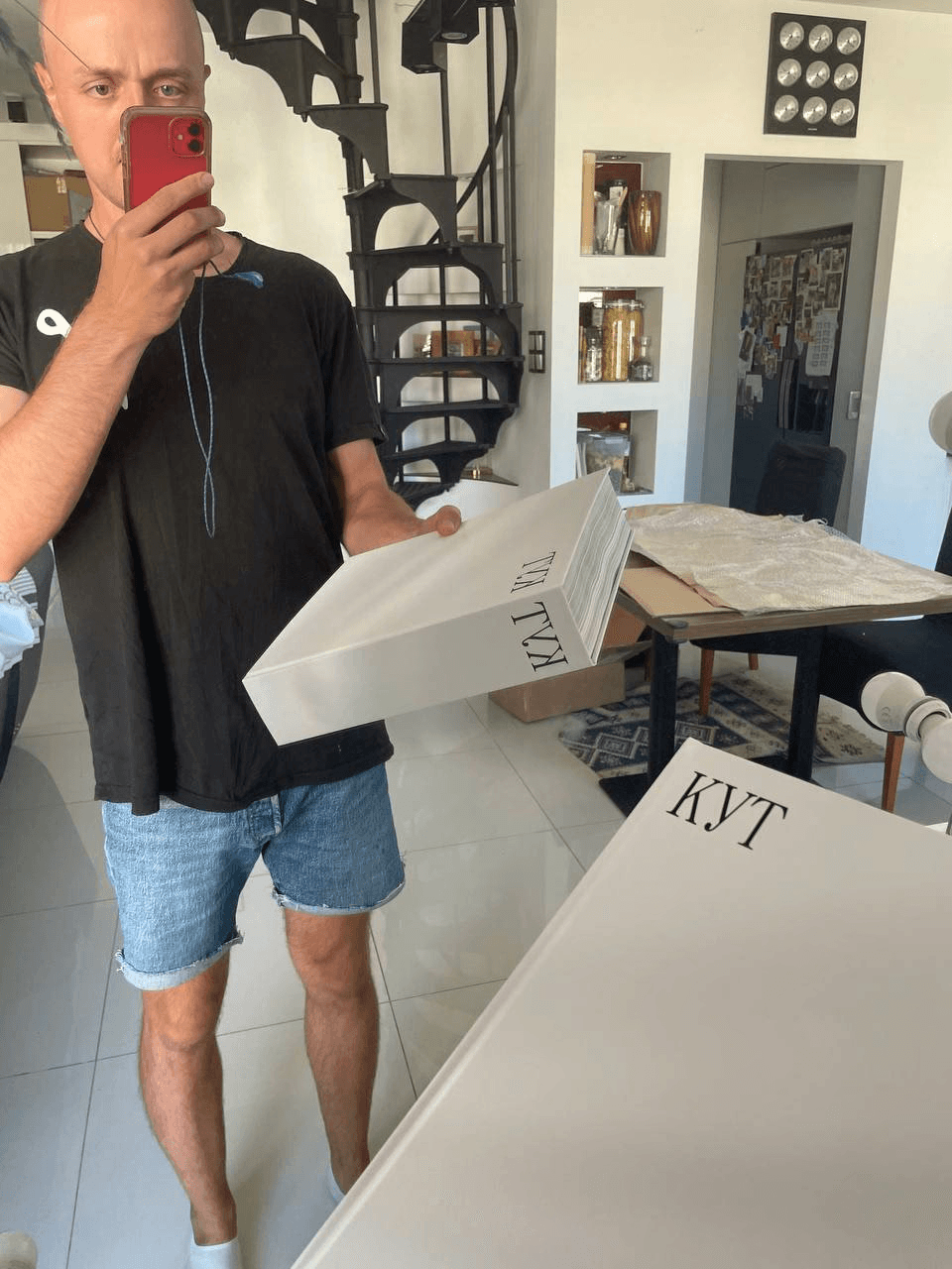
The first copy
The first copy
The first copy
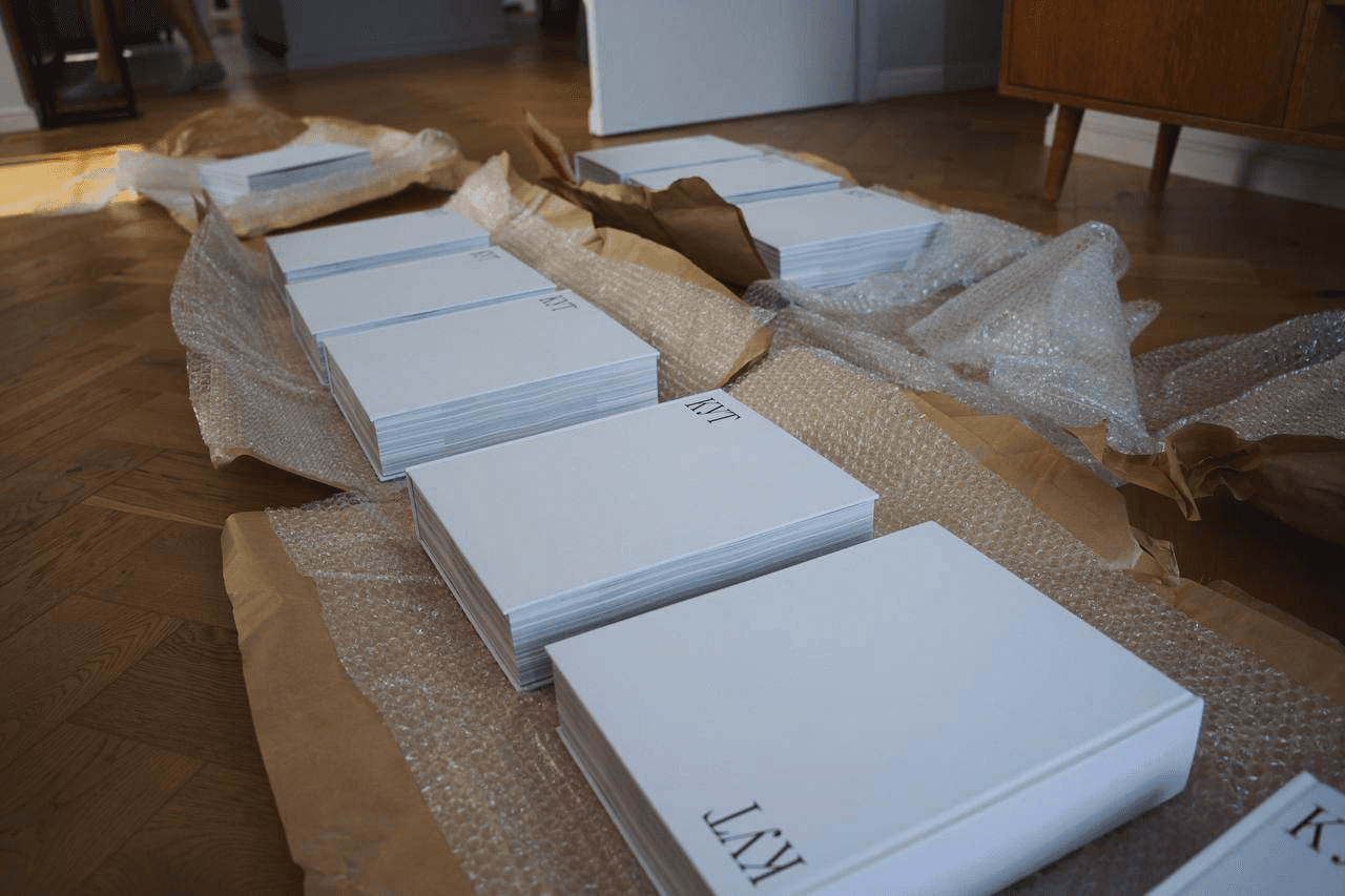
10 pilot copies :)
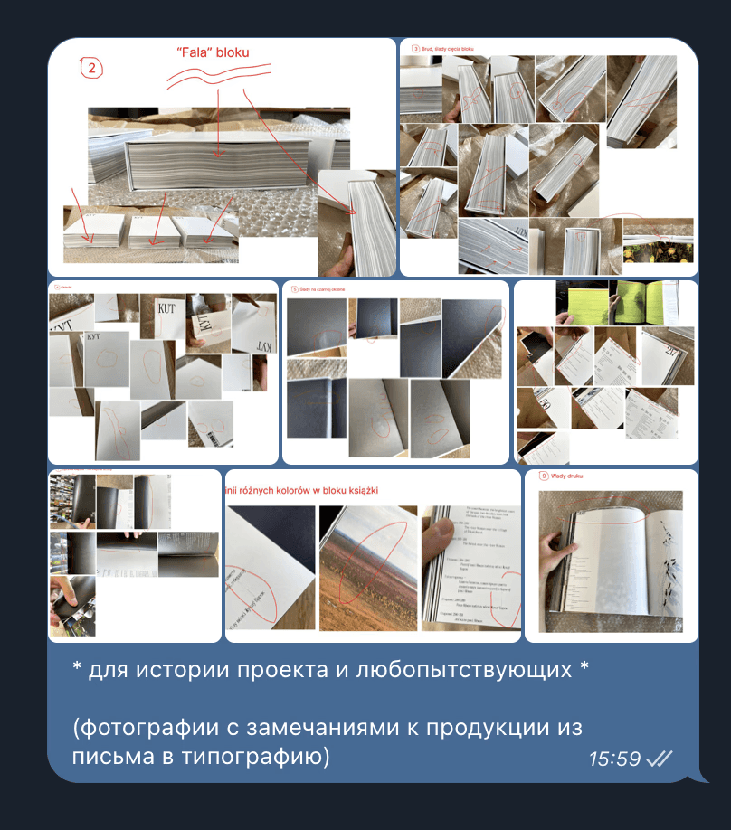
Feedback to the printers
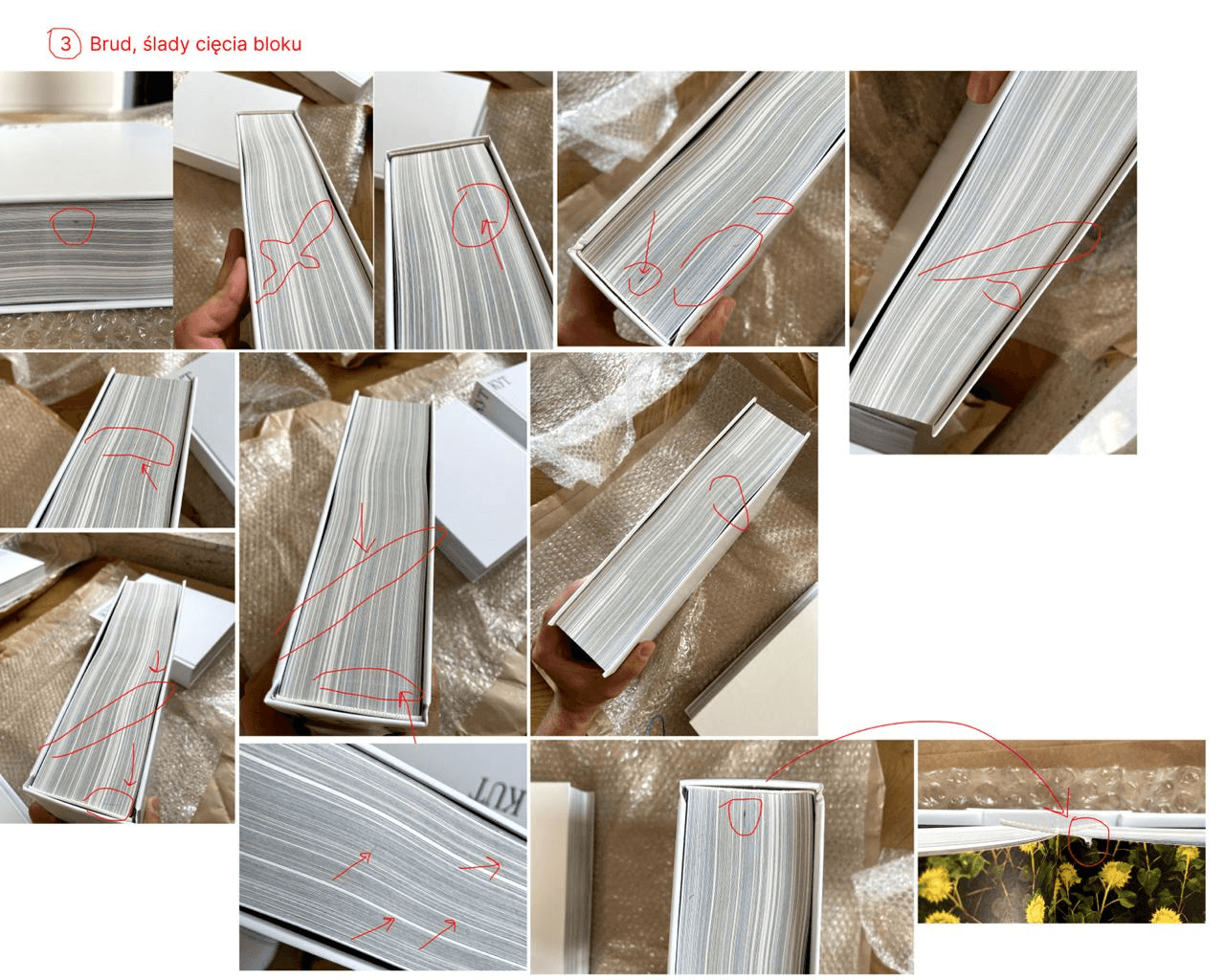
Feedback to the printers
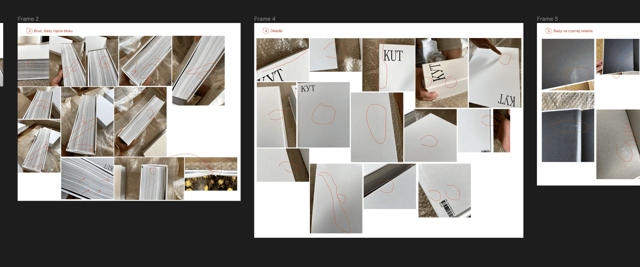
Feedback to the printers
Once the pilot had gone to print, we imported the entire layout into Miro so that everyone involved in the project could compile any comments in one place.
The final layout of the book is spread out in Miro
The final layout of the book is spread out in Miro
Adding a part to the book about how we started the project
The first page became white, instead of black
Tweaking hanging punctuation
Proofreading and searching for inaccuracies
Endless minor edits
We got our first haters. The main reason for this was that we gave the pilot to be printed without conducting a final proofread. There were typos and mistakes in it. We did it deliberately to speed up the whole production cycle of the book and to bring the production of the print run closer, to have time to receive it before the New Year. But doing it this way, we ended up with very obvious typos, and it did not go unnoticed by our readers.
The most "commented" typo
But aside from that, there was a lot of good stuff. Having sorted out the little thing, we could begin to share the results of all our work, launch the website and open pre-orders for the first print run.
Our editor, Olga, and the first copy of the book.
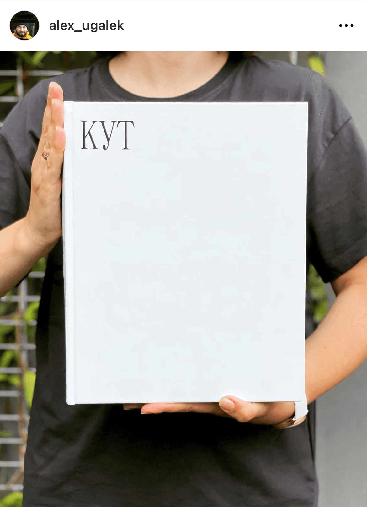
Katya, Alex’s wife, holds the first copy of the book
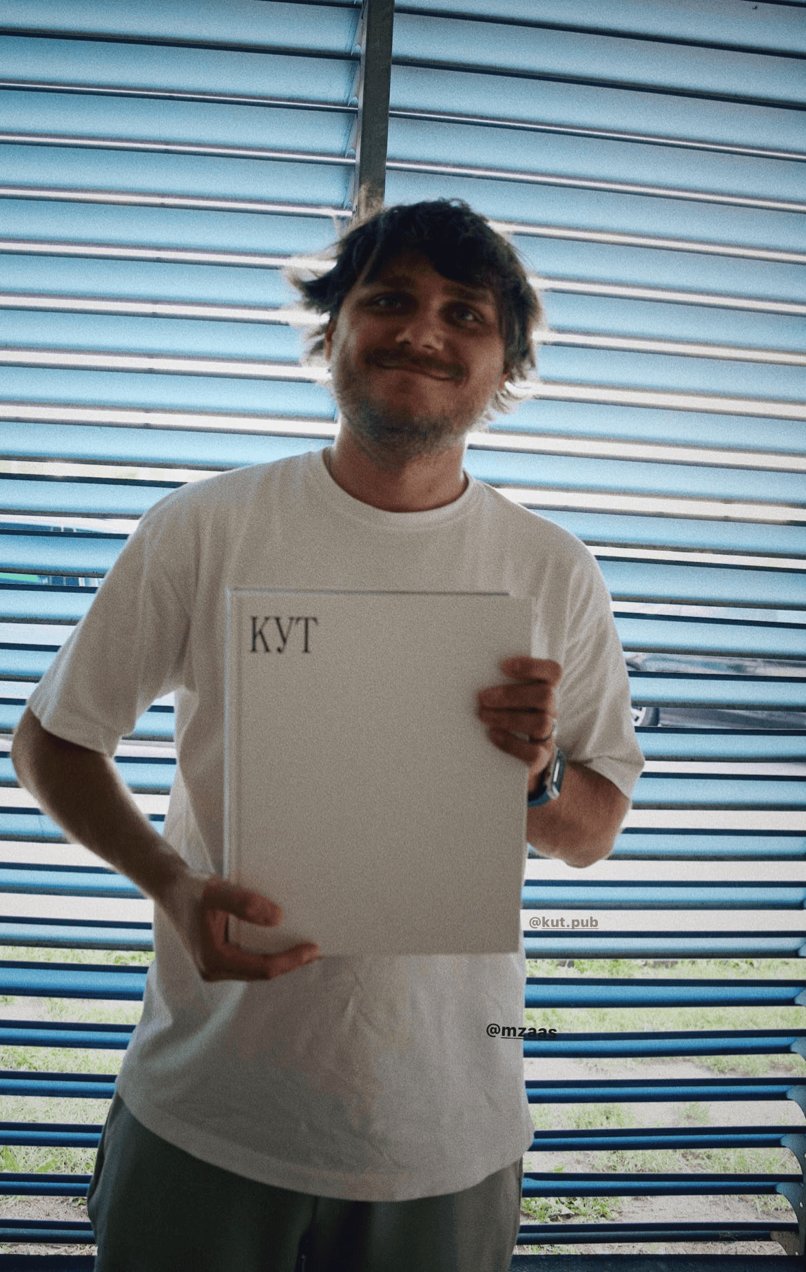
Slava holds the first copy of the book
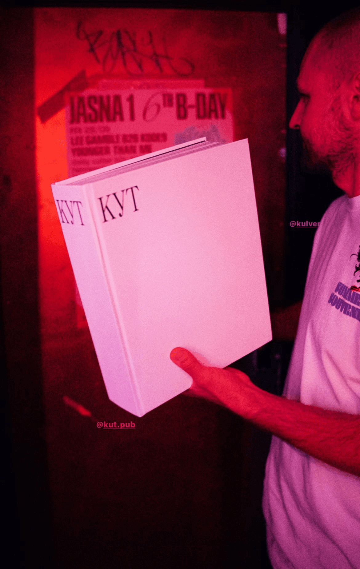
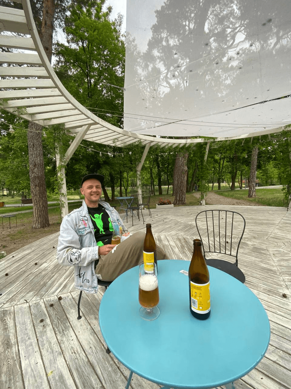
Celebrating the launch in a bar
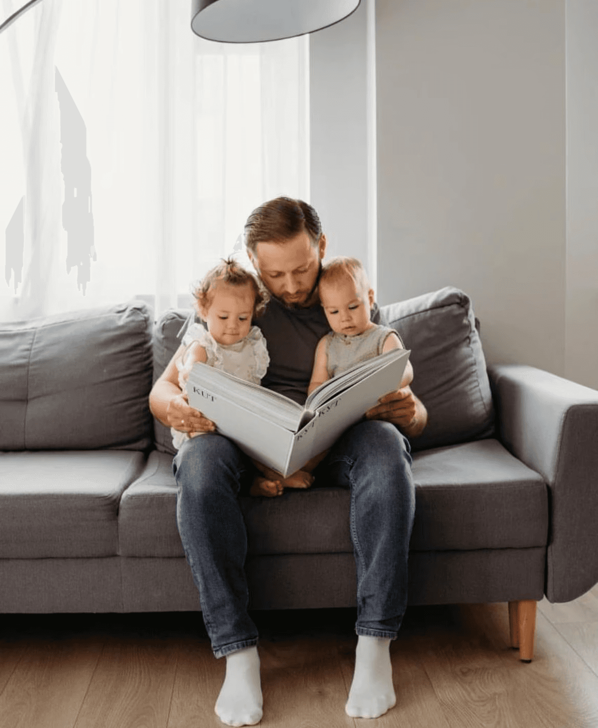
Alex looking through the book with his kids
Alex’s daughter flipping through the book
The pilot version of the book on its way to the Białowieża Forest
Developing the book’s packaging
The book in Minsk
Slava leafing through the book (it’s easy to understand that size of the book here)
PRINTING THE BOOK
During the printing of the first edition, Slava wanted to take a photograph of the book coming out of the printing press. To do this, in theory, we had to go to the printing house in Szczecin and persuade them to let us take a photograph.
They said no to all kinds of filming: the printing house said that they could not disclose the name of the equipment they use and most of their production processes. Apparently, it's a trade secret. They were happy to show us everything, but they wouldn’t let us film. Since you can’t film, then... well okay, I'll go have a look and tell everyone in words! I bought train tickets and went to Szczecin.
I was very lucky: I got to the printing house on the day that our book was being printed. Or rather, when the book blocks were lying separately from the book covers. The print shop is large and works on a hundred items a day, so the likelihood of getting to my book was very low.
Originally, I shot these videos for the guys since I had gone alone. Later, I decided to publish them as the story of how books are made seemed to interest everyone.
THE FIRST PRINT RUN
We had an agreement with the printing house that the print run would be sent to us in installments — as soon as one is ready — to speed up the process.
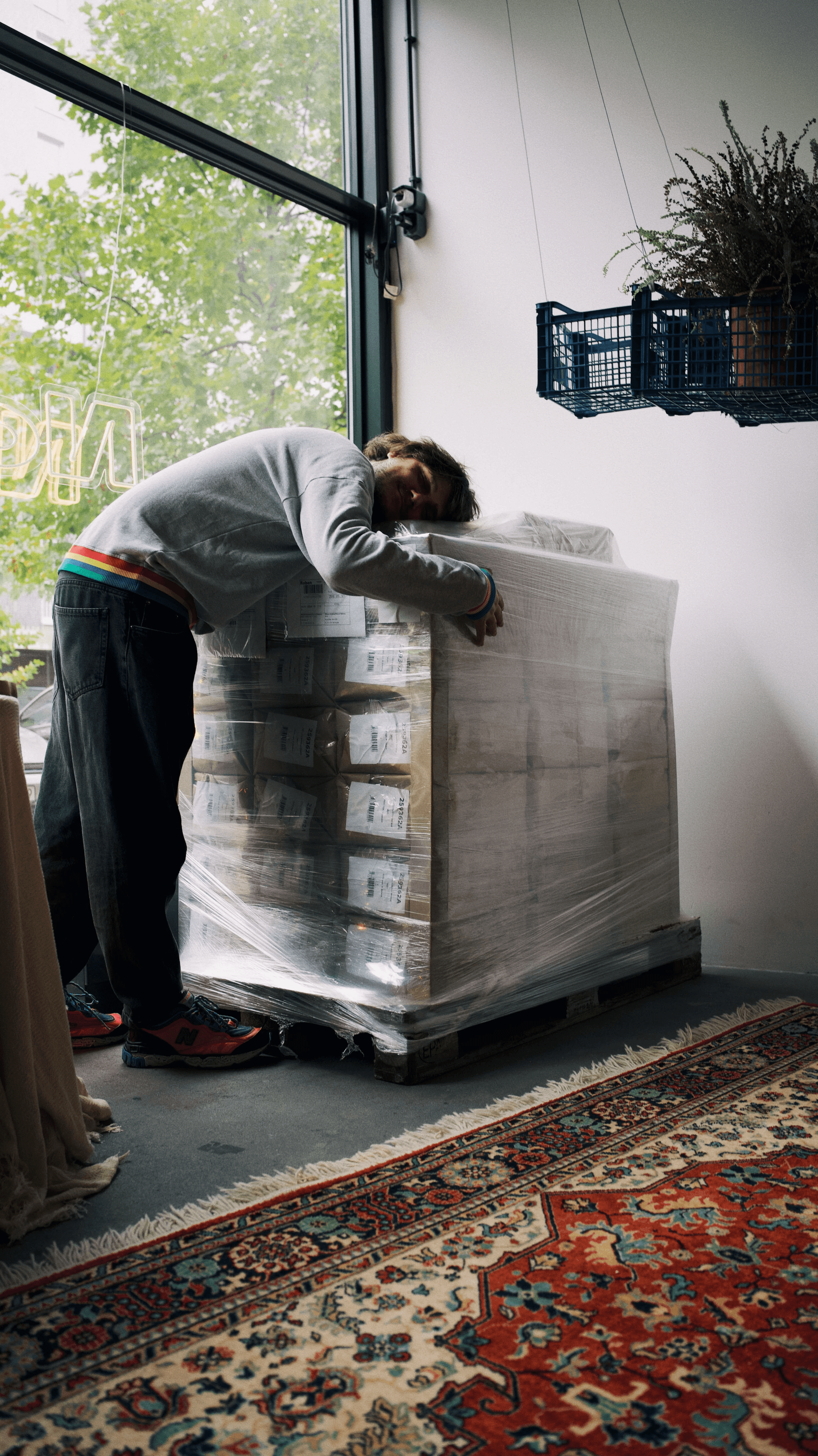
Slava is happy to see the first pallet
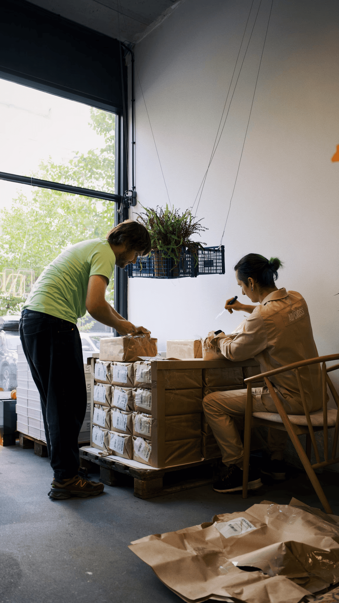
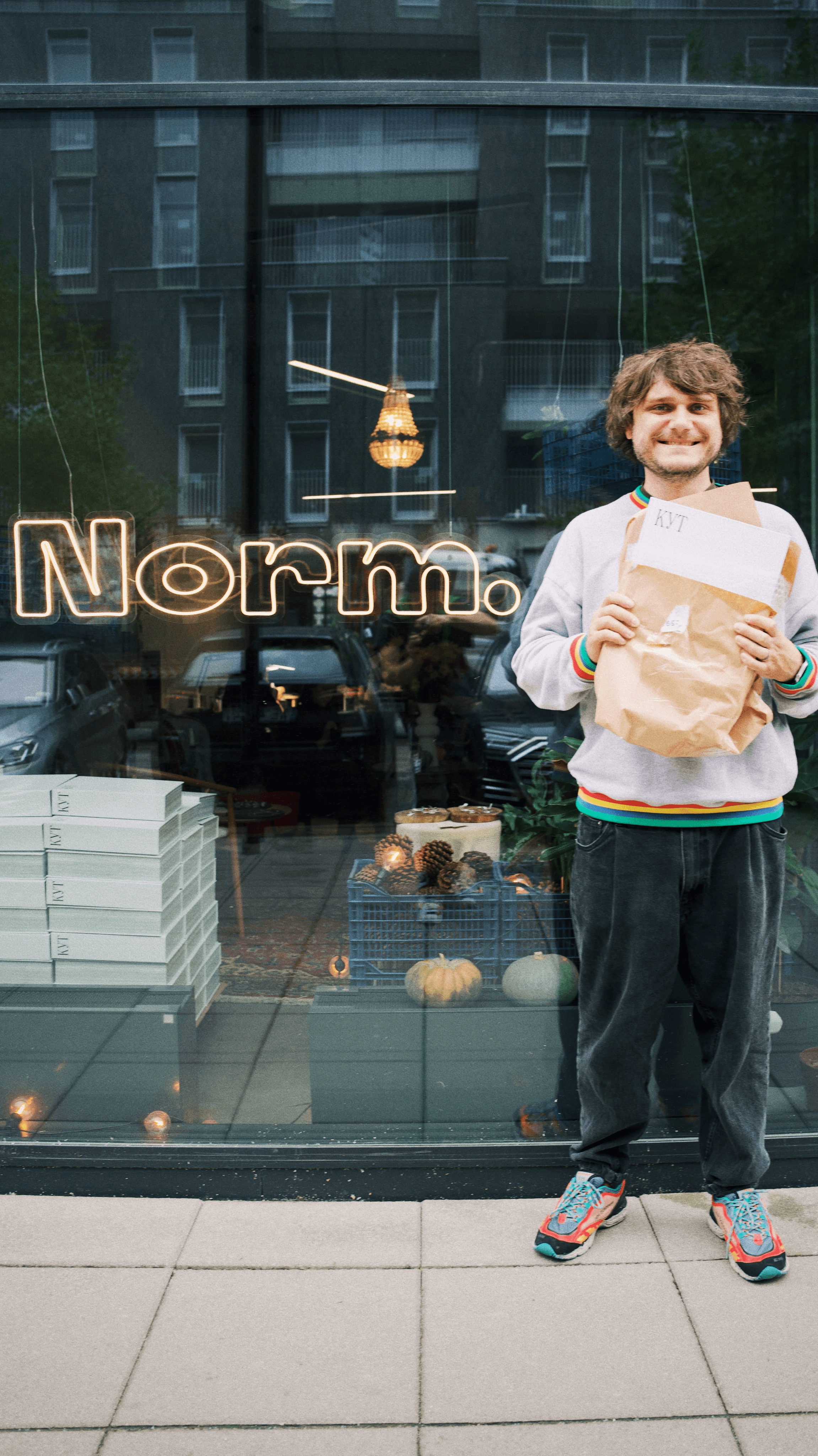
Nastia, the owner of Norm Studio in Warsaw, helps to unpack
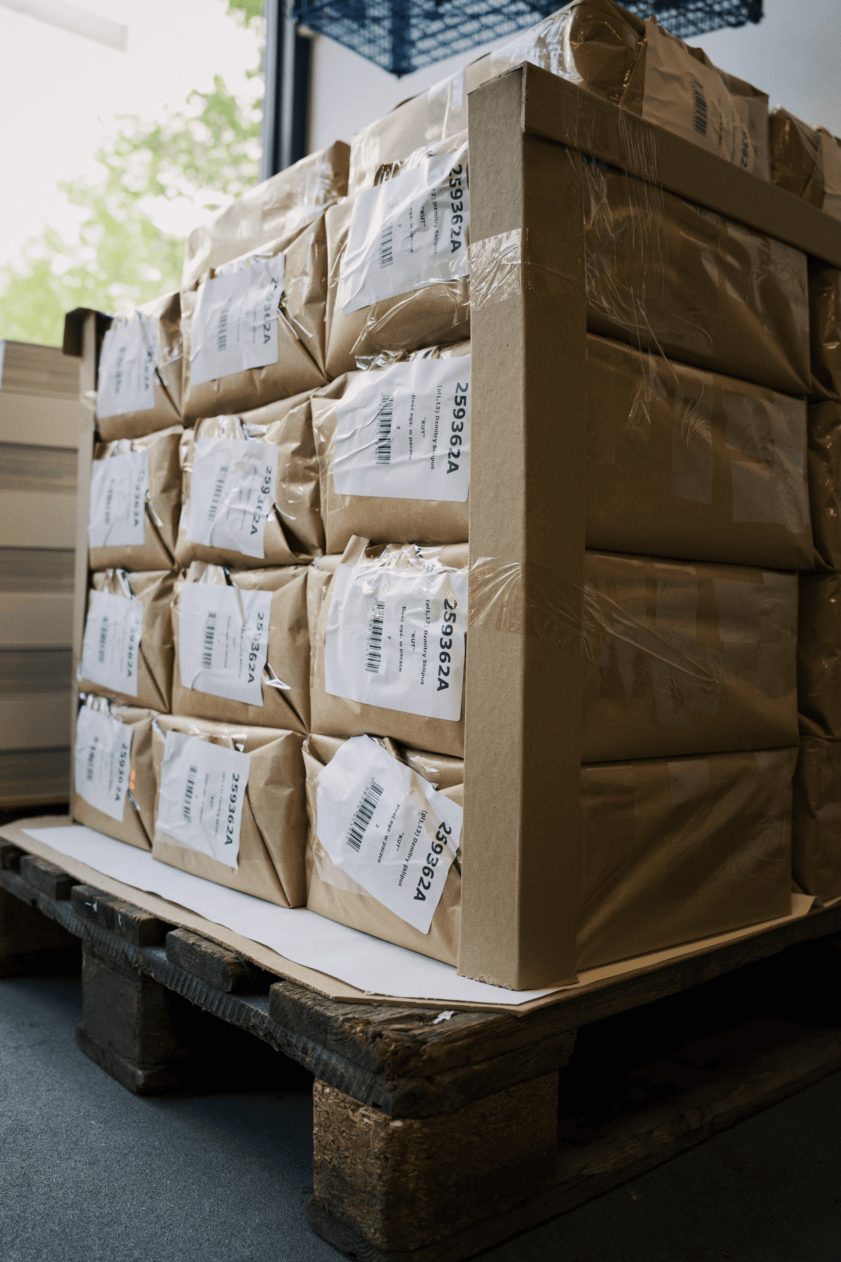
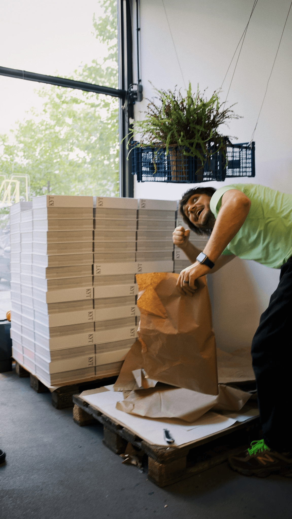
The books are packaged two at a time in shipping paper
I am happy to see the second pallet
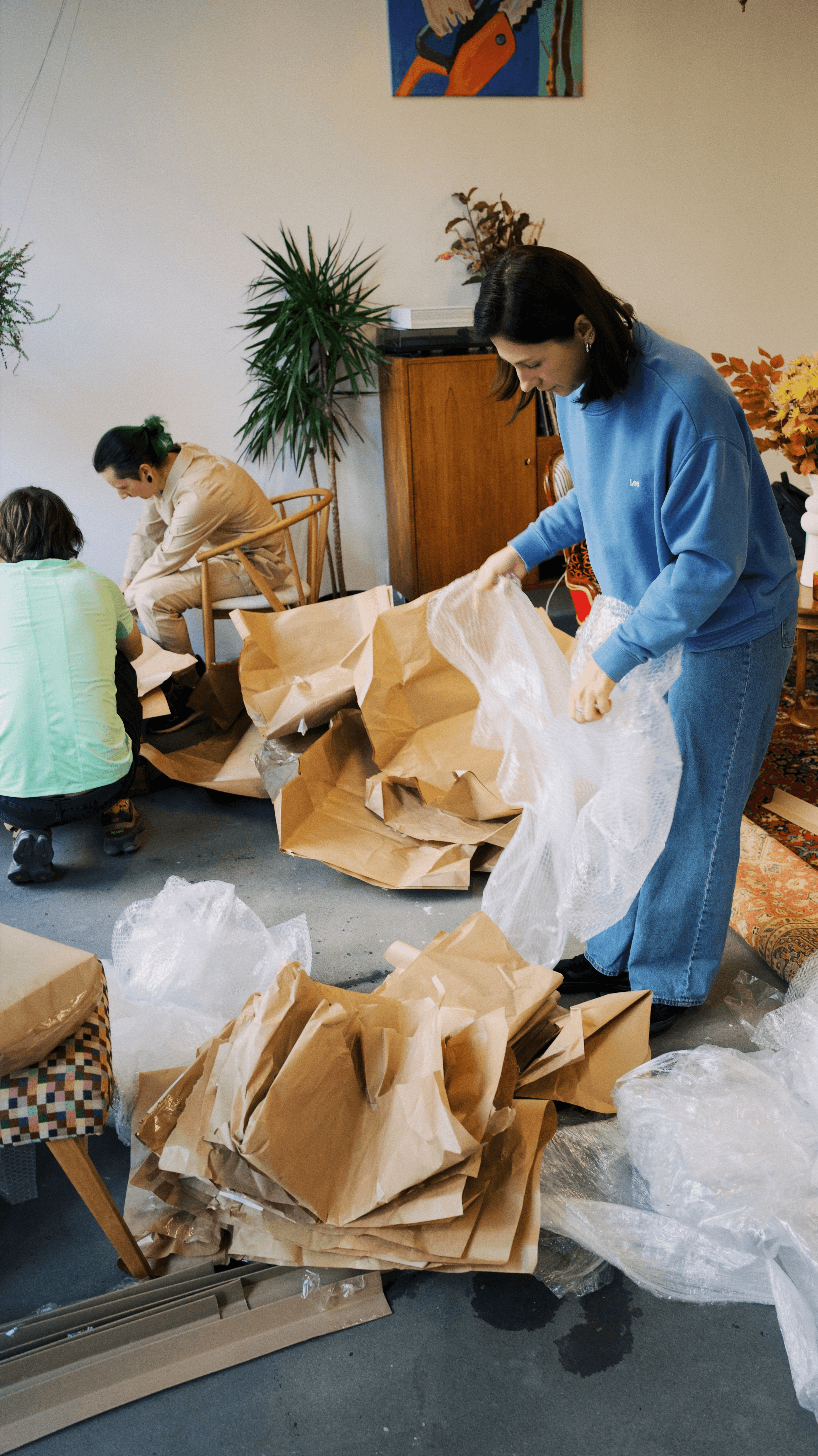
Opening up each package
A photo for a post announcing that we have launched worldwide shipping
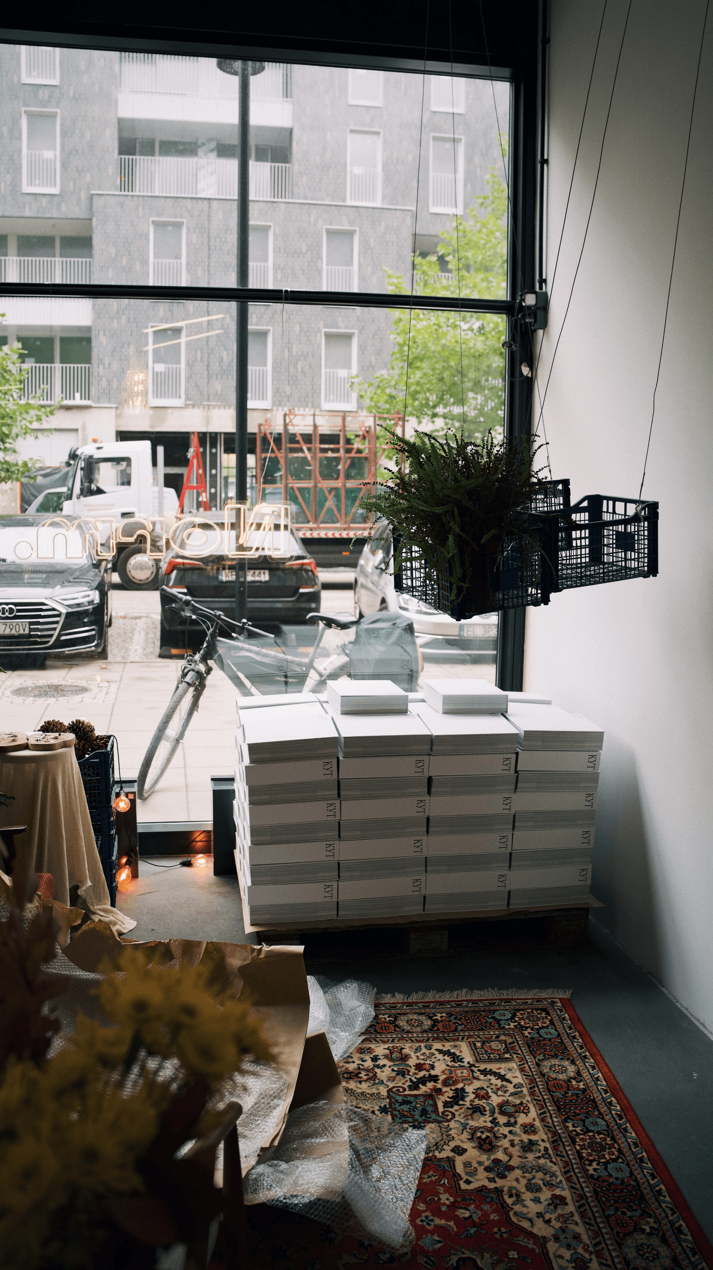
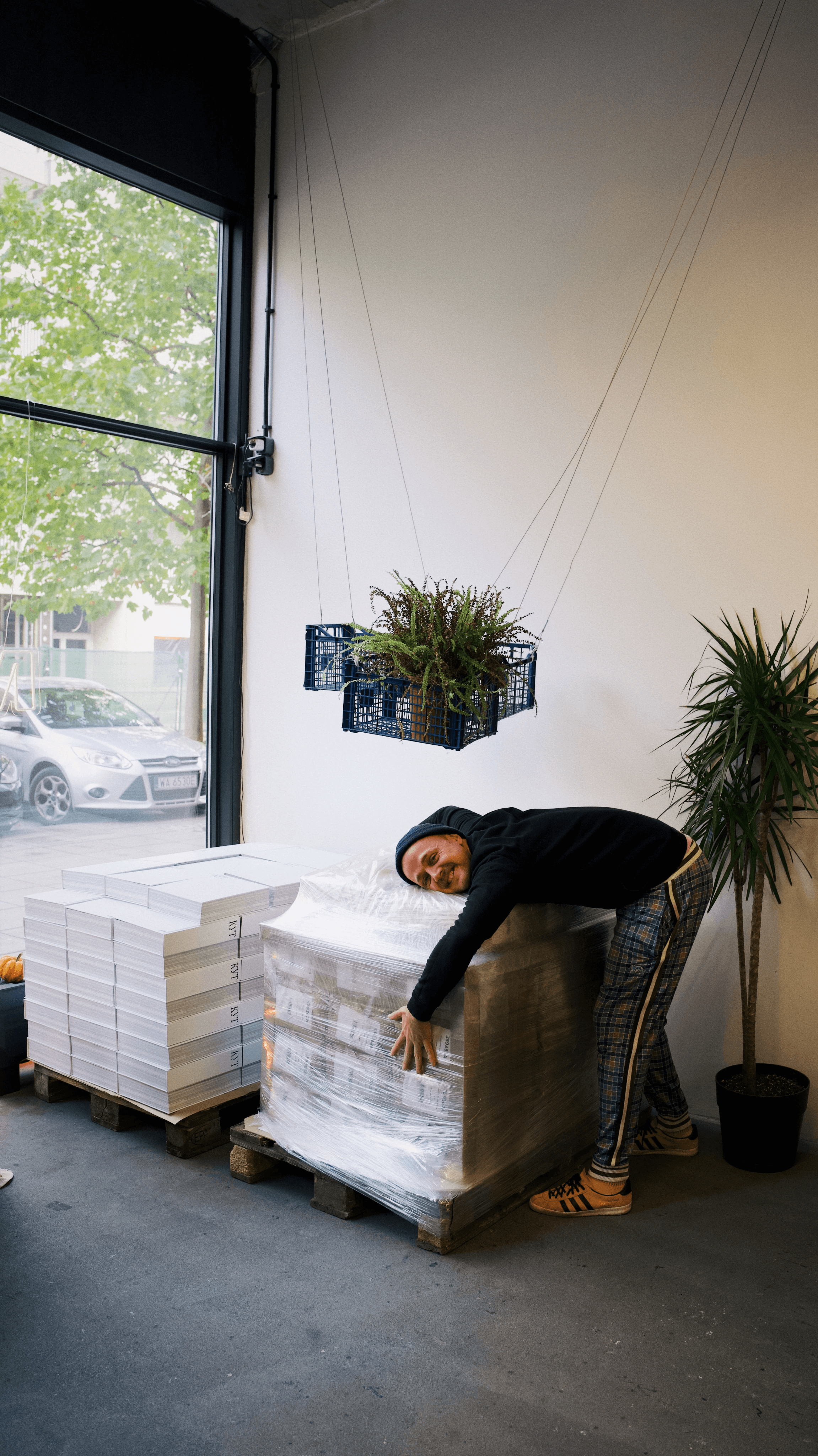
The first pallet at the window
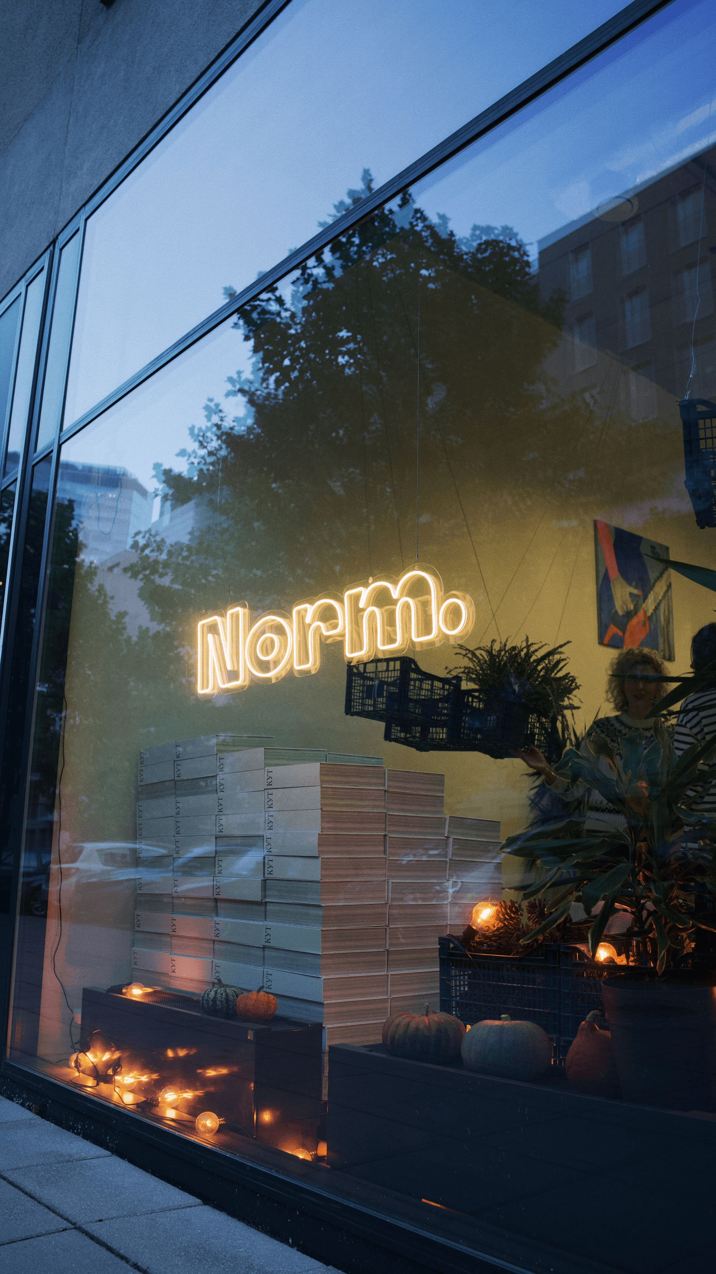
Two pallets at the window
One pallet with our books weighs 415 kg (one hundred books). The first two pallets were brought to Warsaw to our friends at the Norm studio. Our friends helped us to organise the distribution of the books to the first customers. We tried our best to hand out the first books in person.
That's all for now, thank you for listening!
You can support the project by sharing something about it on social media.
❤️
P.S. Olya-the-editor has demanded that I write a conclusion. I will give it my best shot.
Firstly, a book is a dream. In this case, Slava's dream. And I am really glad that this dream came true. I'm glad that I am someone whose skills and persistence helped to turn this dream into a real thing that you can pick up and be amazed. I believe there are a great number of people around me who have a similar dream, but lack the conditions or strength to make it come true. I believe that this story will inspire someone to write their own book, to create their own project.
Secondly, creating a book is one hell of a long journey. I think that there are thousands more books in the world that were started and abandoned than those that were completed. I won’t even mention the even smaller number of the "beautiful" books where everything came together in the end. Ours came to about 80%, I believe.
Thirdly, now many people ask Slava and me, "Guys, what’s next? But everyone doesn't fully understand that for us the project is still not finished. You see everything that we have designed, and now we have to somehow share it with people. The book will not simply make it to the shelf of every Belarusian. It costs so much money that at first it seemed that this book would not be on anyone’s shelf (I wrote about this at the beginning of this story). But I think we'll come up with something.*
*UPD (2026): First and second edition of the book are sold out
This post is also part of the project. It's an attempt to tell people that we are just a bunch of ordinary guys who wanted to create something that didn’t exist, but we felt like it should.
HUGE THANKS
Slava's parents, Pashka, Nastya Yakovleva, Sasha Yakovlev, Alyaksandra, Dzmitry Sklipus, Ivan Baranau, Alex Nosov, Gvazdovich Dziana, Uknown panda, Kabak Dzmitry, Sasha Krautsou.
BIG THANKS
Darya Muzychak,
This content is published in English thanks to your help.